Microsoft Excel is a handy piece of software. Using the tools and features of Excel, you can do an infinite number of things with a dataset. In Excel, we need to use Polar charts, and Radar diagrams are another name for Polar graphs. Polar diagrams are one of the best ways to compare a variety of items in many different ways. This article will look at two easy ways to display radar area charts in Excel. So, look at these two easy ways to create a Polar Area Chart in Excel.
How to Create Polar Area Chart in Excel: 2 Suitable Ways
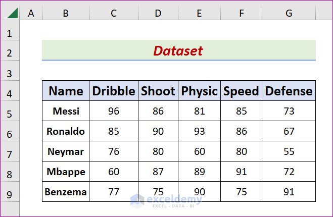
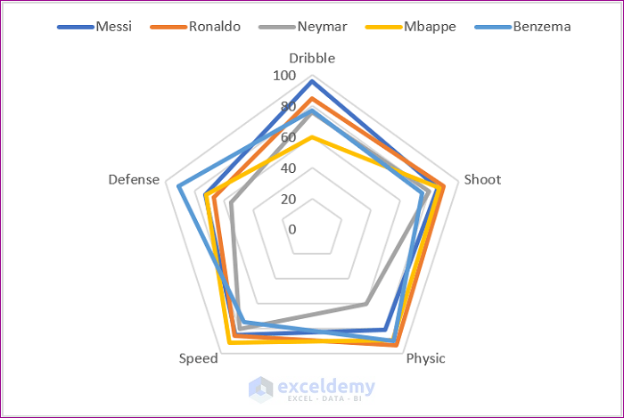
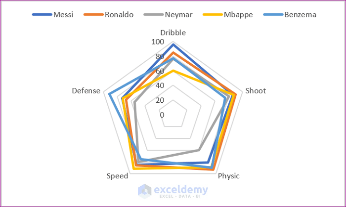
To demonstrate this point, let’s analyze a representative dataset. In the following dataset, for example, there is a Name column and five columns for skills called Dribble, Shoot, Physic, Speed, and Defense. And we have five pieces of information about the best player in this era: Messi, Ronaldo, Neymar, Mbappe, and Benzema. Using the data in the dataset, we will design a Polar Area diagram based on the skills columns. The first method in this article shows how to show radar diagrams using the Charts Feature. In contrast, another makes a polar area graph in Excel using Visual Basic for Applications (VBA). I have also been using Microsoft Excel 365 to write this post. You are free to choose the version that best fits your needs, and whatever choice you make is OK with us.
1. Utilize Charts Feature to Create Polar Area Chart in Excel
A chart that we may put into a workbook is referred to as an integrated chart, and a graph sheet is a diagram that consists of a worksheet. Use the Charts Feature in the spreadsheet to insert an embedding chart. We will create a radar area chart for this scenario using Excel’s Insert Chart capabilities. Please read these directions carefully and follow them to the letter to complete the task.
STEPS:
- First of all, open the intended sheet as the Activesheet.
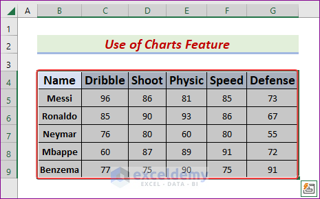
- Second, select the B4:G9 range.
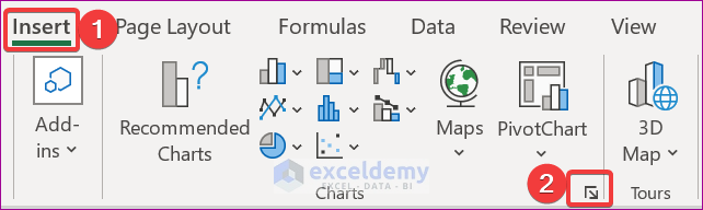
- After that, navigate to the Insert tab.
- Later, from the Charts group, click the Expand icon.
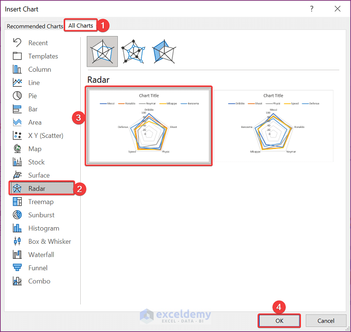
- Subsequently, the Insert Chart window will pop up.
- Presently, select the All Charts tab, and from the left pane, pick Radar.
- Latterly, choose the first Radar sample.
- Now, hit OK.
- Due to this, the desired chart will appear.
- Next, click on the chart area and pick the Plus symbol.
- After that, check the Axes, Gridlines, and Legend from the Chart Elements.
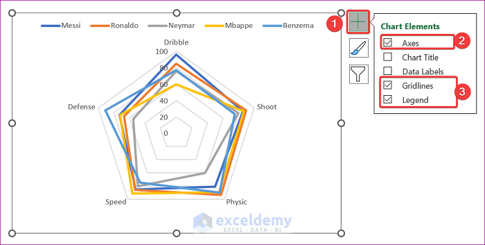
- At this time, click anywhere in the sheet.
- As a result, it will display the intended sheet as below.
2. Run VBA Code to Generate Polar Chart in Excel
The acronym for Visual Basic for Applications is VBA. Microsoft designed VBA. We can use Excel-incompatible functionalities via VBA code, and Excel’s VBA offers an innovative alternative for displaying a polar area chart. This tutorial will create a polar diagram in Excel using VBA. Please complete the assignment by following these instructions.
STEPS:
- To begin, choose the desired sheet as the Activesheet.
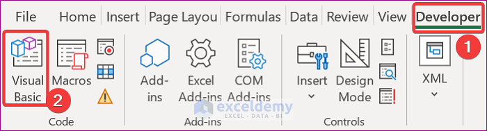
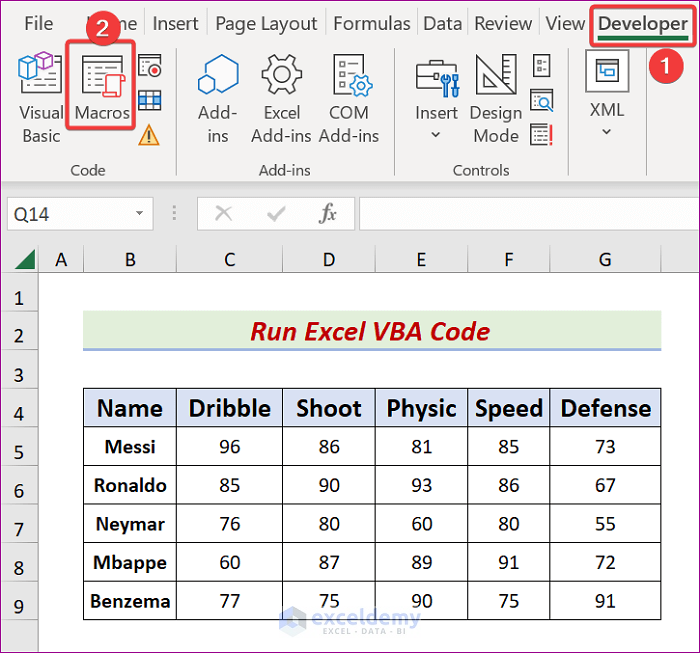
- Secondly, navigate to the Developer tab.
- Then, click the Visual Basic icon from the Code group.
- Subsequently, the Microsoft Visual Basic for Applications window will appear.
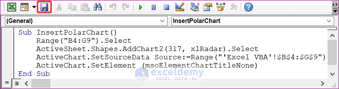
- After that, click on,
Insert → Module
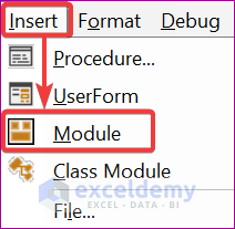
- Later, input the following formula in the Module box.
- It is essential to modify the range and sheet name as you need.
Sub InsertPolarChart()
    Range("B4:G9").Select
    ActiveSheet.Shapes.AddChart2(317, xlRadar).Select
    ActiveChart.SetSourceData Source:=Range("'Excel VBA'!$B$4:$G$9")
    ActiveChart.SetElement (msoElementChartTitleNone)
End Sub- Now, press Ctrl + S or click the Save icon with the .xlsm extension.
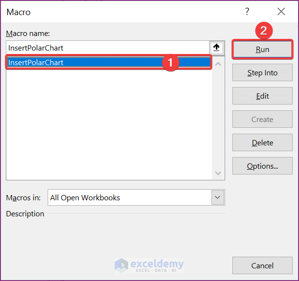
- Likewise, go to the Developer tab and click on the Macros symbol.
- Consequently, the Macro window will pop up.
- Next, choose the InsertPolarChart macro, followed by the Run.
- As a result, the intended chart will be displayed as below.
Download Practice Workbook
Please click the link underneath this section if you want a free copy of the illustration workbook we discussed during the demonstration.
Conclusion
If you do what we said, you’ll soon be able to make a Polar Area Chart in Excel. Keep using them, and if you have any more ideas or better ways, please share them. Remember to write your thoughts, questions, and suggestions in the space given.
Related Articles
- What Is Radar Chart in Excel
- How to Make a Radar Chart in Excel
- How to Include Standard Deviation in Excel Radar Chart
- How to Create Excel Radar Chart with Different Scales
- How to Create Excel Radar Chart Max Value
- How to Create Radar Chart and Fill Area in Excel
- Color Rings on Radar Chart in Excel
- How to Create Radar Chart with Radial Lines in Excel
- How to Create Pie Radar Chart in Excel
- How to Create a Circular Radar Chart in Excel
- How to Make a Wind Rose in Excel
<< Go Back To Excel Radar Chart | Excel Charts | Learn Excel
Get FREE Advanced Excel Exercises with Solutions!
