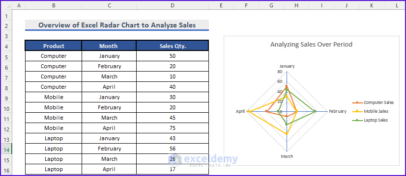
In this article, we are going to represent our data with a Radar Chart with Radial lines in Excel to compare our goal vs. our achievement meaning overall performance analysis and concentration of different actions in different variables. A radar chart also known as a Spider chart, Web, or Polar chart has the same origin and compares two or more data. Here is a simple example of a Radar Chart where the sales quantity of different products is analyzed over a certain period.
What Is a Radar Chart and Why Is It Necessary?
If you want to run a business to find out which month which product you have sold the most in which month and compare your customer satisfaction to the fullest to achieve satisfaction and make decisions according to it, a Radar chart can easily assess the situation for you.
Create Radar Chart with Radial Lines in Excel: 2 Practical Examples
First, we are going to see sales of different products in different months to decide in which month electronic product sales happen more. Then we will deal with data from the Customer service company.
1. Sales Analysis Using Excel Radar Chart with Radial Lines
In this article, we are going to make a Radar Chart of monthly sales of different electronic products so that we can find out which product is sold more in which months.
Steps:
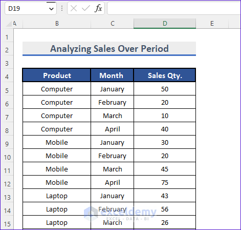
- First, we have to create the Sales data of Products for different months. Here we have created data about Computer, Mobile, and Laptop in four different months.
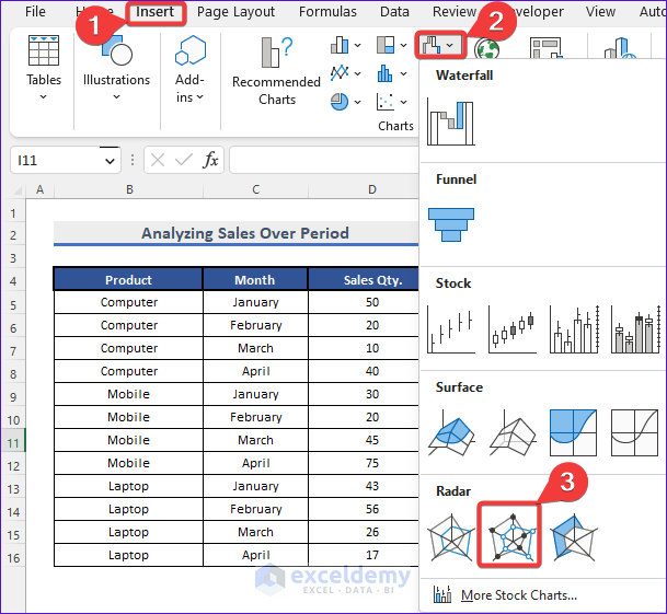
- After that, we will select Insert >> Charts >> Radar Chart with Markers.
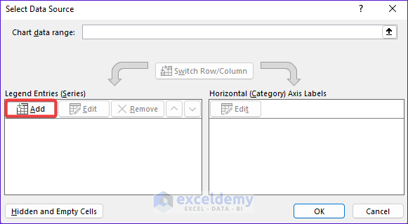
- Then, we will get a blank chart and right-click on it. After that, we will select data.

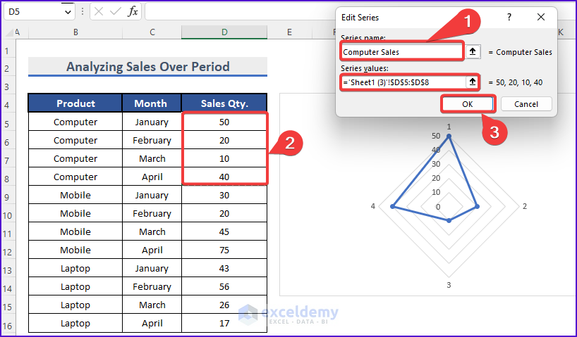
- Then, the Select Data Source dialog box will appear. We are going to add Legend Entries. Select Add from the Legend Entries (Series)
- Consequently, another dialog box will show up. We will give the series name Computer Sales and select the data from Sales Qty. Here, the range for the Sales Quantity is D5:D8. Then we will Press OK.
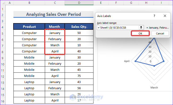
- Thereafter, we select the Edit options from the Horizontal axis Label.
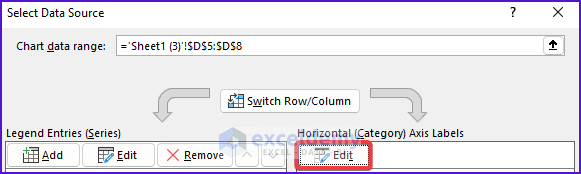
- Then, we select the month name from the Month.
- Finally, we get the Radar chart without Radial Lines.

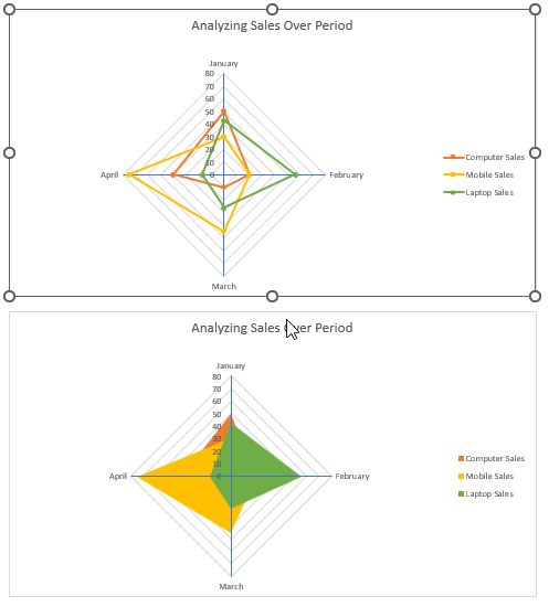
- Now, we will perform the same operation above with Mobile and Laptop from the Data Table. Finally, we will get the chart.
- Then, you can select different colors of your choice to make it look better.
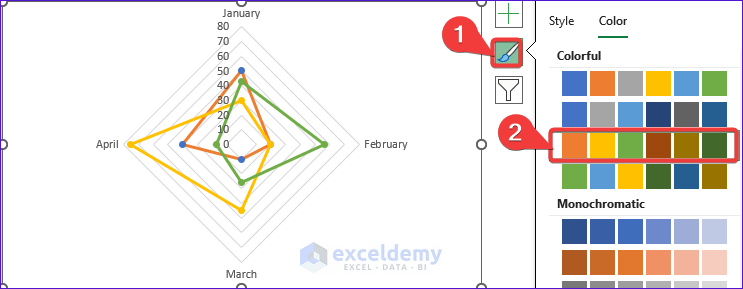
- After that, select the Plus icon at the top right corner of the chart.
- Thereafter, select Axes >> More Options.
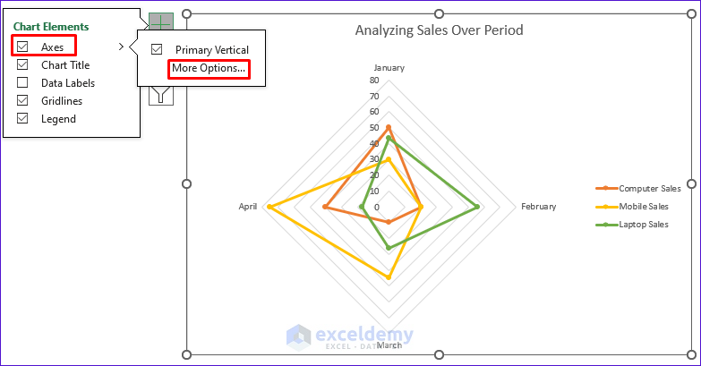
- Then according to the picture below, we select Solid line to get Radial lines.

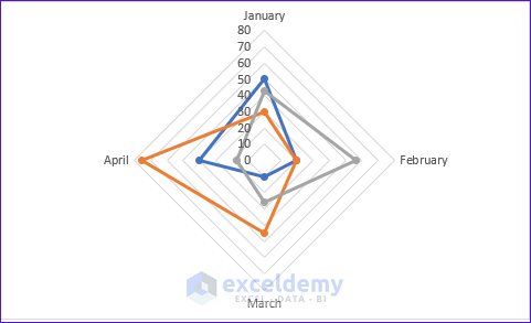
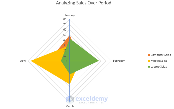
- Finally, we will get the chart with Radial Lines and now we are going to title the chart Analyzing Sales Over Period.
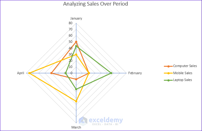
- Here we can see that in January Computer Sales are High but in February Laptop Sales are high. And Finally, in April Mobile Sales are high.
By following the above steps, you can create your own custom Radar Chart with Radial Lines and analyze your own data to find which trend is higher or not.
Read More: How to Create Excel Radar Chart with Different Scales
2. Candidates Performance Analysis with Radar Chart
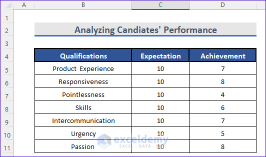
In this example, we are going to analyze the performance data of candidates with the expectation to find out if he or she is fit for the job.
Steps:
- First, we will create the data table. Here the dataset is about the candidate’s qualifications and achievements.
- Following the steps of Example 1, we can create a Radial Chart with Radial Lines using this dataset. Just select the range B4:D11 and create the Radar Chart. After that, format the chart to get the radial lines.

- Here, we can see the candidate has more Passion than Pointlessness and better Product Experience. We can compare other qualifications too by this single chart.
Above these examples, we are going to compare the optimum level to candidates’ performance for hiring purposes.
How to Create Radar Chart with Radial Lines and Filled Background in Excel
In this section, we are going to fill the Background of a Radial Chart. Let’s take our first example where we analyzed the sales over a certain period. Here we will see both marked and filled Radial Charts overlapping.
Steps:
- First, we have to select the chart we have created from Example 1.
- After that, we will copy the chart.
- Then we will select Insert >> Radar >> Filled Radar.
- Now, we are going to overlap the previous Radar Chart with the Markers of Example 1 and the Filled Radar Chart. So we copy the previously created Radar Chart by pressing ctrl+C on it and paste it on the Filled Radar Chart by pressing ctrl+V on it.
- After that, let’s select an area of the chart.
- Thereafter, we select the Filled Radar Chart.

- After doing this for three areas, we will get a distinct Filled Radar Chart with a Marked Radar Chart.
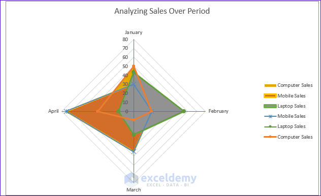
At the end of it, you will get the beautiful Radial Chart with Radial lines filled.
Read More: Color Rings on Radar Chart in Excel
Download Practice Workbook
You may download the following workbook to practice yourself.
Conclusion
At the end of this article, you can create your own custom data and analyze the concentration and performance of your own variable. If you have any questions or feedback, please note them in the comment section.
Related Articles
- What Is Radar Chart in Excel
- How to Include Standard Deviation in Excel Radar Chart
- How to Create Excel Radar Chart Max Value
- How to Create Radar Chart and Fill Area in Excel
- How to Create Pie Radar Chart in Excel
- How to Create a Circular Radar Chart in Excel
- How to Create Polar Area Chart in Excel
- How to Make a Wind Rose in Excel
<< Go Back To Excel Radar Chart | Excel Charts | Learn Excel
Get FREE Advanced Excel Exercises with Solutions!
