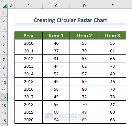
Step 1 – Creating Dataset to Make a Circular Radar Chart
- Create a dataset in the following format.
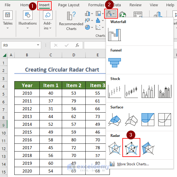
Step 2 – Employing Radar Chart Option
- Go to the Insert tab.
- Choose Radar with Markers from Others Charts.
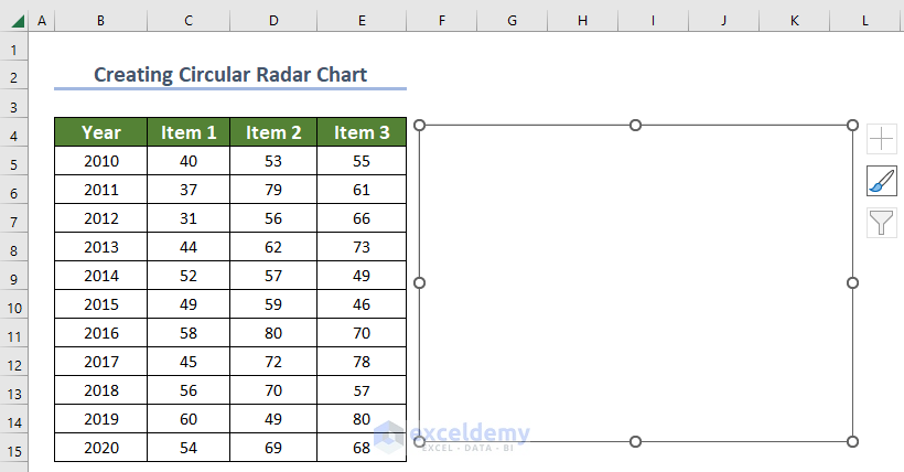
- A blank radar chart will be generated.
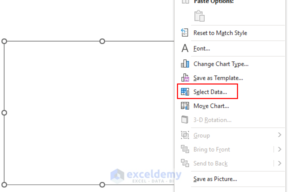
- Right-click on your mouse while selecting the chart.
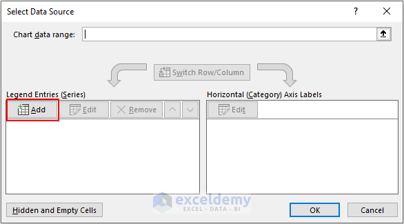
- Go to the Select Data option.
- After clicking Select Data, a Select Data Source dialog box will open.
- Click on the Add option.
- An Edit Series dialog box will open.
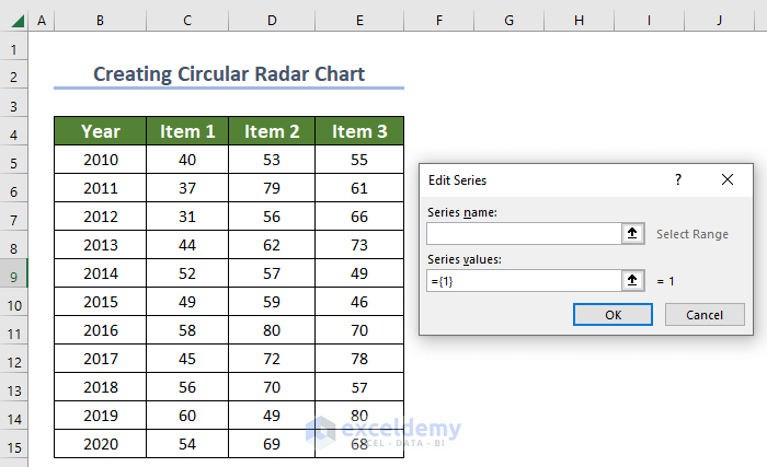
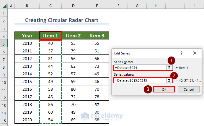
- Select cell C4 which is Item 1 as a Series name, and select C5:C15 as Series values.
- Click OK to proceed.
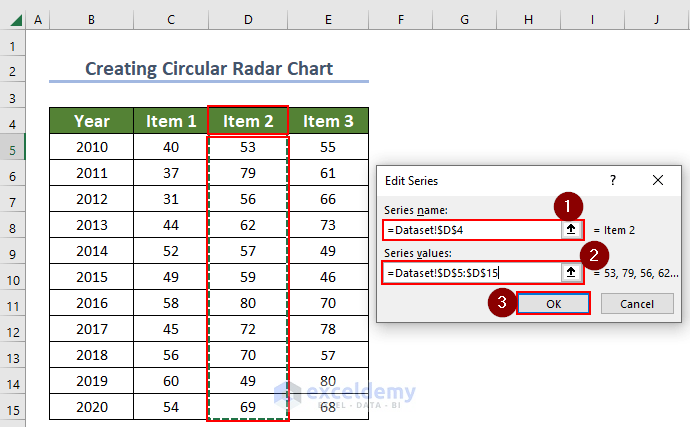
- For Item 2, select cell D4 as a Series name and select D5:D15 as Series values.
- Click OK to proceed.
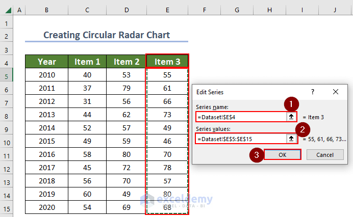
- For Item 3, select cell E4 as a Series name and select E5:E15 as Series values.
- Click OK to proceed.
- To edit Horizontal Axis Labels, click on Edit.
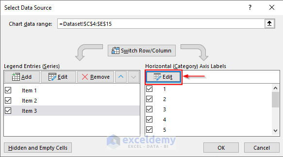
- An Axis Labels dialog box will open.
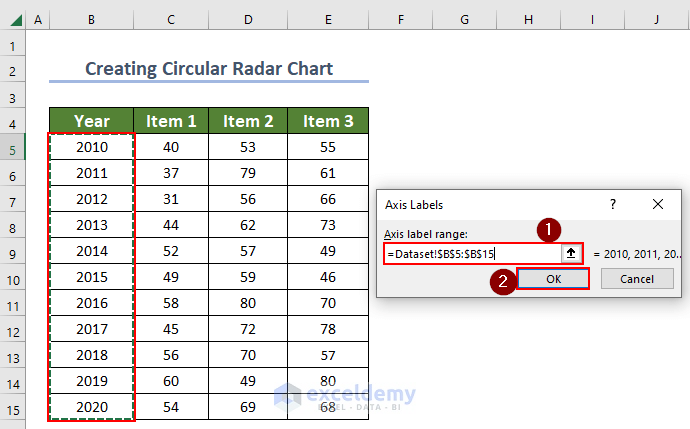
- Select the Year column (B5:B15) as the Axis label range and click OK to proceed.
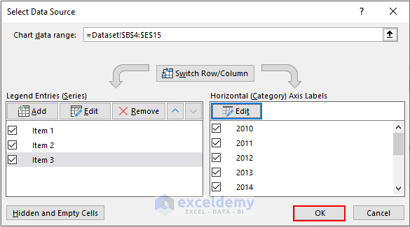
- The Select Data Source dialog box will look as shown below.
- Click OK.
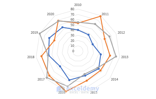
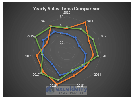
- It will create circular radar chart without formatting.
Read More: How to Create Radar Chart with Radial Lines in Excel
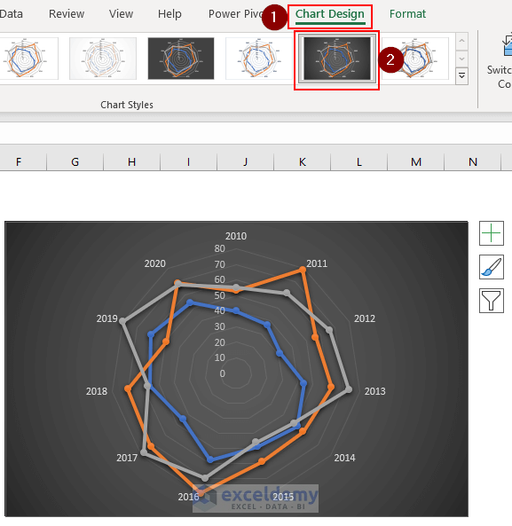
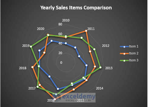
Step 3 – Formatting Radar Chart
- Go to the Chart Design tab.
- Select your preferred Chart Design. We have selected Style 7 in this case.
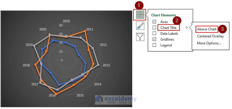
- Click on the chart and click on the plus symbol which is Chart Elements.
- Click on the arrow sign (>) beside Chart Title.
- Click on the Above Chart.
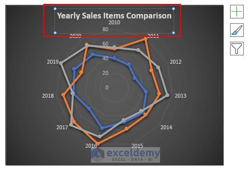
- Enter a Chart Title according to your dataset. We have given “Yearly Sales Items Comparison” as a Chart Title.
- To change the color of each radar line, right-click on your mouse.
- Go to Outline and select a color.
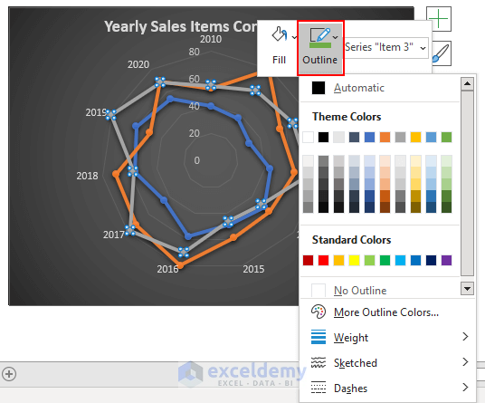
- You can change each line color of this radar chart.
- To add Legend, click on the chart and click on the plus symbol which is Chart Elements.
- Click on the arrow sign (>) beside Legend.
- Click on the Right option.
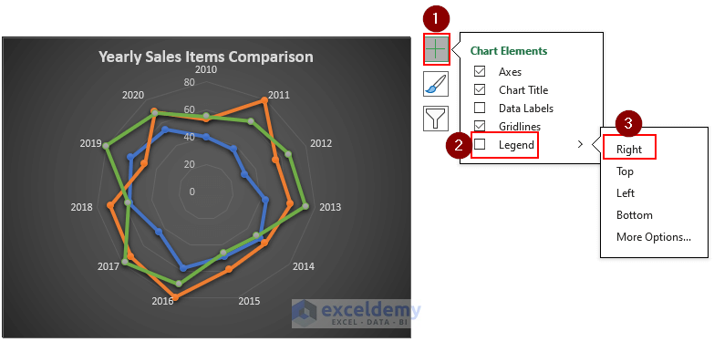
- Legend will be added on the right side of your chart.
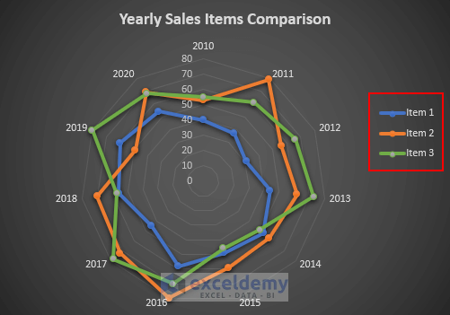
- You can format the font size, color, and theme color as per your requirement.
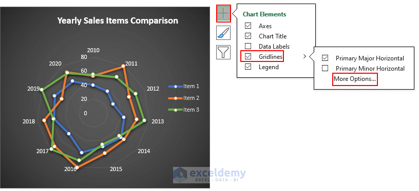
- To edit Gridlines, click on the chart and click on the plus symbol which is Chart Elements.
- Click on the arrow sign (>) beside Gridlines.
- Click on More Options.
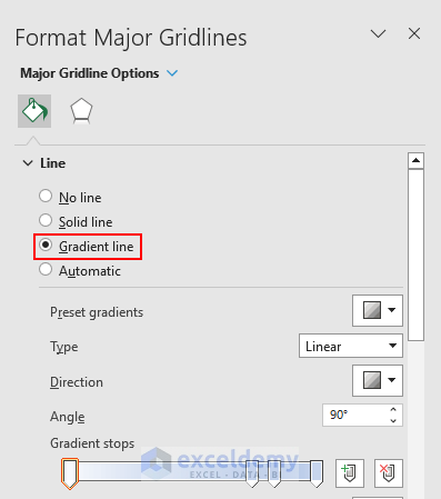
- The Format Major Gridlines dialog box will open.
- Select the Gradient line.
- Close the Format Major Gridlines dialog box.
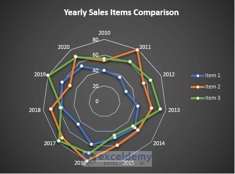
- You will have a Circular Radar Chart as shown.
Read More: Color Rings on Radar Chart in Excel
Download Practice Workbook
Related Articles
- What Is Radar Chart in Excel
- How to Create Excel Radar Chart with Different Scales
- How to Create Excel Radar Chart Max Value
- How to Create Radar Chart and Fill Area in Excel
- How to Create Pie Radar Chart in Excel
- How to Make a Wind Rose in Excel
<< Go Back To Excel Radar Chart | Excel Charts | Learn Excel
Get FREE Advanced Excel Exercises with Solutions!
