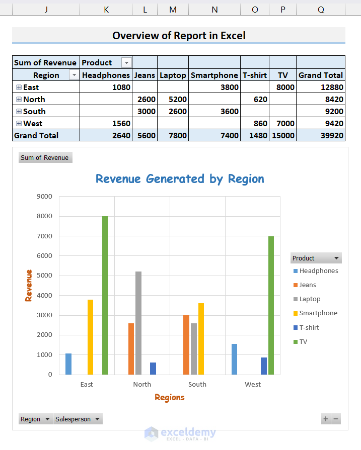
In this Excel tutorial, you will learn how to generate a report in Excel. You can organize raw data with PivotTable, create charts to visualize data, and print them in a suitable format. Let’s use a sales dataset to showcase reporting.
Download the Practice Workbook
What Are the Steps for Creating a Report in Excel?
We can create a report in just five easy steps. They are:
- Managing Data
- Inserting a Pivot Table to Organize Data
- Creating a Chart to Visualize Data
- Summarizing the Report
- Printing the Report with a Proper Header and Footer
Let’s put these to practice with a sample Sales Report.
Step 1 – Managing Data
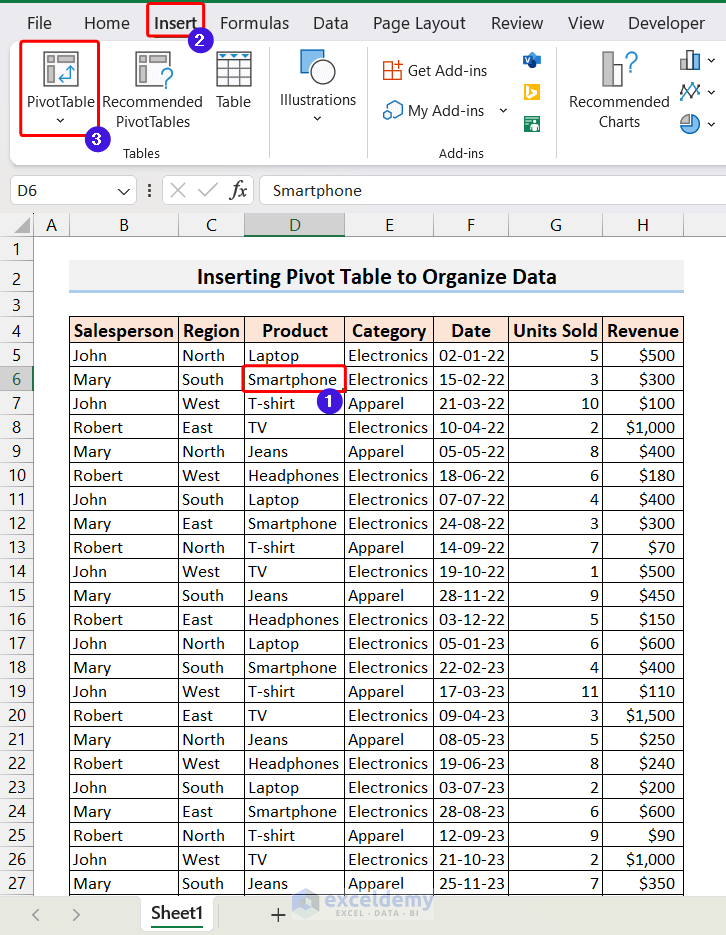
- We have gathered some sample sales data containing columns for Salesperson, Region, Product, Category, Date, Units Sold, and Revenue.
- This dataset has 100 rows but we are only showing the first 23 rows.

Click the image for a detailed view.
- This dataset is not well organized but rather very scattered.
- To generate a report, we need to organize it in a way from which we can extract meaningful and presentable information.
- To organize this kind of data, the Pivot Table feature in Excel is one of the best options.
Read More: How to Generate PDF Reports from Excel Data
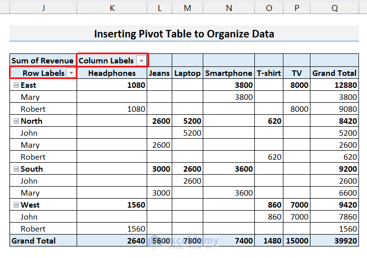
Step 2 – Inserting a Pivot Table to Organize Data
- Select any cell from the dataset, and then go to the Insert tab and click on the PivotTable option.
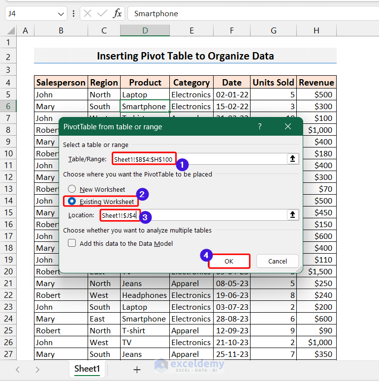
- A new dialog box named PivotTable from table or range will pop up.
- You need to select the source range, the range of the dataset, and the destination where the pivot table will be placed if you want to place it inside the existing worksheet.
- Click OK.
Click the image for a detailed view.
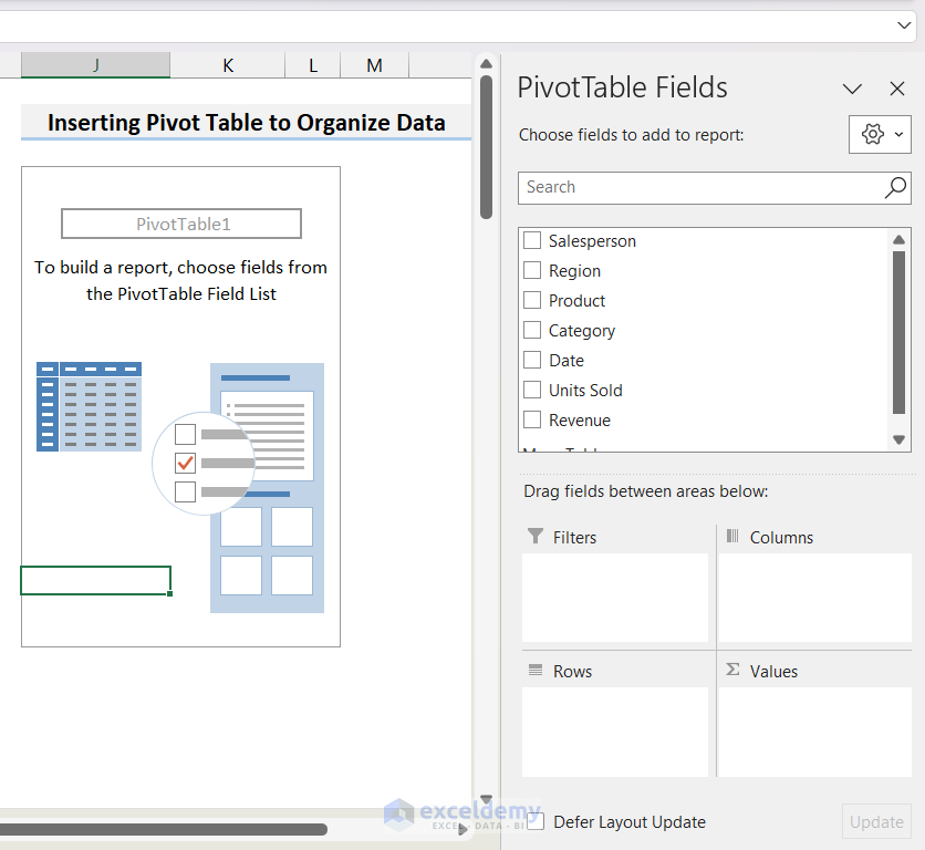
- You will see a PivotTable layout around the destination cell and a PivotTable Fields list in the right corner.
Click the image for a detailed view.
- Depending on how you want to organize and summarize the date, you need to drag fields into different areas. We chose the fields as in the image below.
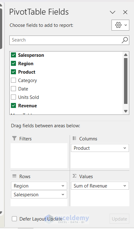
- The PivotTable will be generated as soon as you drag the fields in. You may need to change some auto-generated Labels.
Read More: Create a Report in Excel as a Table
Step 3 – Creating a Chart to Visualize Data
- Click on any cell inside the PivotTable and then go to PivotTable Analyze.
- Click on PivotChart.
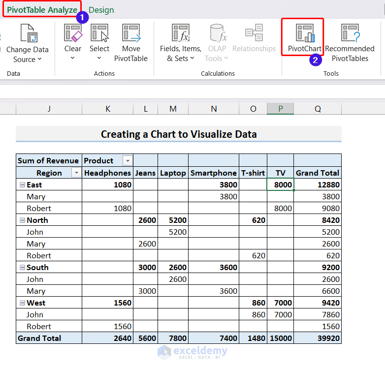
Click the image for a detailed view.
- The Insert Chart window will be opened. Toggle between different chart types and styles and choose the one that best suits your purpose.
- Click OK.
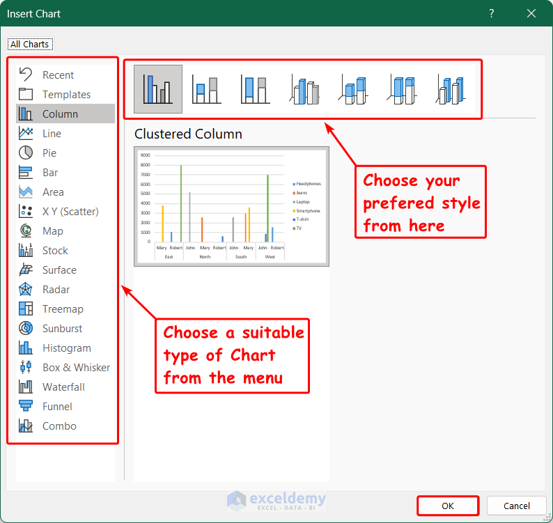
Click the image for a detailed view.
- A chart will be generated on the worksheet.
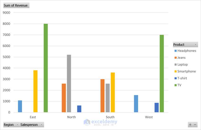
Click the image for a detailed view.
- You may want to add some elements to the chart such as Axis Title, Chart Title, etc., and format the chart to make it more presentable.
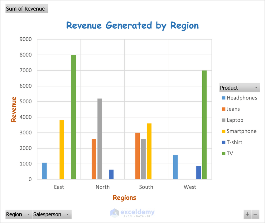
Click the image for a detailed view.
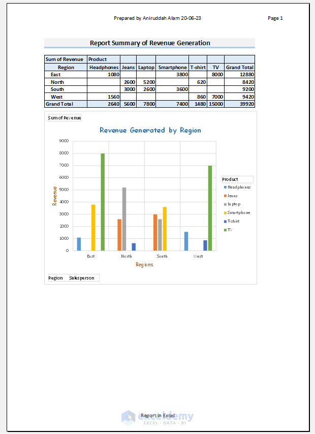
Step 4 – Summarizing a Report
We can compile the chart and pivot table in one location for printing.
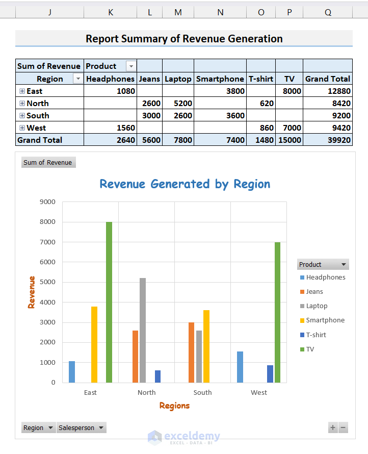
Read More: Create Report That Displays Quarterly Sales by Territory in Excel
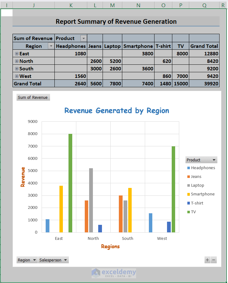
Step 5 – Printing the Report with a Proper Header and Footer
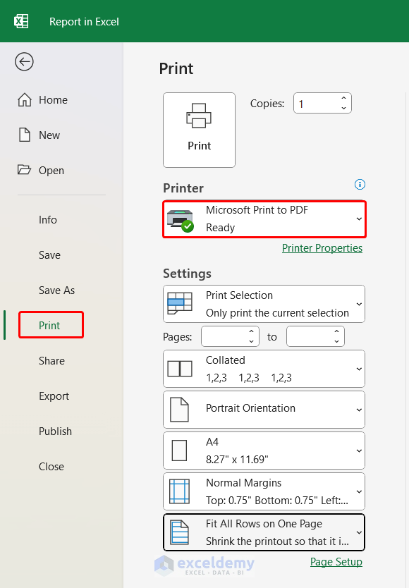
- Decide whether we need to print the entire workbook, any specific worksheet, or a specific portion of a worksheet. We want to print the summary table with the chart, so we’ll select that portion.
- Go to the File tab.
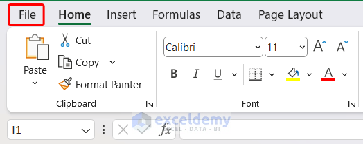
- From the menu that appears, click on Print.
- You will see many options related to printing, such as Printer and different settings related to printing.
- We want to save it as a PDF file, so we chose the Microsoft Print to PDF option in the Print section.
- Under the Print Selection menu, we chose only print the current selection. You can also choose the page size, margins, and orientation.
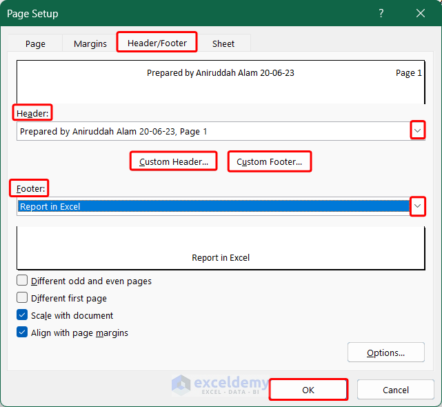
- If you want to add a header/footer, click on the Page Setup below to open the Page Setup dialog box.
- Go to the Header/Footer tab.
- You can choose from predefined headers and footer lists or make a custom one.
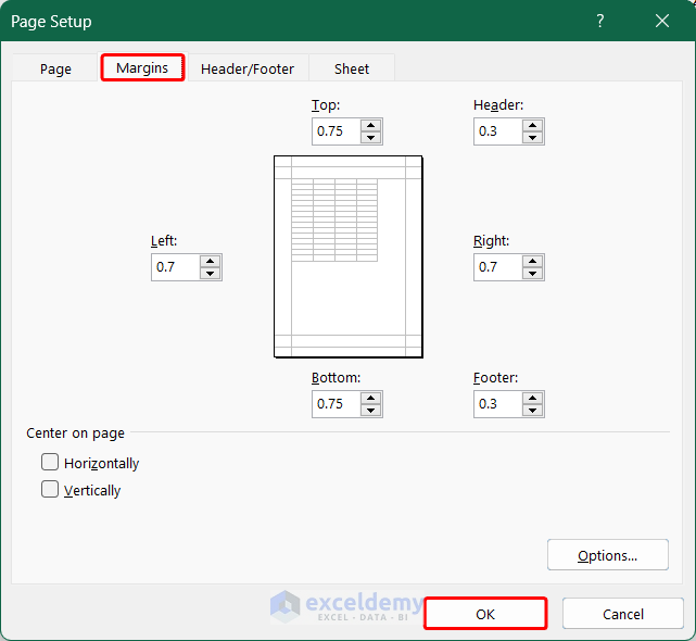
- You can also customize the margin of the borders by going to the Margins tab.
- You can see the preview on the right side of the File tab.
- Click on the big Print option on the top to print the report.
Read More: How to Make MIS Report in Excel for Sales
How to Customize Reports in Excel
Case 1 – Changing the Chart Type in Report
- Click on the chart.
- You will see the Design tab on the ribbon. Go to that tab.
- Click on the Change Chart Type option.
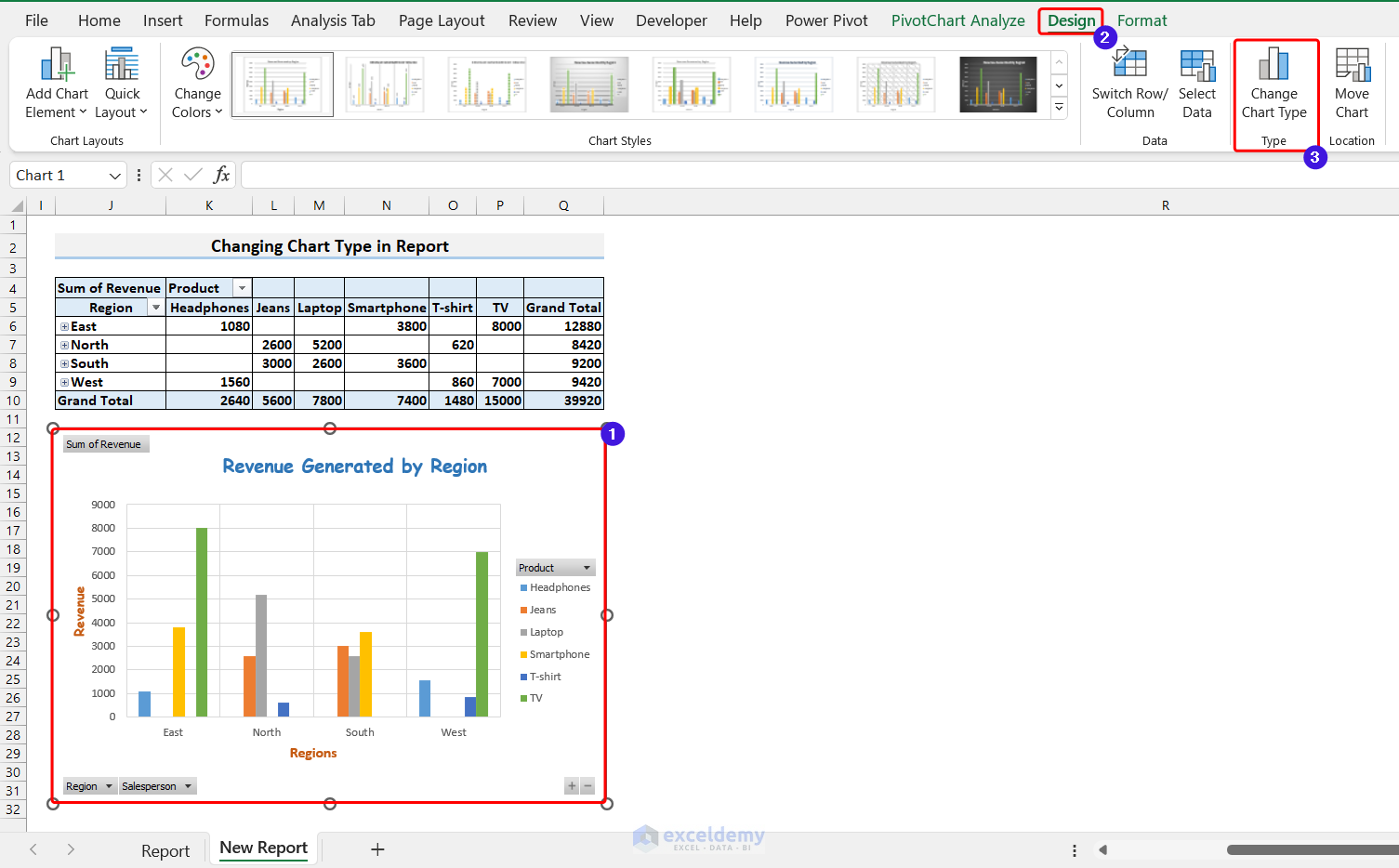
Click on the image for a detailed view.
- The Change Chart Type window will open up. Select any other chart type. For illustration, we chose a Bar Chart.
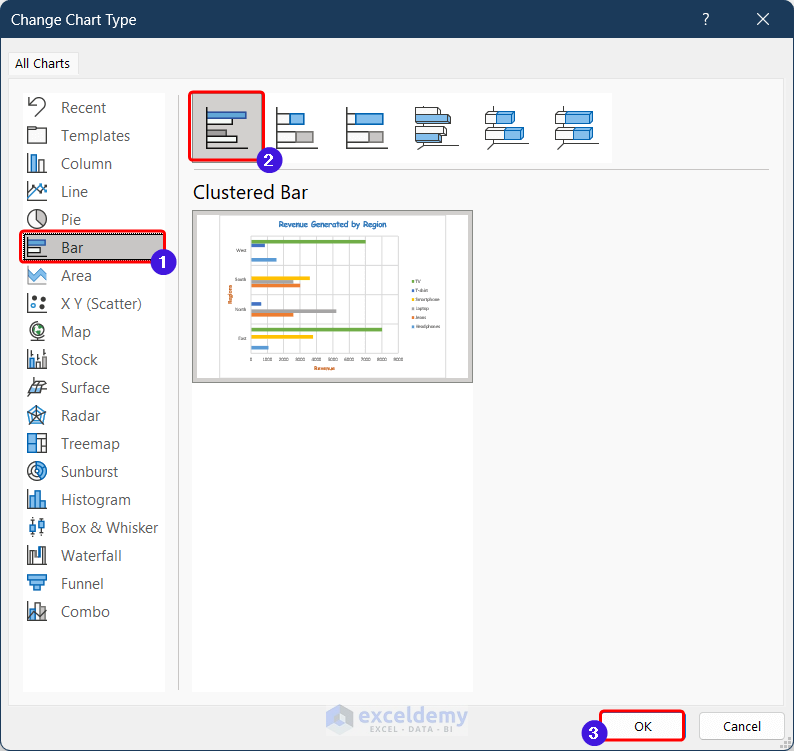
Click on the image for a detailed view.
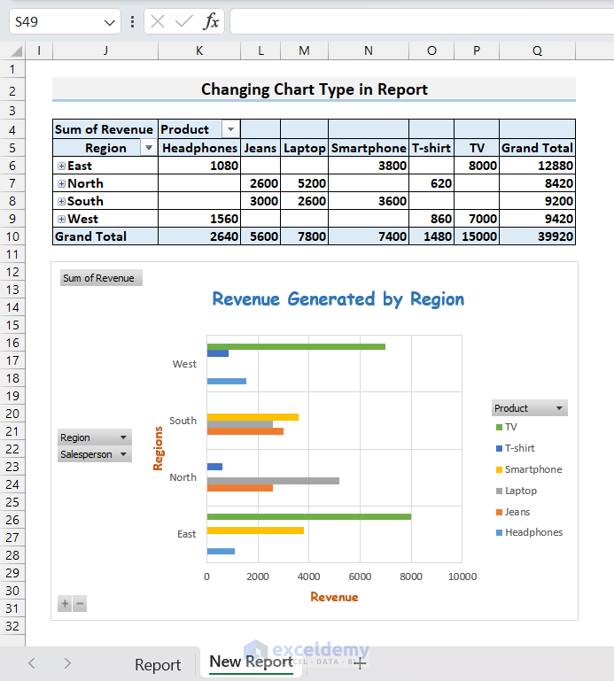
- The bar chart will be shown in the report.
Read More: How to Prepare MIS Report in Excel
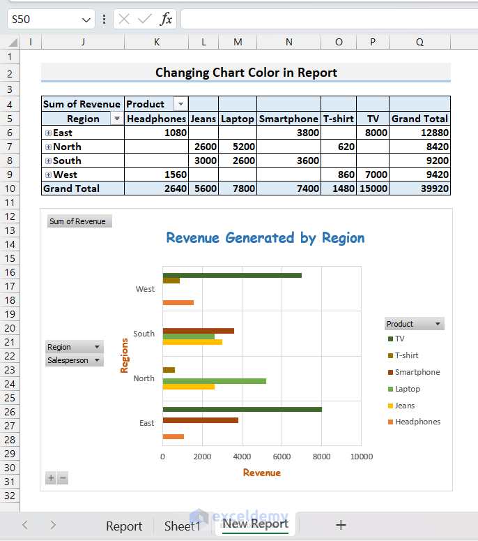
Case 2 – Change the Color of the Chart
- From the Design tab, you can change the color of the chart as well by going to the Change Color command and then selecting your desired color palette.
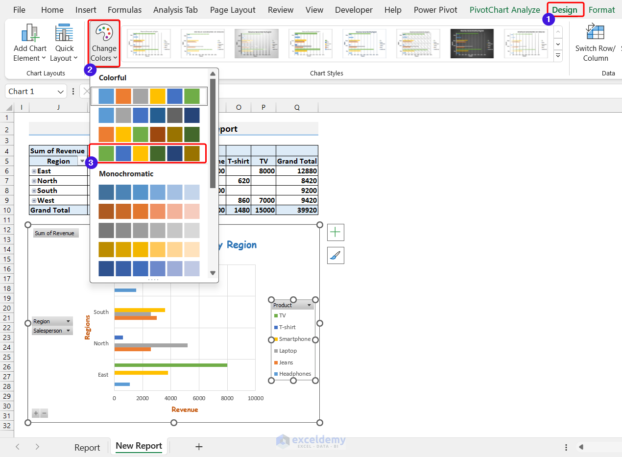
Click on the image for a detailed view.
- You’ll get the desired color of the chart.
Read More: How to Generate Report in PDF Format Using Excel VBA
Things to Remember
- While generating a PivotTable, place the fields in the areas that best suit your purpose. You can always try different orientations to check which orientation is best for you.
- Always try to include the necessary details in the report and exclude any kind of unwanted data.
- Before printing, try different page setups to see which one best fits your report.
Frequently Asked Questions
How do I add data to my report in Excel?
To add data to your Excel report, either manually enter it into the cells or copy and paste it from another source. If your data is large or frequently updated, consider using formulas or functions to retrieve data from other worksheets, workbooks, or external sources. Excel also allows you to import data from databases, CSV files, and other file formats.
Can I include charts and graphs in my Excel report?
You can add a variety of chart types to your report, including column charts, line charts, pie charts, and more. Simply choose the appropriate data range and the chart type that best displays your data.
Can I export reports in PDF format from Excel?
You can export reports using the Microsoft Print to PDF option.
What kinds of reports are usually generated using Excel?
You can generate reports such as income and expense reports, summary reports, daily and monthly activity reports, sales and expenses reports, inventory aging reports, MIS reports, report cards, etc.
Read More: How to Generate Reports from Excel Data
Report in Excel: Knowledge Hub
- How to Create a Summary Report in Excel
- How to Make Report Card in Excel
- How to Automate Excel Reports Using Macros
- How to Generate Reports Using Macros in Excel
- How to Make Sales Report in Excel
- How to Make Monthly Sales Report in Excel
- How to Make Daily Sales Report in Excel
- Create a Report That Displays Quarterly Sales in Excel
- How to Make MIS Report in Excel for Accounts
- How to Make Daily Activity Report in Excel
- How to Make Monthly Report in Excel
- How to Create an Expense Report in Excel
- How to Create an Income and Expense Report in Excel
- How to Make a Monthly Expense Report in Excel
- How to Make Production Report in Excel
- How to Make Daily Production Report in Excel
<< Go Back to Learn Excel
Get FREE Advanced Excel Exercises with Solutions!
