There is no hard and fast rule for preparing an MIS report. But there is a typical flow that is involved in the process:
- Collect the data from different departments like marketing, financial, logistics, etc.
- Merge the data and clean it up with data management software like Excel, SPSS, or R.
- Apply various data analysis tools or formulas according to your demand. Save a backup of the original data somewhere else.
- Make sure to validate your result to determine whether it aligns with expectations.
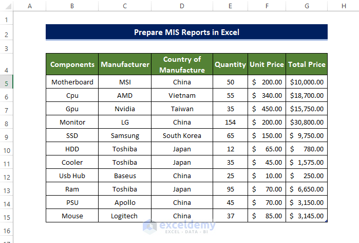
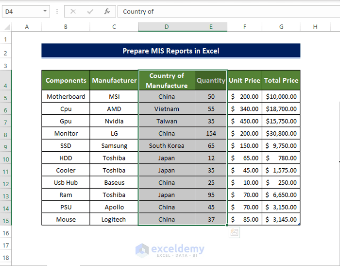
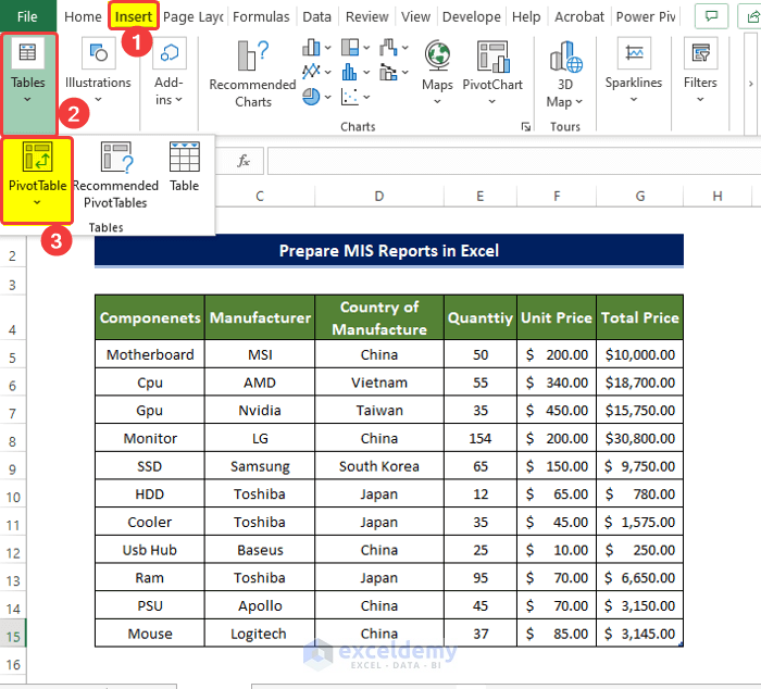
We are going to use the below dataset for demonstration purposes.
Example 1 – Simple MIS Report in Excel
Steps
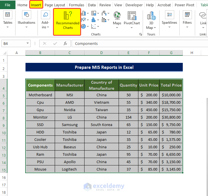
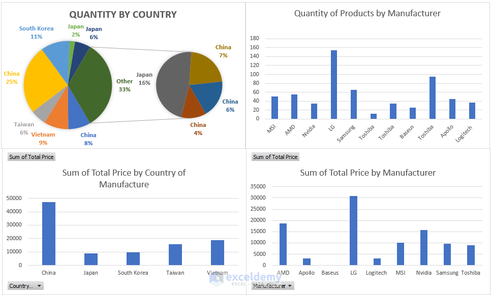
- Select the data table and click on the Recommended Charts from the Insert tab.
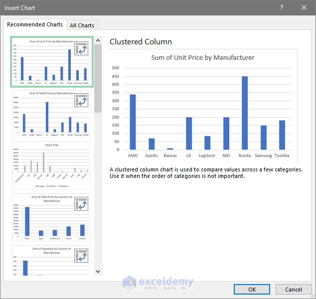
- From that Insert Chart window, click on the recommended chart with the Manufacturer’s Name on the horizontal axis and the Unit Price name on the vertical axis.
- Click OK.
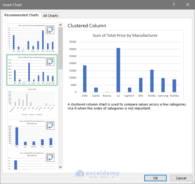
- Go to insert a chart again.
- Click on the chart with the Manufacturer’s Name on the horizontal axis and the Total Price name on the vertical axis.
- Click OK.
- You will see both of these charts are present in the worksheet.
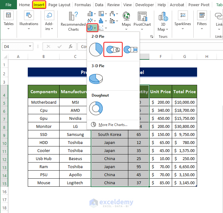
- Select the Country of Manufacture and Quantity columns.
- Click on the Insert Pie Chart command in the Insert tab.
- From the 2D chart section, click on Pie of the Pie.
- You will get a pie chart showing percentages for a larger pie chart.
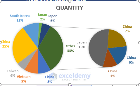
- Add the Total Price by Country of Manufacture chart with a similar process as before.
- They should look something like this below.
Note:
While making these bar charts, they will spawn in a new worksheet. You must copy that chart to the main worksheet(main dataset page) manually.
Example 2 – MIS Report Using Pivot Table
Steps
- Select the dataset.
- From the Insert tab, click on the PivotTable command in the Table group.
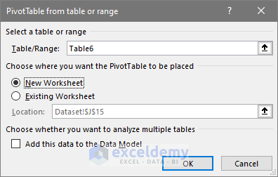
- A new window will open, where you need to select the range of your data table (it should autofill if you selected the table before).
- Click on the New Worksheet option to put your new data table on a new sheet.
- Click OK.
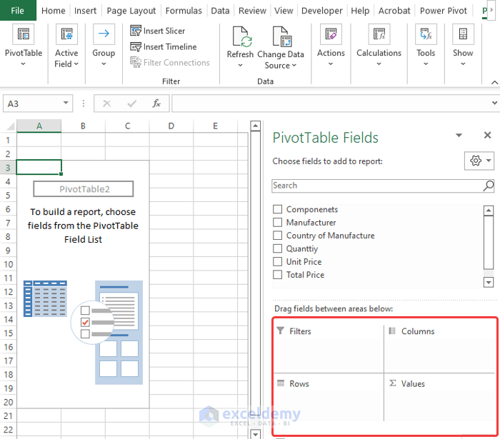
- A new worksheet will open, where you will see a new Pivot table side window.
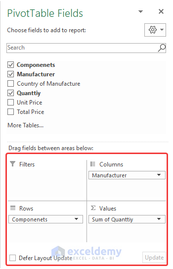
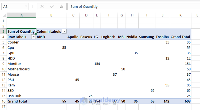
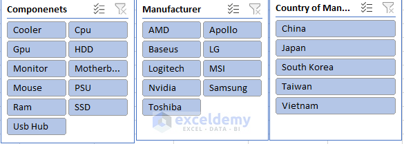
- Drag the Components on the Rows field.
- Drag Quantity to the Value field.
- Drag the Manufacturer to the Columns field.
- Use the filter buttons over the chart column where you can choose which component you want to see.
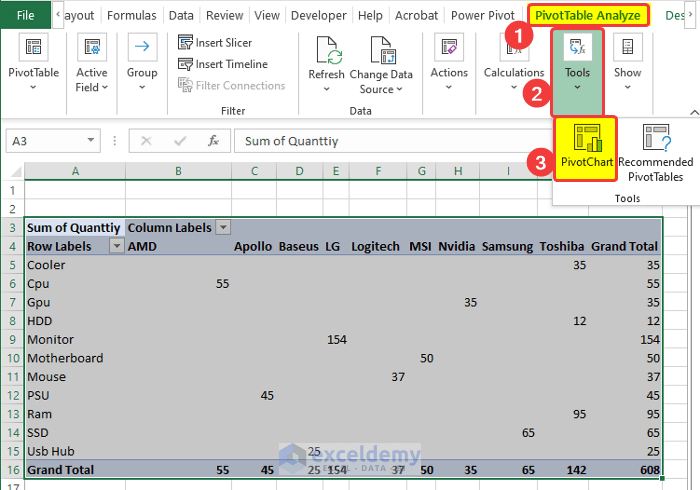
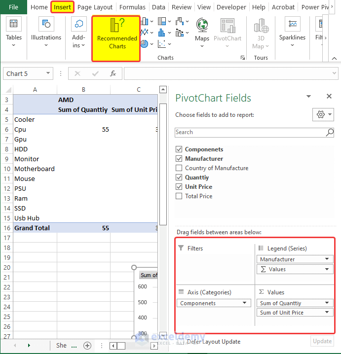
- To add some charts to the Pivot table, click on the Tools command on the PivotTable Analyze tab.
- From the drop-down menu, click on PivotChart.
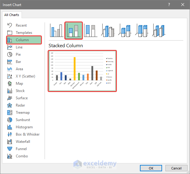
- From the new window, click on Column.
- Click on the second chart icon above. It will show a preview of how the table will look.
- Click on OK.
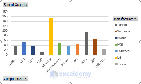
- Then you will notice the new chart with the columns. On the horizontal axis, there is the Components name. They are color-coded in the legend. The vertical axis will have the Sum of Quantity.
- We will add more criteria in the column field. Drag the Unit Price in the Value field.
- Notice that the chart has now changed and includes the data on Unit Price.
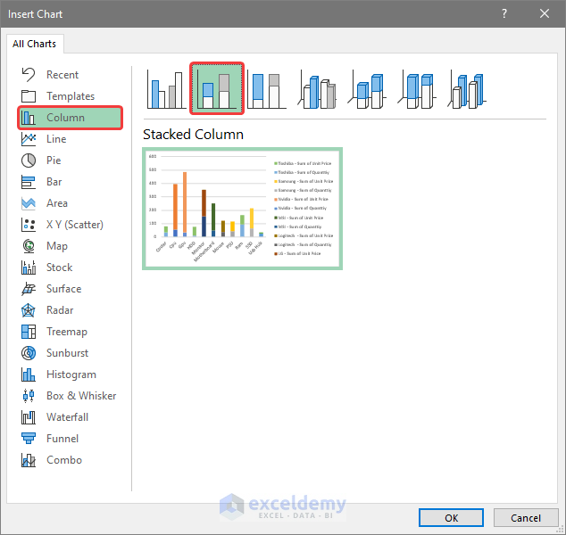
- From the Insert tab, click on Recommended Charts.
- From the new window, click on the Column Chart options.
- Click on the second option above.
- Click OK after this.
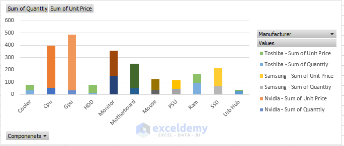
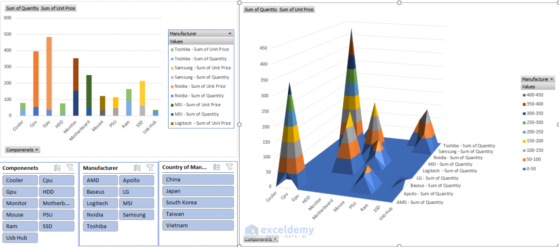
- You will get a new chart showing each component’s quantity and their respective manufacturers’ contribution to that quantity in the vertical bar.
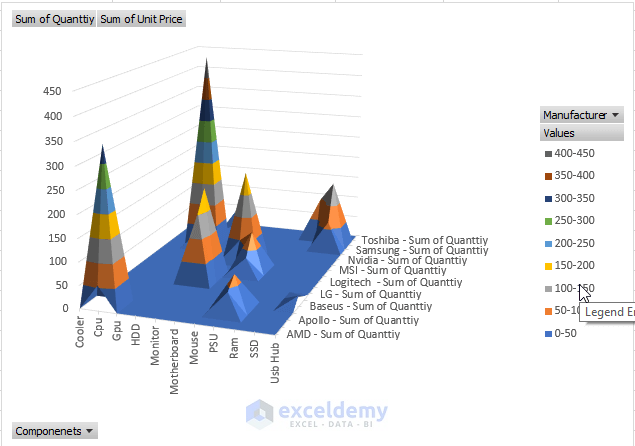
- Click on the Insert chart again and go to the Recommended Charts.
- Click on the Surface option.
- Choose the 3D-Surface options.
- Click OK.
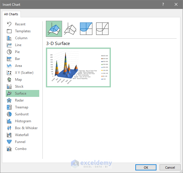
- You will get a 3D Surface graph with three different criteria.
- We’ll add a Slicer. A Slicer can act as a filter button to filter out important information quickly.
- Click on Insert and go to the Filters command.
- Choose Slicer.
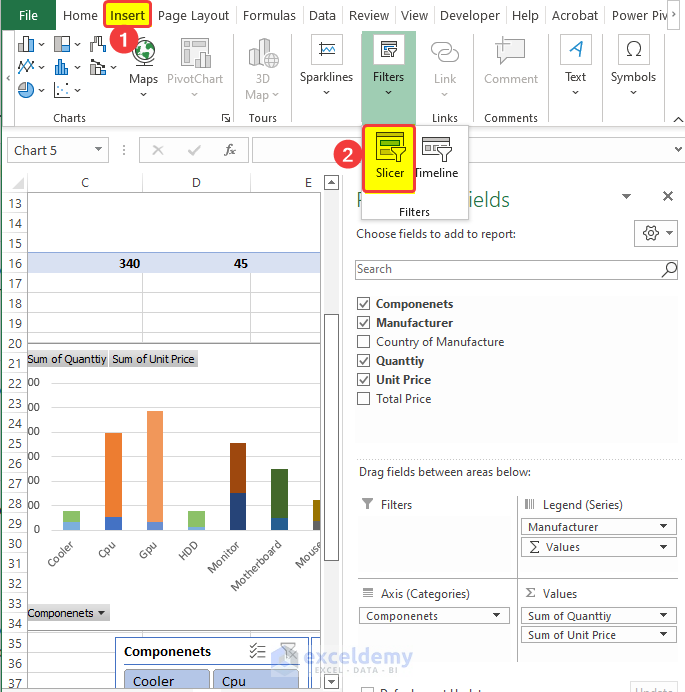
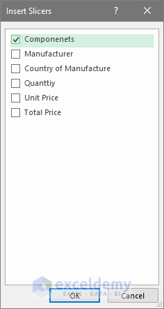
- The Slicer window will ask for the criteria name. Click on Components and then on OK.
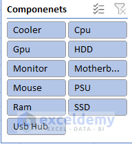
- There will be a Slicer of components criteria, where clicking on any criteria will show the entry values in the table and hide the rest of them, just like Filters.
- Repeat the same process for other criteria like Manufacturing, Country of Origin,
- Then we will have three separate Slicers for the chart.
- Now you can filter out data like you and seamlessly make valuable insights.
- Here is the one kind of MIS report presented with Slicer, and Pivot Table, altogether.
Things to Remember
- You should have a good command of Excel, especially in the chart portion.
- MIS reporting depends on an effective data collection tool that can extract data from various data sources such as databases, spreadsheets, etc.
- Before doing an MIS reporting project, make sure to have a backup database to link later.
Download Practice Workbook
Download this practice workbook below.
Related Articles
- How to Make MIS Report in Excel for Sales
- How to Make MIS Report in Excel for Accounts
- Create a Report that Displays the Quarterly Sales by Territory
- How to Make Monthly Sales Report in Excel
- How to Make Daily Sales Report in Excel
- How to Make Sales Report in Excel
- Create a Report That Displays Quarterly Sales in Excel
<< Go Back to Report in Excel | Learn Excel
Get FREE Advanced Excel Exercises with Solutions!
