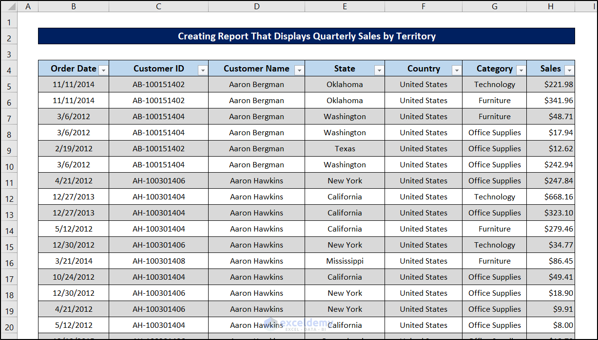
This is an overview.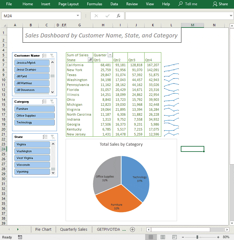
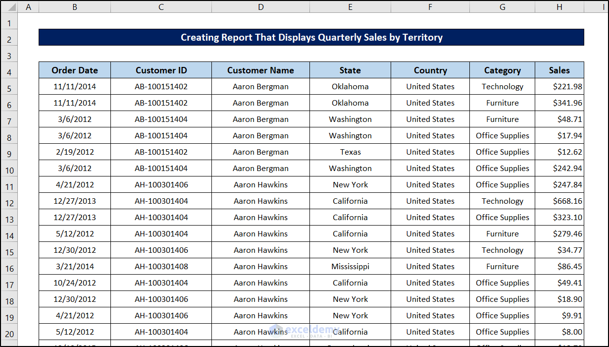
This is the sample dataset.
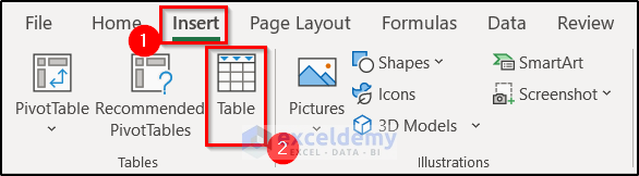
Step 1- Convert the Dataset into a Table
- Select a cell in the range.
- Press Ctrl+T, or go to the Insert tab, in Tables, click Table.
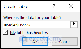
- In the Create Table dialog box, the range will automatically be selected and My table has headers checked.
- Click OK.
The dataset will be converted into a table.
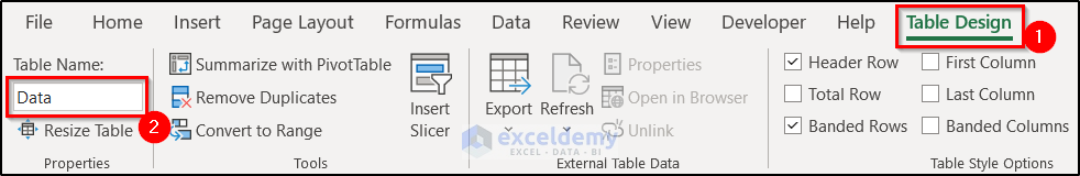
Step 2 – Name the Table Range
- Change the name of your table in the Design tab or use the Name Box. Here, Data.
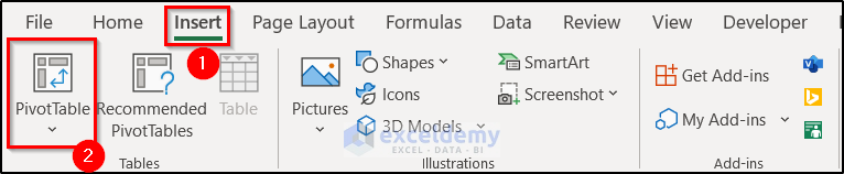
Step 3 – Create a Pivot Table with the Given Data
- Select a cell in the table.
- Go to the Insert tab and click PivotTable in Tables.
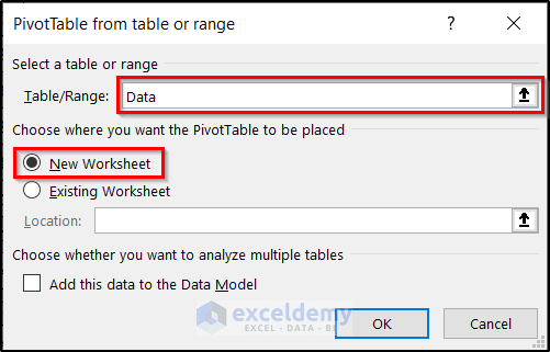
- In the Create PivotTable dialog box, the table: Data is automatically displayed in Table/Range.
- Select New Worksheet in Choose where you want the PivotTable report to be placed.
- Click OK.
A new worksheet is created and the PivotTable Fields task pane is displayed.
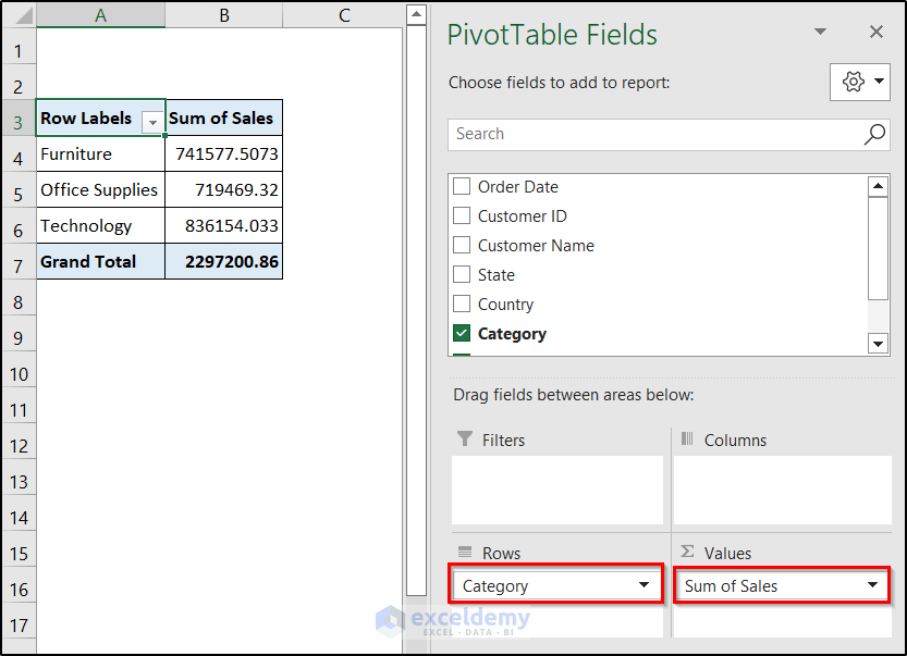
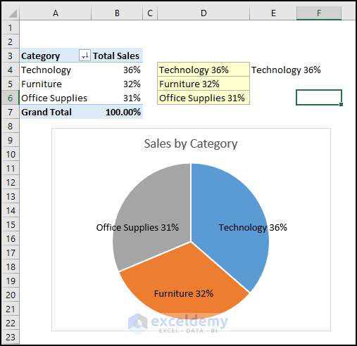
Step 4 – Prepare a Pivot Table by Category Report
Organize the Pivot Table Fields:
- Drag Sales twice to the Values area (Columns and additional Values).
- In Rows, enter Category.
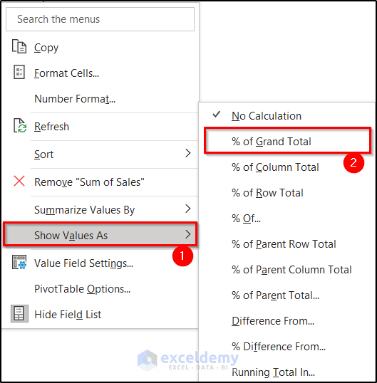
- To change the number format to percentage: right-click a cell in the column (%) of Grand Total.
- Select Show Values As.
- Click % of Grand Total.
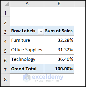
This is the output.
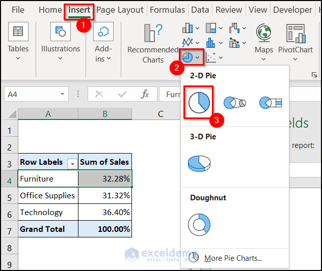
Step 5 – Create a Pie Chart for the Category Report
- Select a cell in the Pivot Table.
- Go to the Insert tab and click the Pie Chart icon in Charts.
- Select Pie.
The pie chart is displayed.
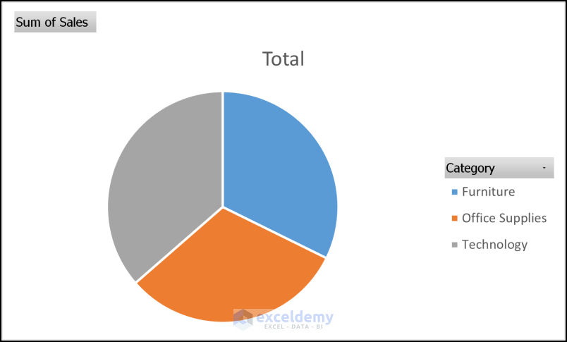 Format the the chart. This is the output.
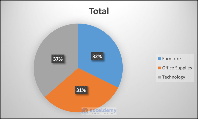
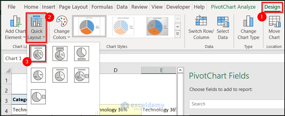
Showing Category Names and Data Labels on a Pie Chart
Add data labels:
- Select the Pie Chart.
- Go to the Design tab and in Chart Layouts, click Quick Layout.
- Select Layout 1.
Alternative:
You can also add data labels to the chart using the GETPIVOTDATA function.
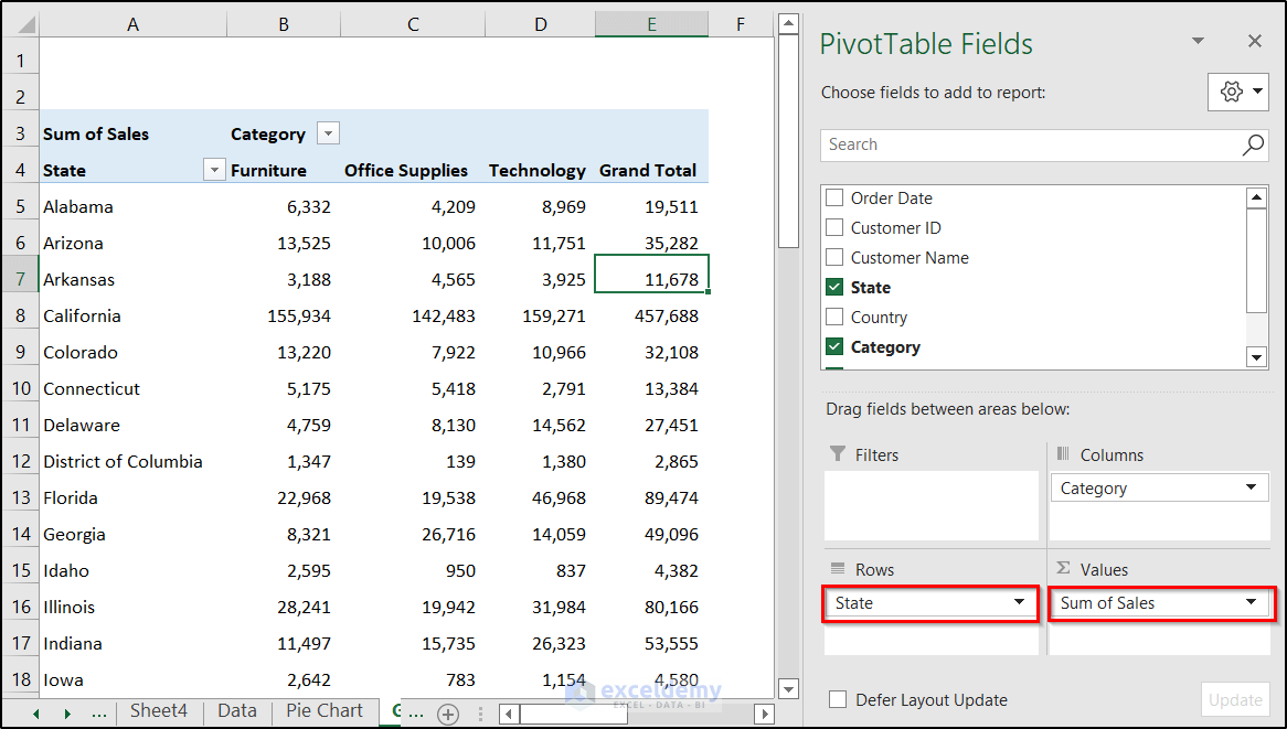
The pivot table is showing the Sum of Sales, State, and Category.
State was placed in Rows, Category in Columns, and Sales in Values.
The GETPIVOTDATA syntax is: GETPIVOTDATA (data_field, pivot_table, [field1, item1], [field2, item2], …)
In the Pivot Table above:
- The data_field is Sales
- The other two fields are State and Category.
- Use the GETPIVOTDATA formula in H9:
=GETPIVOTDATA("Sales", A3, "State", H7, "Category", H8)The formula returns 950 in H9.
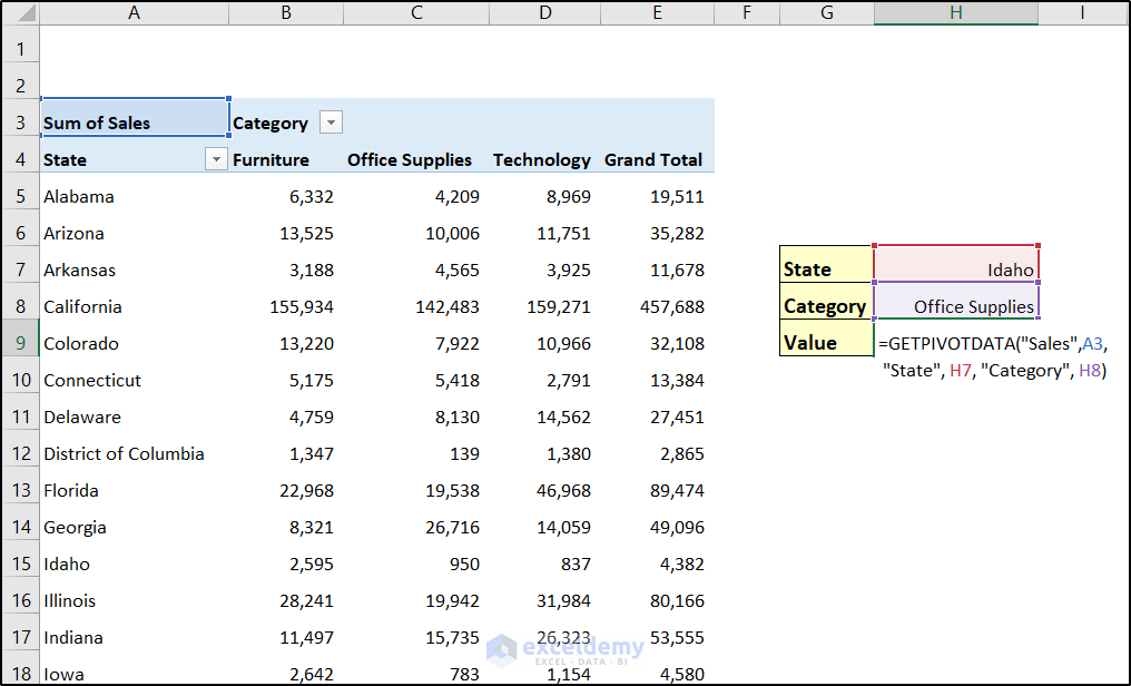
Formula Breakdown
- The data_field argument is Sales.
- A3 is a cell reference within the pivot table.
- field1, item1 = “State”, H7. Idaho (the value of H7 is Idaho) item in State
- field2, item2 = “Category”, H8 –Office Supplies (the value of H8) item in Category
- The cross-section of the Idaho values and Office Supplies values returns 950.
To Show the Labels:
Using the GETPIVOTDATA function, the category names and sales values (% of Total) are displayed as shown below.
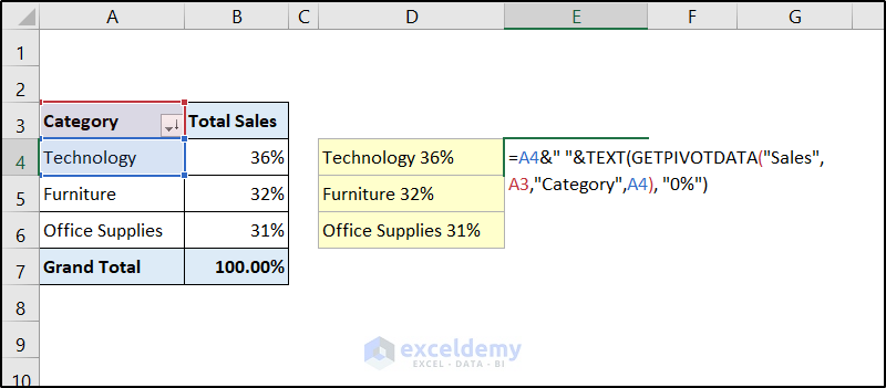
- Use the formula in D4:
=A4&" "&TEXT(GETPIVOTDATA("Sales", A3, "Category", A4), "0%")- A4&” ” is a cell reference and creates a space in the output.
- The TEXT as the value argument of the TEXT function passes the GETPIVOTDATA function. The format_text argument is:“0%”
- The GETPIVOTDATA function:
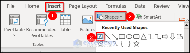
- Insert a Text Box: go to the Insert tab => Illustrations => Shapes
- Enter an equal sign in the Formula Bar and select D4.
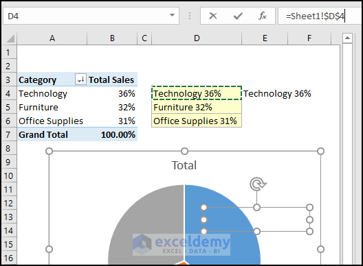
If you press Enter, the Text Box will show the value in D4.
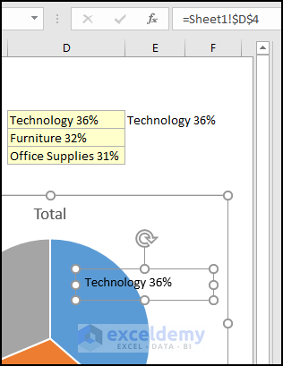
Other Text Boxes were created.
Note: You can create new Text Boxes:
- Hover your mouse pointer over the border of the Text Box and press Ctrl. A plus sign will be displayed.
- Drag your mouse to create a new Text Box. Choose a place to drop it.
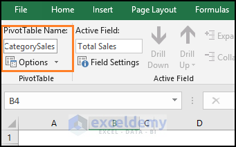
The name of the Pivot Table was changed to PT_CategorySales.
Read More: How to Make Daily Sales Report in Excel
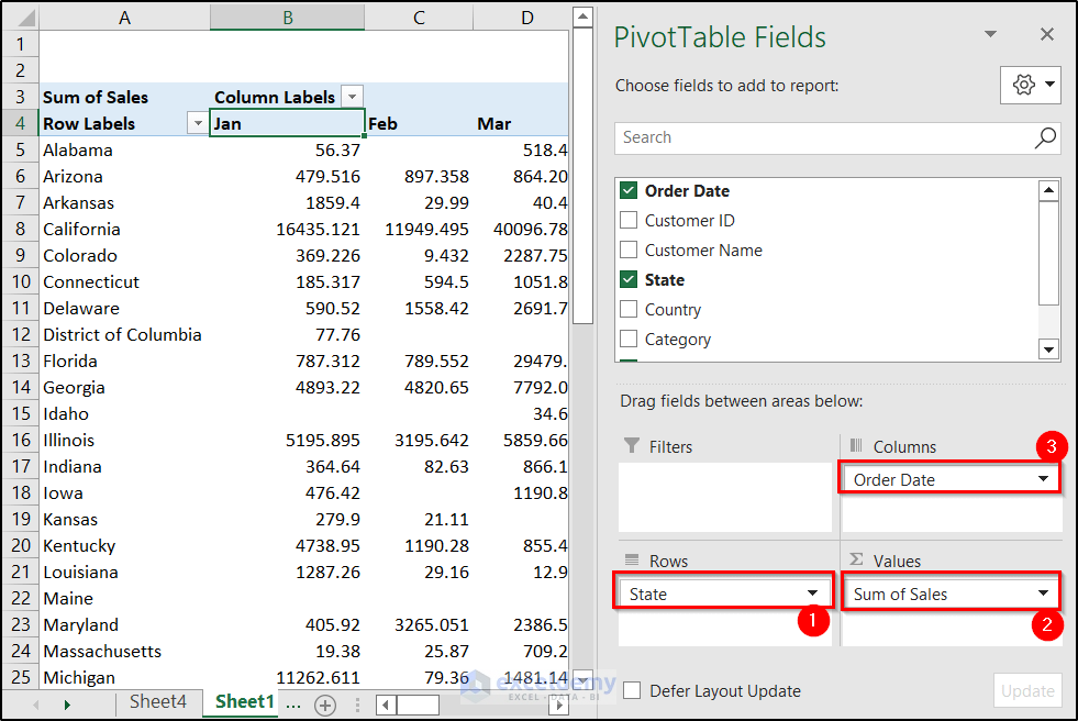
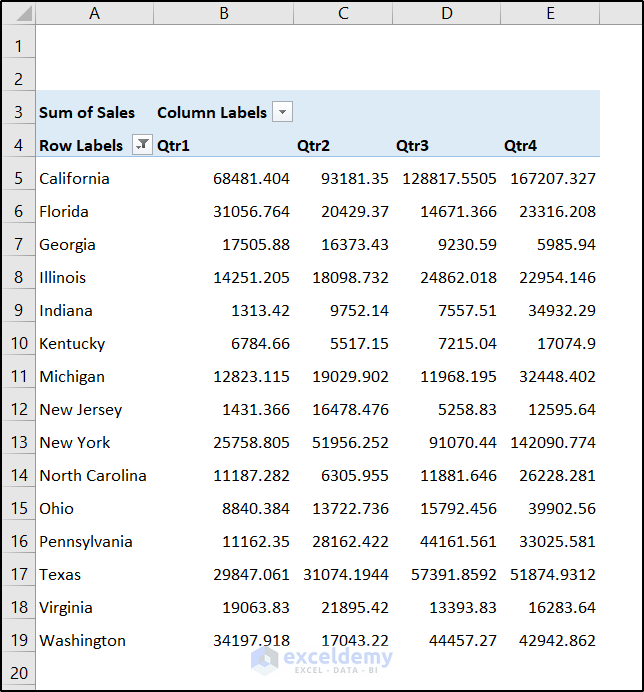
Step 6 – Prepare a Pivot Table for Quarterly Sales
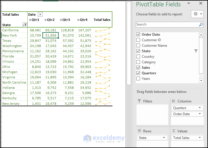
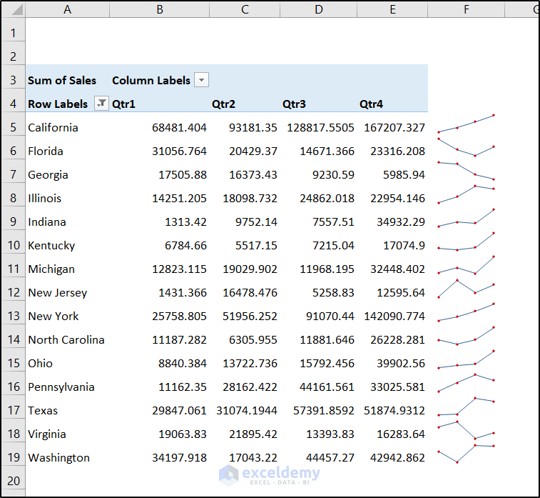
The image above shows the top 15 US States according to Total Sales in different quarters. Sparklines were added to show the trends.
Prepare the pivot table for quarterly sales:
- Select a cell.
- Select PivotTable in Tables, in the Insert tab.
- Choose a destination for the pivot table and click OK. Here, a new worksheet.
- Add the Order Date in Columns, the State in Rows, and the Sales in Values
- To show the quarterly report, right-click any cell in Column Labels and select Group.
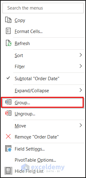
- In Grouping, choose By and select Quarters.
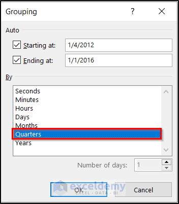
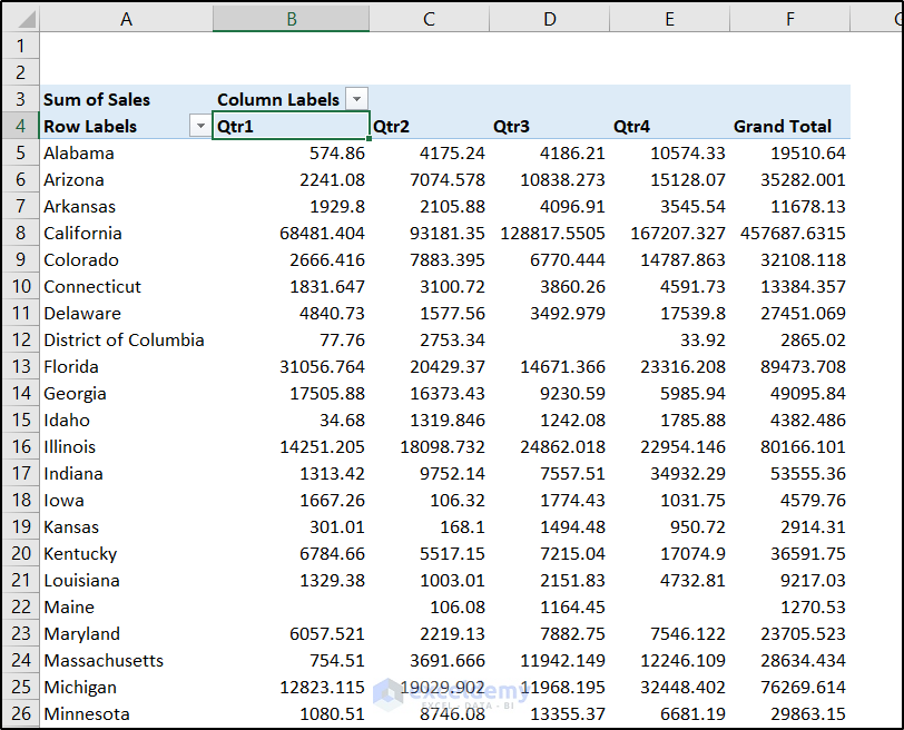
- Click OK.
- This is the output.
Step 7 – Show the Top 15 States in Sales
- Right-click any cell in State.
- Select Filter and choose Top 10.
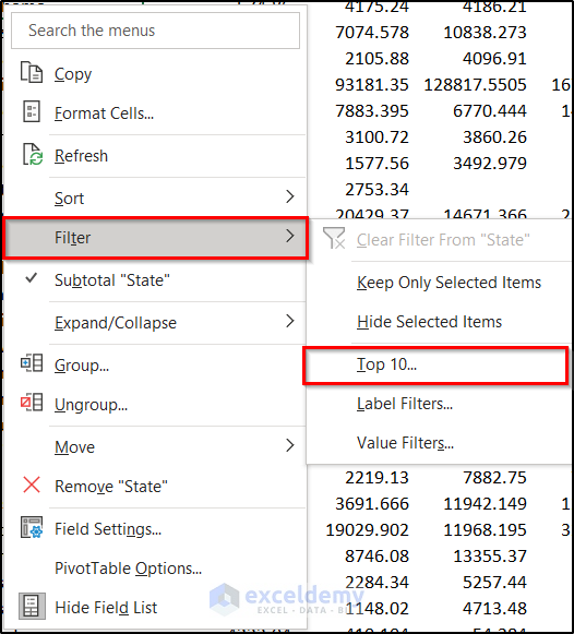
- Select 15 in Show.
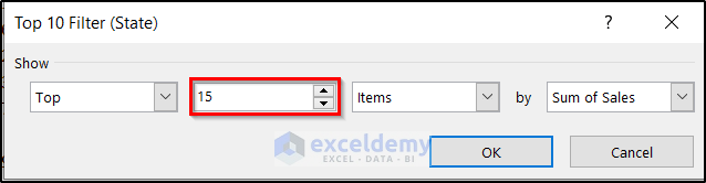
- Click OK.
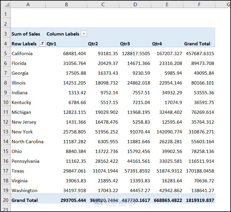
This is the output.
Step 8 – Add Sparklines to Table
Remove both Grand Totals:
- Select a cell in the pivot table.
- Go to the Design tab.
- Select Grand Totals in Layout
- Select Off for Rows and Columns.
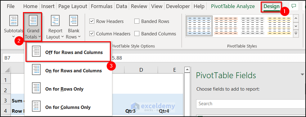
The Grand Total section will be removed.
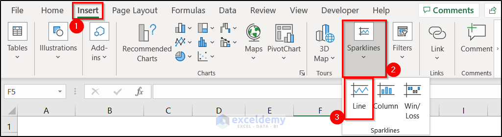
- To add sparklines, select F5 and go to the Insert tab.
- Select Line in Sparklines
- In the Create Sparklines box, select B5:E19 as Data Range and F5:F19 as Location Range.
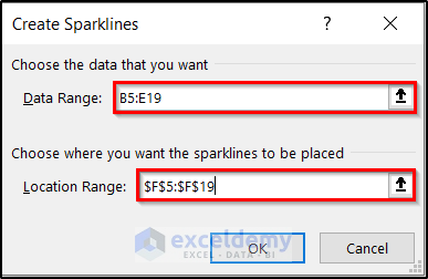
- Click OK.
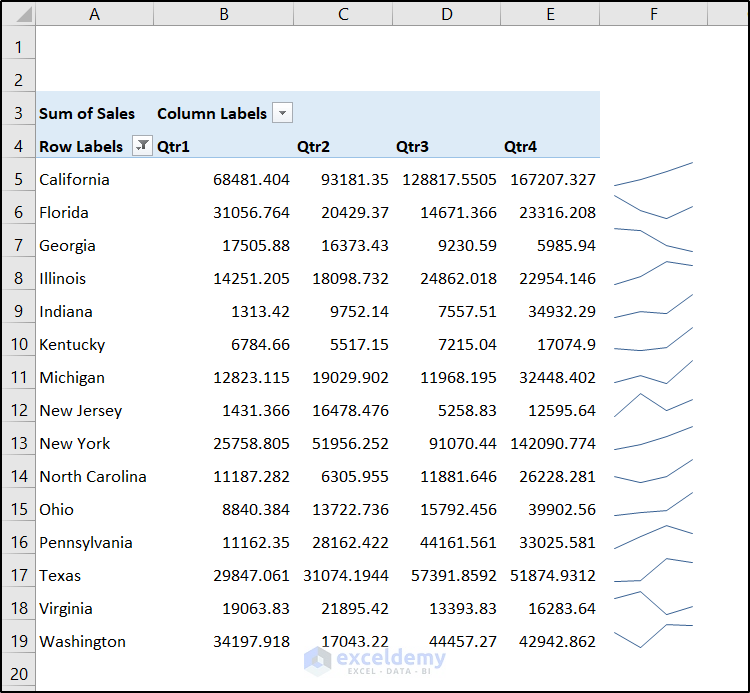
This is the output.
- Add markers: go to the Sparkline tab and select Markers in Show.
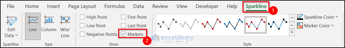
This is the final output.
Read More: How to Make Sales Report in Excel
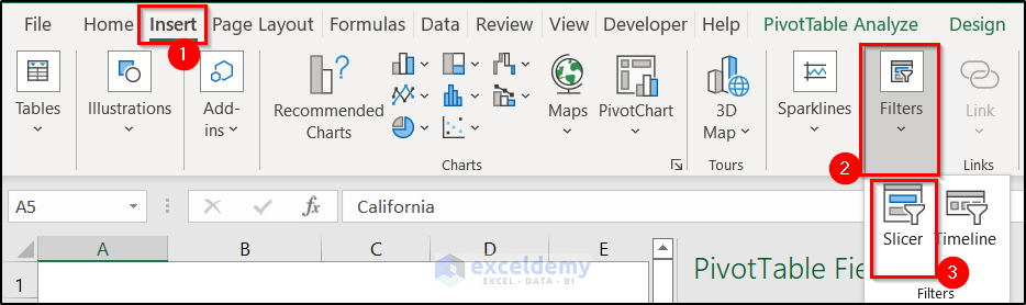
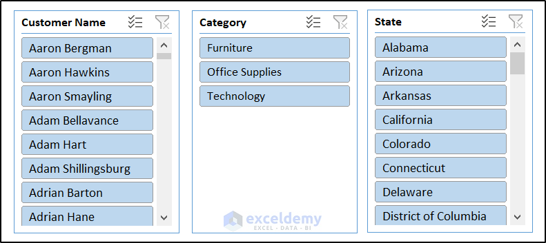
Step 9 – Add a Slicer to Filter the Output
- Select the pivot table.
- Go to Insert and in Filters, click Slicer.
- In the Insert Slicers dialog box, select the fields to create slicers. Here, Customer Name, State, and Category.
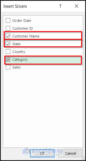
- Click OK.
3 slicers will be displayed.
Step 10 – Prepare the Final Report
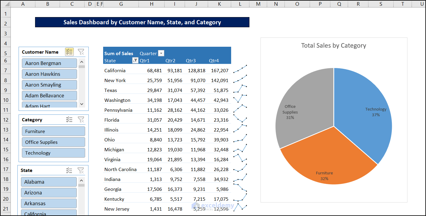
If you select/deselect an option in the slicer, the result will change accordingly. For example, select Arizona. Only that report is displayed.
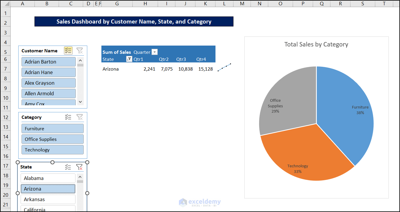
You can select multiple slicers. Add Alabama to see the result:
Download Practice Workbook
Download the workbook.
Related Articles
- How to Prepare MIS Report in Excel
- How to Make MIS Report in Excel for Accounts
- How to Make MIS Report in Excel for Sales
- Create a Report That Displays Quarterly Sales in Excel
- How to Make Monthly Sales Report in Excel
<< Go Back to Report in Excel | Learn Excel
Get FREE Advanced Excel Exercises with Solutions!

That was a Udemy class without audio! Thank you, sir. I find your posts to be specific and accurate without any “I’m the Greatest” bullbucky. My compliments to your motivations and gracious habit of giving-away wonderful tutorials! -GuyR8s
Thank you for your valuable feedback. It’s something 🙂
Best regards
Thank you very much Kawser:
Best regards,
Sohail Rizki
713 459 1340
Thank you so much for your feedback.
Best regards
Really helped me in learning something new.
Glad to know that it helped you to learn something new.
Excellent Tutorial. Thank you for sharing Kawser
You’re most welcome! Thanks for your feedback, Anthony!
It is not a blog post, it is an entire book copied to a blog. Super complete..
Thank you very much for your efforts of writing this tutorial. Wish you more knowledge !
Very glad to be your free online student. This is very great post.
It teaches me more than the ttle especially the use of pivot table for sales reporting.
Thanks