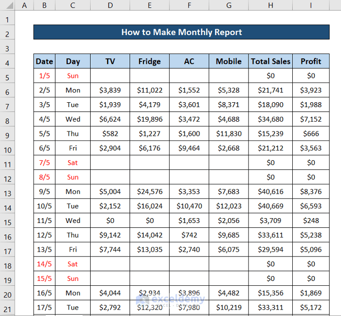
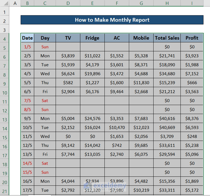
Step 1: Import Your Dataset
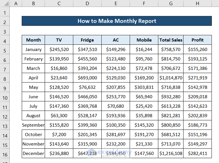
This is the sample dataset.
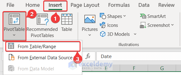
Step 2: Create Pivot Tables from the Dataset
- Select a cell in the dataset and press Ctrl+A.
- Go to the Insert tab on the ribbon.
- In Tables, select PivotTable and choose From Table/Range.
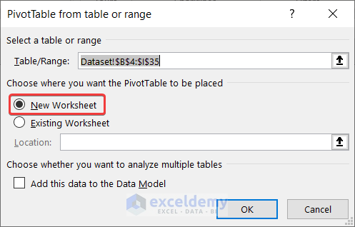
- Select New Worksheet.
- Click OK.
- Go to the new sheet and select Day and Total Sales from the PivotTable Fields.
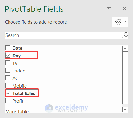
The pivot table with the column headers will be displayed.
Step 3: Insert a Daily Report Chart
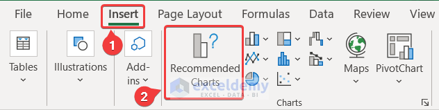
- Select a cell in the pivot table.
- Go to the Insert tab on the ribbon.
- In Charts, select Recommended Charts.
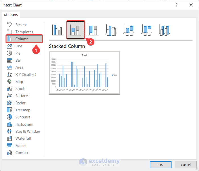
- In Insert Chart, select Column and the type of column chart you want. Here, Stacked Column.
- Click OK.
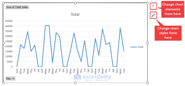
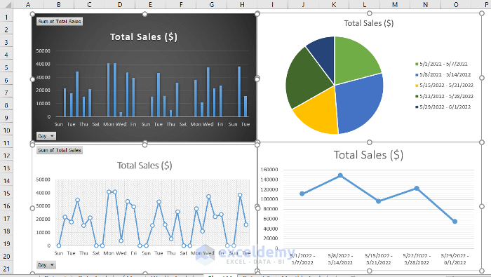
A column chart will be created.
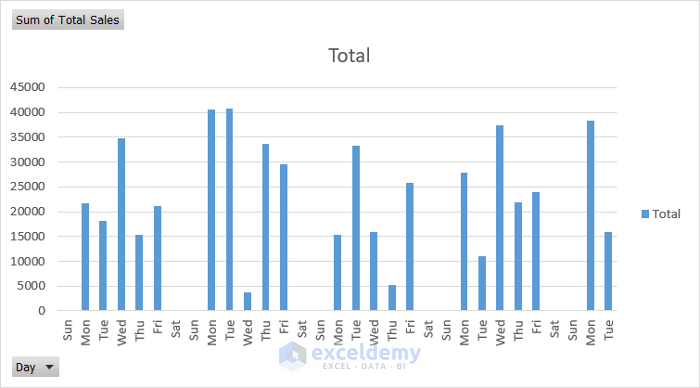
- You can modify the chart style by selecting it and using the plus and the brush icons on the right.
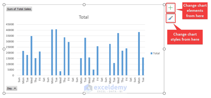
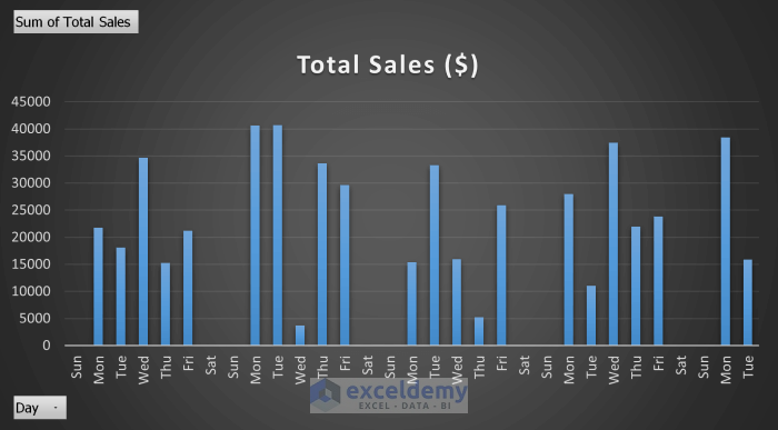
This is the output (Style 8 was selected and the legend was removed).
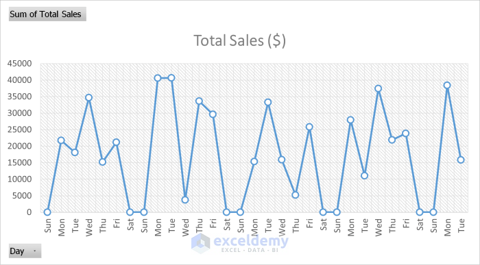
In Insert Chart, choose a line plot.
- Select a cell in the pivot table.
- Go to the Insert tab and select Recommended Charts from the Charts group.
- In the Insert Chart dialog box, select Line.
- Choose a type of line chart.
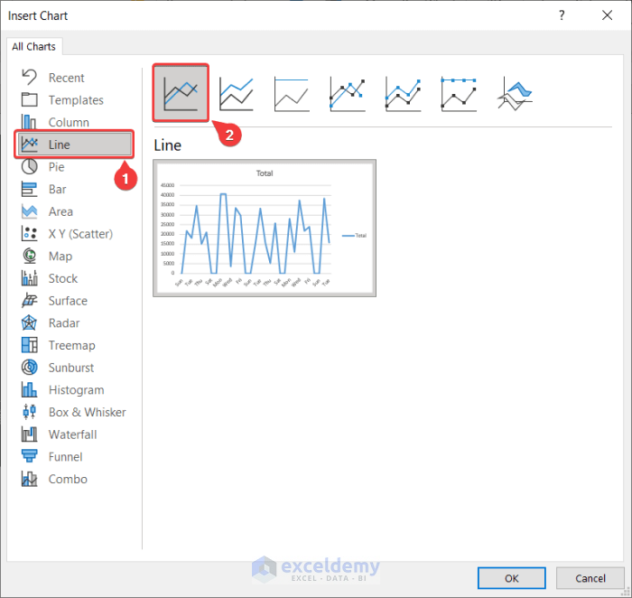
- Click OK. The line chart will be displayed.
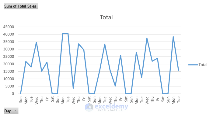
- You can change chart elements and styles, by selecting the chart and using the plus and the brush icons.
This is the output (chart styles were changed and the legend was removed).
Read More: How to Make Daily Sales Report in Excel
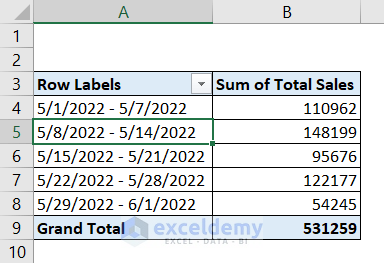
Step 4: Insert a Weekly Report Chart
- Use the pivot chart in step 2 or create a new pivot table.
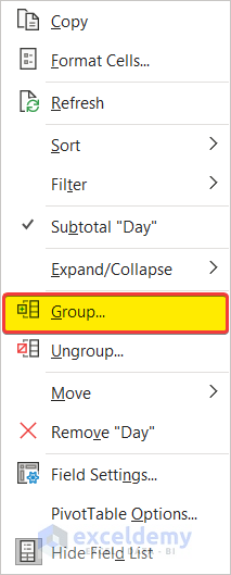
- Right-click one of the cells in the days’ column.
- Select Group.
- In Grouping, select Days and unselect Months.
- In Number of Days, select 7.
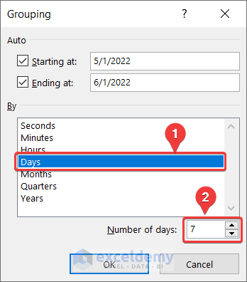
- Click OK.
This is the output.
- Select one of the cells in the pivot table and go to the Insert tab.
- In Charts, choose Recommended Charts.
- In the Insert Chart dialog box, select Pie and a type of pie chart.
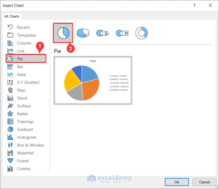
- Click OK.
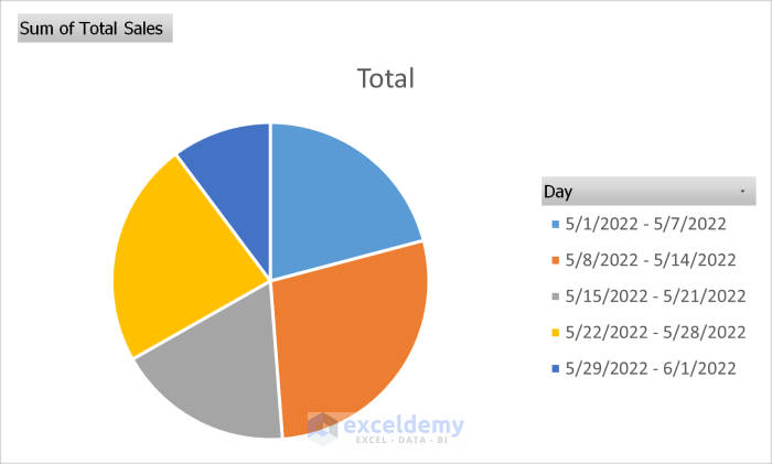
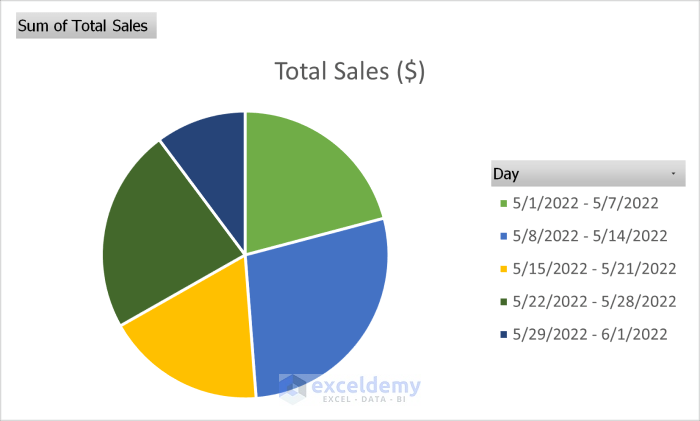
A pie chart will be displayed.
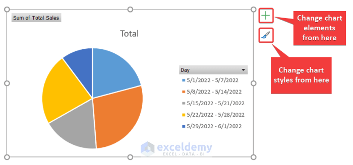
- You can change chart elements and styles, by selecting the chart and using the plus and the brush icons.
This is the output (the color palette was changed).
To create a line plot:
- Select a cell in the pivot table.
- Go to the Insert tab and in Charts, select Recommended Charts.
- In the Insert Chart dialog box, select Line and choose a style.
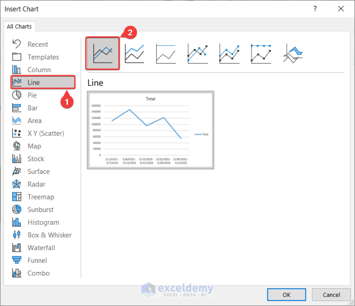
- Click OK.
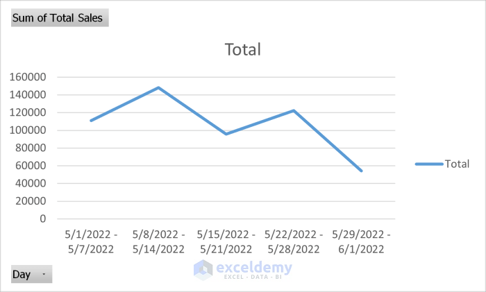
This is the line plot.
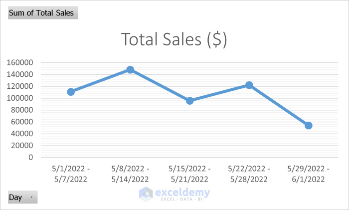
This is the output (style was changed and the legend removed).
Step 5: Generate a Final Report
Daily or weekly reports can be copied to a new sheet to create a monthly report.
Read More: How to Make Sales Report in Excel
How to Make a Report for Consecutive Months in a Year in Excel
Step 1: Import Your Dataset
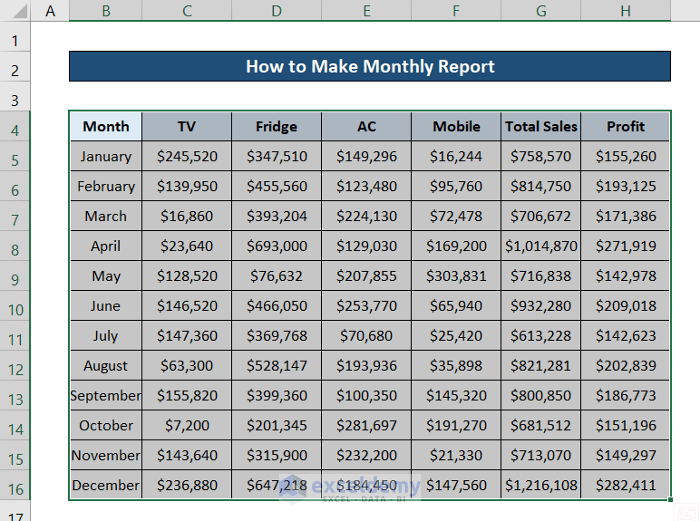
In the following dataset data is tracked and recorded by months.
Step 2: Create a Pivot Table
Convert your dataset into an Excel pivot table:
- Select the dataset.
- Go to the Insert tab.
- In Tables, select PivotTable.
- Choose From Table/Range.
- Select New Worksheet and click OK.
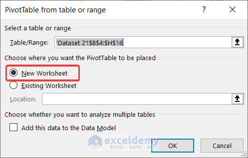
A new worksheet will be created.
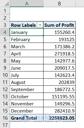
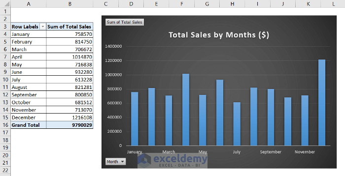
- Go to the sheet and in PivotTable Fields select Month and Profit.
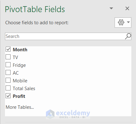
A pivot table will be displayed.
Step 3: Insert a Chart from a Dataset
- Select a cell in the pivot table.
- Go to the Insert tab.
- In Charts, select Recommended Charts.
- In the Insert Chart dialog box, select Column on the left.
- Choose a type of column chart.
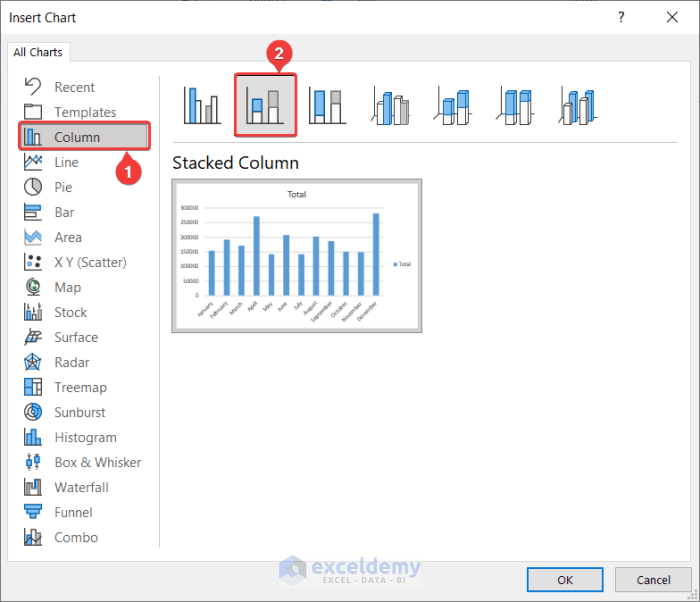
- Click OK.
A column chart will be created.
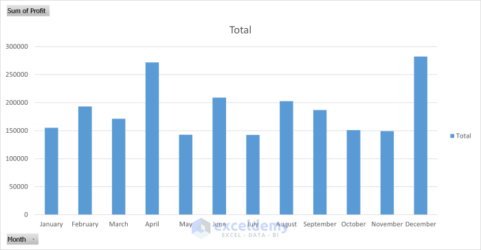
Step 4: Generate a Final Report
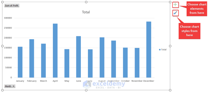
- You can modify the chart style by selecting it and using the plus and the brush icons on the right.
This is the output.
Download Practice Workbook
Download the practice workbook.
Related Articles
- How to Create an Expense Report in Excel
- How to Create an Income and Expense Report in Excel
- How to Make Production Report in Excel
- How to Make Daily Production Report in Excel
- How to Make a Monthly Expense Report in Excel
<< Go Back to Report in Excel | Learn Excel
Get FREE Advanced Excel Exercises with Solutions!
