A Trendline is a popular way to make predictions in Excel. Often, we need to find the Trendline equation to see the slope and the constant. Excel has ...
When you are working with a dataset that needs to plot on a chart, you will try to create dynamic Excel charts with a drop-down list. A dynamic chart ...
While working in Microsoft Excel you might need to show your data in different directions for better visualization. You can change the direction of ...
The following table contains the Product, Cost Price, Selling Price, and Profit columns. We will create an Excel Bubble chart and adjust the bubble ...
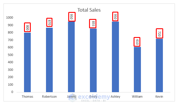
Excel is often used to make charts and graphs that show how data looks. We often put labels on charts to help us understand them better. Also we try ...