Dynamism is everywhere! Then, why not with Microsoft Excel? Creating dynamic charts in Excel is possible in many ways. What I am going to cover in this article is how you can create Excel charts with dynamic title and legend labels.
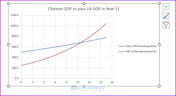
See the dynamic image below. Like it? If the image was static, would you like it the same way?
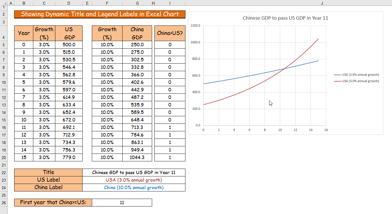
Observe the above image carefully!
When I change the values of cells C5 and F5, the chart shows different titles and legends. In this article, I will show you how to create Excel charts with dynamic title and legend labels.
Excel Charts with Dynamic Title and Legend Labels: with Easy Steps
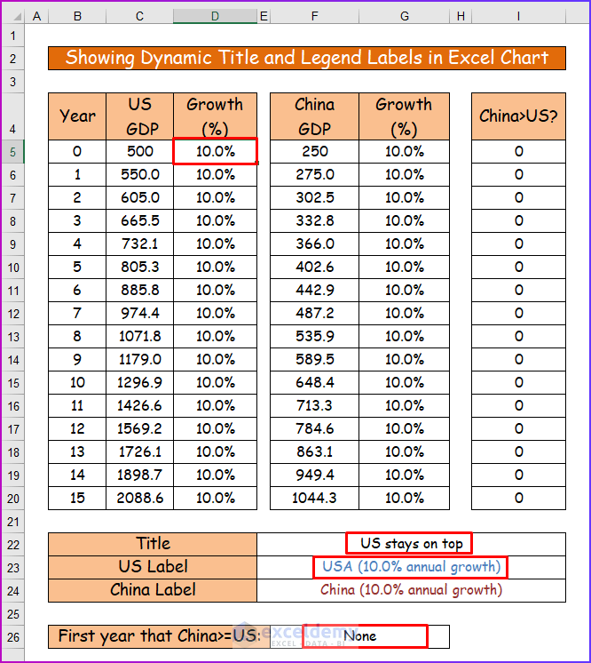
The worksheet shows the GDP forecasts for the US and China. You will see this type of forecasting in practical life.
- GDP for the US is set at 500 (see cell C5) with a growth rate of 3% (cell D5).
- GDP for China is set at 250 (see cell F5) with a growth rate of 10% (cell G5).
This forecast wants to know what the scenario will be if the above GDP and growth rate continue for the next 15 years which we want to see on a chart.
By using the following data set, I will first create a chart using a step-by-step procedure. Then, I will show you how to add dynamic titles and legend labels to the chart.
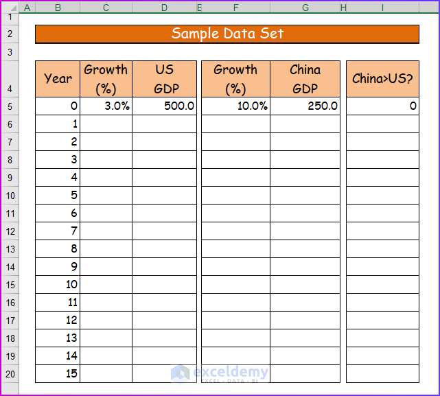
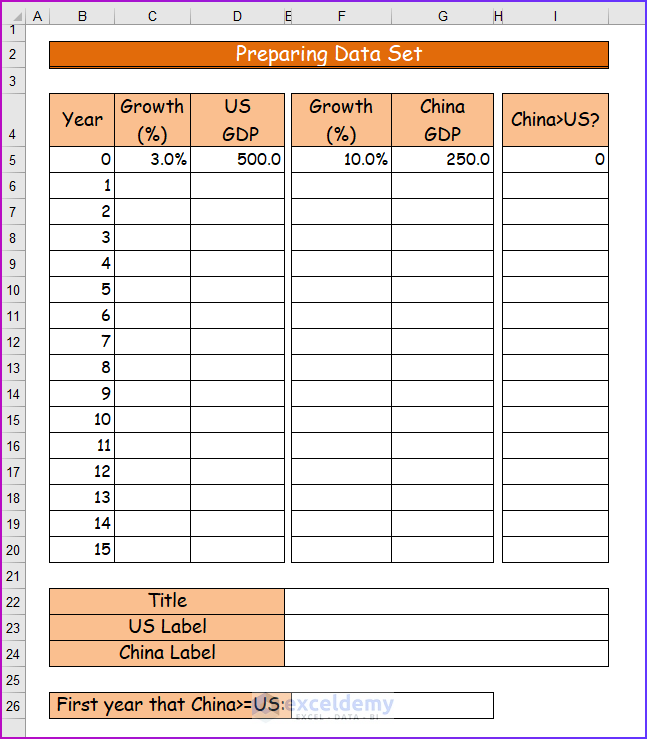
Step 1: Preparing Data Set
In the first step, I will modify the data set a little more and add some more rows for calculation. To do that,
- First of all, create four more data tables in rows 22-26 respectively, under the sample data set.
- Then, give appropriate headers to those new data tables, like in the following image.
- From cell B5 to B20, values from 0 to 15 are set. You can think of these values as years. 0 is the starting point (year), and 1 is regarded as after one year.
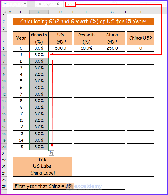
Step 2: Calculating GDP and Growth (%) of US for 15 Years
Secondly, I will show the calculation for the GDP and Growth (%) of the US in columns C and D. For that,
- Check out cell C6. It holds this formula.
=C5So it just copies the value of cell C5 and it is 3%.
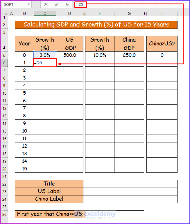
- Then, I just copied this formula for other cells to the bottom (up to cell C20) using AutoFill. So all the cells are holding the value of 3% in them.
- Thirdly, check out the formula in cell D6. It is:
=D5*(1+C6)- The values of D5 and C6 are 500 and 3% Consequently, the result is 515.
- Lastly, using the Fill Handle, I have copied this formula for other cells on the bottom (up to cell D20).
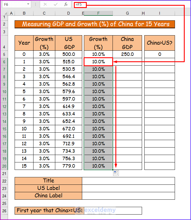
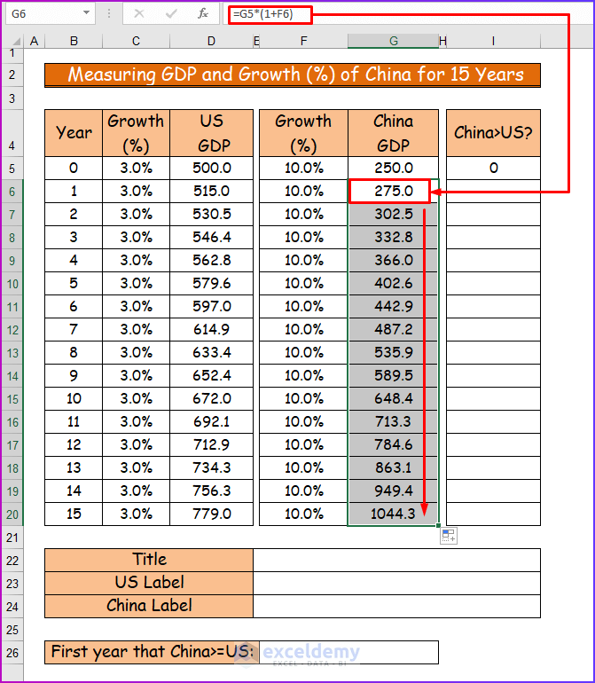
Step 3: Measuring GDP and Growth (%) of China for 15 Years
In the third step, I will show the measurement of the GDP and Growth (%) of China. To measure that,
- Firstly, in cell F6, type the following formula.
=F5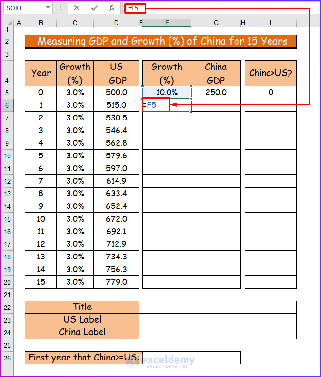
- Secondly, use the AutoFill feature to drag the formula to the lower cells of the column.
- Thirdly, measure the GDP of China for the first year in cell G6 by using the following formula.
=G5*(1+F6)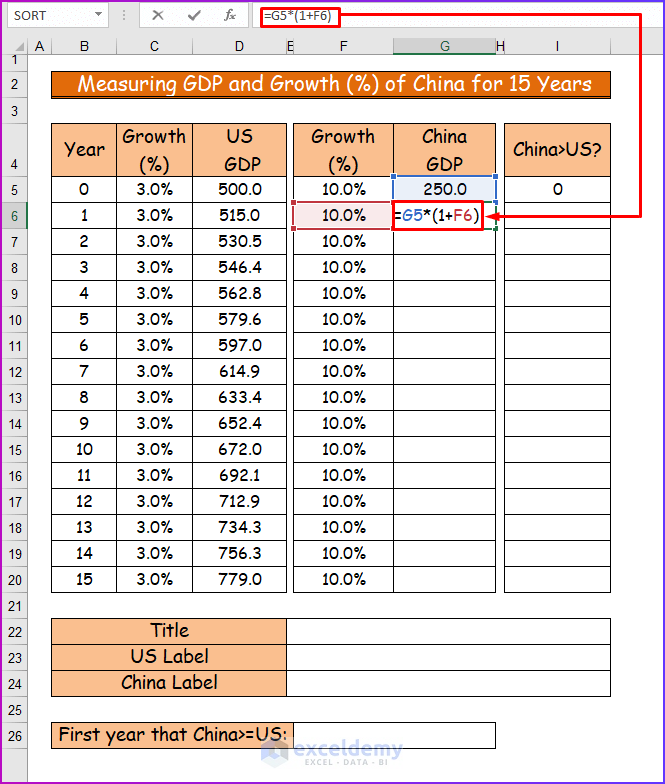
- Lastly, drag the formula to the lower cells of the column using the Fill Handle to see all the values.
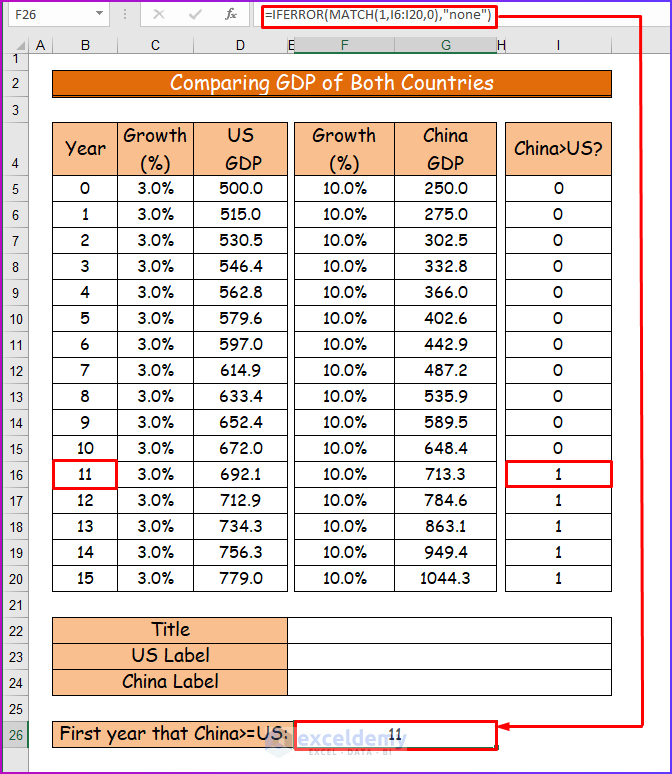
Step 4: Comparing GDP of Both Countries
In this step, I will show you the comparison of GDPs between these two countries. For that do the followings,
- First of all, write the following formula in cell I6.
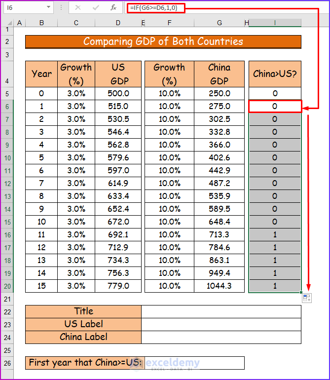
- If the value of cell G6 is greater than or equal to the value of cell D6, it will return 1, otherwise 0.
=IF(G6>=D6,1,0)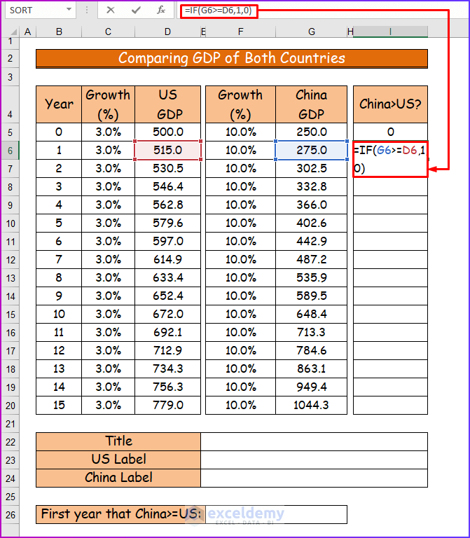
- Then, I copied this formula for other cells to the bottom (up to cell I20) using AutoFill.
- Thirdly, check the following formula in cell, F26.
=IFERROR(MATCH (1, I6:I26, 0),”none”)- Here, look at the MATCH function It searches for the value 1 in cell range I6:I20, and, if it finds any, returns the position of 1 in the range. If it does not find any, it returns an error. The IFERROR function catches that error and returns “none.”
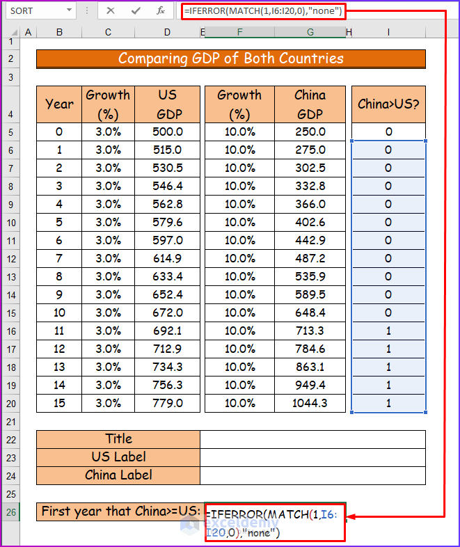
- Finally, the first time, 1 is returned to cell I16.
- Here, the value of B16 is 11. So after 11 years, China’s GDP (with 713.3) has crossed the GDP of the US (with 692.1).
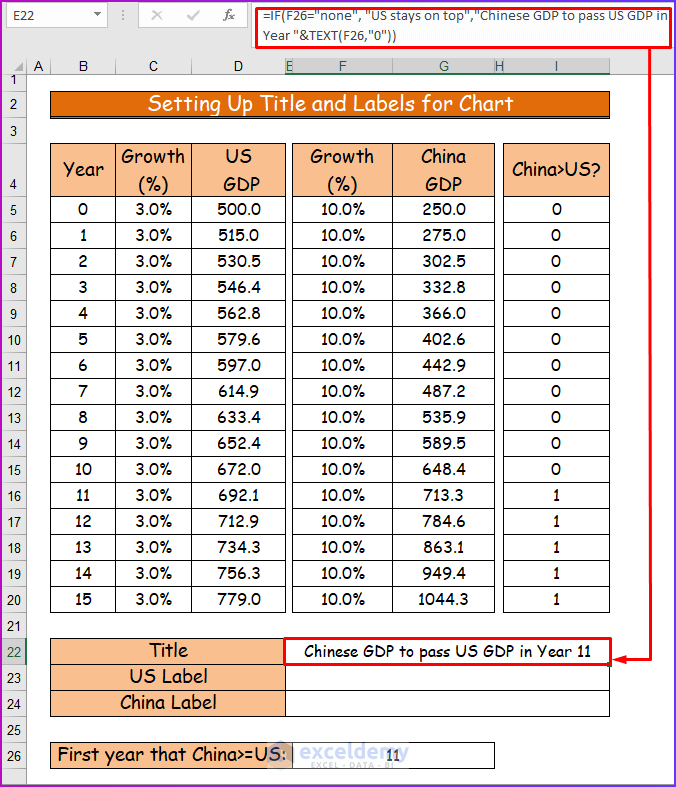
Step 5: Setting Up Title and Labels for Chart
In this section, I will set up the title and labels for the chart using Excel functions. How I do it is described below.
- Firstly, we will set the title for the chart.
- For that, use the following formula in cell E22.
=IF(F26=”none”, “US stays on top”, “Chinese GDP to pass US GDP in Year “&TEXT(F26,”0”))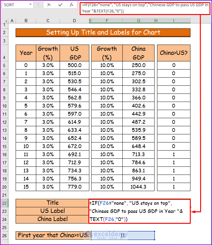
- Here, if F26 is none (it means there is no 1 in the range I6: I20), the IF function returns “US stays on top”, otherwise the IF function returns “Chinese GDP to pass US GDP in Year “&TEXT(F26,”0”)”. The TEXT function returns the value of cell F26 in general format.
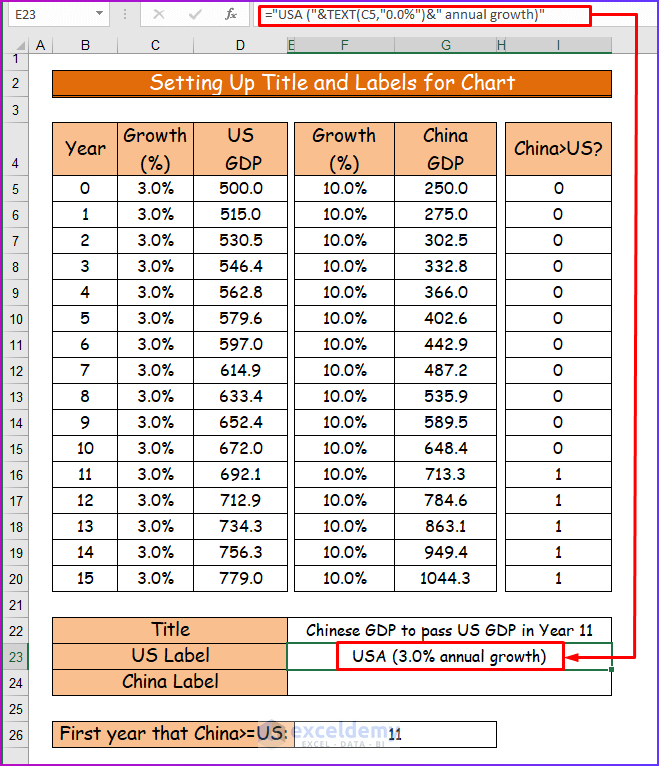
- Secondly, to add the label for the US GDP to the chart, type the following formula in cell E23.
="USA("&TEXT(D5,"0.0%")&" annual growth)"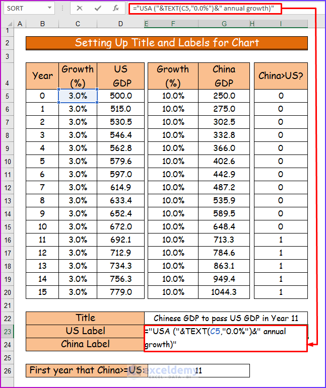
- Then, press Enter to see the annual growth of the US.
- Consequently, the value of cell E23 will be changed along with the value of cell C5.
- Thirdly, write the following formula in cell E24 to add the label for China’s GDP in the chart.
="China("&TEXT(G5,"0.0%")&" annual growth)"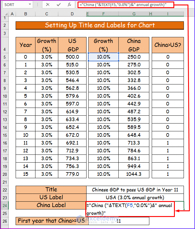
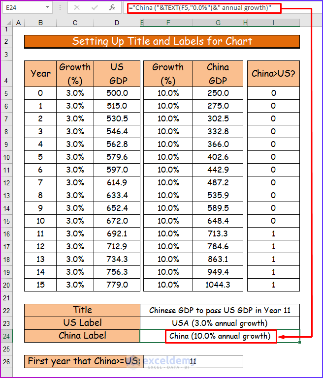
- Finally, you will get the desired result in cell E24 after pressing Enter.
Read More: How to Add a Legend in Excel
Step 6: Inserting Data Series for Chart
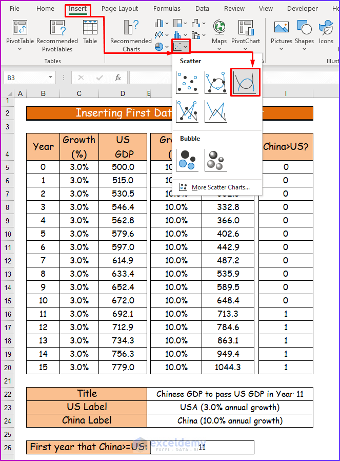
Now, I will create an Excel chart to show the dynamic title and labels in it. To do that,
- Firstly, select an empty cell in the worksheet and create an XY chart (Scatter with Smooth Lines).
- Secondly, right-click on the empty chart and choose Select Data.
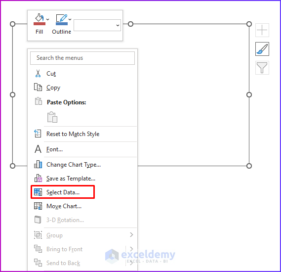
- Thirdly, click on the Add button to add Legend Entries (Series).
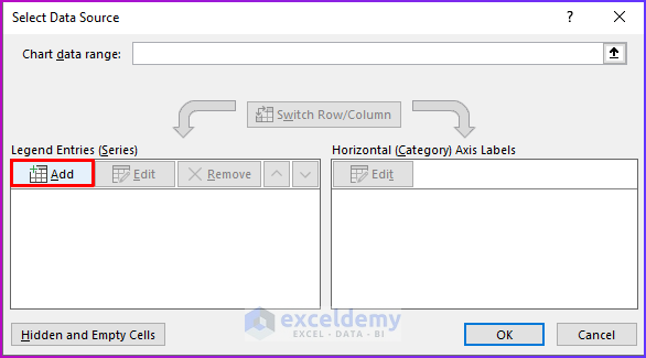
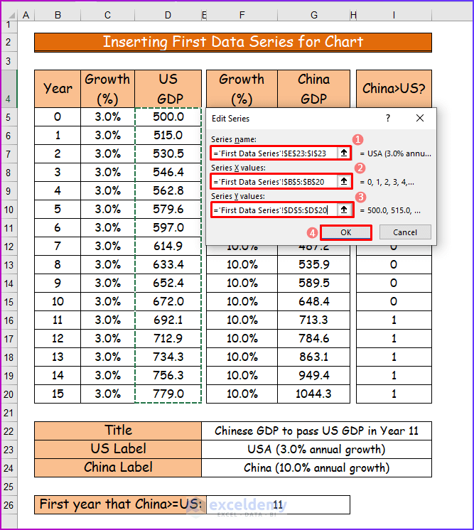
- Fourthly, to add the first series to the chart, go to the Edit Series dialog box.
- Then, as Series name, point to cell reference E23, as Series X values point to cell range B5:B2,0 and as Series Y values point to range D5:D20.
- Lastly, when done, click OK.
- Fifthly, the Select Data Source dialog box will appear again, and you will see the entry of the first series.
- To add the second series, click on Add.
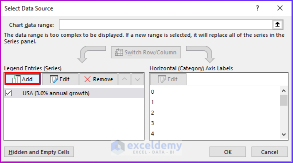
- Again, the Edit Series dialog box will be opened.
- This time, the Series name, points to cell reference E24, the Series X values point to cell range B5:B20, and the Series Y values, point to range G5:G20.
- Finally, when done, click OK.
Step 7: Showing Final Result
In this last step, we will create the chart with a dynamic title and label. See the following discussion to do the same.
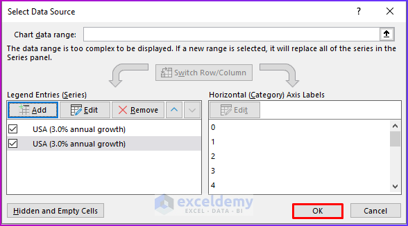
- Firstly, you will see the two data series in the Select Data Source dialog box after the previous step.
- Here, press OK.
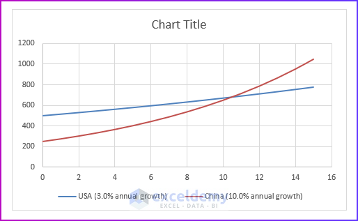
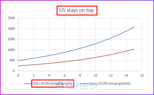
- Secondly, the chart will look like the following picture.
- Thirdly, click on the chart title and wait to see the solid border box around the title.
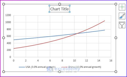
- Fourthly, in the formula bar, write the following formula to add the dynamic title to the chart.
='Showing Chart'!$E$22:$I$22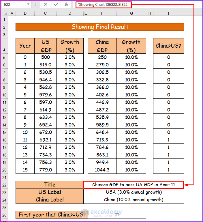
- Finally, after pressing Enter, the final result will look like the following image.
Read More: How to Show Legend with Only Values in Excel Chart
Showing Dynamic Title and Legend Labels in Excel Chart
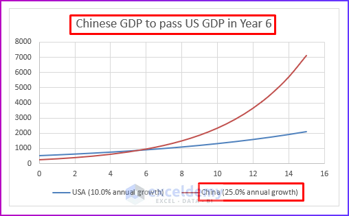
In my last discussion, I will show how to play with charts with dynamic titles and labels. By changing values within the chart’s data range, you can witness a significant change. The whole procedure is shown in the following steps.
- First of all, in cell D5, change the value of Growth (%) of the US from 3% to 10%.
- Then, after calculation, you will notice the changed cell value in E22, E23, and F26.
- Consequently, you will notice the change in the chart’s title and legend label for the US.
- Again, change the Growth (%) of China in cell G5 from 10% to 25%.
- Here, cell values of E22, E24 and F26 will change according to the value of the cell range F5:F20.
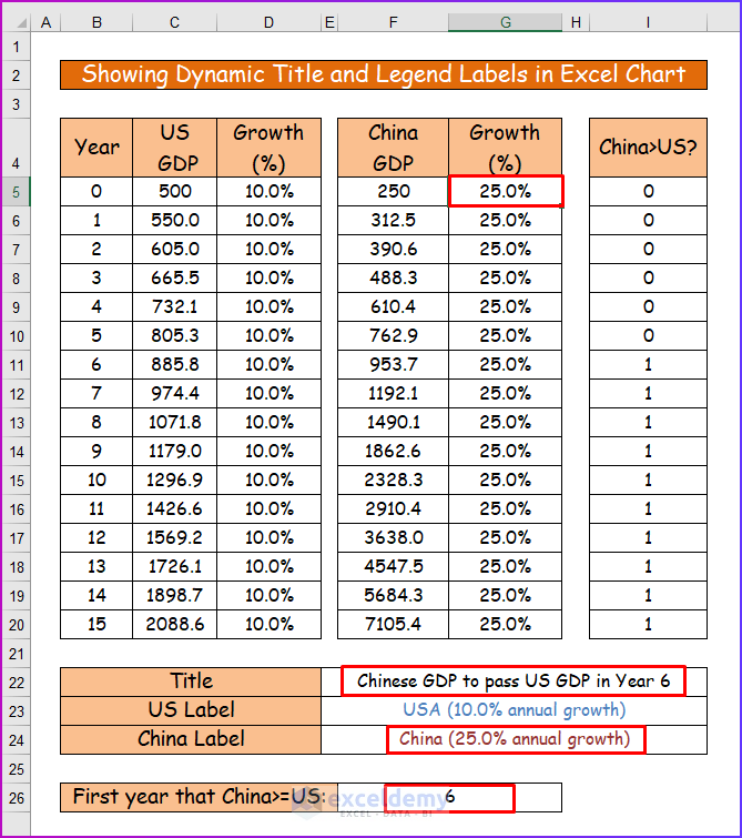
- Finally, you can see the changed title and data label in the graph.
Read More: How to Create a Legend in Excel Without a Chart
Download Practice Workbook
To follow along with me in the entire article, download the working file first.
Conclusion
That’s the end of this article. I hope you find this article helpful. After reading the above description, you will be able to create and visualize Excel charts with dynamic title and legend labels by following the above-mentioned discussion. Please share any further queries or recommendations with us in the comments section below.
The ExcelDemy team is always concerned about your preferences. Therefore, after commenting, please give us some moments to solve your issues, and we will reply to your queries with the best possible solutions ever.
Happy Excelling 🙂
Related Articles
- What Is a Chart Legend in Excel?
- How to Edit Legend in Excel
- How to Rename Legend in Excel
- How to Change Legend Title in Excel
- How to Change Legend Colors in Excel
- How to Ignore Blank Series in Legend of Excel Chart
- How to Reorder Legend Without Changing Chart in Excel
<< Go Back To Legend in Excel Chart | Excel Chart Elements | Excel Charts | Learn Excel
Get FREE Advanced Excel Exercises with Solutions!
