Method 1 – Using Conventional Formula to Calculate Relative Frequency Distribution
We can efficiently calculate the relative frequency distribution by using simple basic formulas like the SUM function division cell referencing.
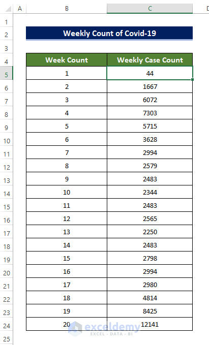
Example 1 – Relative Frequency Distribution of Weekly Covid-19 Cases
In the sample dataset, calculate the relative frequency distribution of weekly COVID cases in Louisiana state in the USA.
Steps:
- Click on cell C5 and enter the following formula,
=SUM(C5:C24)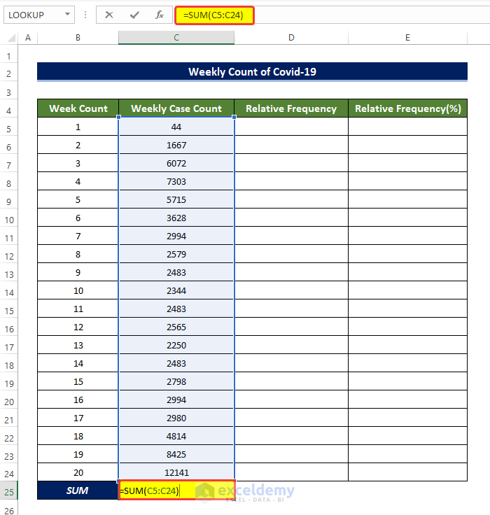
- This will calculate the sum of contents in the range of cells C5:C24.
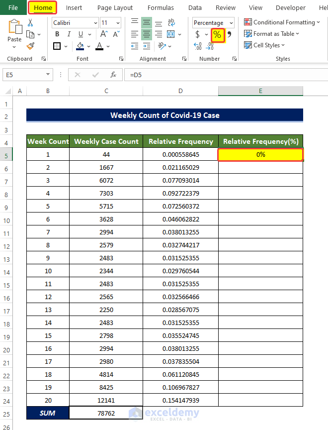
- Select cell D5 and enter the following formula.
=C5/$C$25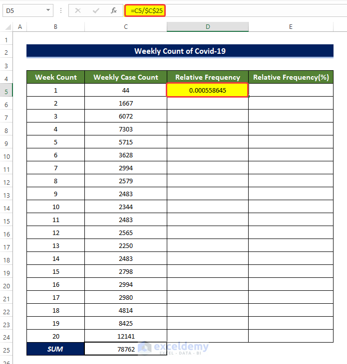
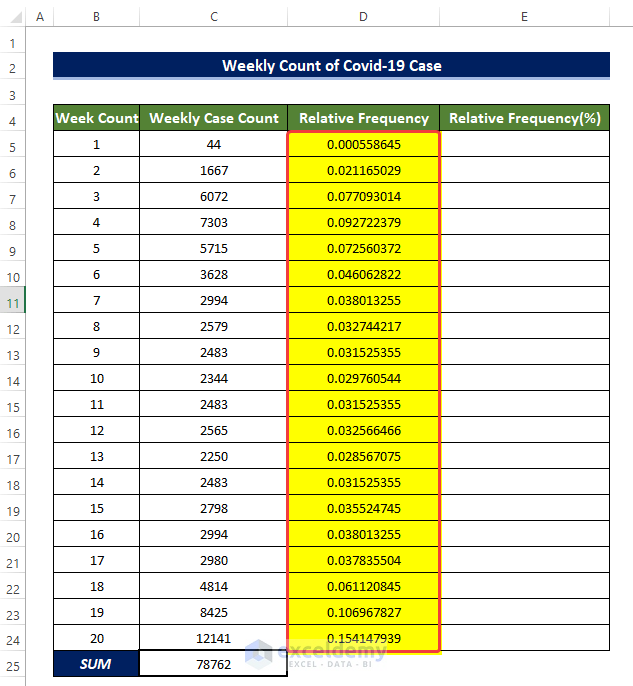
- Drag the Fill Handle to cell D24.
- This will populate the range of cells D5 to D24 with the division of cell content in the range of cells C5 to C24 with the cell value in C25.
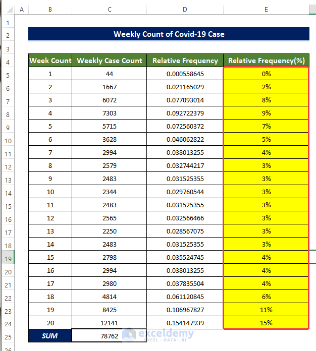
- Copy cell D5 and copy the content of this cell to cell E5.
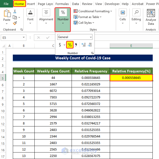
- From the Number group in the Home tab, click on the Percentage sign to convert the decimal to percentage.
- Drag the Fill Handle to cell E24.
- Doing this will populate the range of cells E5:E24 with the relative percentage of the Weekly count of COVID cases.
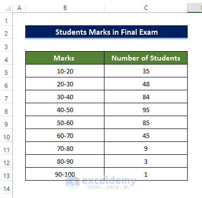
Example 2 – Relative Frequency Distribution of Students’ Marks
Determine the Relative Frequency Distribution of the marks of the students in the final exam using basic formulas.
Steps:
- Click on cell C5 and enter the following formula,
=SUM(C5:C13)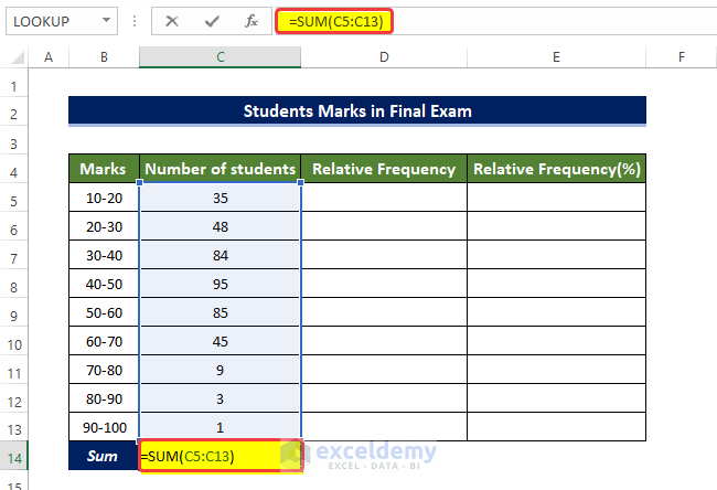
- This will calculate the sum of contents in the range of cells C5:C13.
- Select cell D5 and enter the following formula.
=C5/$C$14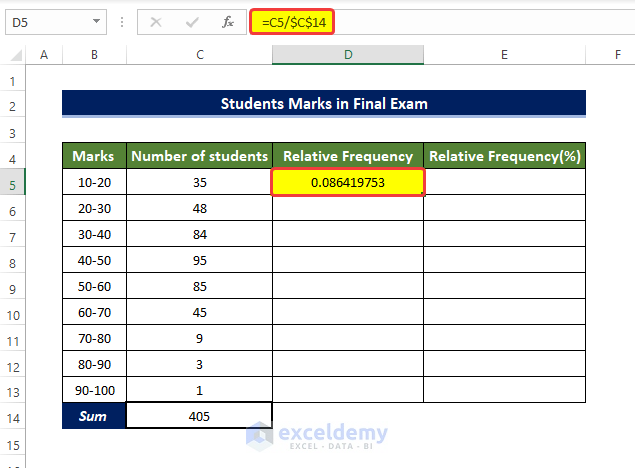
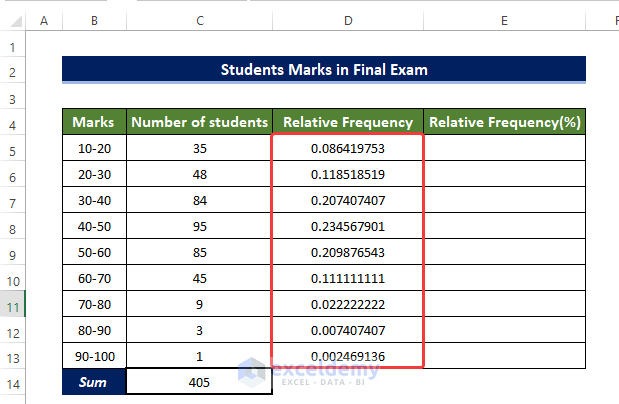
- Drag the Fill Handle to cell D13.
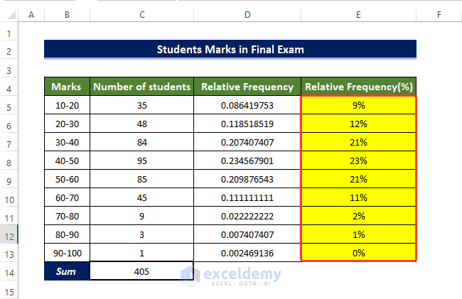
- Copy the range of cells D5:D13 to the range of cells E5:E13.
- Select the range of cells E5:E13 and from the Number group in the Home tab, click on the Percentage Sign (%).
- This will convert all the relative frequency distribution values in the range of cells E5:E13 to percentage relative frequency distribution.
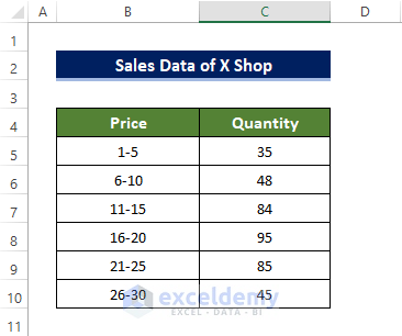
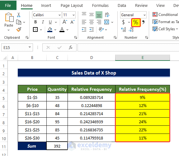
Example 3 – Relative Frequency Distribution of Sales Data
Determine the Relative Frequency Distribution of the sales data of X shop.
Steps:
- Click on cell C5 and enter the following formula,
=SUM(C5:C10)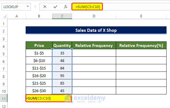
- This will calculate the sum of contents in the range of cells C5:C10.
- Select cell D5, and enter the following formula.
=C5/$C$11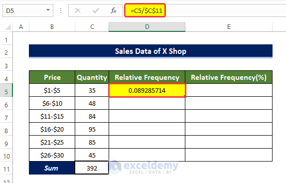
- Drag the Fill Handle to cell D10.
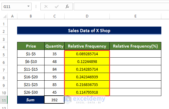
- Copy the range of cells D5:D10 to the range of cells E5:E10.
- Select the range of cells E5:E10 and from the Number group in the Home tab, click on the Percentage Sign.
- This will convert all the relative frequency distribution values in the range of cells E5:E10 to percentage relative frequency distribution.
Read More: How to Make Frequency Distribution Table in Excel
Method 2 – Use of Pivot Table to Calculate Relative Frequency Distribution
Example 1 – Relative Frequency Distribution of Weekly Covid-19 Cases
Utilizing the Pivot Table, calculate the relative frequency distribution of weekly COVID cases in Louisiana state in the USA.
Steps:
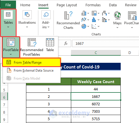
- From the Insert tab, go to Tables > Pivot Table > From Table/Range.
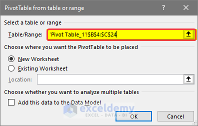
- A small window will open, specify the location of the new table and the range of our data. We select the range of cell B4:C24 in the first range box.
- We choose New Worksheet under the Choose where you want the Pivot table to be placed the option.
- Click OK.
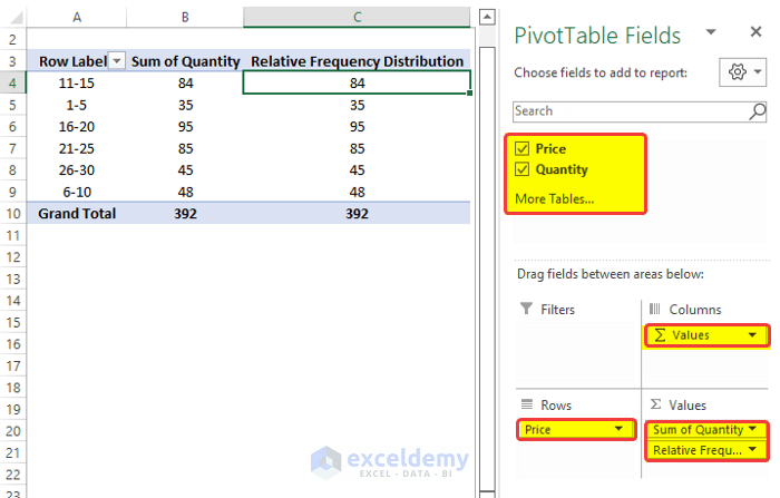
- A new window with the PivotTable Fields side panel will open.
- Drag the Weekly Case Count to the Values field two times.
- Drag the Week Count to the Rows field.
- A Pivot Table will appear on the left side based on our selection.
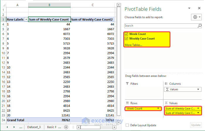
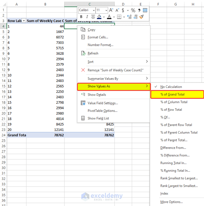
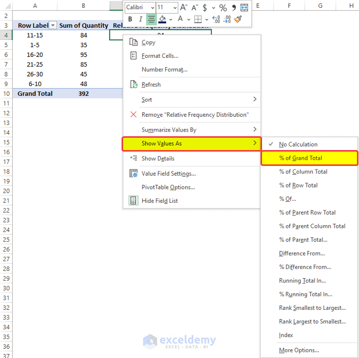
- Click on the rightmost column and right-click on it.
- From the context menu, go to Show Values As > % of Grand Total.
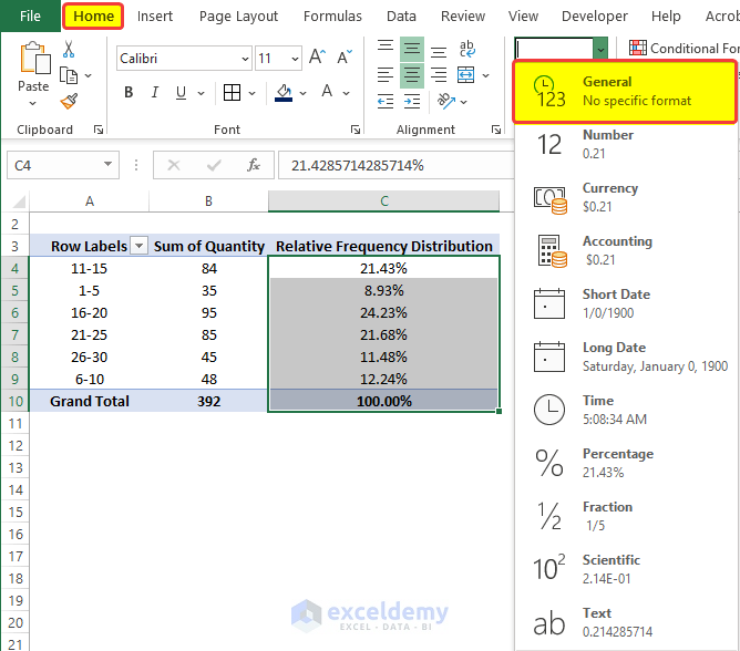
- After clicking on the % of Grand Total, you will observe that the range of cells C4 to C24 has their relative frequency distribution in the percentage format.
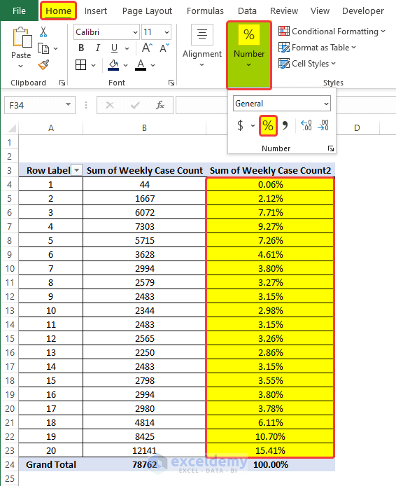
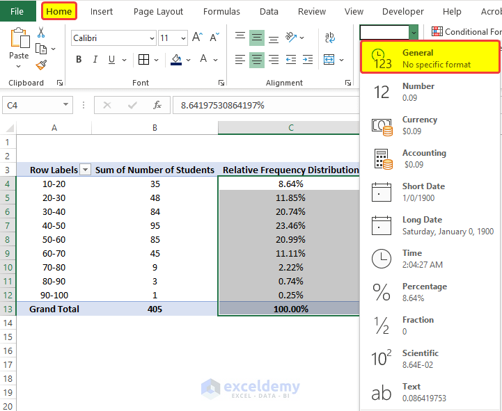
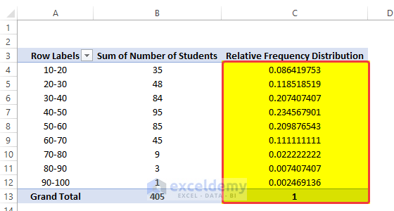
- Select the range of cells C4:C24 and from the Number group in the Home tab, click on the Number Properties. From the drop-down menu, click on General.
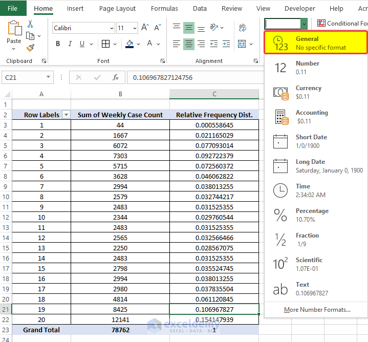
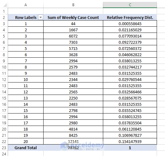
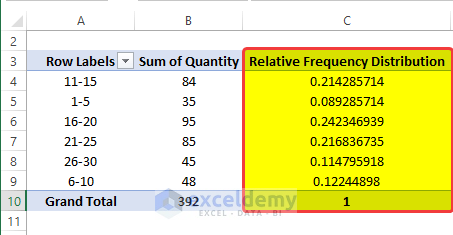
- The range of cells C5 to C24 is now filled with the relative frequency distribution of the student’s marks.
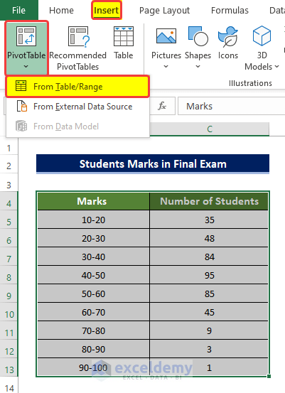
Example 2 – Relative Frequency Distribution of Students’ Marks
Utilizing the Pivot Table, determine the Relative Frequency Distribution of the marks of the students in the final exam using basic formulas.
Steps:
- From the Insert tab, go to Tables > Pivot Table > From Table/Range.
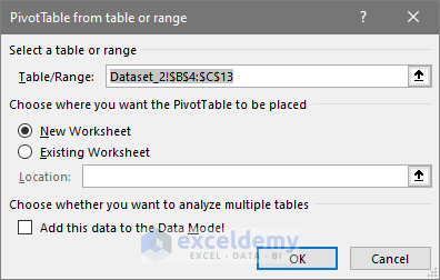
- A small window will open, specify the location of the new table and the range of our data. We select the range of cell B4:C13 in the first range box.
- We choose New Worksheet under the Choose where you want the Pivot table to be placed the option.
- Click OK.
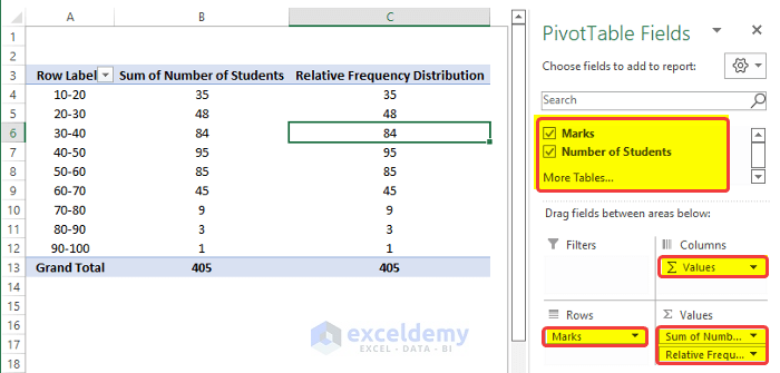
- A new window with the PivotTable Fields side panel will open.
- Drag the Weekly Case Count to the Values field two times.
- Drag the Week Count to the Rows field.
- APivot Table will appear on the left side based on our selection.
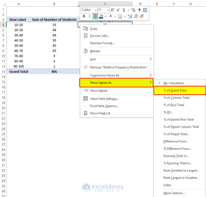
- Click on the rightmost column and then right-click on it.
- From the context menu, go to Show Value As > % of Grand Total.
- Select the range of cells C4:C13, and from the Number group in the Home tab, click on the Number Properties, from the drop-down menu, click on General.
- The range of cells C4 to C24 is now filled with the relative frequency distribution of the students’ marks.
Example 3 – Relative Frequency Distribution of Sales Data
Using the Pivot Table, determine the Relative Frequency distribution of the sales data of X shop.
Steps:
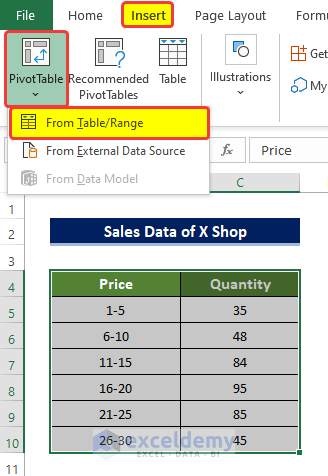
- From the Insert tab, go to Tables > Pivot Table > From Table/Range.
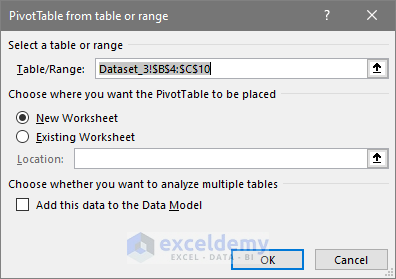
- A small window will open, where you need to specify the location of the new table and the range of our data. We select the range of cell B4:C10 in the first range box.
- We choose New Worksheet under the Choose where you want the Pivot table to be placed the option.
- Click OK.
- A new window with the PivotTable Fields side panel will open.
- Drag the Weekly Case Count to the Values field two times.
- Drag the Week Count to the Rows field.
- A Pivot Table will appear on the left side based on our selection.
- Click on the rightmost column and right-click on it.
- From the context menu, go to Show Values As > % of Grand Total.
- Select the range of cells C4:C10, and from the Number group in the Home tab, click on the Number Properties, from the drop-down menu, click on General.
- The range of cells C4 to C10 is now filled with the relative frequency distribution of the students’ marks.
Read More: How to Create a Grouped Frequency Distribution in Excel
Download Practice Workbook
Related Articles
- How to Calculate Upper and Lower Limits in Excel
- How to Find Mean of Frequency Distribution in Excel
- How to Make a Relative Frequency Histogram in Excel
- How to Calculate Cumulative Relative Frequency in Excel
<< Go Back to Frequency Distribution in Excel | Excel for Statistics | Learn Excel
Get FREE Advanced Excel Exercises with Solutions!
