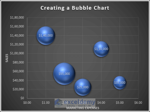
Bubble chart in Excel is very useful to visualize and compare three sets of data simultaneously. This type of chart is useful when you have a dataset with three variables. It is effective to present and analyze data with three variables in this chart.
In this article, we will explore bubble chart in Excel. We will start this article by describing the process to create a bubble chart in Excel. Then we will move on to discuss various customization options of bubble charts. Finally, we will wrap up by explaining the steps to create a bubble map in Excel.
Download Practice Workbook
Download this practice workbook while reading this article.
How to Create a Bubble Chart in Excel
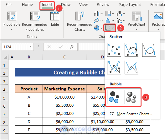
- Go to the Insert tab and click on Insert Scatter (X, Y) or Bubble Chart.
- Then select Bubble or 3-D Bubble.
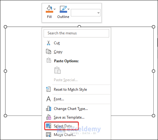
- A blank chart will be created. Right-click on the blank chart and choose Select Data.
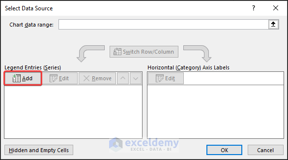
- Then click on Add to add series data.
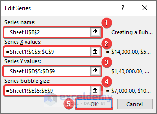
- Choose a Series name.
- Select C5:C9 as Series X values and D5:D9 as Series Y values.
- After that, choose E5:E9 as Series bubble size and click on OK.
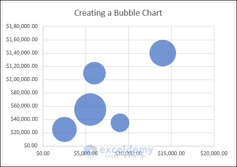
- As a result, a 2-D bubble chart will be created.
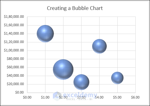
- If you choose the 3-D bubble chart from the chart options, you will get a 3-D bubble chart.
How to Customize Bubble Chart in Excel
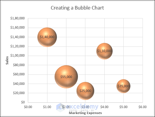
1. Add data Labels
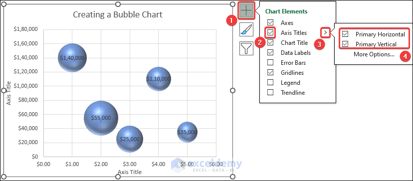
- Click on the Chart Elements icon and check the box of Data Labels.
- Then you can choose the position of the labels as per your need.

2. Add Axis Title
- Click on the Chart Elements icon and check the box of Axis Titles.
- Then you can keep both of the axis titles or just one based on your need.
3. Apply Different layout
- Select the chart and go to the Chart Design tab.
- Then select any of the chart layouts as per your requirements.
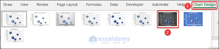
- Consequently, the chart layout will be changed.
4. Change Color, Outline and effects
- Click on the Chart Styles icon and then select the Color tab.
- From there, choose a color combination to change the color of your chart.

- As a result, the bubbles in the chart will have your chosen color.
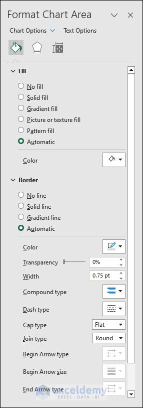
- If you double-click on the chart, a side panel will open.
- In the panel, you will get several options to choose Fill, Border, and many other options to format your chart.
Read More: How to Color Excel Bubble Chart Based on Value
How to Create a Bubble Map in Excel
- Select cells B4 to C18 and go to,
Insert → Insert Scatter (X, Y) or Bubble Chart → Scatter
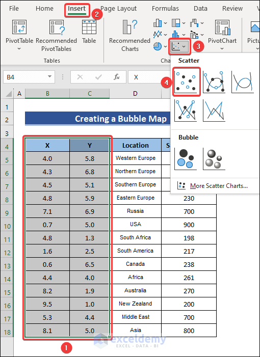
- Next, right-click on the chart and select Change Chart Type.
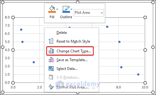
- After that, click on X Y (Scatter) and select Bubble.
- Press OK to convert it into a bubble chart.

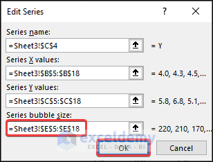
- Then right-click on the chart and choose Select Data.

- Click on Edit to open the Edit Series box.

- Choose E5:E18 as Series bubble size and press OK.
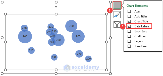
- Now open Chart Elements by clicking on the Chart Elements icon and check the box of Data Labels.
- Then double-click on the plot area to open the Format Plot Area side panel.
- Click on the Fill & Line icon and select Picture or texture fill.
- After that, click on Insert under Picture source option.
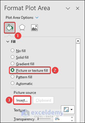
- You will need to insert an image of the world map. You can insert this image from your files on PC or from online.

- Once the image is inserted, you will get your desired bubble map.

Read More: How to Create Bubble Chart in Excel
Things to Remember
- Make sure to format data labels, bubble size and color to make the chart easy to comprehend.
- You must ensure that the X and Y values of your data are correct so that the bubbles are overlapped in the right position.
Frequently Asked Questions (FAQs)
1. What is bubble chart in data visualization?
Bubble charts are handy to visualize data with two to four dimensions, where two dimensions are visualized as coordinates. The third one is visualized as color and the fourth one as size.
2. What is the difference between bubbles and scatter?
Scatter plots are useful when you have a dataset with two variables, whereas bubble charts are used if you need to present and analyze a dataset that has three variables.
3. What is the advantage of bubble chart in Excel?
Bubble charts are helpful to explain complex data, analyze data with three variables and make the dataset easy to comprehend.
Conclusion
Thanks for making it this far. I hope you found this article useful. In this article, we have discussed bubble chart in Excel. We have explained steps to create a bubble chart and ways to customize it. We have also described the procedure to create a bubble map in Excel. If you have any queries or recommendations regarding this article, feel free to let us know in the comment section below.
Bubble Chart in Excel: Knowledge Hub
<< Go Back To Excel Charts | Learn Excel
Get FREE Advanced Excel Exercises with Solutions!
