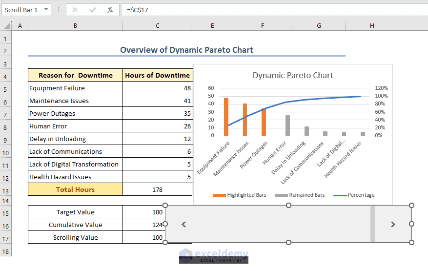
A clustered scatter plot is a type of chart in Excel that displays data points as individual dots on a graph. Unlike a regular scatter plot where all ...
In the business world, calculating sales revenue is a crucial task that helps organizations monitor their financial performance. Excel, being one of ...
A Heat Map Scatter Plot in Excel is a type of data visualization that can be created in Microsoft Excel to represent the density of data points in a ...
Excel is a versatile tool that can be used to analyze data and create charts and graphs. One common use of Excel is to plot the best-fit line through ...
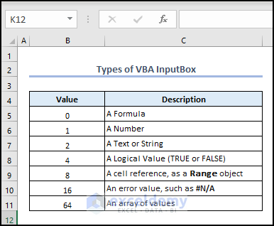
Here is an image overview of using a constant (vbNewLine or vbCr) of the InputBox function that allows multiple lines in the InputBox. This InputBox, ...
When working with large Excel worksheets, cleaning unnecessary data is essential. Deleting specific rows and shifting the remaining ones up to close ...