This Excel blog post provides a detailed discussion on how to create a dynamic Pareto chart in Excel. This kind of graph is helpful in determining the key elements that significantly influence a specific result. The post includes screenshots and comprehensive instructions on how to create the chart and have it update automatically as the target value changes.

What Is a Pareto Chart?
Pareto chart shows the relative importance of various items in a dataset. It bears Vilfredo Pareto’s name, an economist from Italy. You can make this graph by placing the dataset’s items in descending order of impact, then plotting them as bars. With the most important items on the left and the least important on the right, the bars are arranged in descending order of importance.
People use Pareto charts in quality control and process improvement frequently to pinpoint the key causes of a problem or issue.
Dynamic Pareto Chart in Excel: 2 Simple Steps
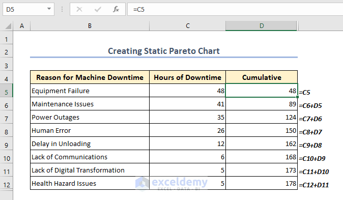
To demonstrate the steps of creating a dynamic Pareto chart, we have taken a dataset from an industry. In this data, reasons that cause a delay in the workflow and their corresponding hours. After creating a dynamic Pareto chart, we can easily understand which factors are causing the most delays. We have two columns of data named “Reason for Machine Downtime” and “Hours of Downtime.”

⦿ Step 1: Creating a Static Pareto Chart
The factors that significantly contribute to a given issue or circumstance are analyzed and prioritized using a Pareto chart. The process of making a static Pareto chart in Excel will be covered in this section.
📌 Steps:
- Create a new column next to the “Hours of Downtime” column and figure out the Cumulative for each factor.
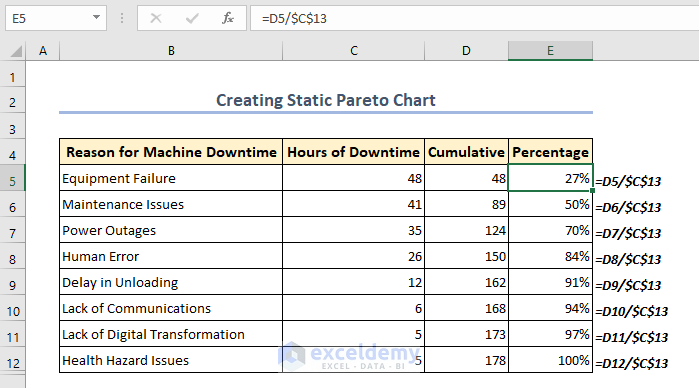
- Create a new column next to the “Cumulative ” column and figure out the Percentages for each factor.
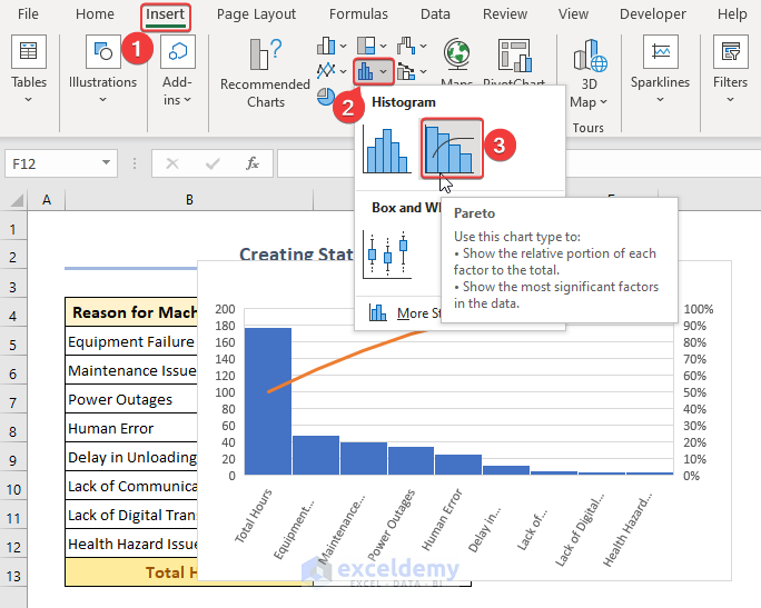
- To create a Pareto chart, go to the Excel ribbon’s Insert>> Insert Statistic Chart>> Histogram>> Pareto. The Hours of Downtime for each cause is there in a bar graph as a result.
Read More: How to Make Pareto Chart in Excel
⦿ Step 2: Creating a Dynamic Pareto Chart
A dynamic Pareto chart is an effective tool that enables you to swiftly analyze factors affecting a specific issue or circumstance. You can dynamically switch between different categories by connecting the chart to an Excel drop-down list, which makes it simple to compare and assess the effects of each category. We’ll look at how to make a dynamic Pareto chart in Excel in the following section.
📌 Steps:
- First, create two new columns named Highlighted Bars and Remained Bars. In the column of Highlighted Bars enter the following formula in F5:
=IF($C$16>=D5,C5,NA())- In cells C15 and C17, we have created Target Value and Scrolling Value for controlling the scroll bar. Also, in cell C16, we have a Cumulative Value that is linked to cell C15. This Cumulative Value will make the Pareto chart dynamic.

- In the column of Remained Bars enter the following formula in G5:
=IF($C$16<D5,C5,NA())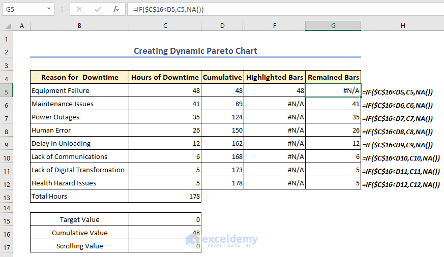
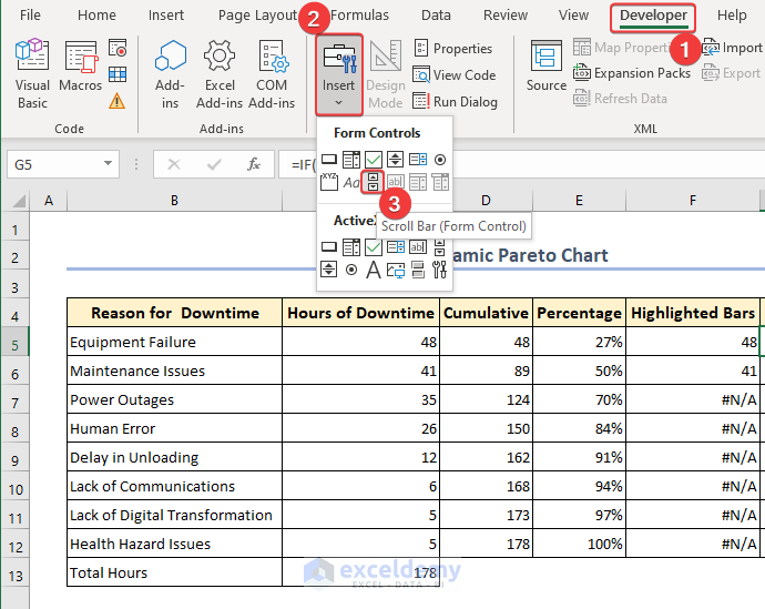
- Select Developer >> Insert from the ribbon menu.
- Then follow this path Form Controls>> Scroll Bar>> click anywhere on the Excel worksheet.
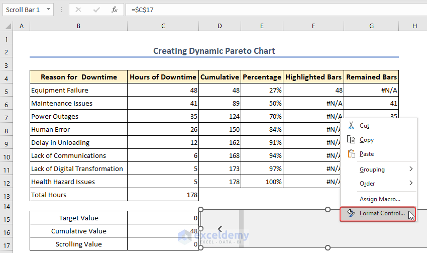
- Now resize the bar and right-click on the Scroll Bar and select Format Control.
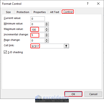
- Format Control window will appear and we select the Maximum value: 100, Incremental change: 5, Cell link: $C$17, and click OK.
- For this moment select C15 and enter =C17. After that select C16 and enter the following formula:
=IFERROR(INDEX($D$5:$D$12,IFERROR(MATCH($C$15,$D$5:$D$12,1),0)+1),1)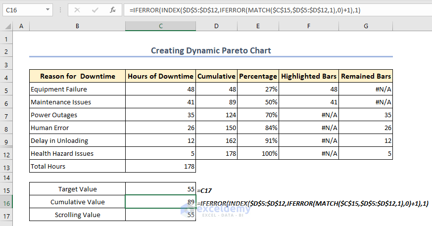
- Follow these steps to insert a graph: Insert >> Charts >> 2D Column Charts >> Clustered Column. By doing so, a column chart with three data series will be added (Cumulative Percentage, Highlighted Bars, and Remained Bars)

- Now Change Series Chart Type after a right-click on any of the bars in the 2-D column chart.

- A Change Chart Type dialogue box will appear. From this box, in the left pane select Combo and turn the Cumulative Percentage into Line and mark the Secondary axis check box.

- Finally, the dynamic Pareto chart is ready like in the following GIF.
Read More: How to Make a Pareto Chart Using Pivot Tables in Excel
Download Practice Workbook
You can download the practice workbook from the following download button.
Conclusion
Follow these steps and stages on Dynamic Pareto Chart Excel. You are welcome to download the workbook and use it for your practice. If you have any questions, concerns, or suggestions, please leave them in the comments section.
Related Articles
- How to Create a Stacked Pareto Chart in Excel
- How to Create Pareto Chart with Cumulative Percentage in Excel
- How to Use a Pareto Chart in Excel
- How to Interpret Pareto Chart in Excel
<< Go Back to Excel Pareto Chart | Excel Charts | Learn Excel
Get FREE Advanced Excel Exercises with Solutions!
