This is an overview.

Method 1- Using Excel 2016-365 Versions to Create a Pareto Chart with the Cumulative Percentage in Excel
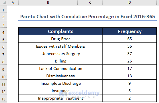
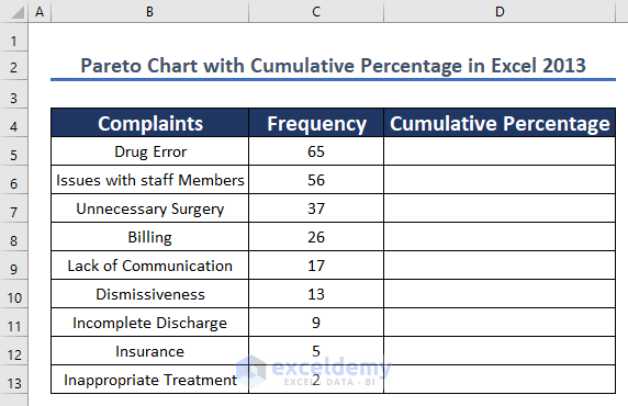
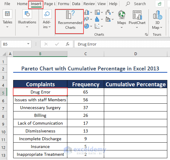
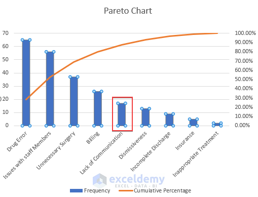
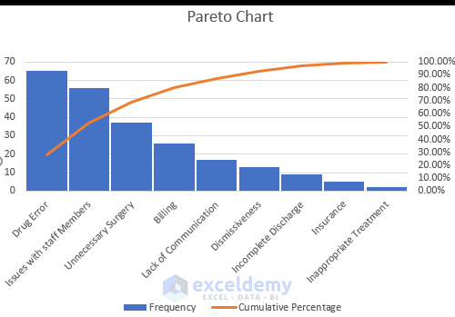
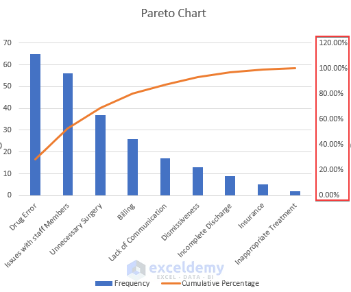
The dataset showcases information regarding the complaints of patients in a hospital. The number of complaints about an issue is considered as frequency.
Steps:
- Select any cell in the data table.
- Click Insert.
- Select Recommended Charts.
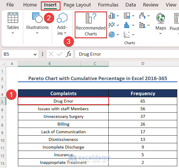
- Select All-Charts.
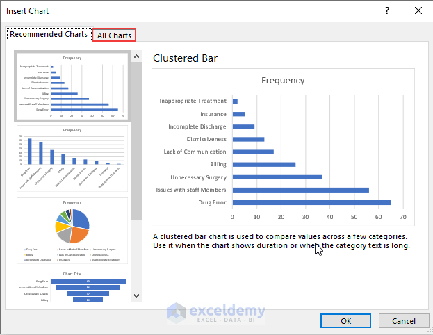
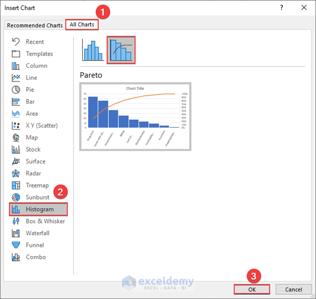
- Choose Histogram in Recommended Charts.
- Select Pareto in Histogram.
- Click OK.
The Pareto chart with the Cumulative Percentage is created.

Read More: How to Create a Stacked Pareto Chart in Excel
Method 2 – Using Excel 2013 to Create a Pareto Chart with the Cumulative Percentage
Step 1: Calculating the Cumulative Percentage
- Enter the formula in D5:
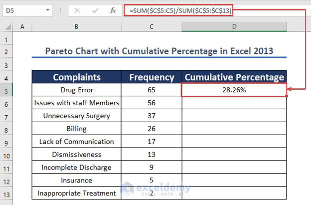
=SUM($C$5:C5)/SUM($C$5:$C$13)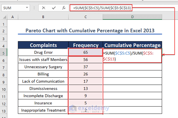
- Press ENTER to see the result.
(The data type of the Cumulative Percentage column is Percentage).
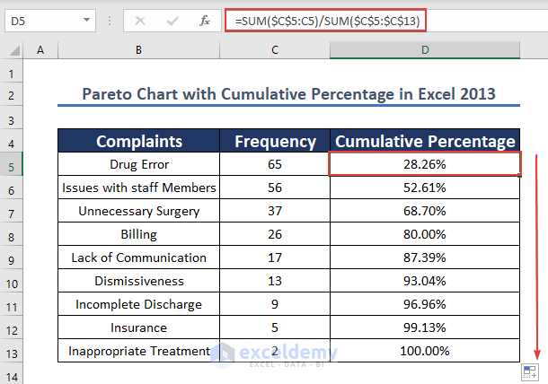
- Drag down the Fill Handle to see the result in the rest of the cells.
This is the output.
Step 2: Creating a Pareto Chart
- Select any cell in the table. Here, C5.
- Click Insert.
- Select Recommended Charts.
- Select All Charts.
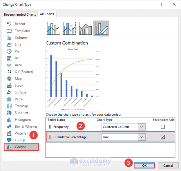
- Click Combo.
- In Cumulative Percentage , choose Line.
- Check the blank box beside Line. It defines the Cumulative Percentage as the Secondary Axis.
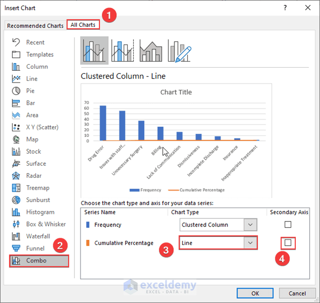
- Click OK.
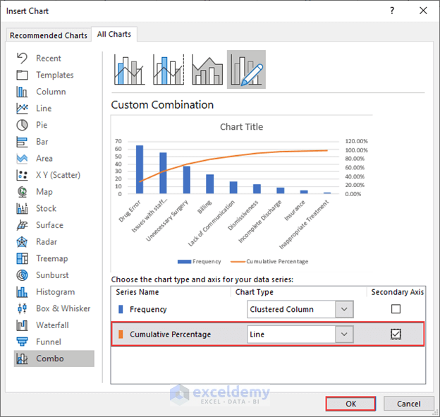
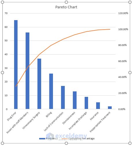
- The Pareto Chart is displayed.

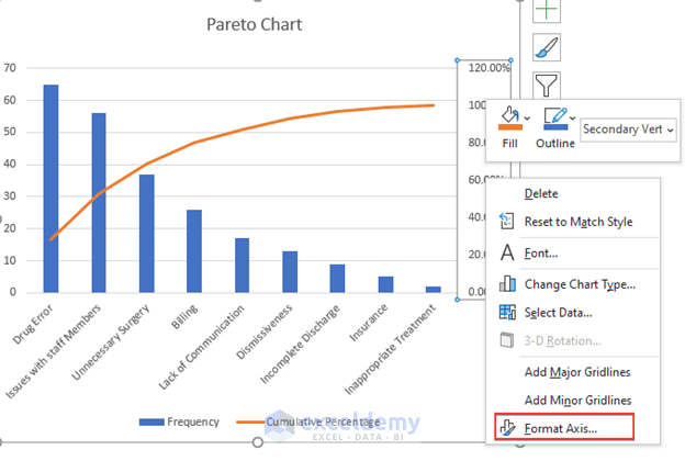
Step 3: Formatting the Axis
- Right-click the secondary axis.

- Select Format Axis.

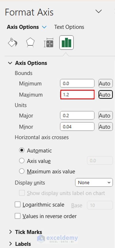
- In Axis Options, you will see that the Bounds Maximum value is 2 by default.
- 2 means it will show up to 120%.
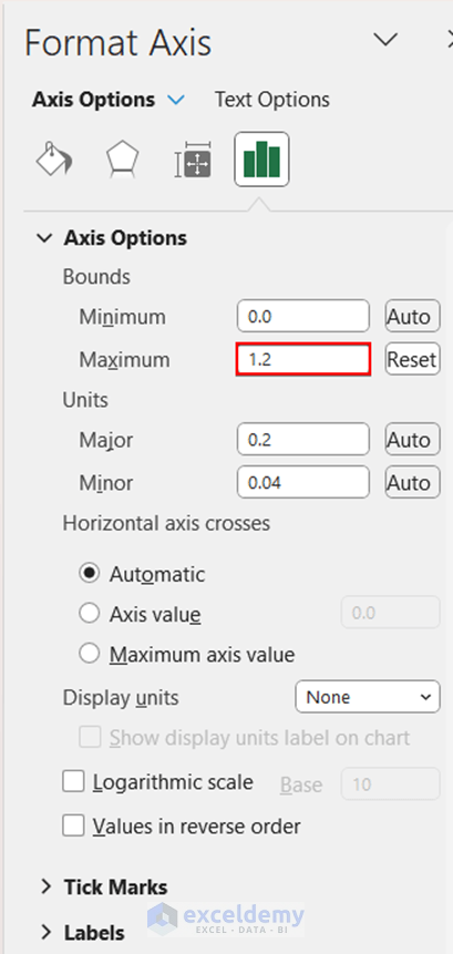
- Change 2 to 1.0 to see the cumulative percentage up to 100%.

This is the output.

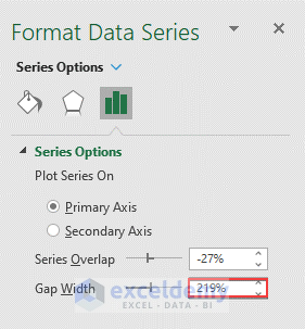
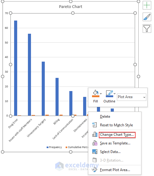
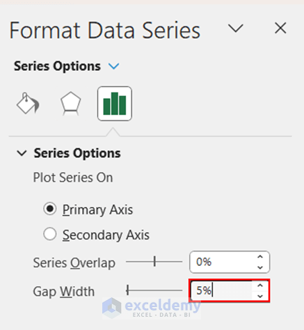
Step 4: Formatting the Bar Width
- Right-click a Column bar.
- Select Format Data Point.
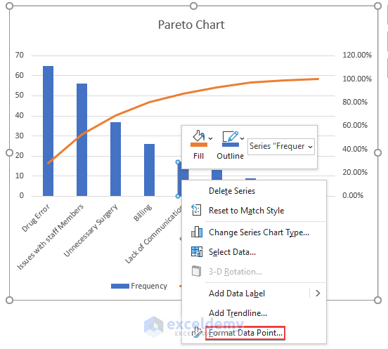
- Change the Gap Width is set to 219% by default.
- Change it to 5%.
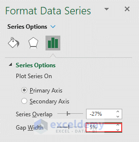
This is the output.
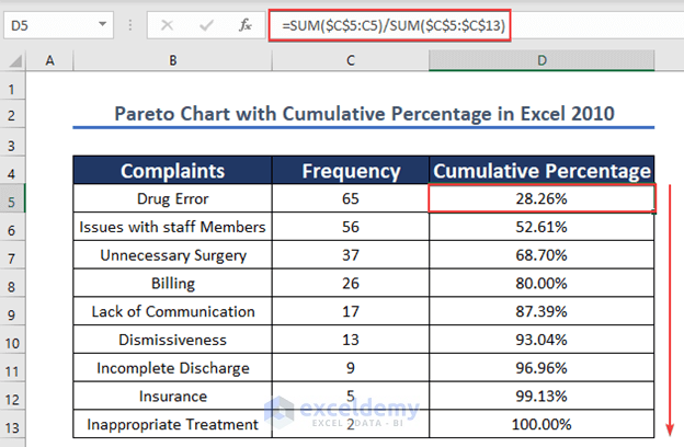
Method 3 – Using Excel 2010 to Create a Pareto Chart with the Cumulative Percentage
Calculate the cumulative percentage in the dataset below:
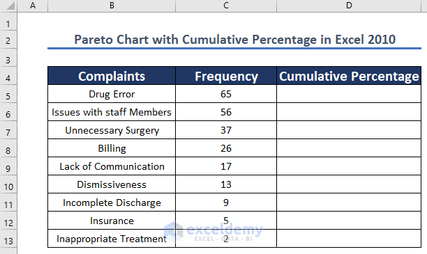
Step 1: Prepare the Data Set
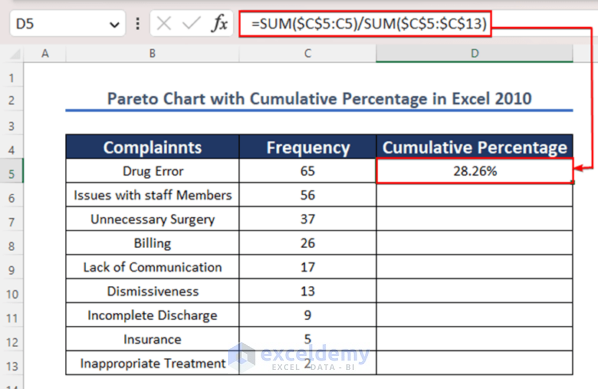
- Enter the formula in D5:
=SUM($C$5:C5)/SUM($C$5:$C$13)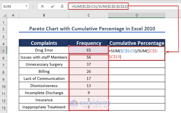
- Press ENTER to see the result.
- Drag down the Fill Handle to see the result in the rest of the cells.
The cumulative percentage is calculated.
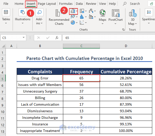
Step 2: Inserting Columns
- Select any cell in the data table. Here, C5.
- Click Insert.
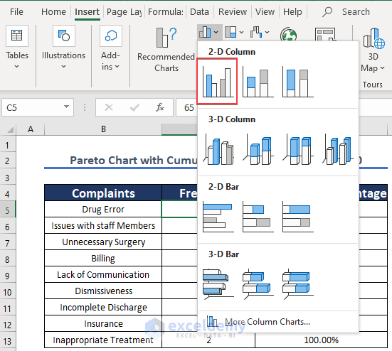
- Choose the column icon shown below.
- Select 2-D Column.
- Choose the first option.
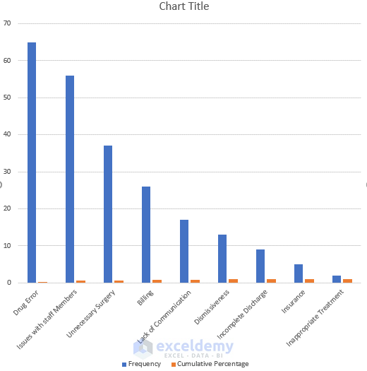
The chart will be displayed:
Step 3: Changing the Series Chart Type
- Select the cumulative percentage column.
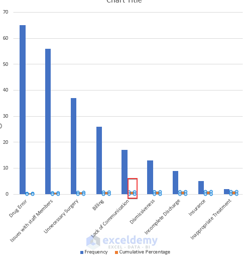
- Right-click it and choose Change Chart Type.
- Click Combo in Recommended Charts.
- Check the blank box beside Cumulative Percentage (the secondary axis will be the cumulative percentage).
- Click OK.
The Cumulative Percentage is displayed in a line.
Step 4: Formatting the Axis
- Choose the Secondary Axis.
- Right-click it.
- Select Format Axis.
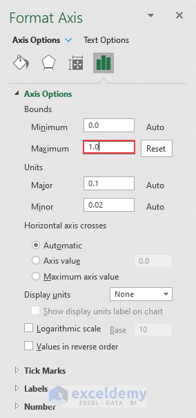
- In Axis Options, in Bounds, the Maximum value is 1.2 (120% is the maximum value).
- Change it to 1.0 (the highest value is 100%).
The chart will be displayed.

Step 5: Formatting the Data Points to decrease the column width
- Select any Column.

- Right-click it and choose Format Data Point.

- In Primary Axis, the Gap Width is 219%.

- Change it to 5%.
This is the output.

Download Practice Workbook
Download the following Excel workbook.
Related Articles
- How to Make a Pareto Chart Using Pivot Tables in Excel
- How to Create Dynamic Pareto Chart in Excel
- How to Use a Pareto Chart in Excel
<< Go Back to Excel Pareto Chart | Excel Charts | Learn Excel
Get FREE Advanced Excel Exercises with Solutions!
