In this article, we will show you how to interpret Pareto Chart in Excel. Pareto chart is used for finding out what sectors are major contributions to any cause. Suppose we went to the nearest medical hospital to see what types of diseases people are more prone to have and you are going to find out what type of food people are eating. To find most occurred diseases you will use Pareto chart and using Pareto Chart you can find out what type of food they are eating. Then you can correlate food and diseases to find what type of food causes it.
Why Do We Use Pareto Chart?
Pareto analysis has the basics of Pareto principle named after famous economist Vilfredo Pareto. He was remembered for the famous formula called 80/20 principle. Here according to Pareto, 80 percent of the event is controlled by the 20 percent of the factor. The real life examples are
- 80% market share owned by 20% of the company
- 80% of the fortune is acquired by 20% of the people
- 80% of the software issues caused by 20% of the bug
So we should use Pareto Chart in Excel to find out which major issues contribute to the problems, which are the main causes of the problem and identify them and solve them.
How to Interpret Pareto Chart in Excel: 2 Practical Examples
Here we have given 2 practical examples to interpret Pareto Chart. You will easily create your own data in Excel to set and apply your Pareto analysis. First we analyze Pareto Chart of restaurant Complaints and then we also create Pareto Chart to find out Disease and Food correlation.
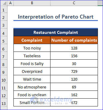
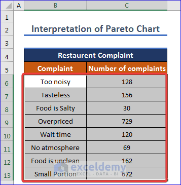
Here is the Data Table of Restaurant Complaints.
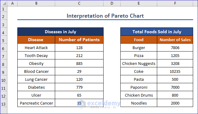
And this is the data table for Disease and Food Correlation which we will use to interpret a Pareto Chart.
In the following description, we will interpret this chart with useful discussions.
1. Analyzing Restaurant Complaints by Interpreting Excel Pareto Chart
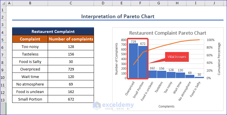
Here we will go to the Insert Tab, then ,we will go to Histogram option and select Pareto. And then we will create a Pareto Chart and find out the most contributing factors.
Steps:
- First you have to select the data from the table.
- Then, we are going to Insert to Statistics Chart. After that, we are going to select the Pareto chart.
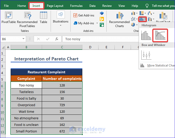
- Finally, we will get the result and give the title.
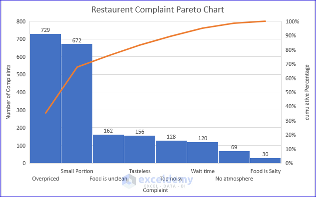
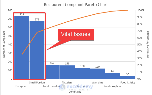
- Here, in this chart we can see people complaining that foods are overpriced and small portions. Both of them contribute more than the other contributing factors.
- Thus the Pareto Chart gives us the opportunity to focus on the problems.
Read More: How to Use Pareto Chart in Excel
2. Finding Correlation Between Food and Disease Interpreting Pareto Chart
In this example we will give the data table of the patients and the sales of food to find out which food is causing the diseases. The dataset we will use in this example is given below.
Steps:
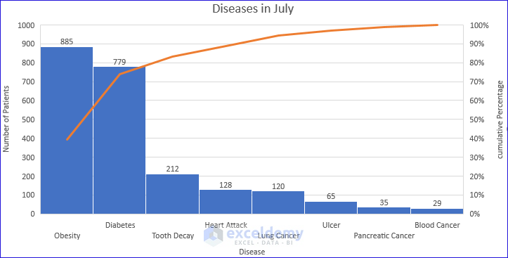
- First, we are going to select the Data Table of Disease in July and create a Pareto chart. To see the process of creating a Pareto Chart, please follow the steps of Example 1.
- Then, we will give title Diseases in July like previous example,
- Thus, we get the Pareto Chart of Diseases in July.
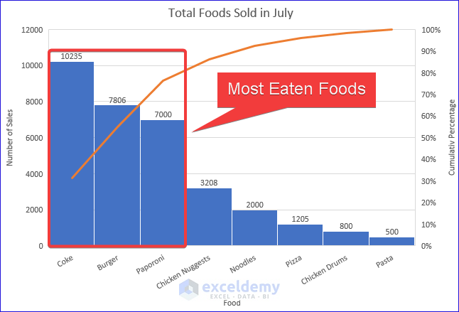
- Similarly, we can get the Pareto Chart for Total Foods Sold in July by selecting corresponding data in the Excel sheet.
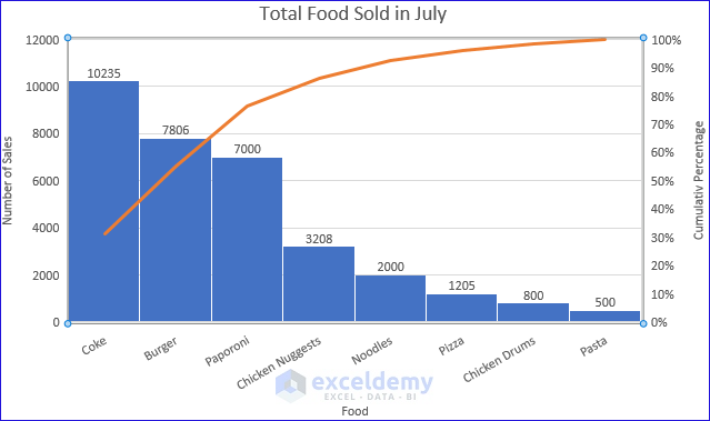
If we analyze the two charts, we can see that eating Coke, Burger and Paporoni contributes to Obesity and Diabetes.Here, we can gather an idea of what type of foods people usually like.
And the following figure shows us the common disease that may occur consuming those type of foods.
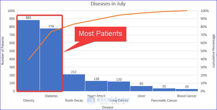
Thus Pareto Charts give us the idea what foods are contributing to the most occurring diseases.
Download Practice Workbook
You may download the following workbook to practice yourself.
Conclusion
In the above pictorial discussions, you can easily know how to interpret Pareto Chart in Excel. You can create your own custom data and interpret Pareto Chart like we have done it. Thus Pareto Chart will help you to find major issues of the problem easily.
Related Articles
- How to Create Pareto Chart with Cumulative Percentage in Excel
- How to Make Pareto Chart in Excel
- Create a Stacked Pareto Chart in Excel
- How to Make a Pareto Chart Using Pivot Tables in Excel
- How to Create Dynamic Pareto Chart in Excel
<< Go Back to Excel Pareto Chart | Excel Charts | Learn Excel
Get FREE Advanced Excel Exercises with Solutions!
