Excel Pareto Chart

How to Use a Pareto Chart in Excel (2 Suitable Examples)

Wondering how to use the Pareto chart in Excel. Do not worry, we are here for you. In this article, we will describe 2 ways to use a Pareto chart in ...

How to Create Dynamic Pareto Chart in Excel (with Simple Steps)

This Excel blog post provides a detailed discussion on how to create a dynamic Pareto chart in Excel. This kind of graph is helpful in determining ...

How to Create Pareto Chart with Cumulative Percentage in Excel

Pareto charts are used to identify the issues to focus on first in order to make improvements. This article walks readers through a few simple steps ...

How to Interpret Pareto Chart in Excel (2 Practical Examples)

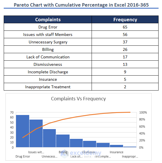
In this article, we will show you how to interpret Pareto Chart in Excel. Pareto chart is used for finding out what sectors are major contributions ...

How to Create a Stacked Pareto Chart in Excel (In Simple Steps)

In order to summarize values with bars and lines in descending order, it is best to use a Pareto Chart. It can visualize the dataset with elegance ...

How to Make Pareto Chart in Excel (with Easy Steps)

When you want to analyze or compare two or more things, a Pareto chart can be a helpful tool. A Pareto chart can be helpful in many situations where ...

How to Make a Pareto Chart Using Pivot Tables in Excel

We can easily create a Pareto Chart for a normal range or table. But the Pareto Chart command of Excel doesn’t work for a Pivot Table, we have to do ...

Advanced Excel Exercises with Solutions PDF


ExcelDemy
Logo