In order to summarize values with bars and lines in descending order, it is best to use a Pareto Chart. It can visualize the dataset with elegance and simplicity. In this article, I am going to explain 2 smart ways to create a stacked Pareto Chart in Excel. I hope it will be helpful for all Excel users.
What Is a Pareto Chart?
A Pareto chart is a form of a graph with both bars and a line graph, where the bars reflect individual values in descending order and the line the cumulative total. This chart is widely used for some project management tasks and it follows the 80/20 rule.
Step-by-Step Procedures to Create a Stacked Pareto Chart in Excel
We can also use the Recommended Charts command to create a Pareto chart in Excel. It is not as simple as the previous one. It is a detailed and manual process to create the chart. This process can be explained in three simple steps.
- Arrange data in descending order
- Calculate the percentile of a product on the whole amount
- Creation of a stacked Pareto chart
Step-01: Arrange Data in Descending Order
The first thing we need to do is to arrange our data in descending order. Maintain the following steps to do so.
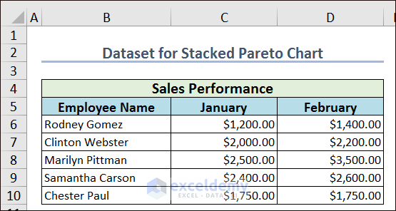
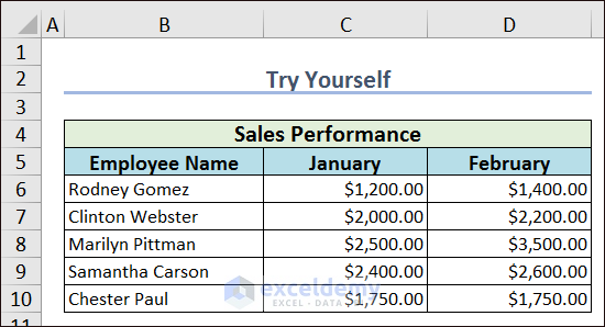
- Firstly, make a dataset with the related data to create a stacked Pareto chart. I have decorated my data of Employees’ sales performance in the Employee Name, January, and February columns.
- Apply the following formula in cell E6 and use Fill Handle to AutoFill the rest cells in column E to calculate the total sales amount.
=C6+D6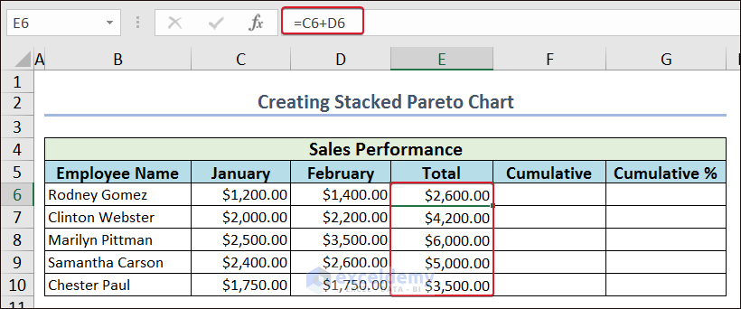
- Now, select all the values in column E and go to Home.
- From the Sort & Filter option, pick Sort Largest to Smallest.
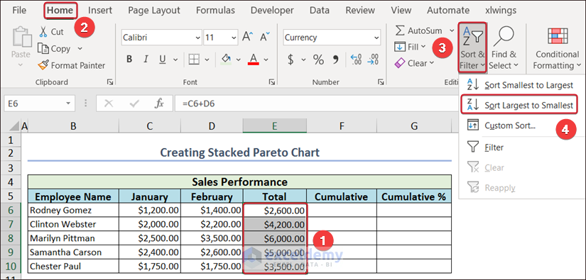
- A Sort Warning wizard will appear.
- Check the box named Expand the selection and click OK to finish the process.
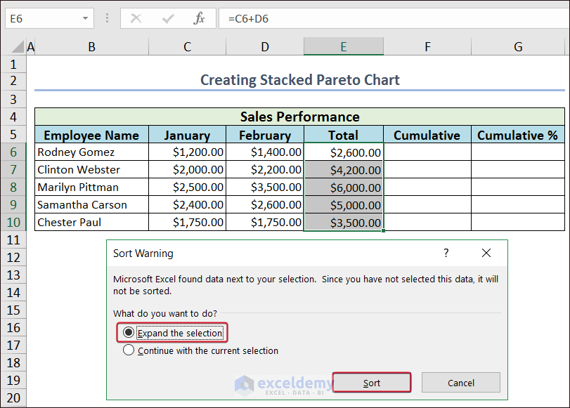
- Now, we have the Total column in descending order.

Step-02: Calculate Product Percentile on Whole Amount
After organizing the dataset, we need to do is find out the product percentile on the whole amount to reach our destination.
- First of all, apply the following formula in cell F6 to have the first value in the Cumulative column.
=E6
- Afterward, apply the following formula in cell F7 and AutoFill the rest cells in column F to calculate the cumulative amount.
=F6+E7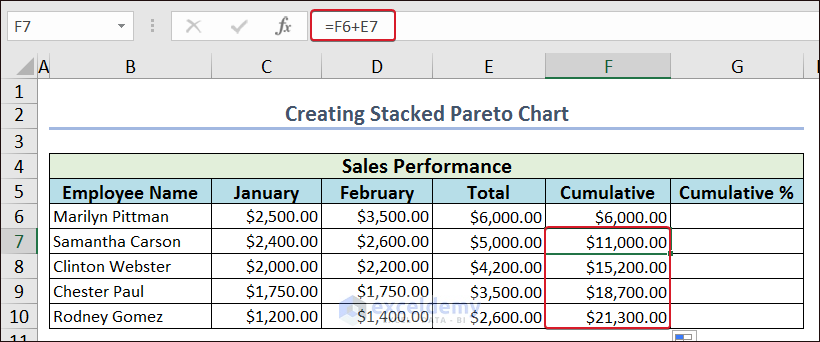
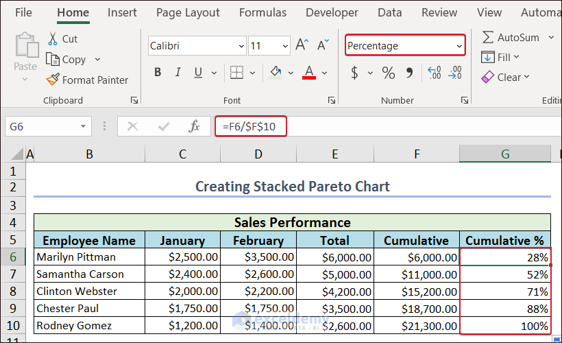
- To have the percentile of the cumulative values, apply the following formula in cell G6 and AutoFill the rest cells in column G.
=F6/$F$10- Then, select the values in Cumulative % and set the number format to Percentage.
Step-03: Creation of a Stacked Pareto Chart
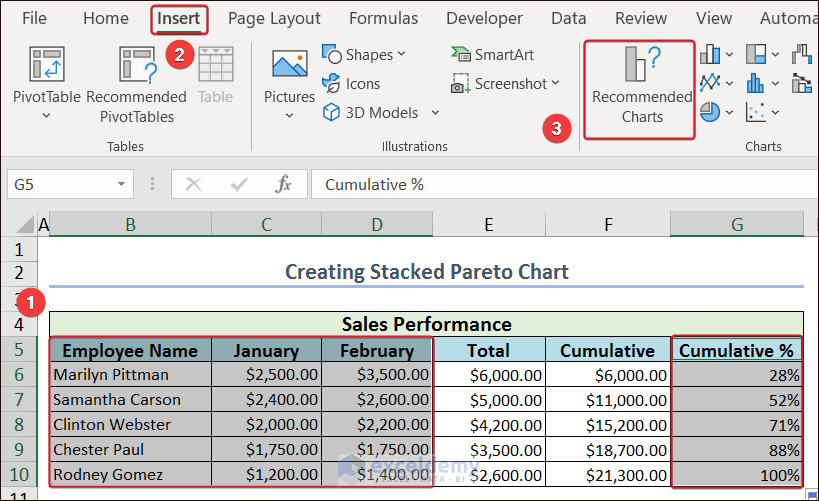
As we have a proper dataset to create a Stacked Pareto Chart, we can now create it quite easily.
- Select the Employee Name, January, February, and Cumulative %
- Go to the Insert tab and click on Recommended Charts from the ribbon.
- Now, from the Insert Chart wizard, go to the Recommended Charts tab and click on Clustered Column.
- After that, click OK.

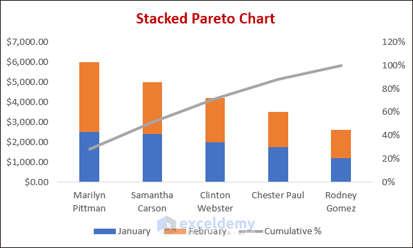
- Now, we have a Pareto Chart.
- After that, right-click on the mouse and pick the Change Chart Type… option.
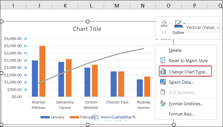
- Change Chart Type to Stacked Column for the January and February columns and click OK to finish the process.
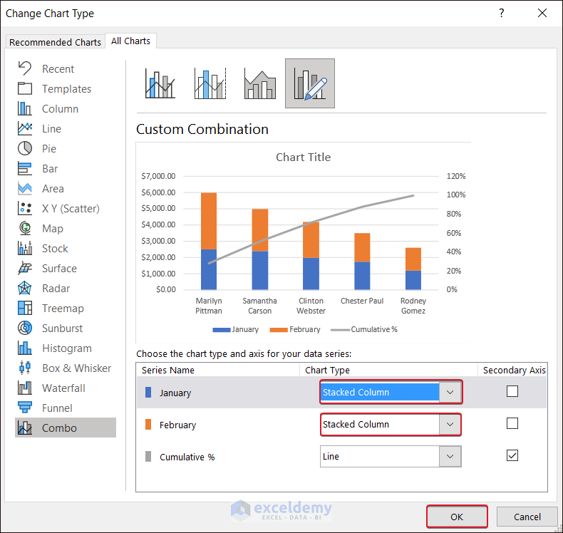
- Now, we have a proper Stacked Pareto Chart.
How to Create a Pareto Chart
A histogram is the simplest way to create a stacked Pareto chart. For this, you need to follow the following procedures.
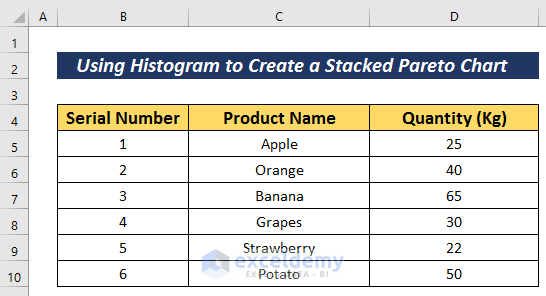
- Decorate your dataset with the related data to create a stacked Pareto chart. Here, I have organized my data of product sales in Serial Number, Product Name, and Quantity(Kg) columns.
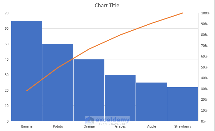
- Next, select the data with that you want to create the stacked Pareto chart.
- Then, go to the Insert tab.
- Click on the Insert Statistic Chart option.
- From the Histogram option, choose Pareto to create a stacked Pareto chart.

Thus, we can create a stacked Pareto chart in the simplest possible way.
Read More: How to Make a Pareto Chart Using Pivot Tables in Excel
Practice Section
For more expertise, you can practice here.
Conclusion
That’s all for the article. In this article, I have tried to explain 2 smart ways to create a stacked Pareto chart in Excel. It will be a matter of great pleasure for me if this article could help any Excel user even a little. For any further queries, comment below.
Related Articles
- How to Create Pareto Chart with Cumulative Percentage in Excel
- How to Create Dynamic Pareto Chart in Excel
- How to Use a Pareto Chart in Excel
- How to Interpret Pareto Chart in Excel
<< Go Back to Excel Pareto Chart | Excel Charts | Learn Excel
Get FREE Advanced Excel Exercises with Solutions!
