Introduction to Excel Pareto Chart
The Pareto chart, sometimes referred to as a sorted histogram chart, comprises columns arranged in descending order and a line chart displaying the cumulative percentage.
Below is a sample Pareto Chart.
What Is Pareto Analysis?
Pareto analysis is a problem-solving technique. The Pareto principle is the basis of Pareto Analysis. It is named after Italian economist Vilfredo Pareto. This analysis uses the Pareto chart to observe the most important issues in a dataset.
The Pareto principle, also known as the 80/20 rule, suggests that for most events, roughly 80% of the effects come from 20% of the causes.
Pareto Analysis includes the following steps:
- Define the problem
- Collect data
- Create a Pareto chart
- Analyze the chart
- Prioritize actions
- Monitor progress
Usages of Pareto Chart
Pareto Chart is widely used in the following cases:
- Controlling Quality: A Pareto chart is a tool used in manufacturing to figure out which defects happen most frequently during the production process. By using this chart, companies can determine which issues to tackle first to reduce defects and improve the overall quality of their products.
- Examining Customer Complaints: A Pareto chart is a helpful tool to examine customer complaints and determine the most common types of problems that customers face. This data can then be used to enhance customer service and tackle the most important issues.
- Analyzing Sales: A Pareto chart can show which products or services a business sells the most and which customers buy them the most. This information can help the business concentrate on marketing those products or services and improve how many they sell.
- Inspecting Employee Performance: A Pareto chart is a helpful tool to study the errors that occur frequently among employees. By using this chart, we can recognize which types of mistakes happen most often. This information can be beneficial to identify areas where employees need more training. By improving these areas, we can enhance the overall performance of employees.
- Analyzing Website Traffic: Using a Pareto chart can help you examine the traffic on your website and pinpoint the primary sources of visitors. This data can be beneficial in directing your marketing efforts toward the sources that generate the most traffic. Additionally, this information can assist in improving the performance of your website by identifying areas that require attention.
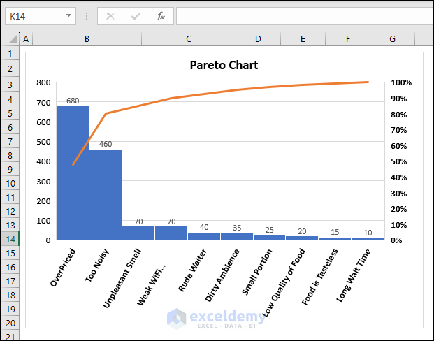
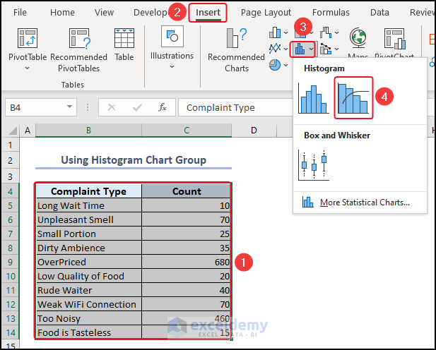
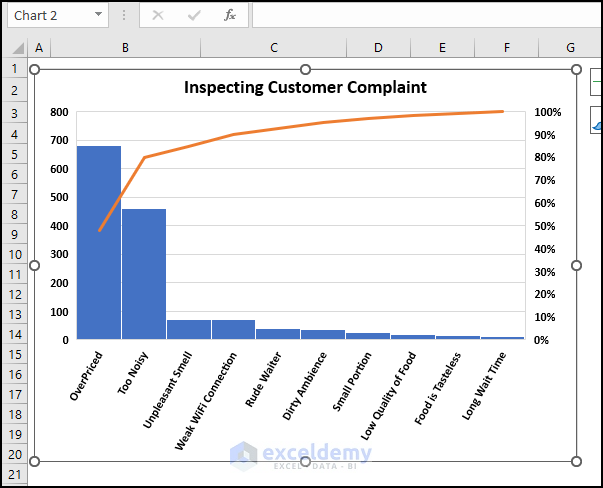
Example 1 – Inspecting Customer Complaint Using Pareto Chart in Excel 2016 and Newer Versions of Excel
1.1. Using Histogram Chart from Insert Tab
- Select the entire dataset >> go to Insert.
- Click on the Histogram chart group >> select Pareto.
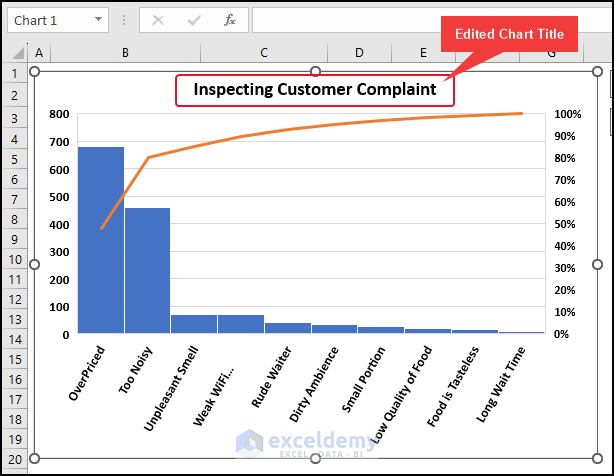
You can see the Pareto chart.
We have edited the Chart Title and axis font.
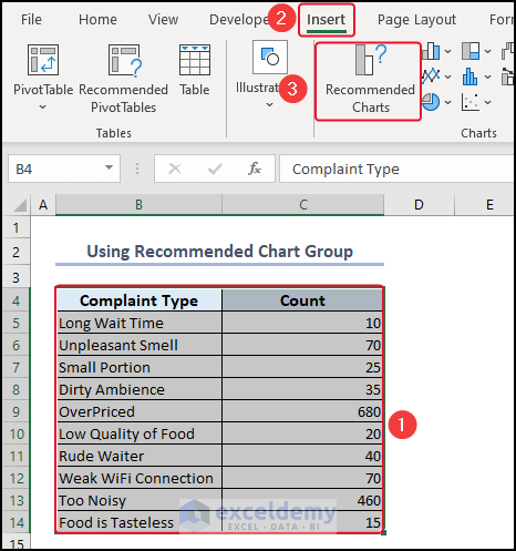
1.2. Use of Recommended Chart Group
- Select the entire dataset >> go to Insert.
- Select Recommended Charts.
The Insert Chart dialog box will open.
- From All Charts >> click on Histogram.
- Select the Pareto chart >> click OK.
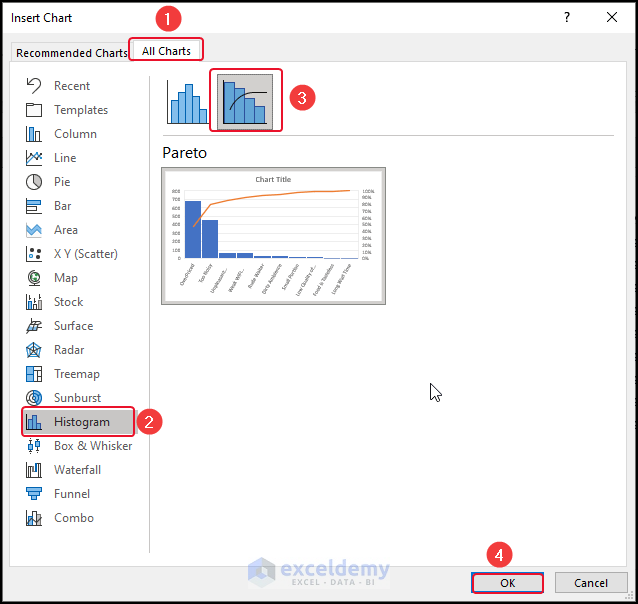
The Pareto chart will be inserted.
Read More: How to Create Dynamic Pareto Chart in Excel
Example 2 – Analyzing Sales Data Using Pareto Chart in Excel 2013 and Earlier Versions of Excel
We have taken the following sample dataset which has a Customer Name and Sales column.
- Select the Sales column >> go to the Home tab.
- From the Sort & Filter group >> select Sort Largest to Smallest.
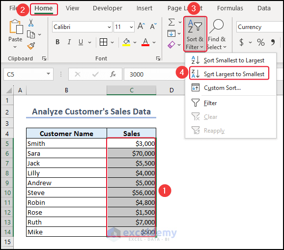
- In the Sort Warning dialog box, select Sort.
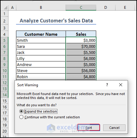
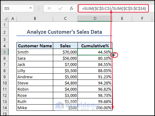
- Add a Cumulative%
- Enter the following formula using the SUM function in cell D5.
=SUM($C$5:C5)/SUM($C$5:$C$14)- Press ENTER.
You will get the result in cell D5.
- Drag down the formula with the Fill Handle tool to other cells.
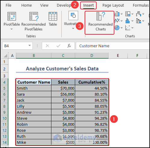
To insert a Pareto chart,
- Select the entire dataset >> go to the Insert tab >> click on Recommended Charts.
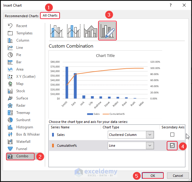
The Insert Chart dialog box will open.
- From the All Charts group >> select Combo > choose the Custom Combination.
- Mark the corresponding axis of the Line chart as the secondary axis.
- Click OK.
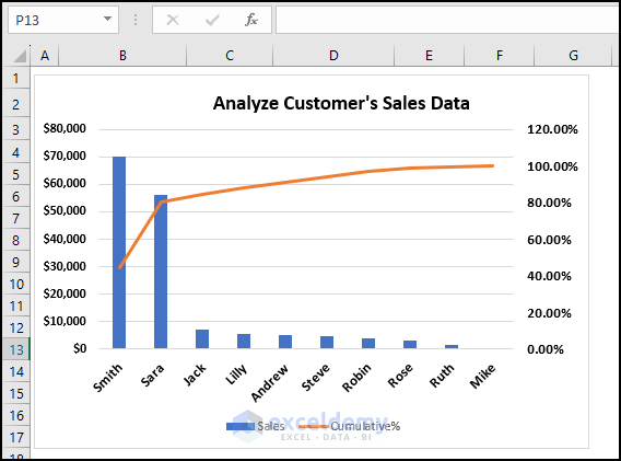
The Pareto chart will be inserted.
Read More: How to Create Pareto Chart with Cumulative Percentage in Excel
How to Format a Pareto Chart in Excel
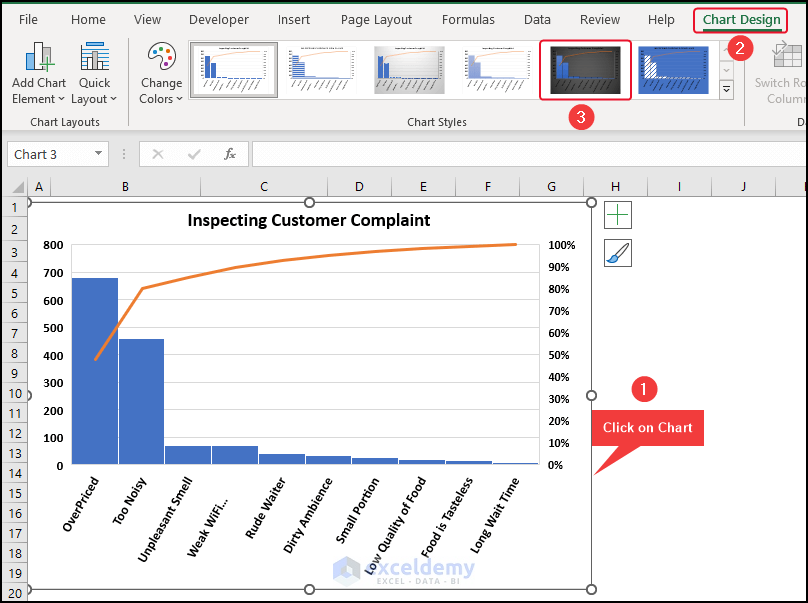
To change the chart style,
- Click on the chart >> go to Chart Design.
- From the Chart Styles group >> select a Chart Style.
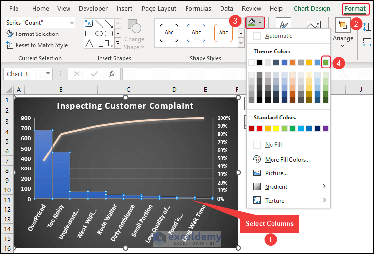
To change the fill color of the columns,
- Select the columns >> go to the Format tab.
- From the Fill Color group >> select a color.
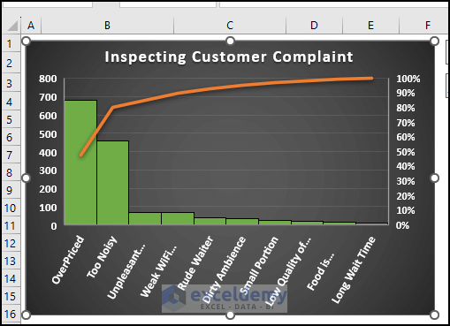
The formatted Pareto chart is as shown below.
Advantages of a Pareto Chart in Excel
- A Pareto chart helps to find the main reason for a problem and solve it.
- By using this chart, you can turn business problems into facts and create plans to address them.
- This makes problem-solving easier and improves decision-making.
- The Pareto chart in Excel gives a simple and clear picture of the information, making it easier to comprehend and examine. It enables you to detect patterns and tendencies that may not be obvious from just looking at the original data.
- The Pareto chart is helpful in making things better because it allows you to keep track of how your improvements are working over time.
Limitations of Pareto Chart in Excel
- The Pareto chart alone cannot provide a complete understanding of the root cause of a problem. In cases where a problem has multiple aspects, creating multiple Pareto charts can help identify issues at each level.
- The Pareto chart is based on frequency distribution, so it cannot be used to calculate statistical values such as mean, standard deviation, etc.
- The Pareto chart does not provide information about the severity of the problem or how much improvement can be made by implementing changes to the process.
- Pareto charts assume that each group or factor is not related to the others. However, in real life, some factors can be linked or influenced by each other.
- Pareto charts are most useful when the data is in distinct categories that can be counted or measured. They may not work well with continuous data that falls on a continuous scale.
Things to Remember
- Before creating a Pareto chart, it’s important to group similar problems together. It’s recommended to keep the number of groups below ten.
- The data should be arranged from the most frequent to the least frequent. We also need to figure out the total percentage of the frequencies.
- The pareto analysis only looks at past data and doesn’t predict the future. So, it’s important to keep updating the data to improve the process continually.
- We can make multiple Pareto charts for each problem and analyze the sub-issues in each chart. We can repeat this process for as many levels as needed.
Frequently Asked Questions
1. What is 80 20 Pareto in Excel?
The 80 20 Pareto principle is a concept in statistics that suggests that 80% of the results come from only 20% of the causes. This is also known as the “Pareto analysis” or the “80/20 rule.”
2. What Type of Data is Best Suited for a Pareto Chart?
Pareto Charts are typically used for data that can be grouped into categories, such as customer complaints, product defects, or types of errors. They are not ideal for data that is continuous or measured on a scale, such as time or temperature. However, you can still use a Pareto Chart for continuous data by grouping it into categories or ranges.
3. What is the Difference Between a Histogram and a Pareto Chart?
A Pareto chart is like a histogram, but instead of showing the bins in order of size, they are arranged from the most frequent to the least frequent.
Download Excel File
Related Articles
<< Go Back to Excel Pareto Chart | Excel Charts | Learn Excel
Get FREE Advanced Excel Exercises with Solutions!

Dear Afia: I´ve found your article about Pareto very interesting and useful.
I am motivated to read other articles wrote by you.
I would like to receive your pdf document problems in excel and solutions.
And your newsletter too.
Very thanks,
Javier E. Martinez
[email protected]
[email protected]
Hello Javier,
Thank you so much for your kind words! I’m really glad to hear that you found Pareto Chart article helpful and motivating. You can find more of Afia’s Excel Tutorials on the ExcelDemy website.
Thanks again for your support!
Best regards,
ExcelDemy
Hello Javier,
Thank you so much for your kind words! I’m really glad to hear that you found Pareto Chart article helpful and motivating. You can find more of Afia’s Excel Tutorials on the ExcelDemy website.
Thanks again for your support!
Best regards,
ExcelDemy