What Is a Pareto Chart?
A Pareto chart combines columns sorted in descending order with a line representing cumulative total percentages. It’s a powerful tool for highlighting the most significant factors in a dataset.
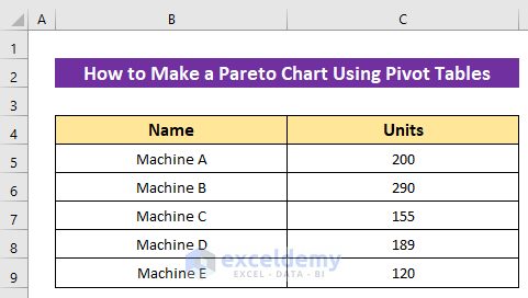
Dataset Overview
- Imagine you have a dataset showing daily production from five machines.
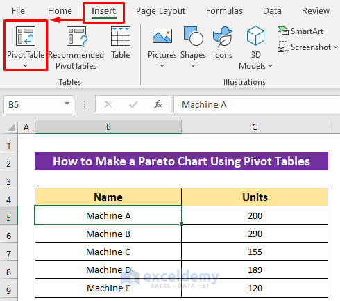
To create a Pareto Chart, start by making a Pivot Table from your data range.
- Select any data from your dataset.
- Click on Insert and select PivotTable.
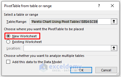
- A dialog box will appear, automatically selecting the data range. Choose your desired worksheet option (e.g., New Worksheet) and click OK.
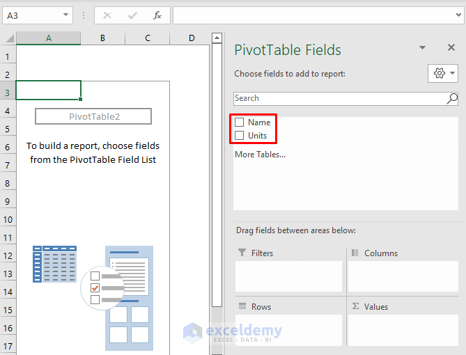
- A new worksheet will open with the PivotTable Fields on the right side.
- Mark the headers from the fields to set up your Pivot Table.
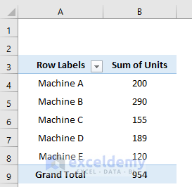
The Pivot Table will look like the image below:
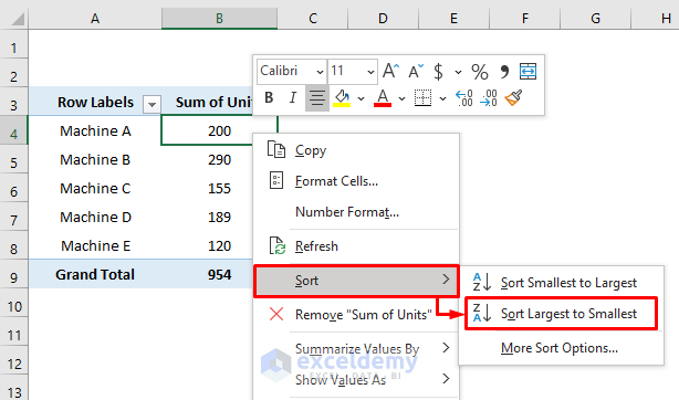
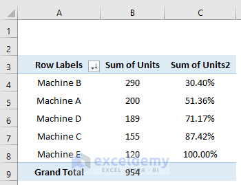
- For the Pareto chart, sort the Sum of Units column in descending order.
- Right-click on any data point and choose Sort and select Sort Largest to Smallest.
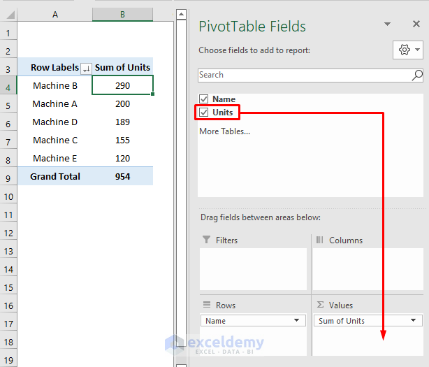
- Instead of using the Copy command, let’s do this more efficiently using PivotTable Fields.
- Drag the Units header into the Sum of Units field.
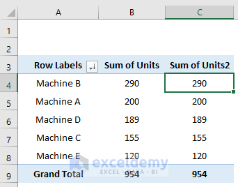
You’ll see a new column with serial numbers (thanks to Pivot Tables).
We’ll find the cumulative percentage in the new column.
- Calculate the cumulative percentage for this new column:
- Right-click on any data point in the new column.
- Select Show Values As and select %Running Total In.
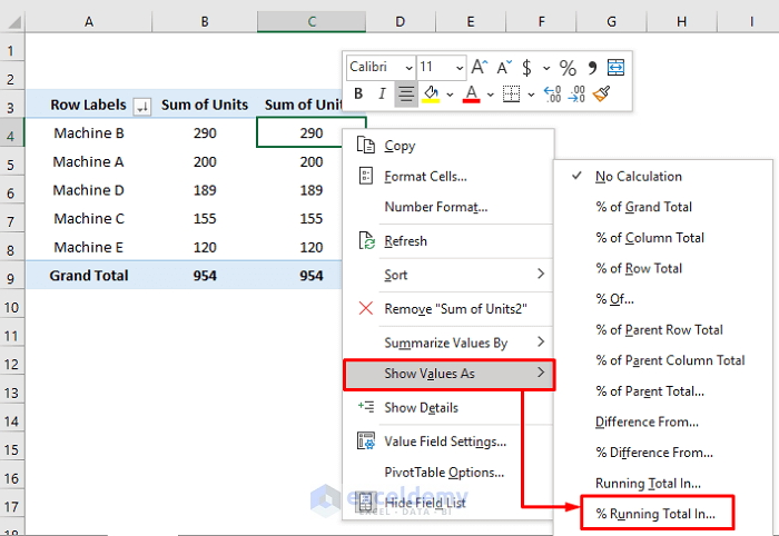
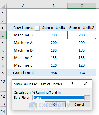
- Choose the base field and press OK.
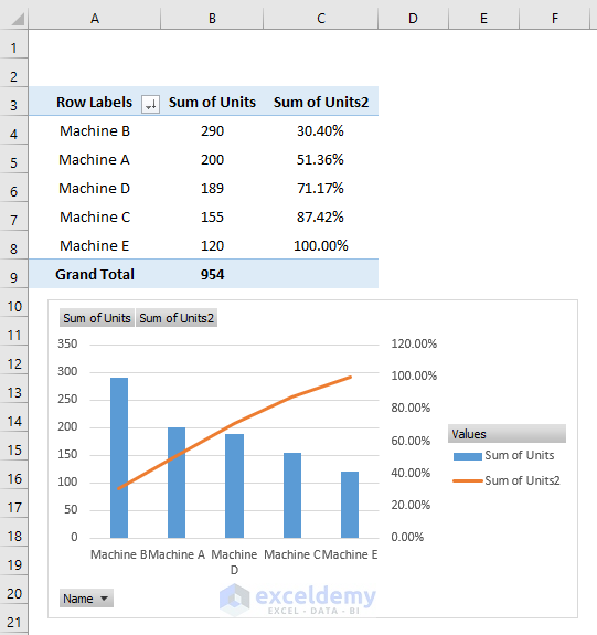
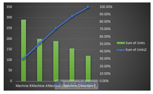
Our Pivot Table is ready to create a Pareto chart.
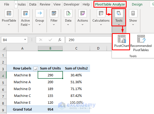
- Select any data from the Pivot Table.
- Click on PivotTable Analyze, choose Tools and click on PivotChart.
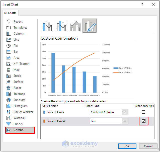
- In the dialog box named Insert Chart, choose the Combo option.
- Mark Sum of Units2 as the Secondary Axis and press OK.
You’ll have a Pareto chart.
Read More: How to Use Pareto Chart in Excel
Customizing a Pareto Chart
Hide All Field Buttons
- Hide all field buttons:
- Right-click on any field button and select Hide All Field Buttons.


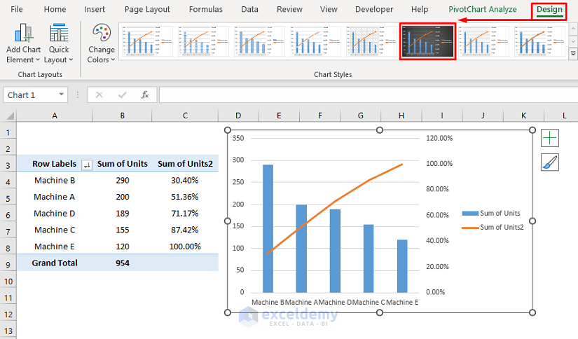
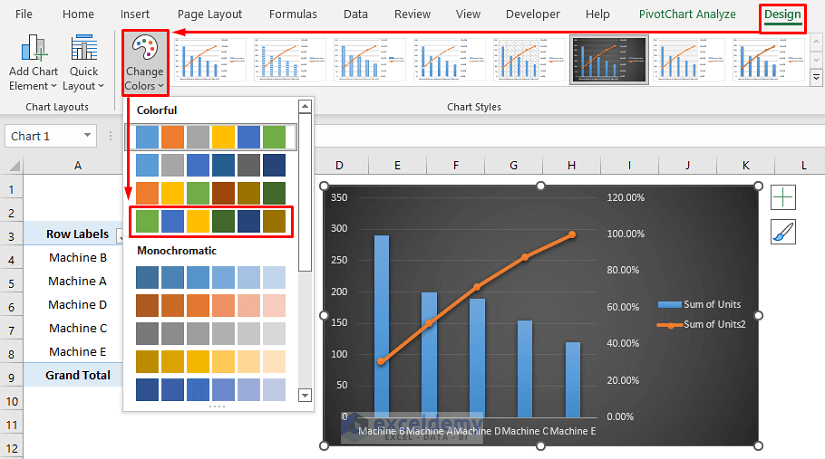
Change Design
- Change the chart design:
- Go to Chart Styles.
- Select your desired chart design from the Style section.
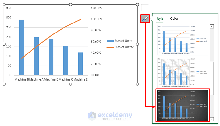
- Or click anywhere on the chart and select a design from the Design ribbon.

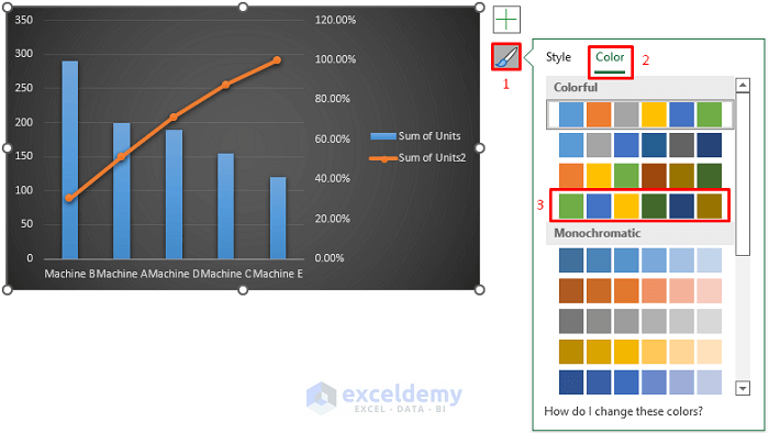
Adjust Color
- Go to Chart Styles or select the Pareto chart and click on Design.
- Select Change Colors and select a color template from the list.

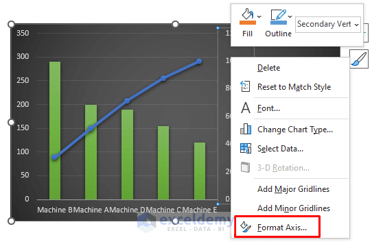
Format Axis
To customize the axis, such as changing minimum and maximum bounds, follow these steps:
- Right-click on the axis you want to format (e.g., the percentage axis).
- Select Format Axis from the context menu.
- Alternatively, you can double-click on the axis to open the Format Axis field directly.
- In the Axis Options section, set the minimum and maximum bounds. For example, set 0 for the minimum (representing 0%) and 1 for the maximum (representing 100%).
- Press ENTER.
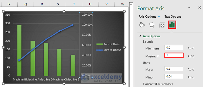
Now your Pareto chart’s axis is formatted according to the new bounds.
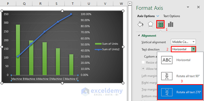
Change Axis Alignment
If your horizontal data labels appear messy due to longer names, consider aligning them vertically for clarity:
- Follow the first two steps from the previous section to open the Format Axis field.
- Click on the Size & Properties icon.
- From the Text direction dropdown, select Rotate All Text 270°.
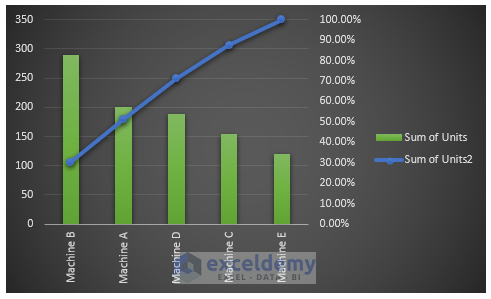
- Your final output will have neatly aligned data labels.
Download Practice Workbook
You can download the practice workbook from here:
Related Articles
- How to Create a Stacked Pareto Chart in Excel
- How to Create Pareto Chart with Cumulative Percentage in Excel
- How to Create Dynamic Pareto Chart in Excel
<< Go Back to Excel Pareto Chart | Excel Charts | Learn Excel
Get FREE Advanced Excel Exercises with Solutions!
