

A worksheet full of numbers can be difficult to interpret at a glance. Excel offers many ways to turn those numbers into visual information without building a complicated dashboard. Excel goes far beyond basic column, bar, and pie charts. With built-in chart types, conditional formatting, sparklines, and a few creative techniques, you can create visuals that reveal patterns, tell clearer stories, and engage audiences more effectively.
In this tutorial, we will show 10 creative ways to visualize data in Excel. These practical and creative approaches go beyond the basics.
1. Sparklines (In-Cell Mini Charts)
Sparklines embed tiny line, column, or win/loss charts inside individual cells. They are perfect for showing trends next to raw numbers without taking up dashboard real estate.
Steps:
- Select the cells where you want the sparklines
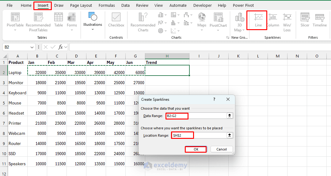
- Go to the Insert tab >> from Sparklines >> choose Line, Column, or Win/Loss
- In the Create Sparklines dialog box:
- Set the Data Range to B2:G2
- Set the Location Range to H2
- Click OK
- Copy the sparkline down to the remaining products
- Use the Sparkline Tools tab to highlight high/low points, change colors, or show markers
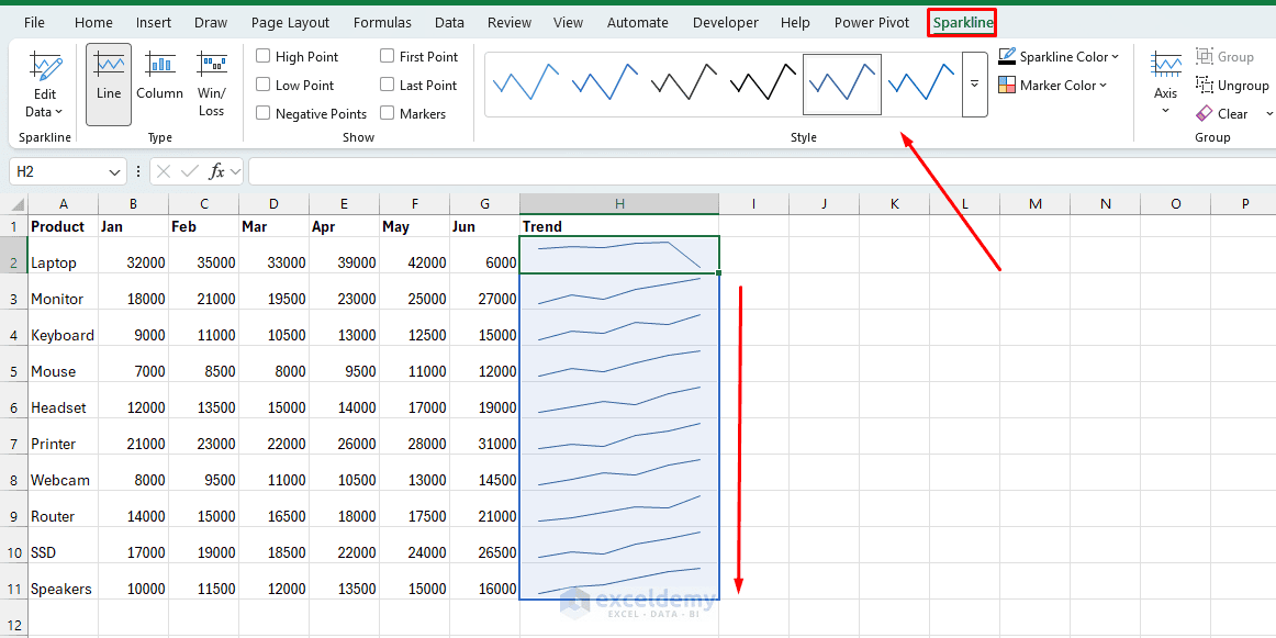
They are perfect for monthly sales trends per product, performance over time in tables, or compact KPI cards. Use sparklines for dashboards where you need to show 12 months of trend data for 20 products without building 20 separate charts. Right-click a sparkline group to adjust markers, axis settings, or color the high/low points.
2. Conditional Formatting Heat Maps (Color Scales)
Turn a plain numbers table into a visual heat map that instantly highlights highs, lows, and patterns.
Steps:
- Select your data range
- Go to the Home tab >> select Conditional Formatting >> select Color Scales
- Choose a 2- or 3-color scale (e.g. red-yellow-green or blue-white-red)
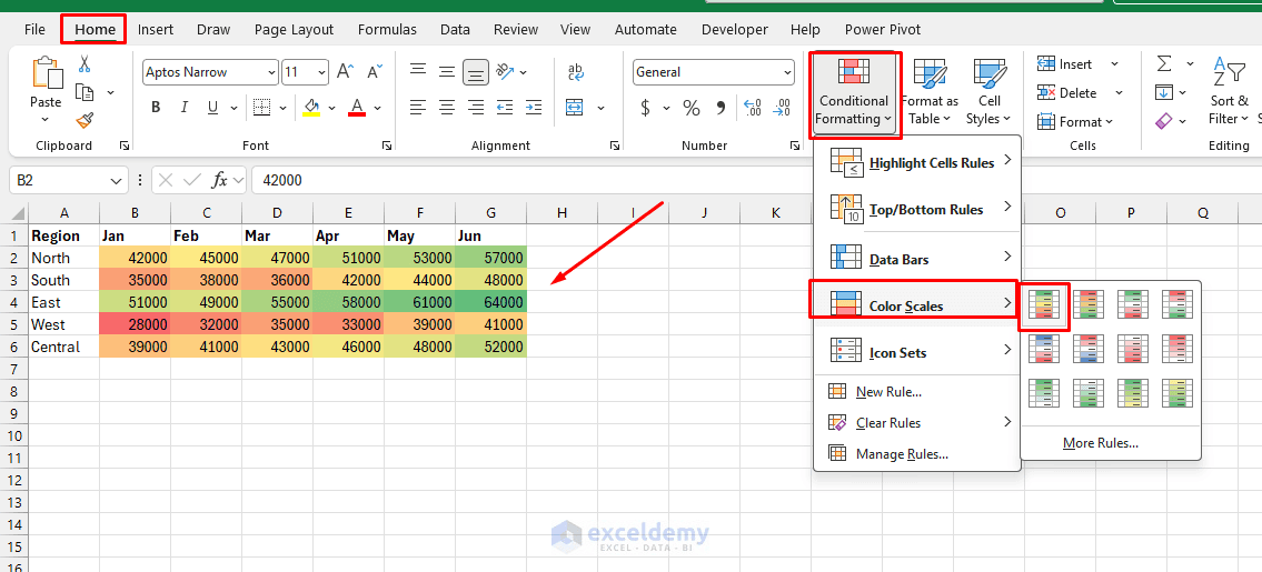
- For more control, use New Rule >> select Format all cells based on their values
This works great for monthly sales by region, exam scores by student, or server uptime by day — anywhere pattern recognition at a glance matters more than exact numbers.
Pro tip: Combine with icon sets or data bars for even richer in-cell visuals. This approach is especially effective for matrices like sales by region and month, or correlation tables.
3. Data Bars for In-Cell Comparisons
You don’t always need a chart to compare values. Conditional Formatting Data Bars can turn ordinary cells into mini horizontal bar charts. Similar to heat maps, data bars show magnitude instead of just color intensity.
Steps:
- Select your range
- Go to the Home tab >> select Conditional Formatting >> select Data Bars
- Choose a gradient or solid fill
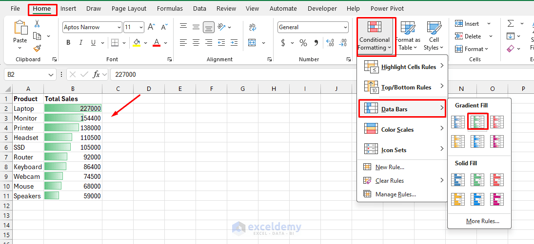
Data bars let you compare values directly inside the cell — no separate chart needed. Combine with Show Bar Only (edit the rule) to hide the numbers and display only the bars, which read more like a mini bar chart embedded in your table. They are useful when you want visualization without taking up additional worksheet space.
4. Icon Sets for Status at a Glance
Instead of showing performance as numbers alone, you can use symbols such as arrows, circles, or traffic lights. Icon sets replace numbers with visual indicators like arrows, traffic lights, stars, and flags.
Steps:
- Select your data range
- Go to the Home tab >> select Conditional Formatting >> select Icon Sets
- Choose a set (3 Traffic Lights, 3 Arrows, 5 Ratings, etc.)
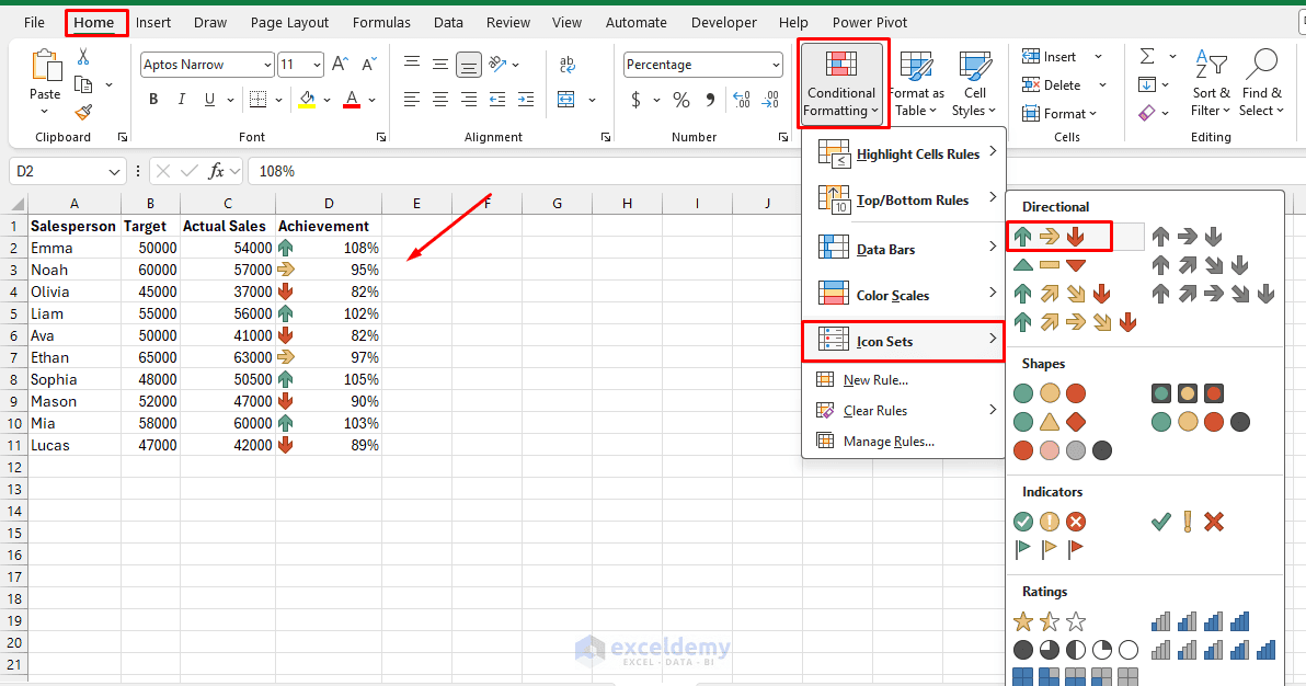
- Customize thresholds via Manage Rules >> Edit Rule to control what counts as “good,” “warning,” or “bad”
- Select the rule and click Edit Rule
- Set Type to Number
- Set the thresholds to:
- Green: >=1
- Yellow: >=0.9
- Red: <0.9
- Click OK
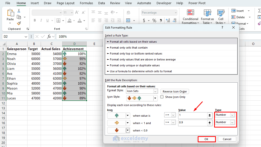
Icon sets are great for KPI dashboards, project status trackers, or risk scoring — anywhere the viewer needs a fast read rather than a precise value. They are particularly useful in dashboards with many rows of data.
5. Waterfall Charts for Cumulative Change
Waterfall (or bridge) charts show how positive and negative values contribute to a total, making them ideal for profit/loss breakdowns, budget vs. actual comparisons, or inventory changes.
Steps:
- Arrange data with a starting value, increases, decreases, and an ending total
- Select the data
- Go to the Insert tab >> from Waterfall, Funnel, Stock, or Surface Chart >> select Waterfall
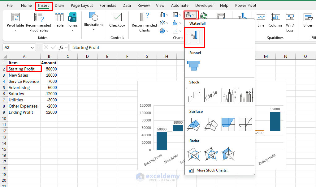
- Click the Starting Profit bar in the chart twice to select only that data point
- Right-click >> choose Set as Total
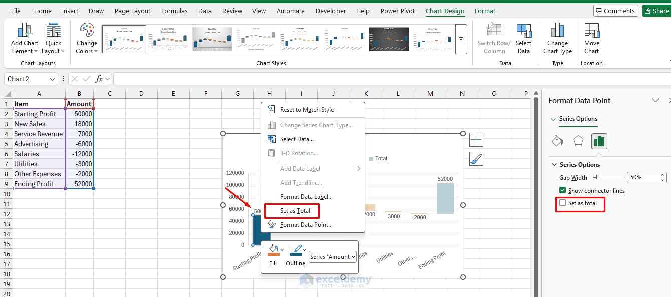
- Repeat the process for Ending Profit
- Right-click the total column(s) >> select Set as Total so they start from the baseline
After doing this, both Starting Profit and Ending Profit should start from the horizontal axis instead of floating.
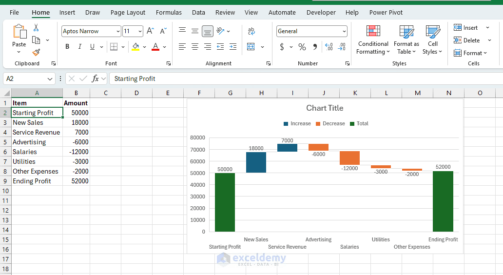
This is one of the most underused native chart types — it tells a story that a stacked bar chart cannot. It is best for financial statements, variance analysis, and “how we got from A to B” narratives.
6. Combo Charts (Column + Line with Secondary Axis)
Combine two chart types on one canvas to compare different scales or metrics (e.g. sales volume as columns and profit margin as a line).
Steps:
- Select data with two series
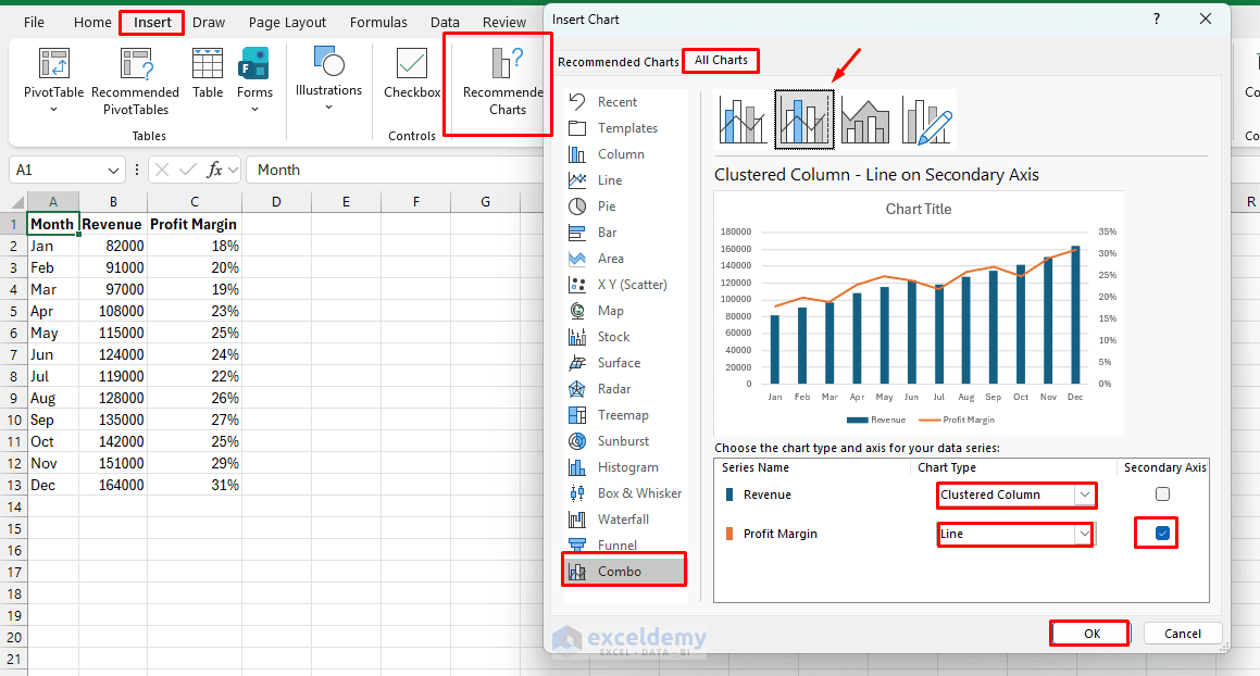
- Go to the Insert tab >> select Recommended Charts >> select All Charts >> select Combo
- Select Clustered Column – Line on Secondary Axis
- Set:
- Revenue as Clustered Column
- Profit Margin as Line
- Enable Secondary Axis for Profit Margin
- Click OK
The chart will display a trend line for profit overlaid against revenue.
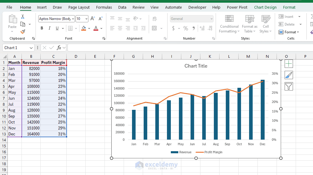
Best for actual vs. target with a trend line, revenue plus growth rate, or any dual-metric comparison. A common pairing is bars for volume with a line for a trend or target threshold overlaid on top.
7. Visualize Geographic Data with a Map Chart
If your dataset contains locations such as countries, states, or regions, a Filled Map Chart can make geographic patterns much easier to recognize.
Steps:
- Select the location and sales columns
- Go to the Insert tab >> select Maps >> select Filled Map
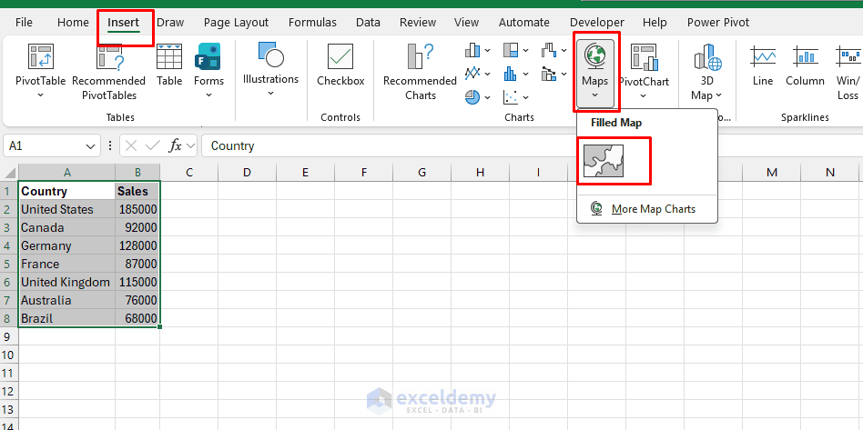
- Excel automatically recognizes the countries and creates the map
- Use Format Data Series to adjust the map area or labels if needed
- The map makes geographic differences in sales much easier to recognize
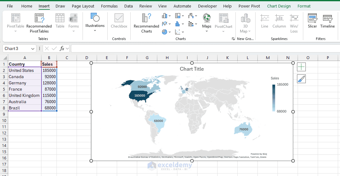
Make sure location names are unambiguous. Adding a country column can help Excel distinguish locations with similar names. This chart type is best for regional sales, demographic data, or any location-based performance metrics.
8. Treemap Charts for Hierarchical Proportions
Treemaps display hierarchical data as nested rectangles, where size represents value. They show part-to-whole relationships across categories and subcategories using rectangles sized by value.
Steps:
- Organize data with categories and subcategories (e.g. Region/Category → Product → Sales)
- Select the whole range
- Go to the Insert tab >> select Hierarchy Chart >> select Treemap
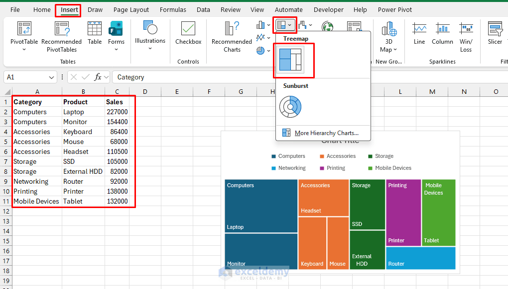
Treemaps are useful for budget breakdowns by department and sub-department, or sales by region and product line — situations where a pie chart would become cluttered with too many slices.
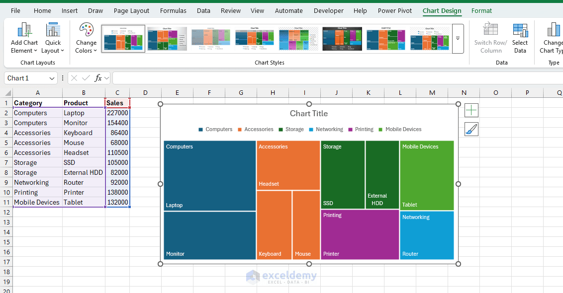
They are best for portfolio composition, market share by category, or file/folder size analysis, packing a lot of hierarchical information into a compact space.
9. Camera Tool for Live Linked Snapshots
The Camera tool creates a live picture of a range of cells (including charts, tables, or conditional formatting) that updates automatically as the source data changes. Unlike a normal screenshot, this picture refreshes whenever the source cells change, which makes it useful for dashboards and summary reports.
Add the Camera Tool:
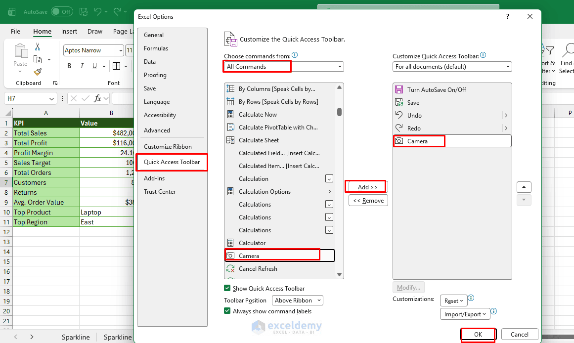
The Camera command may not appear on the Ribbon by default, so add it to the Quick Access Toolbar first.
- Go to the File tab >> select Options >> select Quick Access Toolbar
- Under Choose commands from, select All Commands >> select Camera >> click Add
- Click OK
Create the Dynamic Picture:
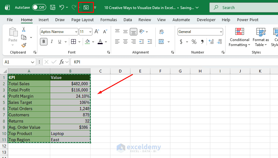
- Select a range
- Click the Camera icon on the Quick Access Toolbar
- Move to the location where you want to display the visualization
- Click once on the worksheet
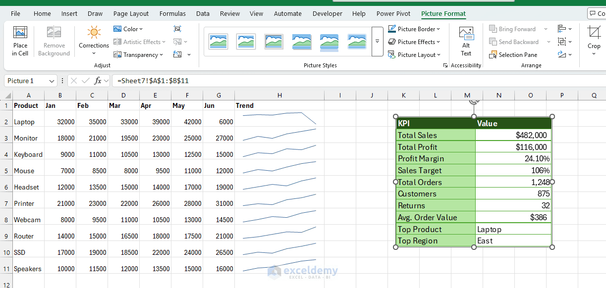
The Camera tool is a favorite for building single-page executive dashboards that pull together snapshots from multiple tabs into one clean view, without duplicating or breaking formulas. It is especially useful when you want to place a formatted table, KPI panel, or small report section in a dashboard without rearranging the original cells. It can even display a range from another worksheet while keeping the visual linked to its source.
10. Interactive Dashboards with PivotCharts and Slicers
Turn static charts into interactive experiences. Users can filter by region, product, time period, and more — without changing any formulas.
Steps:
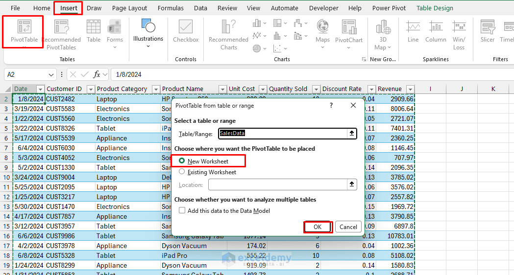
- Convert your data to a Table (Ctrl+T) or set up a PivotTable
- Go to the Insert tab >> select PivotTable
- Choose your location >> click OK
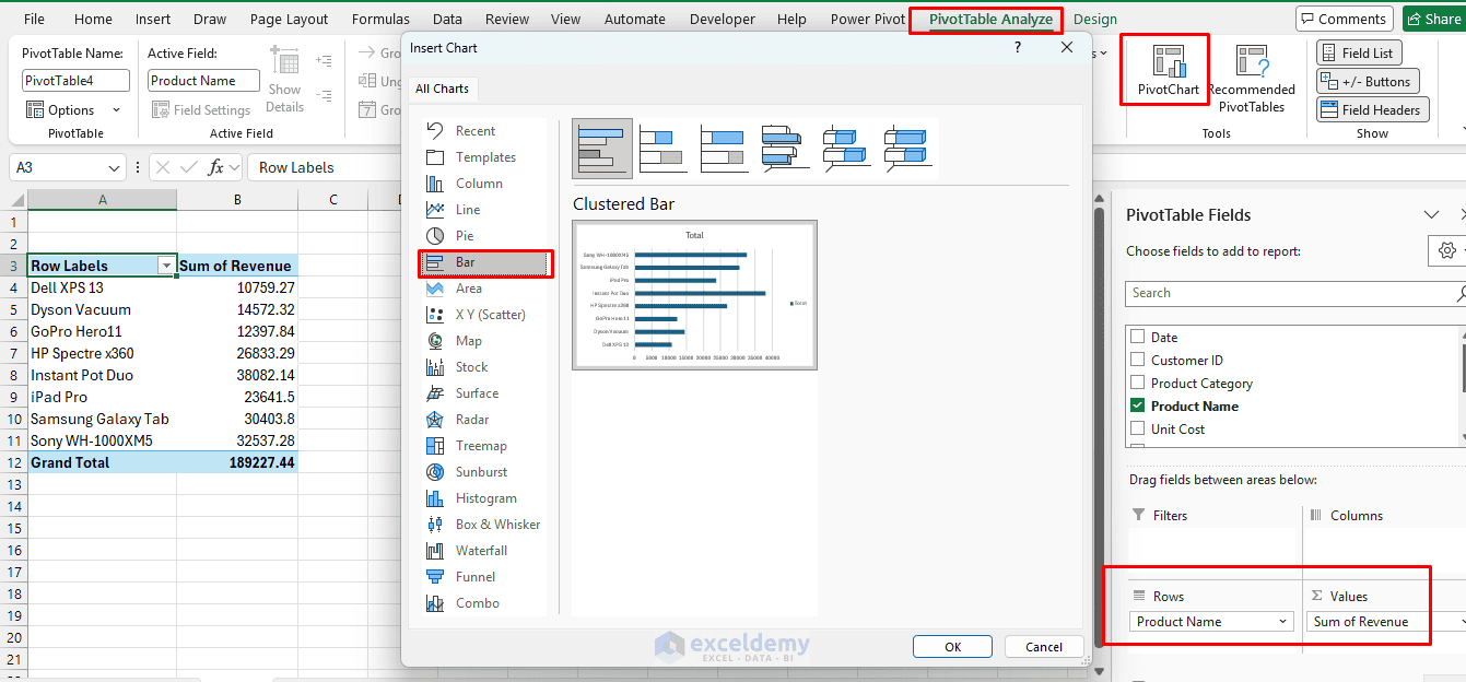
- Go to the PivotTable Analyze tab >> select PivotChart >> choose any chart type
- Go to the PivotChart Analyze tab >> select Insert Slicer (or Timeline for dates)
- Arrange multiple PivotCharts and slicers on a dashboard sheet
- Format consistently and add titles and KPIs
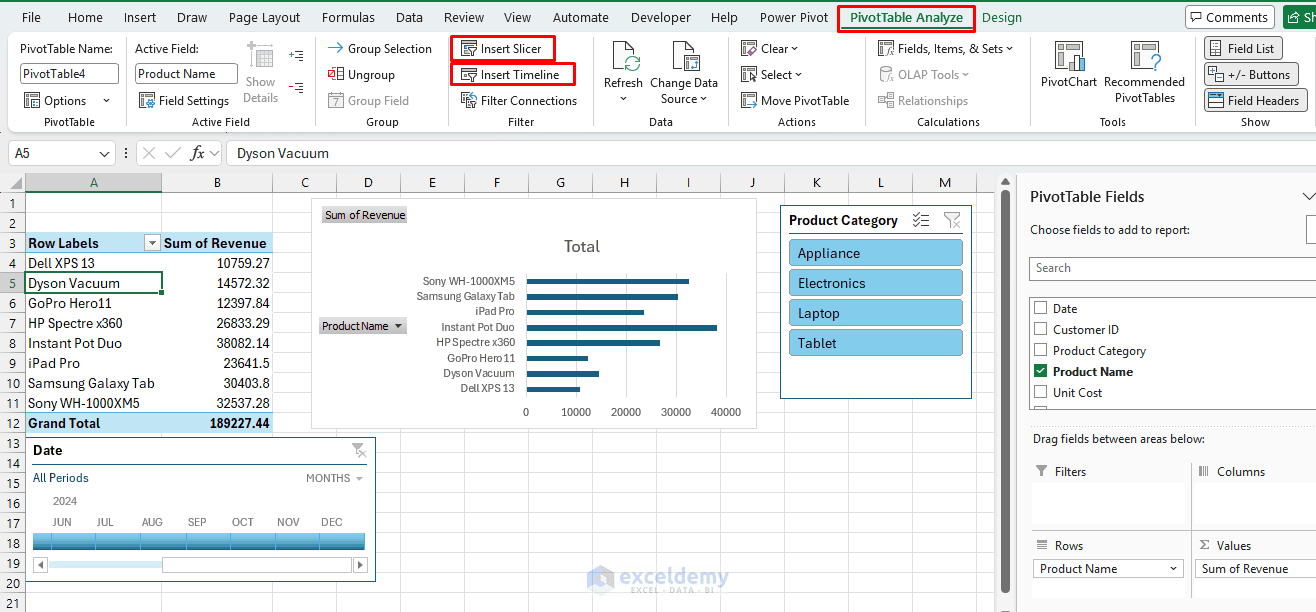
This turns a static report into something a non-technical stakeholder can explore on their own — click a slicer, and every chart and table on the sheet updates together.
Conclusion
These 10 creative ways to visualize data in Excel show that effective visualization doesn’t always require complex dashboards or advanced charting tools. Features such as Sparklines, Conditional Formatting, Icon Sets, Combo Charts, Waterfall Charts, Map Charts, and dynamic charts can turn an ordinary worksheet into a much more readable report. The key is to choose the visualization that matches the message you want the data to communicate. Use Sparklines for trends, heat maps for patterns, KPI icons for status, and specialized charts when you need to explain relationships or changes. Combining several of these techniques can also help you build clean, interactive Excel dashboards while keeping the underlying data easy to maintain.
Get FREE Advanced Excel Exercises with Solutions!


Thank you Shamima. Great ways for visualization in Excel.appreciate you share the Excel file you used in this tutorial for my practicing.
Hello Abdelmutaal,
Thank you for your kind words. I’m glad you found the visualization methods helpful. It’s great to know that the Excel file is also useful for your practice.
We appreciate your support and hope you continue learning with ExcelDemy.
Regards,
ExcelDemy
Thank you for your reply. Apparently you missed to attach the Excel file.
Hello Abdelmutaal,
Sorry to hear that the file is not attached. Here, I am attaching the file, please feel free to download it form here to practice yourself.
10 Creative Ways to Visualize Data in Excel.xlsx
Regards,
ExcelDemy
Nice work
Hello Darren,
Thanks for your feedback and appreciation. Glad to hear that you liked my work.
Keep exploring ExcelDemy to get such helpful content.
Regards,
ExcelDemy