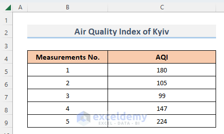
The dataset below contains measurements of the Air Quality Index of Kyiv, the capital of Ukraine.
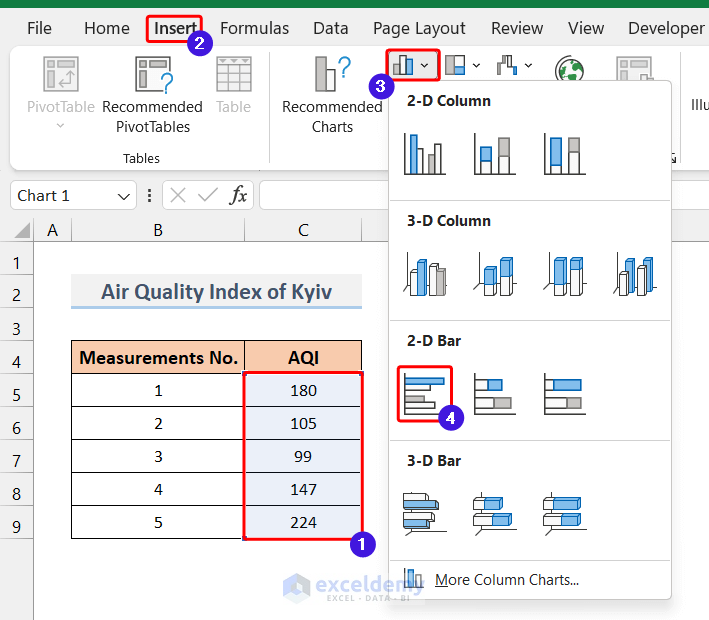
To create a bar chart, select the AQI column and go to the Insert tab >> Insert Column/ Bar Chart. Select the bar chart that fits your needs.
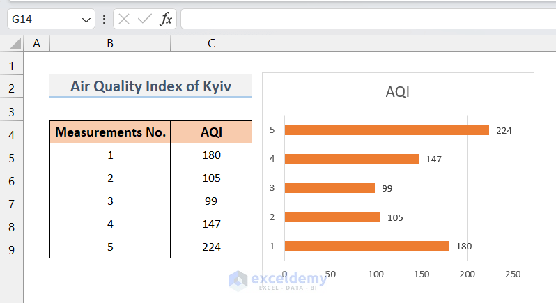
A bar chart will appear like this.
Method 1 – Addition of Standard Error Bars in a Bar Chart
Steps:
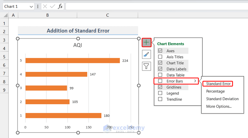
- Click anywhere on the bar chart. A menu will appear on the right side of the graph – as shown below.
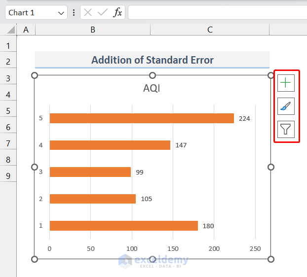
- From the menu, go to Chart Element >> Error Bars >> Standard Errors.
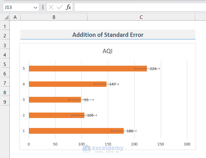
- The bar chart will display Error Bars like this. The standard error of these data should be a constant value, so you will see the Error Bar of the same size on top of each bar in the chart.
Read More: How to Change Bar Chart Color Based on Category in Excel
Method 2 – Addition of Percentage Error Bars in a Bar Chart
Steps:
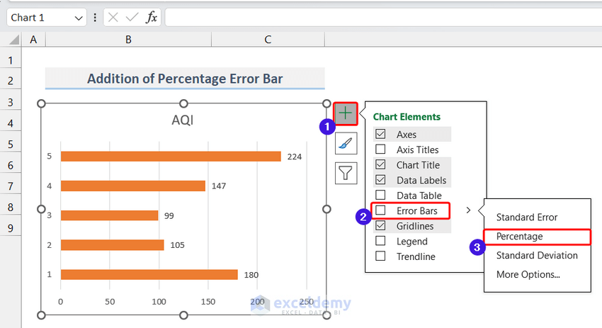
- Click on any point in the chart.
- From the menu in the right corner, select Chart Element >> Error Bars >> Percentage.
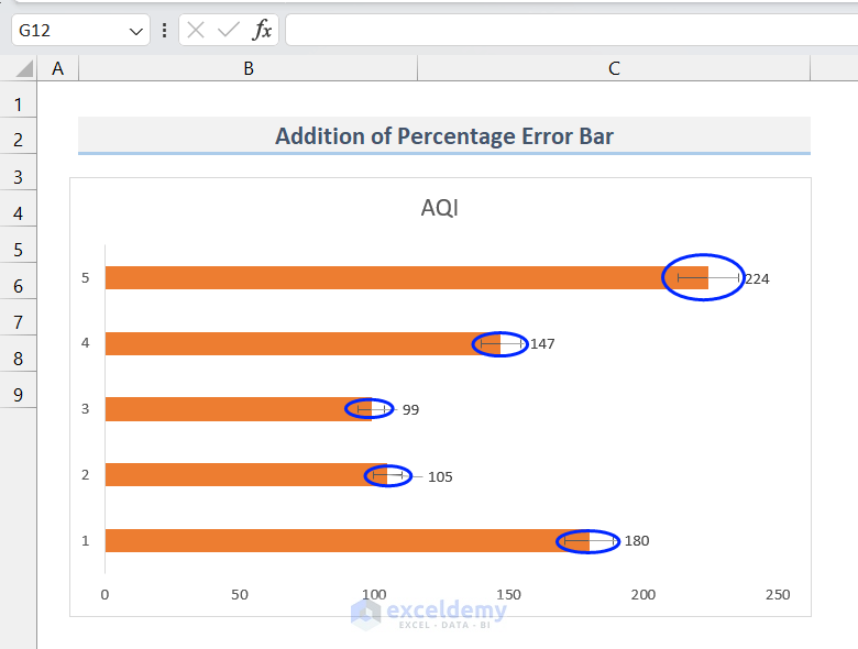
- The Percentage Error Bars will appear on the bar chart (Marked by blue circles). As Excel uses a 5% default value, the Error Bar will be around ±5% of each value. For example, the Error Bar for 224 will be 224±224*5%= 224±11.2= 212.8 to 235.2.
Read More: Excel Add Line to Bar Chart
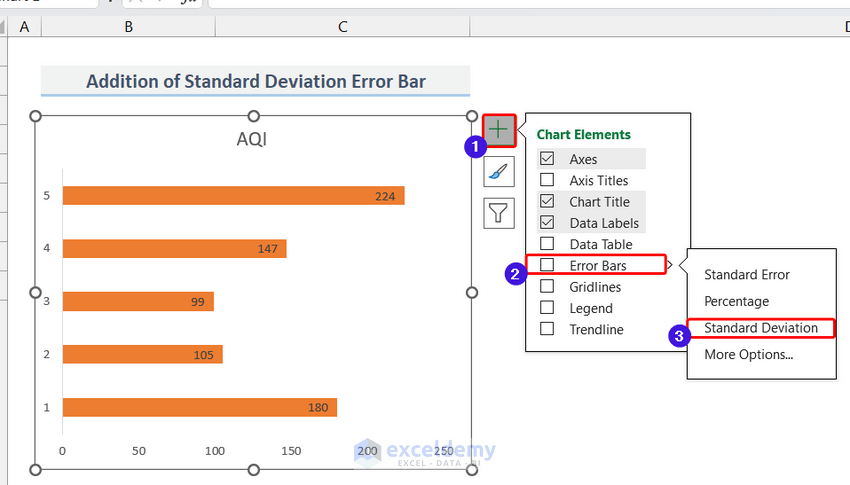
Method 3 – Addition of Standard Deviation Error Bars in a Bar Chart
Steps:
- Click on any point in the chart.
- From the menu in the right corner, select Chart Element >> Error Bars >> Standard Deviation.
- The Standard Deviation Error Bars will appear on the bar chart. (Marked by blue circles)
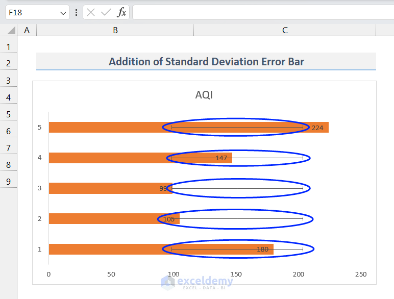
The size of the Error Bars in this method will also be the same for each bar in the chart like in Method 1 where we used the Standard Error Bar. Because the Standard Deviation of these data is also a constant value.
Read More: How to Add Horizontal Line to Bar Chart in Excel
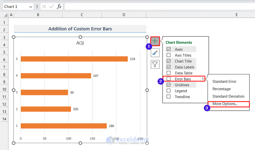
Method 4 – Addition of Custom Error Bars in a Bar Chart
Steps:
- Go to Chart Element >> Error Bars >> More Options.
- You will see Error Bar Options under the Format Window Bar on the right side.
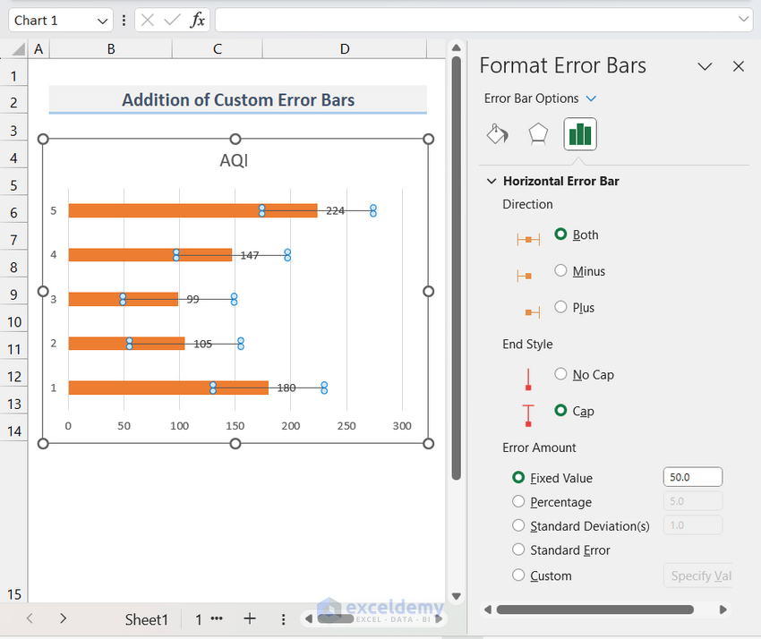
- There are many options available to customize the Error Bars. On the top, we can choose the Direction and End Style of the Vertical Error Bar.
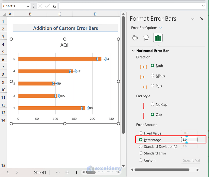
- If we want to customize the default value of the Error Bars, select the type and insert the Error Amount.
- For example, the default value of the Percentage Error Bar is 5⁒. By inserting a value in the percentage, you can modify it to any number you wish.
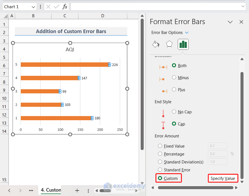
- Specify different error values for each data point by selecting Custom and then clicking on Specify Values.
- A dialogue box will appear.
- Insert error values for each data point (both positive and negative error values). (i.e., in the range of D5:D9.)
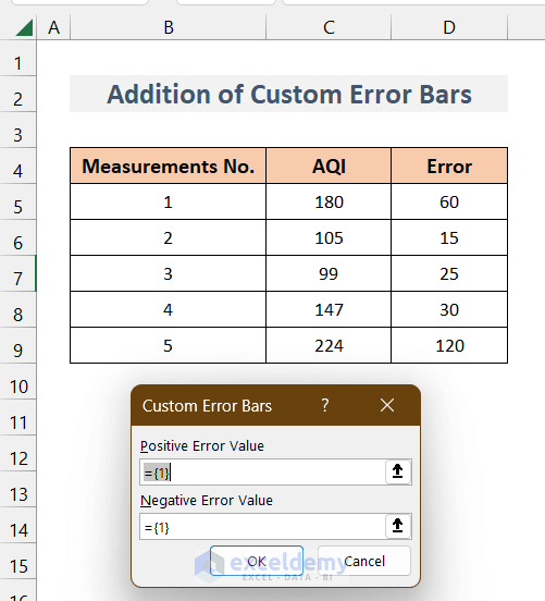
- Select the D5:D9 range for both Positive and Negative values while inserting values into the fields.
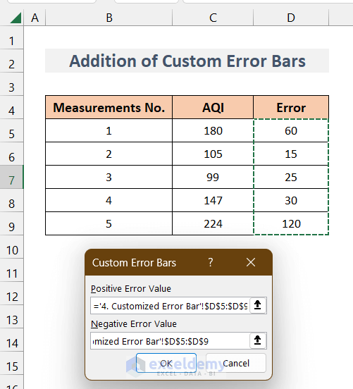
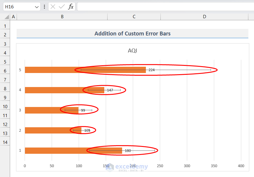
- Click OK, and the chart will display the Error Bars like this.
Read More: How to Add Vertical Lines to Excel Bar Chart
Things to Remember
- We can change the properties of the Error Bar lines, such as line type, color, etc., by accessing the properties tab by clicking on any Error Bar.
- In Horizontal Bar charts, the Error Bar will also be horizontal.
Download Practice Workbook
Download this workbook to practice.
Related Articles
- How to Add Grand Total to Bar Chart in Excel
- How to Sort Bar Charts in Descending Order in Excel
- How to Color Bar Chart by Category in Excel
- Excel Bar Graph Color with Conditional Formatting
- How to Create a Bar Chart with Target Line in Excel
- Excel Bar Chart with Line Overlay
<< Go Back to Excel Bar Chart | Excel Charts | Learn Excel
Get FREE Advanced Excel Exercises with Solutions!
