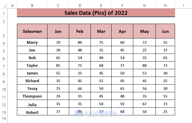
We’ll analyze the half-year sales data for multiple salesmen.
Method 1- Conditional Formatting to Depict Sales Trends
Excel’s Conditional Formatting is a powerful tool for Ranking, Highlighting, Inserting Icons, or Applying Color Scale to sales data.
Step 1: Sum Total Sales by Salesman:
- Calculate the total sales for each salesman during the specified period.
- Use the formula below in an adjacent cell (e.g., I4):
=SUM(C4:H4)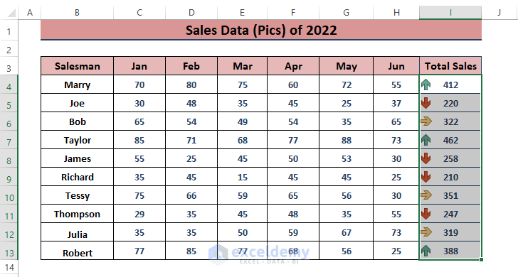
Step 2: Apply Conditional Formatting:
- Go to the Home tab.
- Select Conditional Formatting (in the Styles section).
- Choose from options like Highlight Cells Rules, Top/Bottom Rules, Data Bars, Color Scales, or Icon Sets.
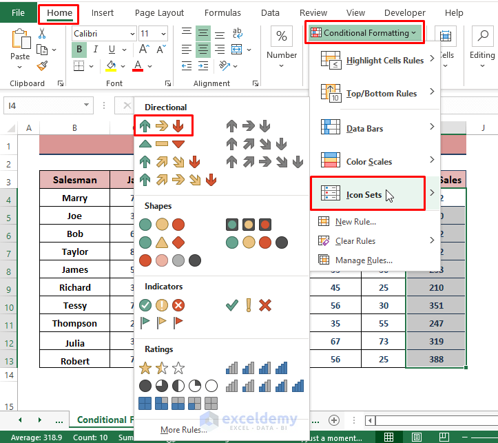
- For example, using Icon Sets, Excel will insert trend icons based on sales values.

Method 2 – Pivot Table to Analyze Sales Data as Percentage
Excel Pivot Table organize and automatically sort data. They allow flexibility in assigning fields as rows or columns, and existing entries can be displayed as percentages.
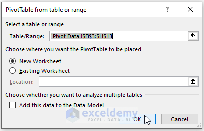
Step 1: Create a Pivot Table:
- Highlight the desired range.
- Go to Insert > PivotTable (in the Tables section) > Select From Table/Range.
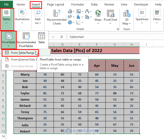
- Excel loads the table/range automatically.
- Choose the New Worksheet option to place the PivotTable.
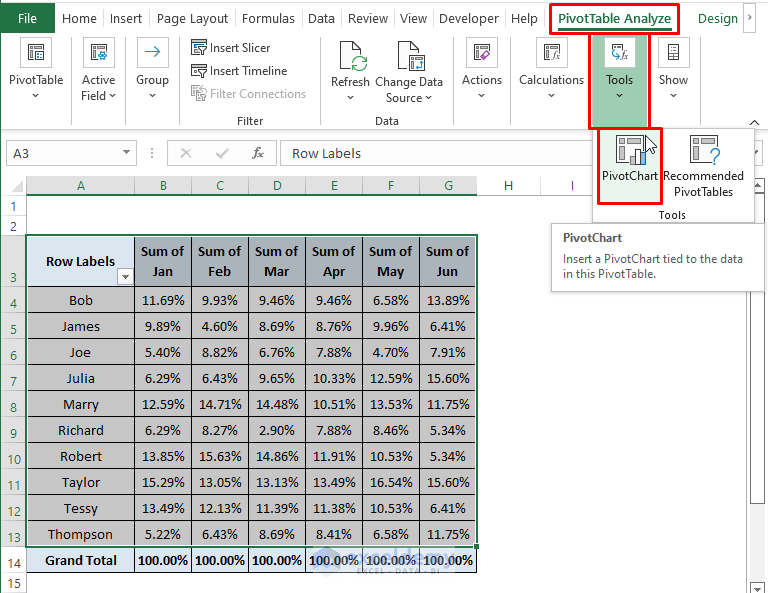
- Excel inserts the Pivot Table in a New Worksheet as depicted below.
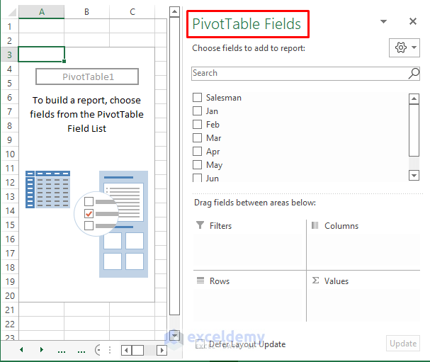
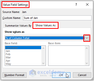
Step 2: Configure PivotTable Fields:
- Select required fields and arrange them.
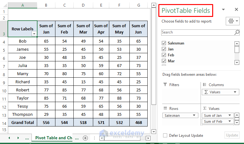
- Right-click on any cell and choose Value Field Settings.
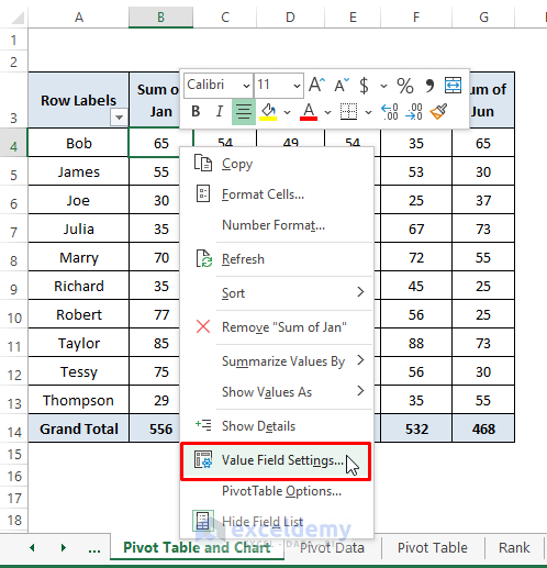
- In the dialog box, select Show Value As” > “% Column Total.
Step 3: Visualize with a PivotChart:
- Insert a PivotChart to represent the percentages visually.
- Go to the PivotTable Analyze tab > Select Pivot Chart (in the Tools section).
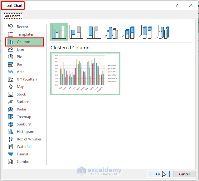
- Choose a chart type (e.g., Column Chart).
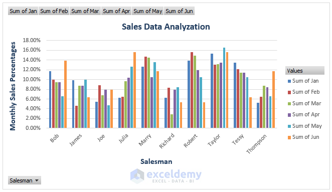
- Excel inserts a Pivot Chart depicting the percentages of each salesman for each month.
Method 3 – Using the RANK Function to Rank Sales Data
The RANK function assigns a rank to a given value by comparing it to a list of numeric values. The syntax of the RANK function is RANK (number, ref, [order])
Step 1: Calculate Ranks:
- Enter the formula in a blank cell (e.g., K4):
=RANK(C4,$C$4:$H$13,0)- Here, C4 is the number, $C$4:$H$13 is the reference range, and 0 indicates descending order.
![]()
Step 2: Apply the Formula:
- Drag the Fill Handle to apply the formula to other cells.
![]()
- The ranks represent the comparative positions of sales numbers among salesmen.
Read More: How to Analyze Time-Scaled Data in Excel
Method 4 – Using Slicer to Analyze Sales Data in Excel
Slicer operates similarly to a Filter, allowing for the representation of individual sales data through Charts. To incorporate a Slicer, our data needs to be structured into an Excel Table.
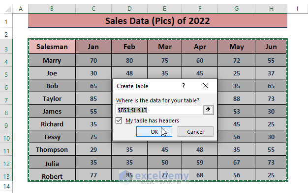
- Select the desired range, then go to Insert > Table (in the Tables section).
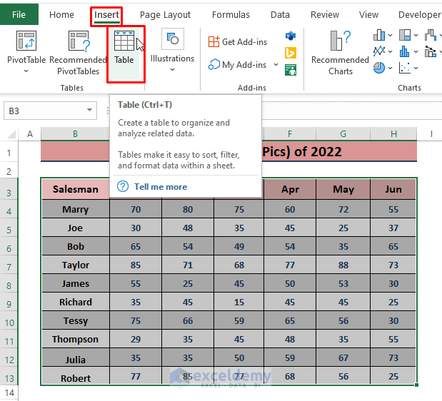
- Excel will display the Create Table dialog box. Check the My table has headers option and click OK.
- In the Insert tab, navigate to Insert > Filters > Slicer.
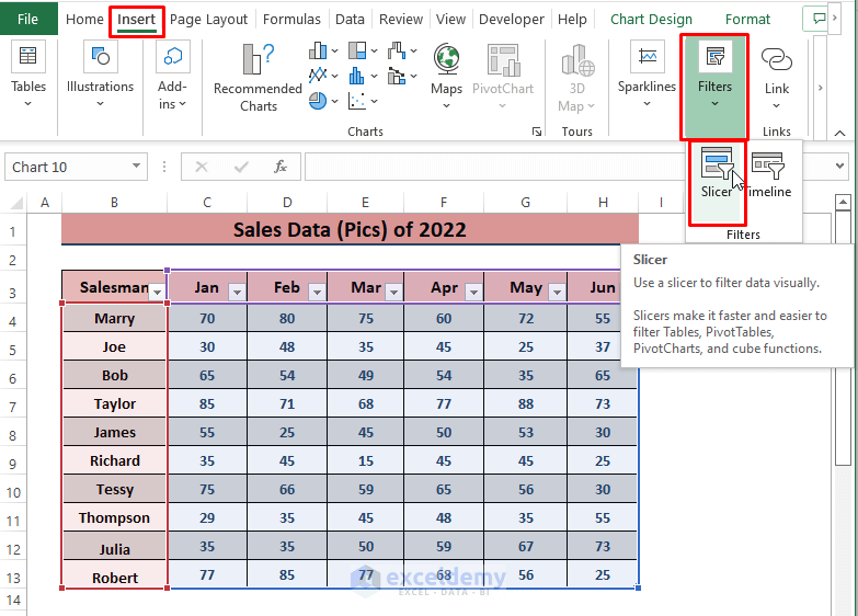
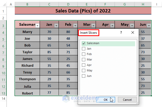
- Excel will open the Insert Slicer command window. Choose a column header (such as Salesman or Months) to slice data by that category.
- Click OK to insert the Slicer.
- Now, in the Insert tab, select any of the Insert Scatter Chart types.
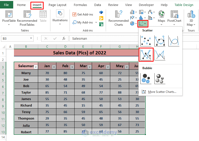
-
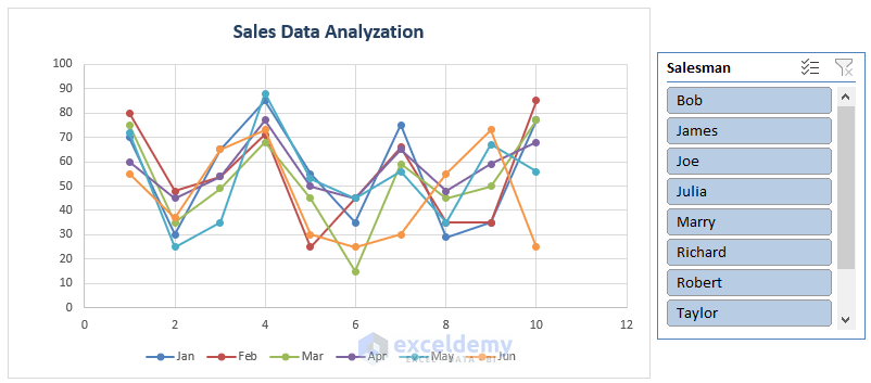
- This will create a scatter chart for all sales data.
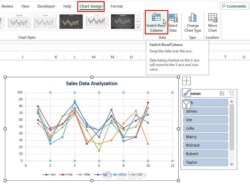
- To view individual sales data for each salesman, switch the rows with columns.
- Click on the inserted chart, go to Chart Design, and select Switch Row/Column.
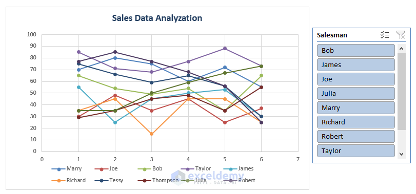
- The Slicer allows you to choose specific salesmen (e.g., Bob), and the chart will automatically display only their sales.
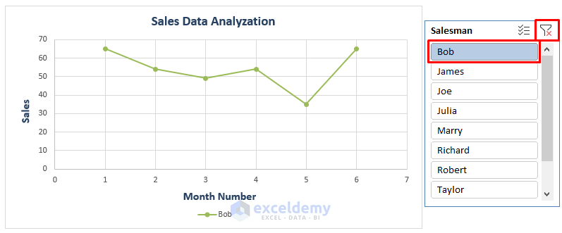
To clear the selection, click the Filter-Cross icon on the right side of the Slicer window.
Read More: How to Analyze Time Series Data in Excel
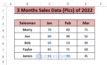
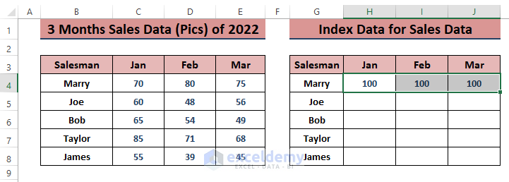
Method 5 – Using an Index Chart to Display Sales Trends
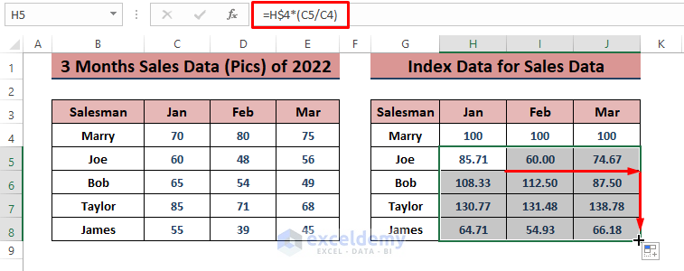
Comparing sales values to 100 provides a clear picture of growth. Transform all sales data into a scale of 100 for easy understanding. Take 3 months’ sales data (as shown in the image below) or use any desired dataset.
- Create an identical range for the index values. Insert 100 in the 1st salesman’s monthly sales.
- Use the formula in cell H5:
=H$4*(C5/C4)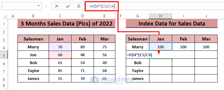
- Press ENTER and drag the Fill Handle to apply the formula to all cells.
- Select the index data range and go to Insert > 2-D Line Chart.
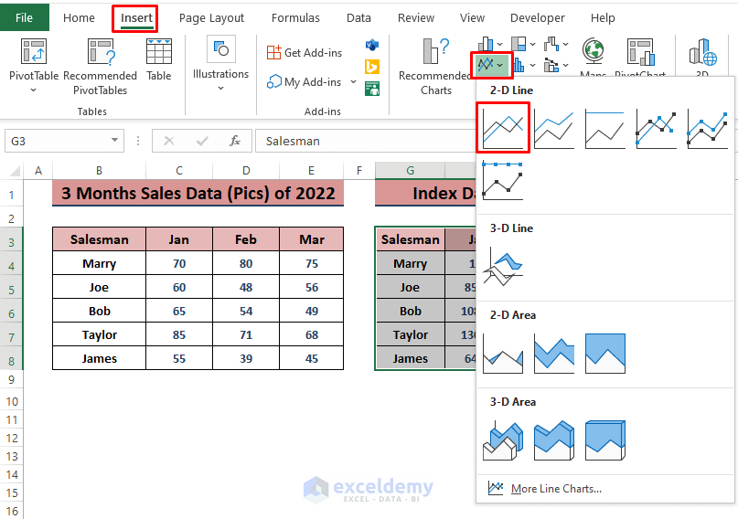
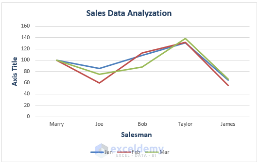
Excel will insert the Index Line Chart to depict sales for different salesmen across months.
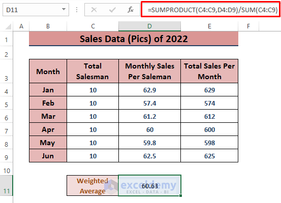
Method 6 – Calculating Weighted Average for Overall Sales Analysis
When dealing with consolidated data, the weighted average is useful. Suppose we have Monthly Sales Per Salesman and Monthly Total Sales.
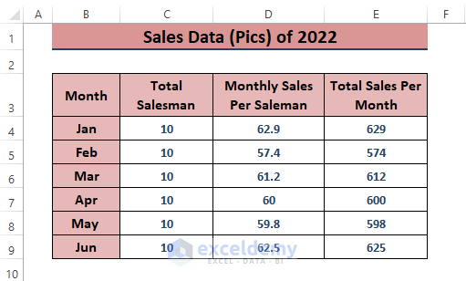
- In a blank cell (e.g., D11), use the formula
=SUMPRODUCT(C4:C9,D4:D9)/SUM(C4:C9)The SUMPRODUCT function multiplies Total Salesman and Monthly Sales Per Salesman, and the SUM function gives the total number of salesmen.
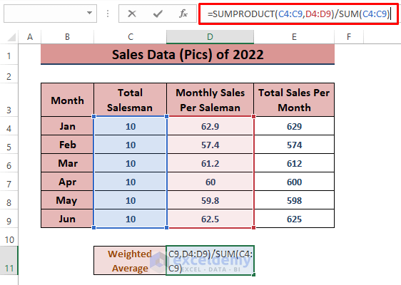
- Press ENTER to execute the formula and display the weighted average.
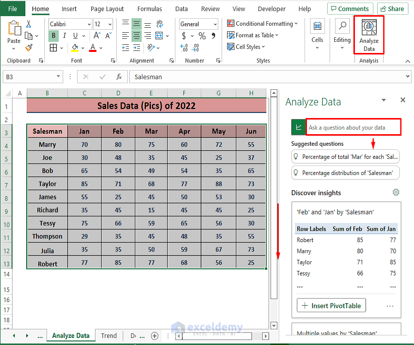
Method 7 – Analyzing Data Using Excel 365’s Analyze Data Feature
- Select the desired range, then go to Home > Analyze Data (in the Analysis section).
- In the Analyze Data window, choose from various analysis options, including inserting Pivot Tables and multiple charts. Previously demonstrated Excel features are also available here.
Read More: How to Analyze Text Data in Excel
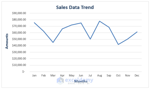
Method 8 – Analyzing Sales Data Using Trendlines in Excel
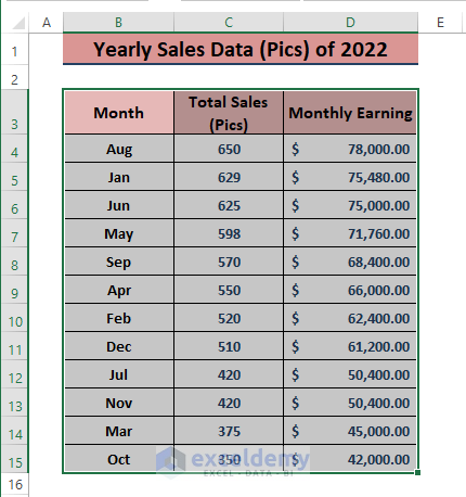
When dealing with yearly accumulated sales data, Line Charts help display trends. Let’s assume the following screenshot represents yearly sales.
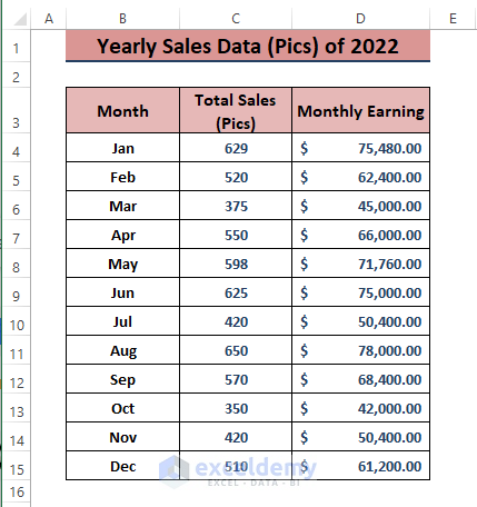
- Highlight the entire dataset, then go to Insert > 2-D Line (in the Charts section).
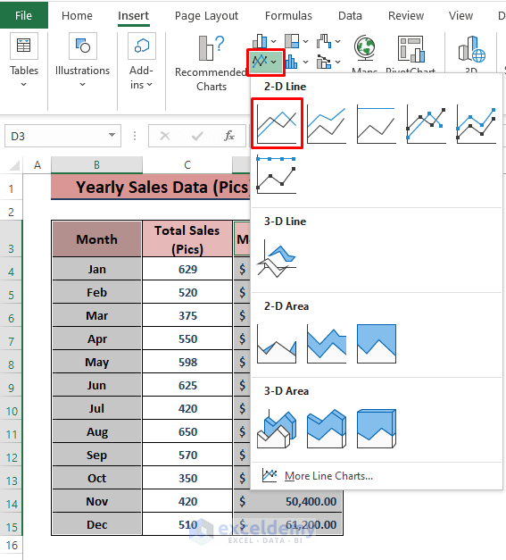
- Excel will insert a Line Chart depicting the sales trends.
Read More: How to Analyze Large Data Sets in Excel
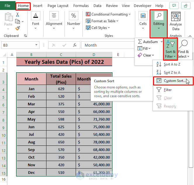
Method 9 – Sorting Sales Data to Identify Greater Values
Data sorting provides quick insights into sales data. Although sorting doesn’t return specific parameters, it’s useful for finding maximum or minimum values.
- Go to Home > Sort & Filter > Custom Sort
-
- Ensure you select the entire range for sorting to avoid mismatches with column or row headers.
- In the Sort dialog box, assign sort items as shown in the image, then click OK.
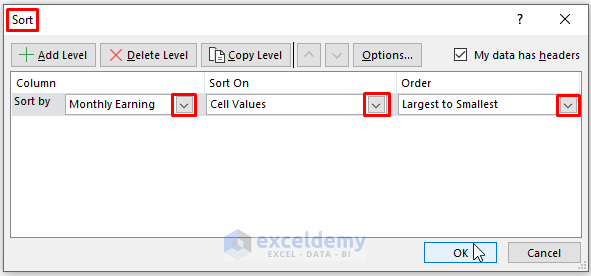
- Click OK and the data will be sorted according to your instructions.
Read More: How to Analyze Raw Data in Excel
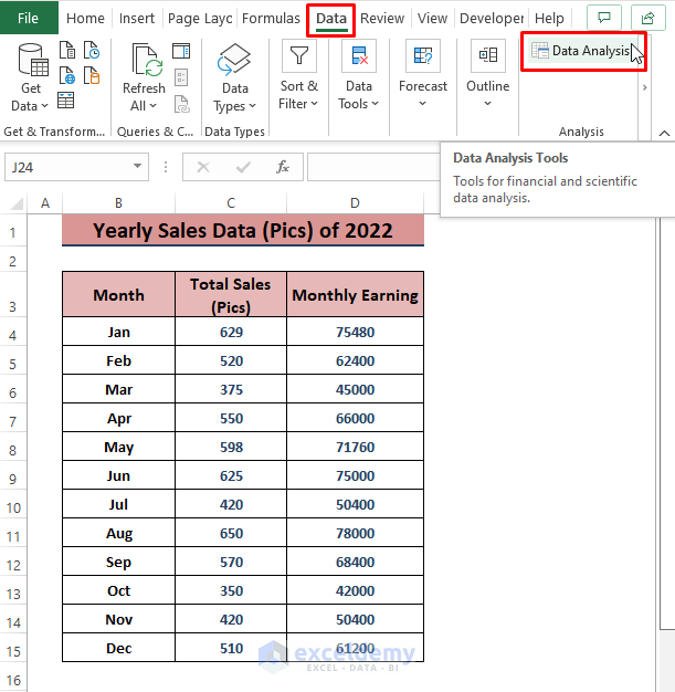
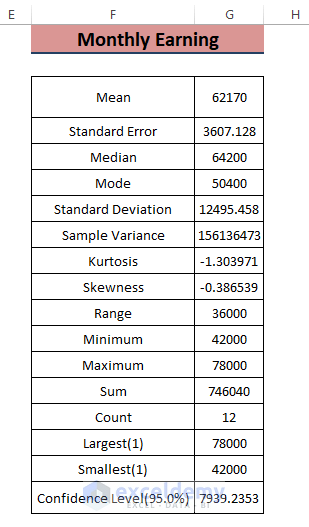
Method 10 – Applying Data Analysis Tools for Sales Data
Excel’s Data Analysis feature offers various tools, including Descriptive Statistics.
- Go to Data > Data Analysis (in the Analysis section).
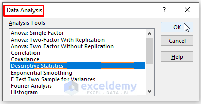
- Select the Descriptive Statistics analysis tool from the Data Analysis window and click OK.
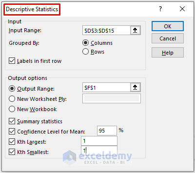
- In the Descriptive Statistics dialog box, choose relevant options based on your data and requirements.
- Click on OK.
-
- Excel will insert Monthly Earning Statistics, including parameters like Mean, Median, Maximum, and Minimum sales values.
Read More: How to Analyze Likert Scale Data in Excel
Download Excel Workbook
You can download the practice workbook from here:
Related Articles
- How to Analyze qPCR Data in Excel
- How to Analyze Quantitative Data in Excel
- How to Analyze Qualitative Data in Excel
- How to Analyse Qualitative Data from a Questionnaire in Excel
- How to Convert Qualitative Data to Quantitative Data in Excel
<< Go Back to Data Analysis with Excel | Learn Excel
Get FREE Advanced Excel Exercises with Solutions!

Thank you Maruf! This was exactly what I needed.
Hi Rassulsson!
Thanks for your appreciation.
Regards
ExcelDemy