Creating charts and graphs is basically about ensuring effective visual communication and presentation of your data. Excel provides default graph settings, upon creation. However, for business purposes, it’s often necessary to spruce up a few elements of your chart, to ensure that you really wow your clients and/or boss with your amazing charts. In this article, we will show you 15 useful tips to make your Excel graphs look professional. If you are also curious about it, download our practice workbook and follow us.
Here are a few handy tips for adding a professional flair to your graphs in Excel.
📚 Note:
All the operations of this article are accomplished by using the Microsoft Office 365 application.
1. Ensuring Descriptive Title to Make Professional Look for Excel Graphs
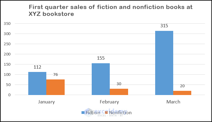
In the example below, the first graph has been updated from the default chart Excel provides, which is shown at the bottom. The first title provides better insight into the data, as well as the location/place it is drawn from. When contemplating titles, try and describe the source data the chart was based on, and don’t forget to add the location/company or another place of reference if that information is available. A chart title is supposed to orientate the user and not leave the user trying to guess who, what or where? Remember a chart is not supposed to be a puzzle.
2. Removing All Junk, Clutter, and Other Distractions
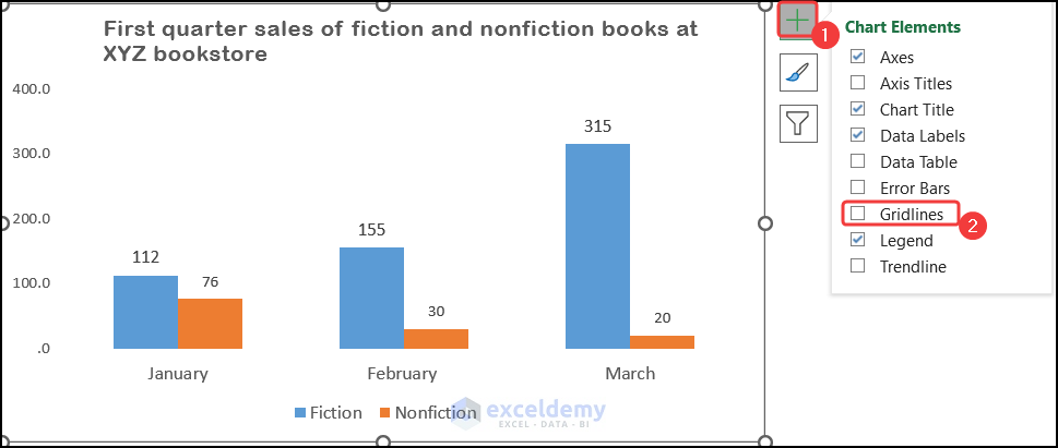
Gridlines are a common source of clutter. In the example below, the chart at the bottom has all the gridlines removed. The chart at the top has gridlines, which are not conveying any meaningful information. The data labels are already providing the numbers.
To remove the Gridlines, click on the Chart Element icon and uncheck the Gridline option.
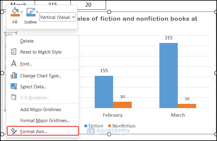
The other problem with the chart at the bottom is the vertical axis is cluttered and contains too many numbers that are not necessary. We can fix this by selecting the vertical axis by clicking on it. The steps to fix this issue are explained below:
📌 Steps:
- Right-click the axis once it’s selected and choose the Format Axis option.
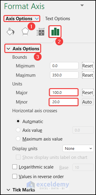
- Now, expand the Axis Options section and change the Major unit to 100, for the example below, and the Minor unit to 20.
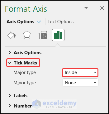
- Then, expand the Tick Marks section and make sure for Major Type, Inside is selected.
Another thing to consider about the vertical axis is that sometimes Excel sets the maximum, way beyond the actual data points. If this has happened to your chart, do not fear. The fixing procedure is described below:
📌 Steps:
- Simply select the vertical axis then right-click and choose the Format Axis option.
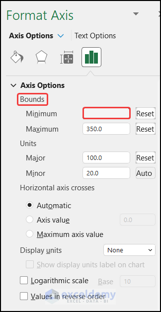
- In the Format Axis panel, under Axis Options, Bounds, set the maximum to a lower value. The chart at the bottom also contains an unnecessary zero.
- Now, in the chart, we removed this by again right-clicking the vertical axis, and selecting Format Axis.
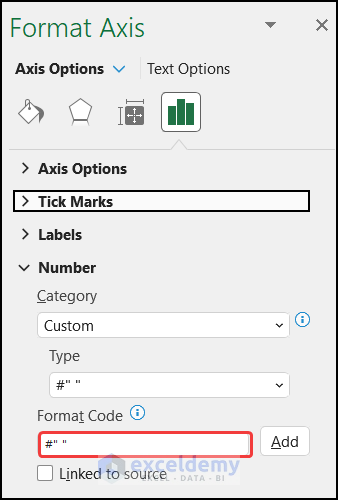
- Then, in the Axis Options section, expanding the Number section, in the Category section, we chose Custom, for format code type #” “, to clear the zero.
- Finally, click Add to add the custom format.
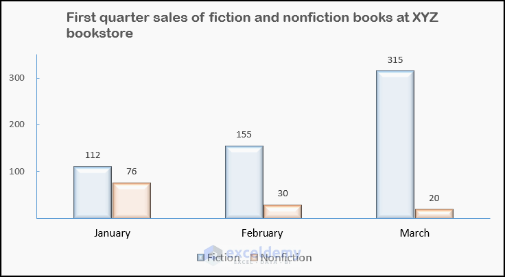
- You will get a clean graph.
You can notice our graph looks more professional after all the modifications.
Read More: How to Rotate Text in an Excel Chart
3. Choosing Suitable Chart According to Dataset
For example, if you are creating a Pie chart, there are a finite amount of slices that the pie chart can accommodate. If you have more than 4 categories instead use a Pie of Pie chart or a Bar chart. In the example below, in the second chart, there are too many slices, and as a result, what the chart is supposed to be representing is unclear. The first chart uses a Pie of Pie chart to represent the data instead and as such it’s a better fit and more clear. So always make sure your data and your graph match and you have chosen the right graph for your data.
4. Keeping Consistency While Dealing with Multiple Charts on Same Sheet
If you have multiple charts on the same worksheet, make sure they all have a consistent look and feel. A way to achieve this is by using Chart Templates. Once you have formatted the chart according to your preferences, right-click the chart and click Save as a Template. You can then apply this template to other charts as needed. In the future, when you will have a chart, you might want to format the new chart according to the saved template. To do that, simply right-click the newly created chart (where you want to apply the already saved template) and select Change Chart Type, then navigate to the Templates folder, choose one of the templates, you previously created, and click OK.
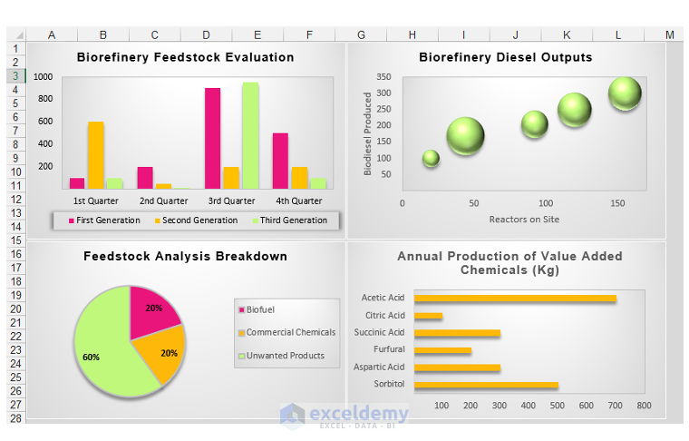
For example, if you notice the charts shown below, look messy, disorganized, and disjointed because of the lack of consistency.
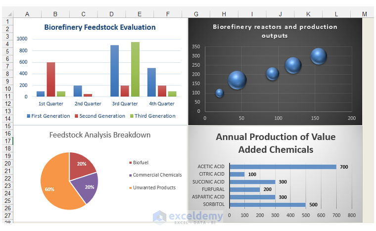
On the other hand, if we just change the design theme of some of our charts the total outlook will be changed and it will more convenient for a user to understand the data pattern.
5. Avoiding Making Unnecessary Excel 3D Graphs For Professional Look
3D charts often give an incorrect perception of the data. Compare the two Pie charts below. The first chart shows the slices of the pie chart in their relative proportions, the 3D Pie chart contains ambiguity with respect to the relative proportions.
Read More: How to Change Text Direction in Excel Chart
6. Using Built-in Themes to Get Professional Look in Excel Charts
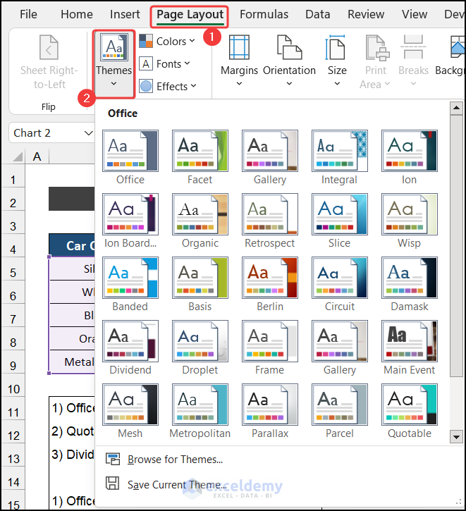
Use the built-in themes Excel has provided to quickly give your chart a new look. Excel has built-in themes, which allow one to change the fonts, and colors associated with the chart at hand. In order to change the theme of the workbook, and thus change the colors, fonts, and/or effects associated with the chart as well. The procedure is:
📌 Steps:
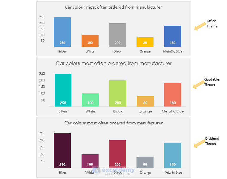
- Firstly, go to Page Layout, in the Themes group, click on the drop-down arrow for Themes and select a theme, to see the chart update its colors and fonts. The charts below, all use the same source data but are formatted using different themes.
- The first chart below uses the default Office theme, the second chart uses the Quotable theme and the third chart uses the Dividend theme.
You can see our graphs are looking more professional than before.
Read More: How to Add Subscript in Excel Graph
7. Customizing and Creating Your Own Theme for Better Look
Customize and create your theme, if you need a unique look or to incorporate your branding. You can create a new theme by picking your colors, fonts, and effects and then saving this as a new Custom theme. The steps to create a custom theme are given as follows:
📌 Steps:
- At first. go to the Page Layout tab.
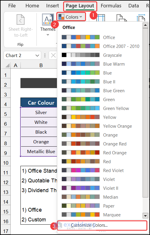
- Now, click on the drop-down arrow of the Colors > Customize Colors option.
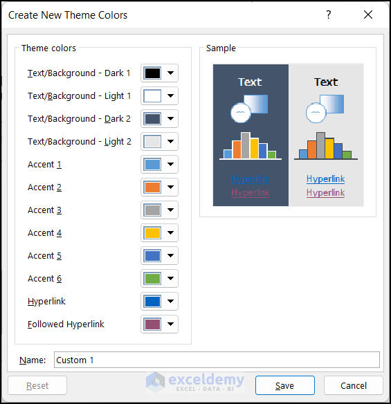
- As a result, a new dialog box called Create New Theme Color will appear and choose a new set of colors, a new set of fonts, and effects from that dialog box.
- Then, click Save.
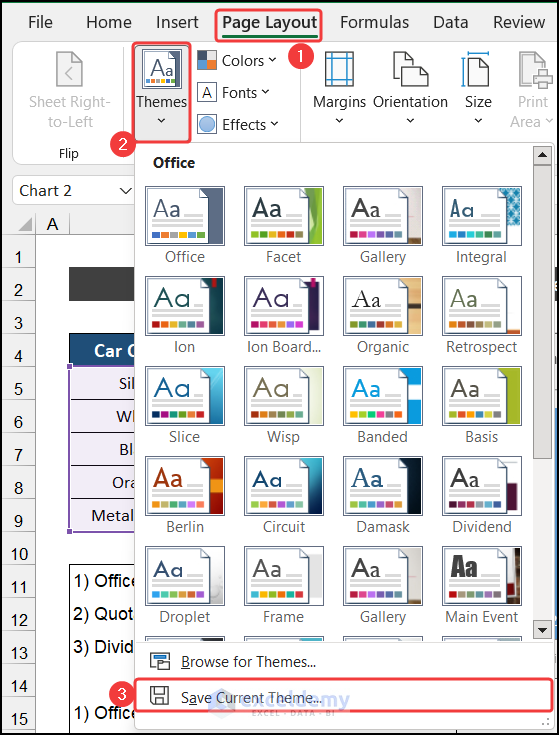
- After that, click on the drop-down arrow in Themes and click on the Save Current Theme option to save this as a new custom theme.
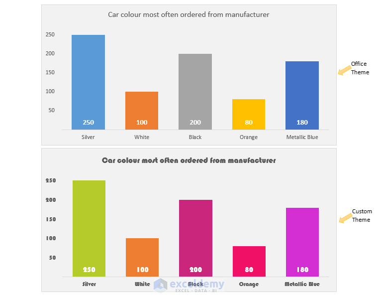
- In the example below the same source, data is used to create both charts. The chart above has the standard Office theme applied, whereas the chart below has a custom-made theme applied.
You can notice our graphs look more professional than before.
8. Having Clear Concept of Line and Scatter Chart in Excel
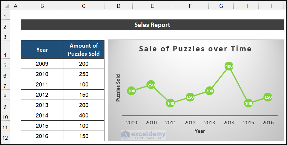
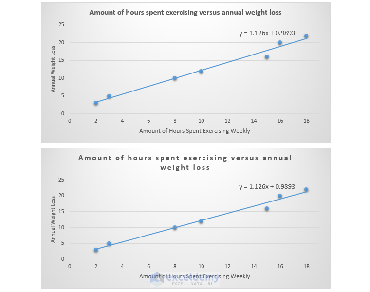
Don’t get confused between a Line chart and a Scatter graph. This is a mistake that many people often make. In the Line chart, the vertical axis is a value axis and the horizontal axis is a category axis. The points on the horizontal axis are equidistant. An example of equidistant points on the horizontal axis can be years or equally spaced quarters. We also showed a line chart that just shows the number of puzzles sold per year.
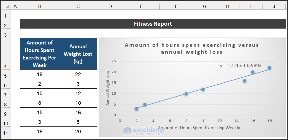
The Scatter chart displays values on the vertical axis and the horizontal axis. Depending on the source data, these points on the horizontal axis can be distributed equally or unequally. A Scatter graph illustrates patterns and showcases trends. A Scatter graph is often used to demonstrate the relationship between two variables. In our example, the Scatter graph at the bottom shows the relationship between the number of hours spent per week exercising and the total annual weight loss of participants in a study. From the chart, we can see that there is a relationship between the two variables and that as hours spent in exercise increase, so too does the annual weight loss.
Read More: How to Show Coordinates in Excel Graph
9. Ensuring Necessary Space Between Each Word
When individual words in chart titles stay close together, the user often faces difficulty in reading them. The way to resolve this is shown below:
📌 Steps:
- First, select the chart title.
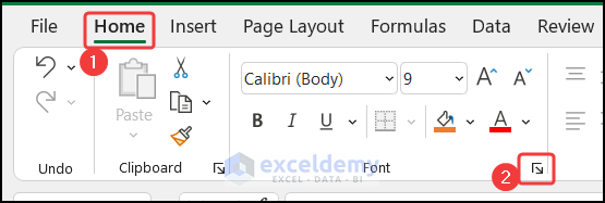
- After that, on the Home tab, in the Fonts group, click on the arrow to launch the Font dialog box.
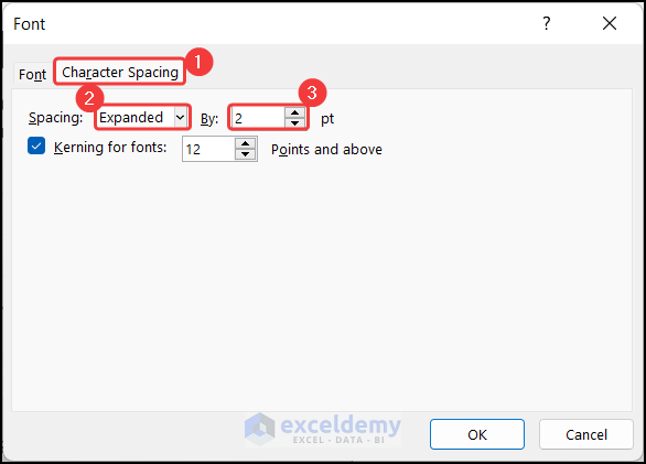
- Now, change the Character Spacing from Normal to Expanded, and change the points to 2.
- Finally, click OK.
- This eliminates the “squashed” chart title look as shown in the top chart. The bottom chart has expanded character spacing.
You can see our Excel graphs look more professional than before.
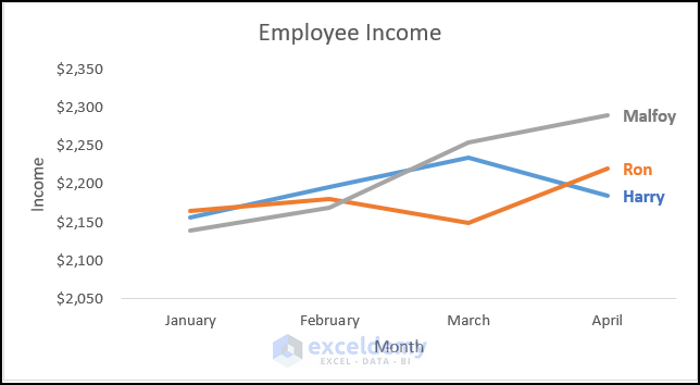
10. Replacing Legends with Direct Labels
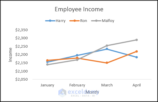
Sometimes, the legends distract the user from concentration. As the Legend is placed separately in a list, the users have to look here and there to understand the data. We have a similar type of chart which is shown below:
But, we can use the Data Labels as the Legends of our graph. Moreover, we can modify the text color with the line color for the better convenience of the users. The steps are shown below:
📌 Steps:
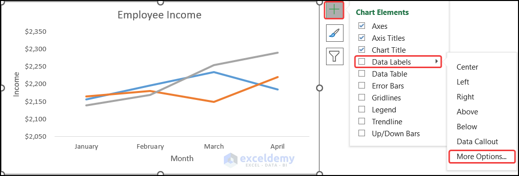
- First, select the Data Labels > More Options from the Chart Element option.
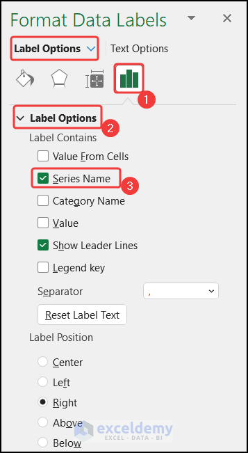
- Now, in the Format Data Labels window, in the Labels Options tab change the option from Value to Series Name.
- Then, keep the far most data labels and delete the other labels individually.
- You will get the graph to look more professional.
Read More: How to Superscript Text in Excel Graph
11. Making Professional Look by Removing Unnecessary Legends in Excel Graphs
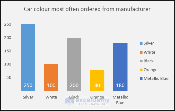
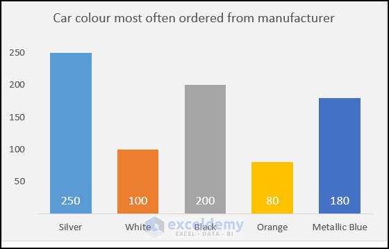
Unnecessary Legends are another distractor of the Excel graphs. Even they make the graph messier for the reader. You can look at the graph shown below:
Here, the category name is also shown on the horizontal axis. So, no need to show the Legends here. Moreover, if we delete them, the columns of our graph will get more space. Thus, it will be more useful for the user and the graph will get a good look.
12. Sorting Dataset in Right Order Make Excel Charts Understandable
Data sorting sometimes helps us to get a good outlook of our Excel graphs and make them professional. But, most of the time you may not be able to sort your data if it has multiple factors. So, if your dataset provides you the flexibility to sort the data in ascend or descend, you should use it, to get a better view of your graphs.
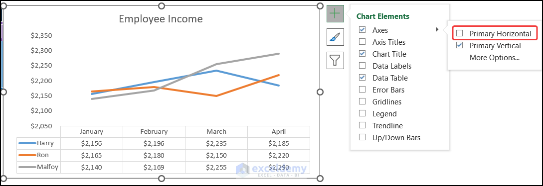
13. Cleaning up Unnecessary Axes from Excel Charts for Professional Look
If the graphs don’t need the axes, don’t keep them in the graphs, Not only the axes, try to delete all the unnecessary elements from your chart. It will make your chart simple and better understood by everyone.
For example, we can see, that in our graph, we don’t need a horizontal axis. Because the heading of the data table works as the horizontal axis. So, we remove it from our graph and get a good professional look.
14. Adding Separate Data Table Instead of Data Points
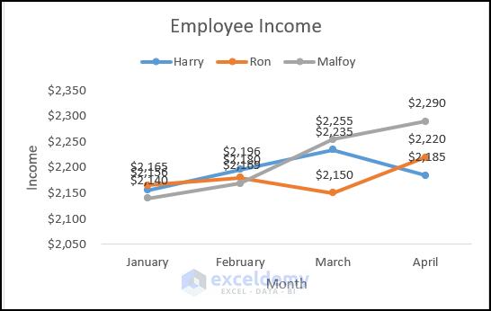
Sometimes, the addition of data points as Data Labels in the graph creates trouble for the readers. For example, we have a graph which we have shown below:
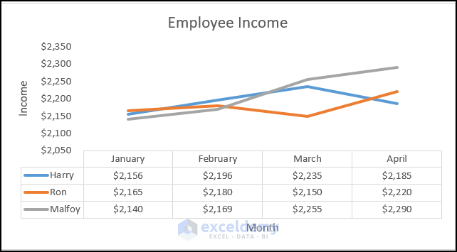
You can see that it is very hard for a person to read the data. Even, due to the Data Labels, we cannot visualize the data changing pattern properly. Instead of the Data Labels, we can add a Data Table to our chart from the Chart Elements icon. It will show the corresponding data in a tabular form below the chart. As a result, we don’t have to provide the dataset separately.
You may notice that the addition of a Data Table provides our Excel graphs professional with a good look.
15. Animating Every Chart While Making a Copy
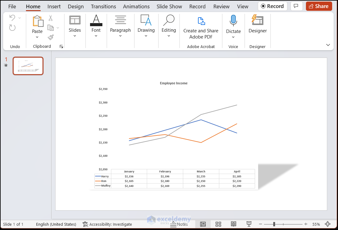
Animate individual chart elements when copying your chart to PowerPoint. This is a cross-over tip. When copying your chart from Excel and pasting it on a slide in PowerPoint.
You can animate individual series and elements of the chart. A sequence for animating the individual series on a column chart, in PowerPoint is shown below:
📌 Steps:
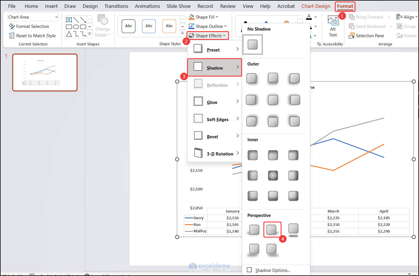
- First of all, select your chart.
- Now, go to Format in the Chart Tools context-sensitive option.
- In the Shape Styles group, click on the drop-down arrow for Shape Effects, choose Shadow, and then Perspective Diagonal Upper Right.
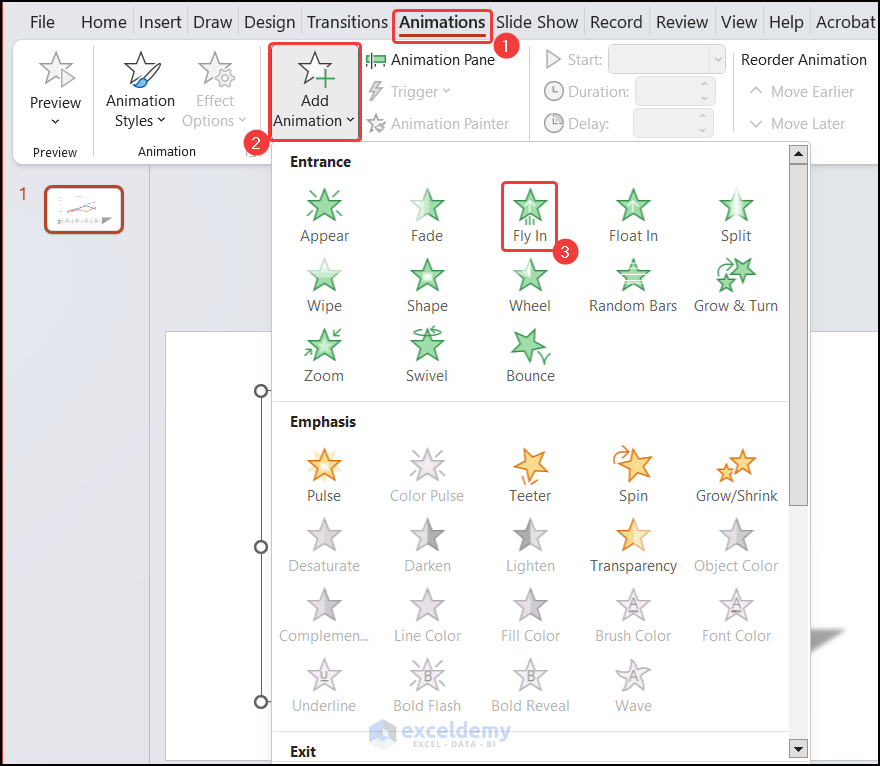
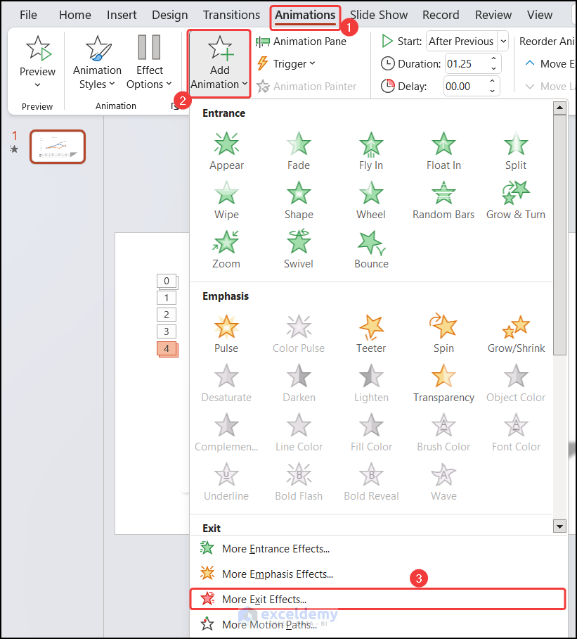
- In the Animations tab, click on the drop-down arrow of the Add Animation.
- Under Entrance Effect, choose the Fly-in option.
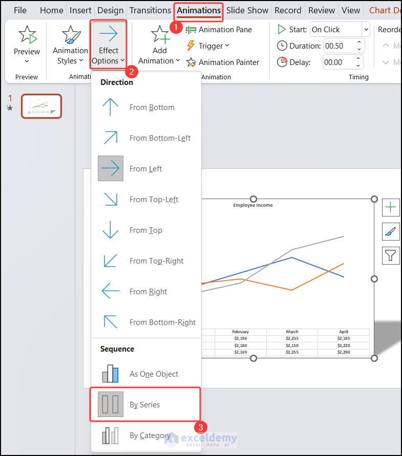
- In the Animation group, click on the drop-down arrow by Effect Options, and under Sequence, Choose the By Series option.
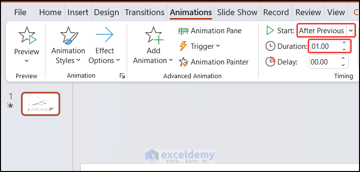
- After that, click on the down arrow on the first animation in the panel and choose the Start option After Previous from the Timing group.
- With that animation still selected in the Animation Pane, in the Timing group change the Duration to 1.00s.
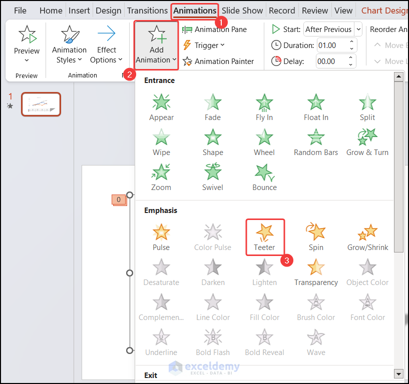
- Next, in the Animation tab, click on the drop-down arrow of the Add Animation.
- Under Emphasis Effect, choose Teeter.
- Click on the down arrow on the second animation in the panel and choose the Start option as After Previous.
- With that animation still selected in the Animation Pane, in the Timing group change the Duration to 1.25s.
- At last, in the Animation tab, click on the drop-down arrow of the Add Animation.
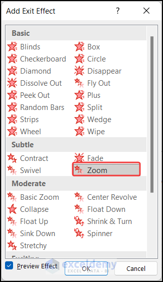
- Under Exit, choose More Exit Effects.
- In the Subtle section, choose Zoom.
- Click the animation in the Animation Pane and set it to the Start option After Previous.
- In the Timing group, set the duration to 1.00s.
Finally, you have an animation sequence involving individual chart elements.
How to Make Excel Line Graphs Look Professional
Excel Line graph is a widely used graph in our regular professional life. It helps us to visualize the data changing pattern easily. As this graph is frequently used in our daily life, we have to present this in a good professional way, so that every person can understand the graph. Here, we will provide you with some useful tips to make the Excel line graph look professional. The tips are given below:
- Proper Title: First of all, provide a meaningful title for your chart so that people can understand which data they going to visualize.
- Axes & Axes Titles: These are the second important element to make your graph understandable to others. People will be able to understand the relationship between them.
- Legends: In a line graph, we have only some lines. So, we have to show the legends in a decent position, so that people can figure out which line represents which category.
- Eliminate Extra Elements: No unnecessary elements should keep on a graph. They will reduce your graph’s understandability.
- Data Labels/Data Table: If you have a limited amount of data you can add the Data Labels of a Data Table. But, If you are dealing with a large dataset you can skip it.
For example, we can consider a line graph which is shown below for your convenience.
Download Practice Workbook
Download this practice workbook for practice while you are reading this article.
Conclusion
That’s the end of this article. I hope that this article will be helpful for you and you will be able to make your Excel graphs look professional. Please share any further queries or recommendations with us in the comments section below if you have any further questions or recommendations.
Keep learning new methods and keep growing!
Useful Chart Related Links from ExcelDemy
- How to Change Chart Color Based on Value in Excel
- [Solved:] Vary Colors by Point Is Not Available in Excel
- How to Center a Chart in Excel
- How to Left Align a Chart in Excel
- How to Add a Vertical Dotted Line in Excel Graph
- How to Add Vertical Line in Excel Graph
- How to Add Border to a Chart in Excel
- How to Add Arrow in Excel Graph
- How to Add Asterisk in Excel Graph
- How to Remove Chart Border in Excel
<< Go Back to Formatting Chart in Excel | Excel Charts | Learn Excel
Get FREE Advanced Excel Exercises with Solutions!





All blog will explain good knowledge…
Thanks, Subbu!