Pivot Chart

Use Excel VBA to Create Chart from Pivot Table

Here's an overview of using VBA to create a chart from a pivot table. Use Excel VBA to Create Chart from Pivot Table: 3 Methods We have ...

How to Add a Secondary Axis in an Excel Pivot Chart (with Easy Steps)

  Suppose you have a PivotTable that includes the Sum of Sales and the Sum of Profit. You can create a PivotChart with the Pivot ...

How to Show Grand Total with Secondary Axis in Pivot Chart

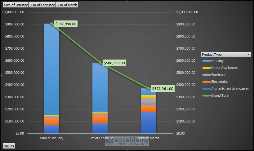
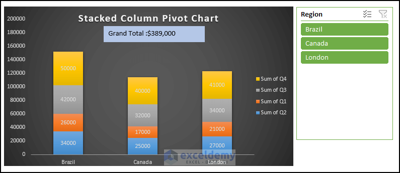
While creating a Pivot Chart in Excel, showing the Grand Total can help understand the chart and increase clarity. If you are curious to know how you ...

How to Add Grand Total to Stacked Column Pivot Chart: 4 Methods

Method 1 - Input Basic Particular Demonstrate how to add the grand total to a pivot chart stacked column in Excel. Introduce our Excel dataset to ...

How to Edit Pivot Chart in Excel (with Easy Steps)

If you are looking for how to edit a pivot chart in Excel, then you are at the right place. In our practical life, we often need to create pivot ...

How to Refresh Pivot Chart in Excel (4 Suitable Approaches)

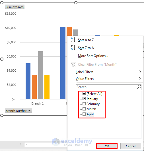
It does not always happen that you edit something in a place and it gets fixed automatically in all other places. But in Pivot Chart, we actually can ...

How to Insert a Stacked Column Pivot Chart in Excel

If we insert a Stacked Column chart from Pivot Table then it has some advantages instead of using a general Stacked Column. Such as Pivot Table ...

Data Labels in Excel Pivot Chart Considering All Factors: 7 Suitable Examples

Method 1 - Adding Data Labels in Pivot Chart Steps Go to Insert tab > Tables group. Select the range of cells of the primary ...

How to Use Pivot Chart in Excel (5 Different Uses)

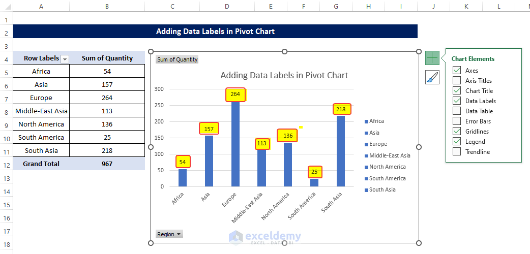
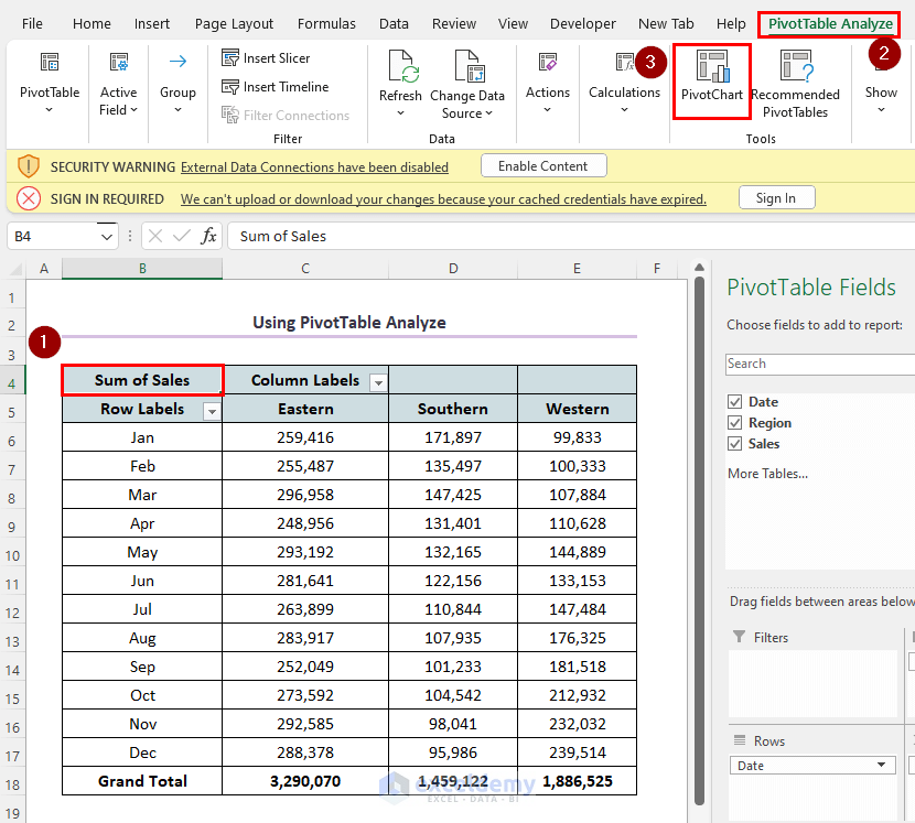
A Pivot Chart is the visual representation of our raw data. Using a Pivot Chart is one of the best ways to present your data in Excel. It allows us ...

How to Create a Clustered Column Pivot Chart in Excel: 3 Easy Steps

Method 1 - Create a Pivot Table from Dataset Create a pivot table to reach the final destination. Select all the cells from the data table ...

How to Add a Target Line to a Pivot Chart in Excel (2 Effective Methods)

The dataset contains sales information about some grocery items. We will show you how to add this amount as a target line in a Pivot Chart. ...

Difference Between Pivot Table and Pivot Chart in Excel

  What Are Pivot Tables and Pivot Charts? A Pivot Table is a functional table that represents the summary of data collection. On the other ...

How to Filter a Pivot Chart in Excel (5 Ways)

We have a dataset containing a shop's Month, Fruits, Sales, and Profit. We will use this dataset to show you how to filter a pivot chart in Excel. ...

How to Create the 7 Most Popular Types of Pivot Charts in Excel

What Is Pivot Chart? Pivot charts are a powerful way to visualize summarized data from a pivot table. They help illustrate comparisons, patterns, ...

How to Create a Chart from a Pivot Table in Excel (2 Easy Methods)

The following dataset contains daily sales by region. The Date field contains the dates for the entire year excluding weekends, the Region field ...

Close the CTA

Advanced Excel Exercises with Solutions PDF


ExcelDemy
Logo