While creating a Pivot Chart in Excel, showing the Grand Total can help understand the chart and increase clarity. If you are curious to know how you can open a workbook with the variable name, then this article may come in handy for you. In this article, we discuss how you can add Pivot Chart grand total in the secondary axis with elaborate explanations.
How to Show Grand Total with Secondary Axis in Pivot Chart: 2 Easy Ways
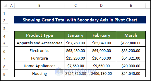
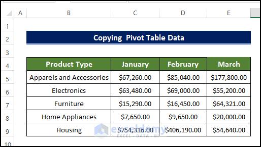
We are going to use the below dataset for the demonstration. We have the product information of several products with their Id. The information is sales data for each month in January, February, and March.
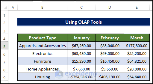
1. Using OLAP Tools
The main challenge we have to face while adding grand total values in the secondary axis in the Pivot Chart does not include the grand total value in the Pivot Chart and we also can’t add the grand total in pivot chart. Any kind of manual data addition is not allowed in the Pivot Chart. So, we need to use the Power Pivot and data model in order to activate the OLAP tools. Using this tool, we can add the Pivot Chart grand total in the secondary axis.
Steps
- The dataset below will be plotted in a Stacked Chart where the grand total for each month will be plotted on the secondary axis.
- To do this, go to Insert tab > Pivot Table > From Table/Range.
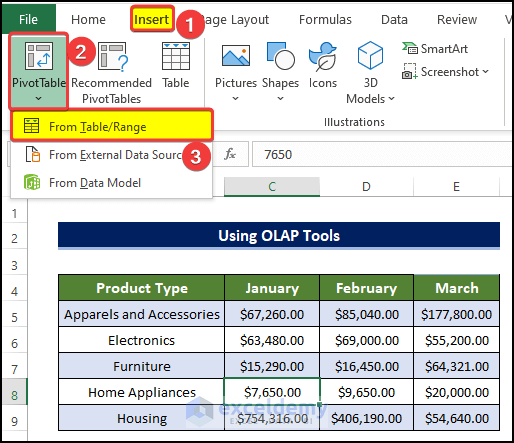
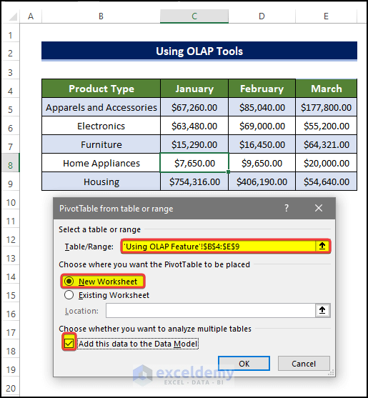
- A new dialog box will appear, in that dialog box, select the range of cell B4:E9.
- And select New Worksheet, in Choose where you want the Pivot Table to be placed.
- And tick the Add this data in the Data Model box.
- Click OK after this.
- In the new worksheet, you can see the PivotTable Fields in the right-side panel.
- From there, drag the Product Type in the Columns area.
- And drag the Values from the Column area to the Row area.
- Finally drag the month’s name: January, February, and March to the Values field.

- We are going to copy the whole table to another cell A9.
- A Pivot Table as shown below will be created.
- Select the whole table and right-click on it.
- Then from the context menu, click on the Copy.

- Then select cell A9 and then paste the table in that cell.
- Select the range of cells A9:G13 and go to Pivot Table Analyze tab > Calculations group.
- Then click on the OLAP tools > Convert to Formulas.
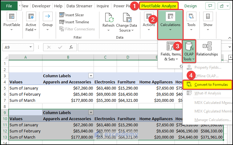
- Then we will notice that the newly copied table values are now converted to formulas.
- Using this general table, we can create a table as we wish.
- Click on the Insert tab and then click on the Stacked Column Chart in the 2-D Column section.
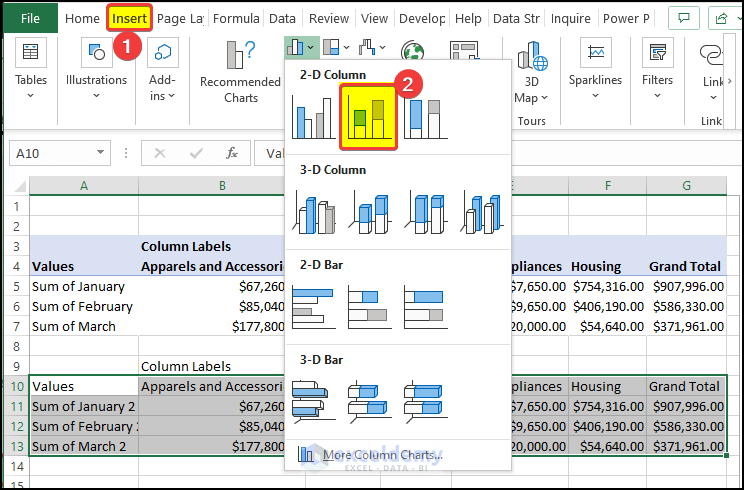
- Right after that, a new Stacked Chart is created.
- But this chart is not the format we want.
- We need to switch the row to column in order to get the desired output.
- To do this, go to Chart Design > Switch Row/Column.
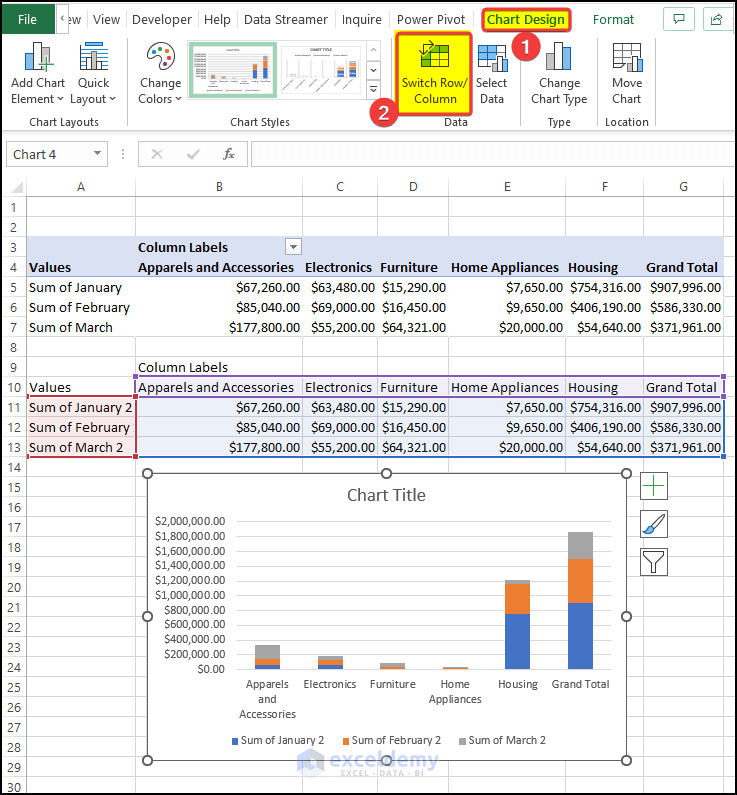
- After clicking the Switch Row/Column, you will notice that the row is now in the column position and the columns are in the row position.
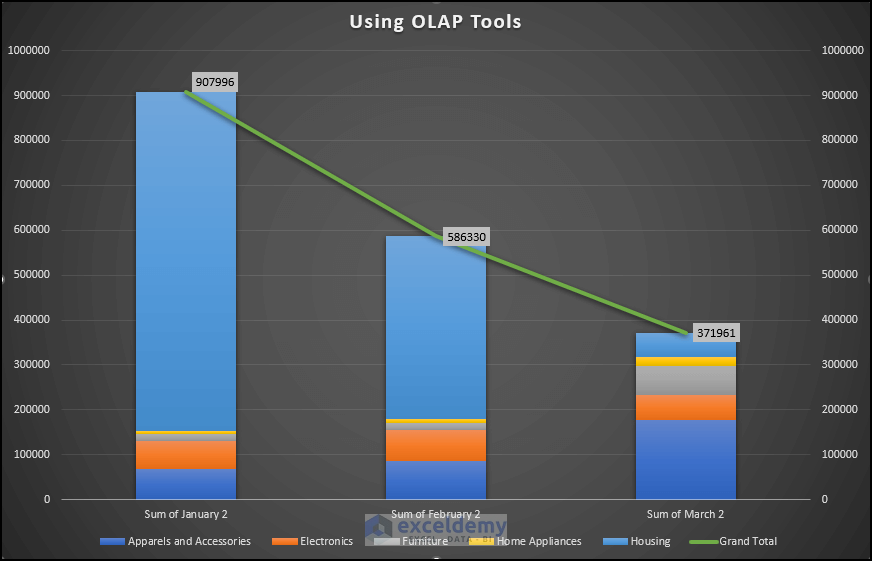
- And this chart is the output that we wanted from the beginning.
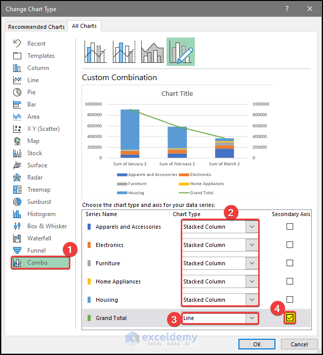
- Next, we have to add a secondary axis to the Pivot Chart and make the grand total columns show as a line chart.
- For this, click on the Chart Design and then click on Change Chart Type.

- In the Change the Chart Type dialog box, go to Combo options.
- Next in the Choose the Chart Type and Axis for your data series option set the Stacked Column chart for all of the series except the Grand Total.
- Set Grand Total chart type as Line. And tick the Secondary Axis box.
- Click OK after this.
- After clicking OK, we can see that our chart is ready.
- Right after some modifications, our chart will look like the one below.
Read More: How to Add Grand Total to Stacked Column Pivot Chart
2. Copying Pivot Table Data
There are a lot of similarities between this method with the first method. We basically have to follow the same Pivot Table creation process, and then just copy the grand total in the source Pivot Table and update the source.
Steps
- The dataset below will be plotted in a Stacked Chart where the grand total for each month will be plotted on the secondary axis.
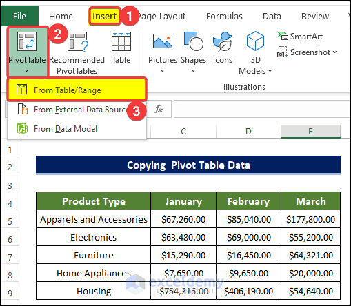
- To do this, go to Insert tab > Pivot Table > From Table/Range.
- A new dialog box will appear, in that dialog box, select the range of cell B4:E9.
- And also select New Worksheet, in Choose where you want the Pivot Table to be placed.
- And tick the Add this data in the Data Model box.
- Click OK after this.

- In the new worksheet, you can see the PivotTable Field in the right-side panel.
- From there, drag the Product Type in the Columns area.
- And drag the Values from the Column area to the Row area.
- Finally drag the month’s name: January, February, March to the Values field.

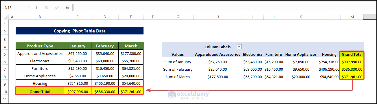
- Then from the Pivot Table, copy the Grand Total values and paste them into the range of B10:E10.
- Right after that, go to Pivot Table analyze > Change Data Source.
- From the context menu, click on the Change Data Source.
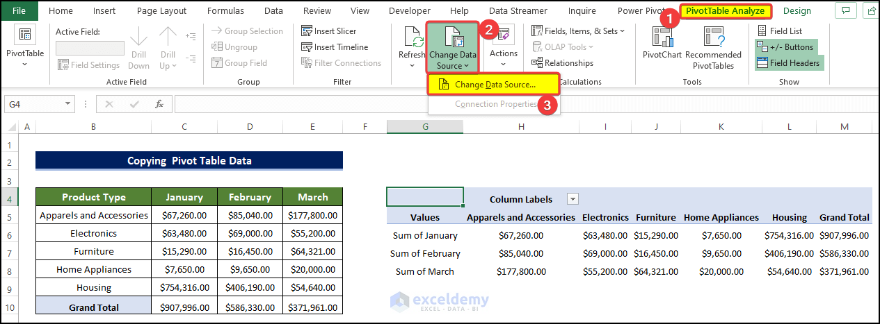
- Then in the dialog box, select the range of the new Pivot Table including the newly copied cells. In this case, the selected range is B4:E10.
- Click OK after this.

- Then go to Pivot Table Analyze > Refresh.
- From the context menu, click on Refresh All.

- Clicking this will refresh the original data and include the newly added value in the range of cell B10:E10 in the Pivot Table.

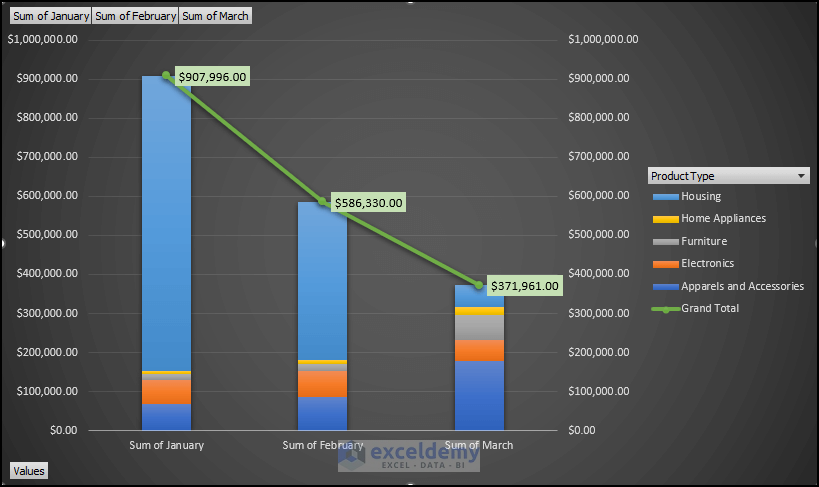
- Next, we will add the Pivot Chart to the Pivot Table.
- For this, click on the Pivot Table Analyze > Pivot Chart.

- In the Insert Chart dialog box, click on the Combo.
- Next in the Choose the Chart Type and Axis for your data series option set the Stacked Column chart for all of the series except the Grand Total.
- Set the Grand Total chart type as Line. And tick the Secondary Axis box.
- Click OK after this.

- After clicking OK, we can see that our chart is ready.
- Right after some modifications, our chart will look like the one below.
Download Practice Workbook
Download this practice workbook below.
Conclusion
To sum it up, the issue of how we can add Pivot Chart Grand Total in the secondary axis in 2 separate ways. For this problem, a macro-enabled workbook is available to download where you can practice these methods.
Feel free to ask any questions or feedback through the comment section. Any suggestion for the betterment of our community will be highly appreciated.
Related Articles
- How to Filter a Pivot Chart in Excel
- How to Add Target Line to Pivot Chart in Excel
- How to Insert a Stacked Column Pivot Chart in Excel
- Create a Clustered Column Pivot Chart in Excel
<< Go Back to Pivot Chart | Pivot Table in Excel | Learn Excel
Get FREE Advanced Excel Exercises with Solutions!
