Method 1 – Input Basic Particular
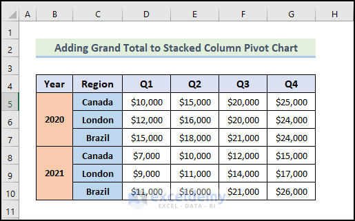
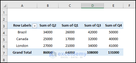
Demonstrate how to add the grand total to a pivot chart stacked column in Excel. Introduce our Excel dataset to give you a better idea of what we’re trying to accomplish in this article. The following dataset represents the quarterly sales for three regions of a company.
Method 2 – Insert Stacked Column Pivot Chart
- Select any cell from the data range.
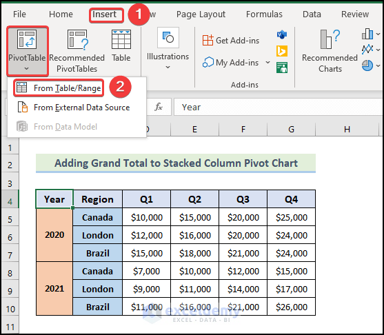
- Go to the Insert tab and select Pivot Table.
- Select From Table/Range from the drop-down list.
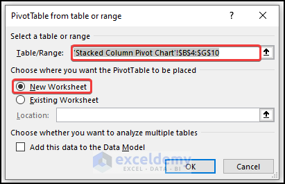
- A dialog box will appear like the following image. Excel will automatically select the data for you. For the new pivot table, the default location will be a New Worksheet.
- Click OK.
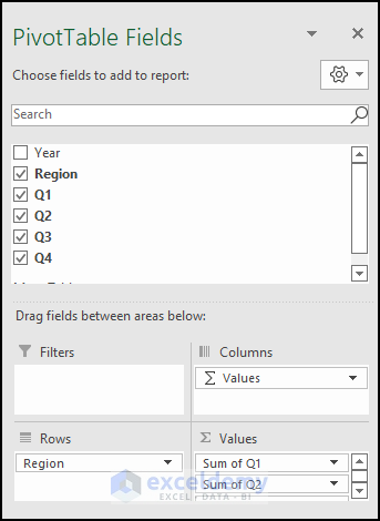
- A new worksheet will open up with PivotTable Fields.
- Mark the quarters and Region options as shown below.
- See that a Pivot Table has been created as in the image below.
- Iinsert a stacked column chart for the pivot table.
- Select any cell from the pivot table.
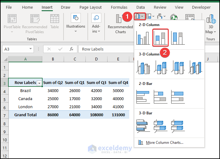
- In the Insert tab, click on the drop-down arrow of the Insert Column or Bar Chart from the Charts group.
- Choose the Stacked Column Chart.
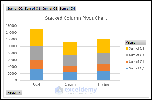
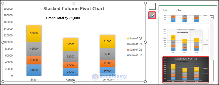
- The Stacked Column Pivot Chart is shown below. In each column, the sum for each quarter is displayed in different colors. This graphical representation makes it easy to understand the difference between the quarter sums at a glance.
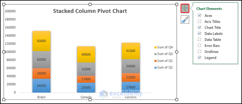
- Aadd graph elements. In Quick Elements, some elements are already added or removed. You can manually edit the graph to add or remove any elements from the chart using the Add Chart Element option.
- After clicking the Add Chart Element, you will see a list of elements.
- Click on them individually to add, remove, or edit them.
- Find the list of chart elements by clicking the Plus (+) button from the right corner of the chart, as shown below.
- Mark the elements to add or unmark the elements to remove.
- Find an arrow on the element, where you will find other options to edit the element.
Method 3 – Evaluate Grand Total
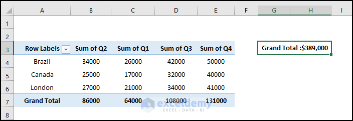
- To calculate the Grand Total, we have to type the following formula.
="Grand Total :" & TEXT(GETPIVOTDATA("Sum of Q2",$A$3)+GETPIVOTDATA("Sum of Q1",$A$3)+GETPIVOTDATA("Sum of Q3",$A$3)+GETPIVOTDATA("Sum of Q4",$A$3),"$#,###")
- Press Enter.
- Get the following Grand Total for every region.
How Does the Formula Work?
- GETPIVOTDATA(“Sum of Q2”,$A$3)+GETPIVOTDATA(“Sum of Q1”,$A$3)+GETPIVOTDATA(“Sum of Q3”,$A$3)+GETPIVOTDATA(“Sum of Q4”,$A$3)
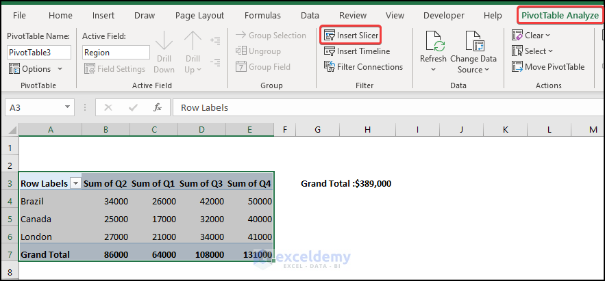
This formula will take the grand total of the quarter data from the pivot table and sum those quarters to get the value of 389,000.
- “Grand Total :” & TEXT(GETPIVOTDATA(“Sum of Q2”,$A$3)+GETPIVOTDATA(“Sum of Q1”,$A$3)+GETPIVOTDATA(“Sum of Q3”,$A$3)+GETPIVOTDATA(“Sum of Q4″,$A$3),”$#,###”)
The TEXT function converts a value to a specified number format, and the format is “$#,###” which indicates the currency format in the dollar. The Ampersand operator joins the text string and returns the output as Grand Total: $389,000.
Method 4 – Add Grand Total to Stacked Column Pivot Chart
- Select the chart.
- Go to the Format tab and select Text Box from the Insert Shapes.
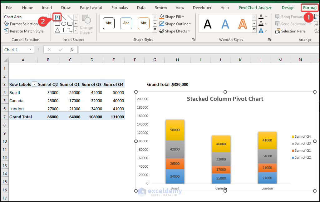
- After selecting Text Box, draw it on the chart as shown below. Type the following into the text box.
=Sheet4!$G$3
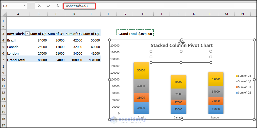
- Add the grand total to the stacked column pivot chart as shown below.
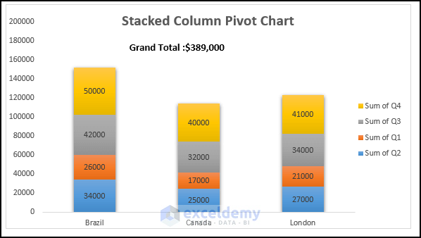
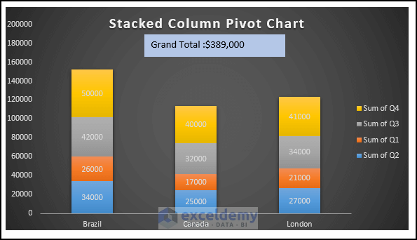
- Modify the chart style, select Design, and select your desired Style 8 option from the Chart Styles group.
- Or right-click on the chart, select the Chart Styles icon, and select your desired style as shown below.
- You will get the following chart.
- Add a slicer for customization purposes.
- Go to the PivotTableAnalyze and select Insert Slicer.
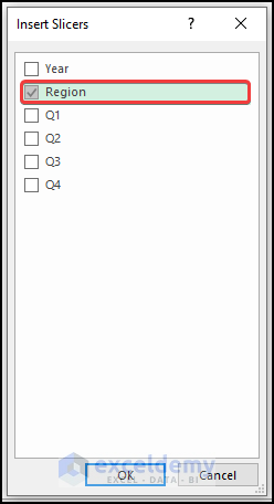
- When the Insert Slicers dialog box appears, check the Region section.
- Get the following output.
- Customize our chart based on a slicer for our visualization analysis.
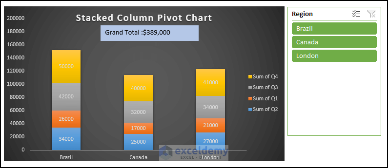
- Below is an example of the Grand Total amount we will receive if we select the Canada region.

Things to Remember
✎ Select anywhere in the pivot table before inserting a stacked column graph. Otherwise, rows and columns will need to be manually added.
✎ By default, the pivot table will always sort the information in alphabetically ascending order. To reorder the information, you must use the sort option.
✎ Whenever you are creating a pivot table, choose New Worksheet. If you choose Existing Worksheet, a pivot table containing the data will be created in your existing sheet. created in your existing sheet that contains the If we create the pivot table in our current worksheet, there is a significant chance that the data will be distorted.
Download Practice Workbook
Download this practice workbook to exercise while you are reading this article. It contains all the datasets in different spreadsheets for a clear understanding. Try it yourself while you go through the step-by-step process.
Related Articles
- How to Filter a Pivot Chart in Excel
- Create a Clustered Column Pivot Chart in Excel
- How to Add Secondary Axis in Excel Pivot Chart
- How to Show Grand Total with Secondary Axis in Pivot Chart
<< Go Back to Pivot Chart | Pivot Table in Excel | Learn Excel
Get FREE Advanced Excel Exercises with Solutions!
