What Is Pivot Chart?
Pivot charts are a powerful way to visualize summarized data from a pivot table. They help illustrate comparisons, patterns, and trends.
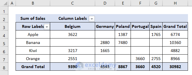
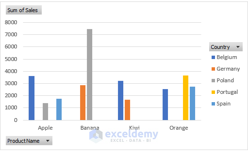
We have prepared a pivot table with the information on sales of 4 types of fruits in 5 European countries. As you can see the pivot table seems quite confusing. We therefore need a pivot chart to explain this clearly.
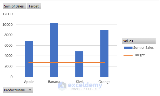
Type 1 – Column Chart
The column chart is helpful for visually comparing values across a few categories over a period of time. It typically displays information based on the horizontal axis and the vertical axis.
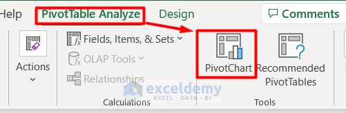
- Select the entire pivot table.
- Go to the PivotTable Analyze tab and choose PivotChart from the Tools section.
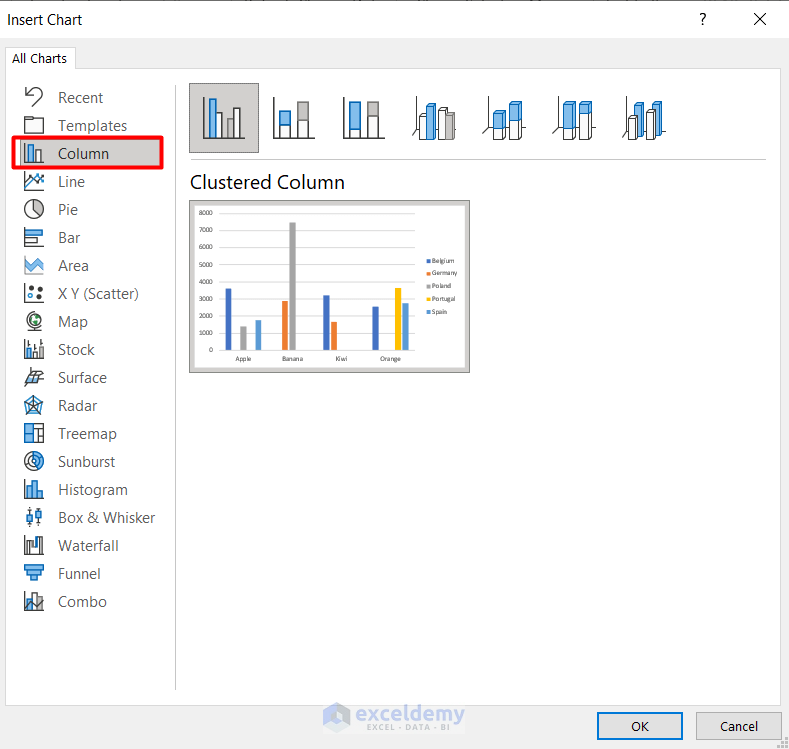
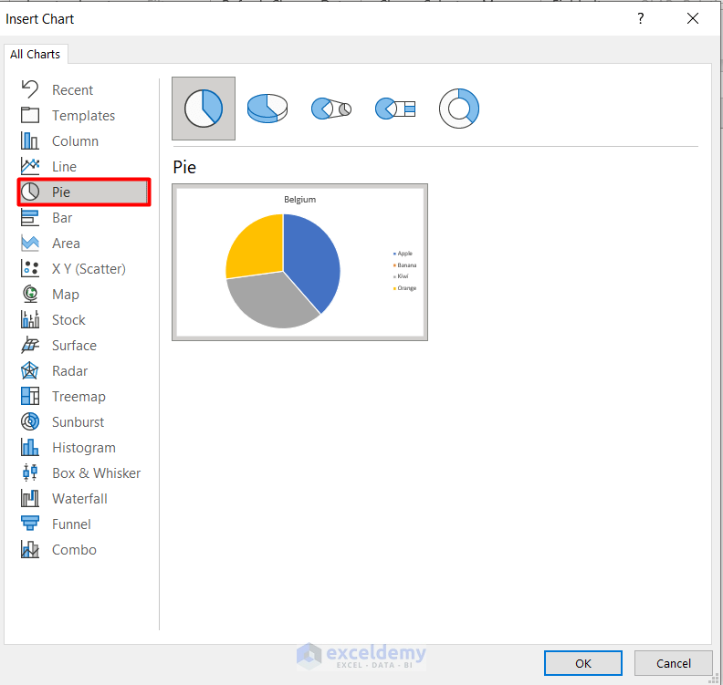
- In the Insert Chart window, select Column and choose a style.
- Click OK to create a column chart based on the pivot table.
- You can see a column chart in the workbook based on the pivot table.
Read More: Use Excel VBA to Create Chart from Pivot Table
Type 2 – Pie Chart
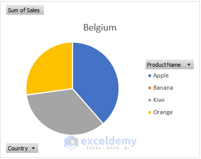
The pie chart is a fun and interesting type of pivot chart. It originates from a circle and divides into several pies according to the categories of the pivot table. The data points are shown as a percentage of the whole pie. Each of the pieces changes its size accordingly.
- Similar to the above steps, select the pivot table.
- In the Insert Chart window, choose Pie.
- You’ve created a pie chart representing the pivot table data.
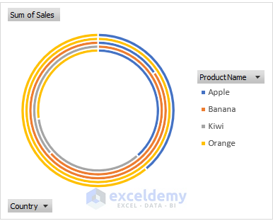
Type 3 – Doughnut Chart
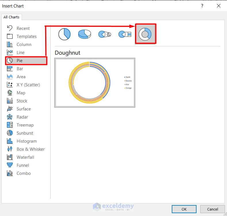
The doughnut chart is similar to the pie chart. The only difference is that it can contain more data series at once.
- Also similar to the pie chart, find the doughnut chart in the Pie section of the Insert Chart window.
- You can see the doughnut chart here.
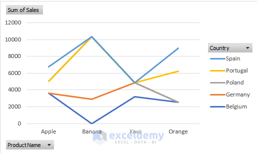
Type 4 – Line Chart
- Ideal for showing trends over equal intervals (e.g., time differences).
- Represents data evenly scaled on both axes.
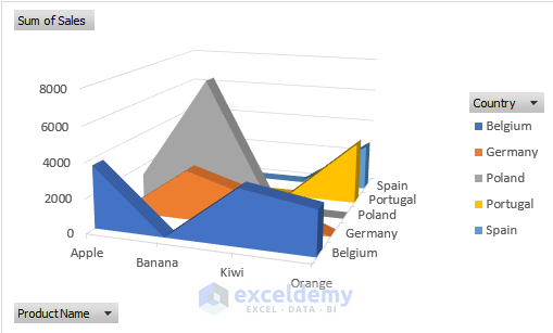
Type 5 – Area Chart
- Visualize your pivot chart as a solid area (instead of bars or lines).
- Shows plot changes over time and relationships between parts.
- Can be 2D or 3D.
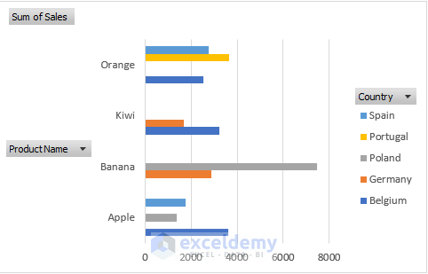
Type 6 – Bar Chart
- Opposite of the column chart: values along the horizontal axis, categories along the vertical axis.
- Commonly used for comparisons among distinct items.
Type 7 – Combo Chart
- Complex but powerful.
- Requires two or more chart types to make data understandable.
- Useful for mixed data (e.g., price and volume).
Follow the steps below to create a combo chart:
- Create a pivot table with different data types.
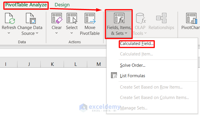
- Add calculated fields using the Calculated Fields option from Fields, Items, and Sets drop-down in the Pivot Table Analyze tab
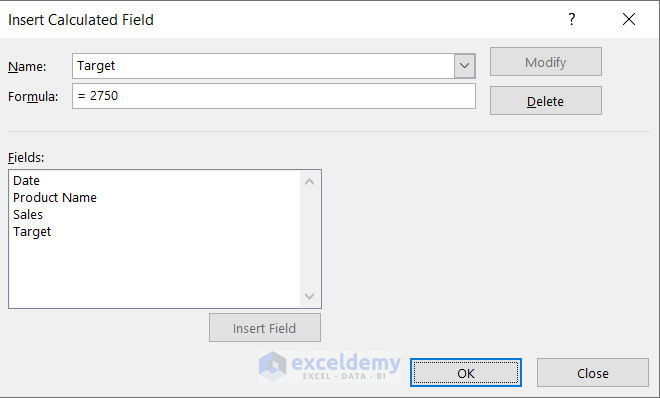
- Add Name and Formula in the Inset Calculated Field section.
- Press OK.
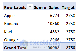
- The pivot table will look like this:
- Choose Combo from the Insert Chart window.
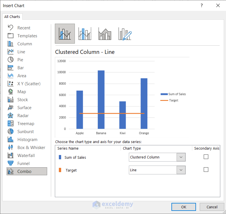
- You have a combo chart based on the pivot table.
Types of Pivot Charts in Excel – 5 Less Popular Ones
Let’s explore some of the less commonly used pivot charts in Excel:
1. Scatter Chart
- Used for comparing scientific or statistical numbers along horizontal and vertical axes.
- Allows changing logarithmic scales and axis values.
- Useful for showing information related to grouped data sets.
2. Bubble Chart
- Similar to a scatter chart but includes an additional third column.
- Required to display data points within a data series.
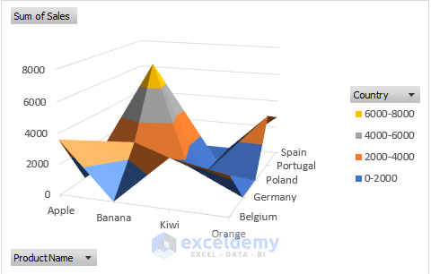
3. Surface Chart
- Acts like a topographic map, using colors and patterns to indicate value areas.
4. Stock Chart
- Shows fluctuations in the same type of data (e.g., prices, temperatures, wind flow).
- Highlights high-low variations among datasets.
5. Funnel Chart
- Represents data without any axis information.
- Displays data as an inverted triangle with a hierarchical structure.
How to Customize Pivot Charts in Excel
After creating a pivot chart, you can edit it:
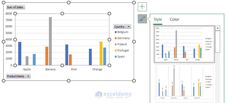
- Click the Plus (+) icon to edit chart elements.
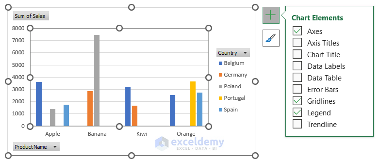
- Use the Brush icon to adjust style and color.
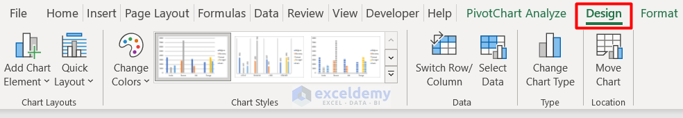
- Explore additional customization options in the Design tab.
Read More: How to Use Pivot Chart in Excel
Things to Remember
- Pivot charts are essential for viewing sales, timelines, productivity, and other metrics.
- They handle negative values easily.
- Keep in mind that flexibility is limited since pivot charts depend directly on the fixed source data from the pivot table.
Download Practice Book
You can download the practice workbook from here:
Related Articles
- How to Refresh Pivot Chart in Excel
- Data Labels in Excel Pivot Chart
- Difference Between Pivot Table and Pivot Chart in Excel

