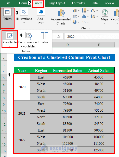
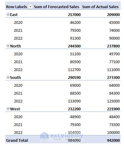
Create a Clustered Column Pivot Chart in Excel (with Easy Steps)

Get FREE Advanced Excel Exercises with Solutions!

While working in Microsoft Excel you might find it difficult to create a chart or diagram in a pivot table. But if you go through this article you can easily make a clustered column pivot chart. In this article, I am going to share with you how to create a clustered column pivot chart in Excel.


Watch Video – Create a Clustered Column Pivot Chart in Excel


How to Create a Clustered Column Pivot Chart in Excel: 3 Easy Steps

Go through the following 3 steps for the successful creation of a clustered column pivot chart in Excel.

Suppose we have a dataset of Forecasted Sales and Actual Sales Region-wise and Year-wise. Now we will make a clustered column pivot chart using the following dataset.

Create a Clustered Column Pivot Chart


Step 1: Create a Pivot Table from Dataset

  • Firstly you have to create a pivot table to reach the final destination.
  • To do that, select all the cells from the data table and then choose “Pivot Table” from the “Insert” option.
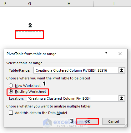
  • A new window will pop up named “PivotTable from table or range”.
  • Click the “Existing Worksheet” and select a location in your worksheet to create the pivot table.
  • Hit the OK button to continue.

Create a Clustered Column Pivot Chart

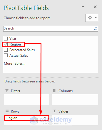
  • A pivot table will be created.
  • Now in the right side pane, drag the “Region” name from the fields to the “Rows” field.

Create a Clustered Column Pivot Chart

  • After that, drag again the “Year” field to the “Rows” section and “Forecasted Sales” and “Actual Sales” to the “Values” section.

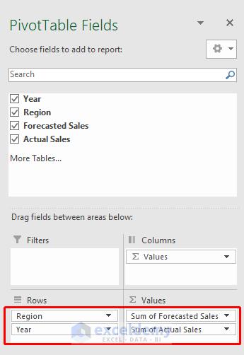
  • After completing all the steps you will get your final pivot table ready in your hand.
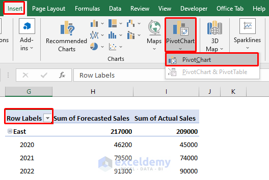
Create a Clustered Column Pivot Chart


Step 2: Insert Clustered Column Chart from Chart Option

  • It’s time to insert a clustered column chart using the pivot table.
  • To do that while selecting the pivot table go to the “Insert” option and then select “Pivot Chart”.

Create a Clustered Column Pivot Chart

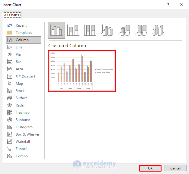
  • A new window will pop up named “Insert Chart”.
  • Choose “Clustered Column” and then press OK to continue.

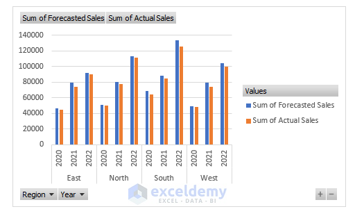
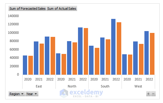
  • A clustered column showing selected values from the pivot table will be created.

Create a Clustered Column Pivot Chart

Read More: How to Insert a Stacked Column Pivot Chart in Excel


Step 3: Edit the Clustered Column Chart

  • In this final step, we will edit the chart.
  • For that, select a bar and click the right button on the mouse to get options.
  • From the options choose “Format Data Series”.

Create a Clustered Column Pivot Chart

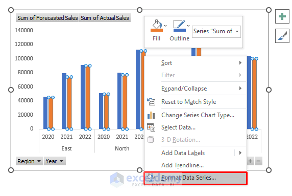
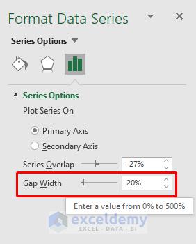
  • A new pane will pop up on the right side of the worksheet.
  • From there change the “Gap Width” to “20%” to make the chart more look native.

  • Finally, we have created our clustered column chart.

Create a Clustered Column Pivot Chart


Things to Remember

  • In the first step, I have chosen region and year in the row section. You can drag them to the column section to make the pivot table in a different way and for easy calculation.

Download Practice Workbook

Download this practice workbook to exercise while you are reading this article.


Conclusion

In this article, I have tried to cover all the simple steps to creating a clustered column chart in Excel. Take a tour of the practice workbook and download the file to practice by yourself. I hope you find it useful. Please inform us in the comment section about your experience. We are always responsive to your queries. Stay tuned and keep learning.


Related Articles


<< Go Back to Pivot Chart | Pivot Table in Excel Learn Excel

What is ExcelDemy?

ExcelDemy - Learn Excel & Get Excel Solutions Center provides online Excel training , Excel consultancy services , free Excel tutorials, free support , and free Excel Templates for Excel professionals and businesses. Feel free to contact us with your Excel problems.

Tags:

Wasim Akram
Wasim Akram

Wasim Akram holds a BSc degree in Industrial and Production Engineering from Ahsanullah University of Science and Technology. Over the past 2 years, he has been actively contributing to the ExcelDemy project, where he has authored more than 150 articles. Now, he is working as an Excel VBA and Content Developer. He likes learning new things about Microsoft Office, especially Excel VBA, Power Query, Data Analysis, and Excel Statistics. He is also very interested in machine learning and... Read Full Bio

We will be happy to hear your thoughts

Leave a reply

Advanced Excel Exercises with Solutions PDF


ExcelDemy
Logo