Suppose you have a PivotTable that includes the Sum of Sales and the Sum of Profit.
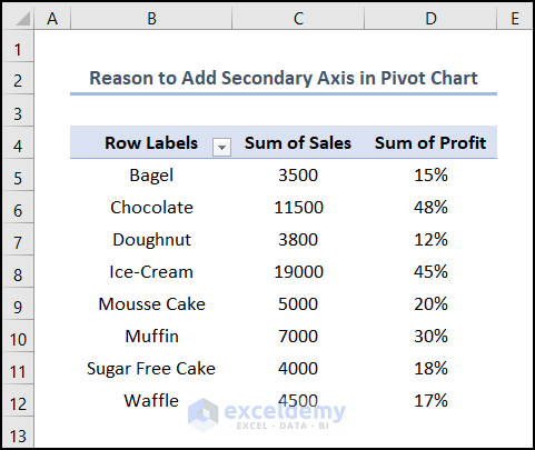
You can create a PivotChart with the Pivot Table, depending on your requirements.
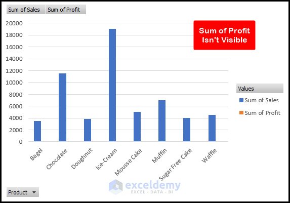
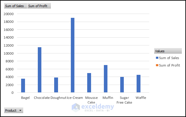
Here, the blue bars represent the Sales. However, the orange bars aren’t visible as the profit value is small compared to sales. Here comes the essentiality of the Secondary Axis. If you had added a new Secondary Axis for the Sum of Profit, this problem would not exist. Let’s see the image below.
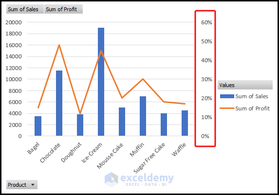
Here, we’ve changed the vertical axis of the Sum of Profit. Now, we can easily interpret the chart and get a sense of the profit percentage for each product.
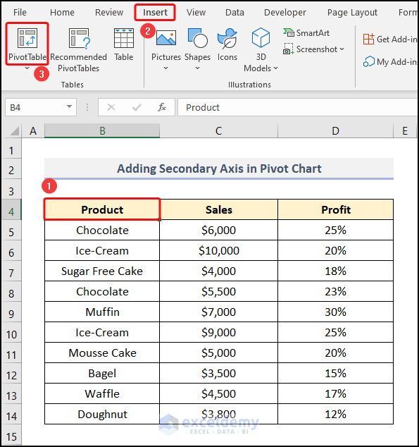
Step 1: Prepare the Dataset
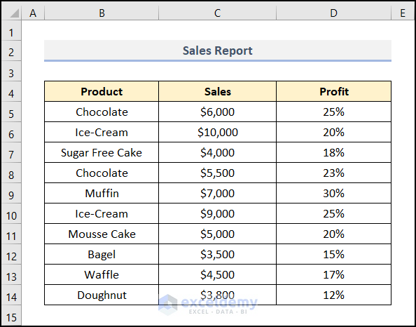
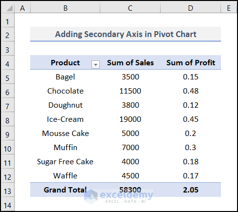
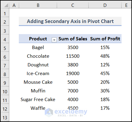
Our dataset uses a monthly sales report of a particular bakery. This dataset includes the product name, the corresponding sales amount, and the analogous profit percentages in columns B, C, and D.
Note: Make sure you format the Sales column in Currency format. On the other hand, apply the Percentage formatting in the Profit column.
Step 2: Insert a Blank Pivot Table
- Select any cell inside the dataset. In this case, we selected cell B4 in our dataset.
- Go to the Insert tab.
- Click on PivotTable in the Tables group.
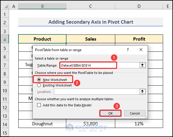
- The PivotTable from the table or range dialog box appears.
- We can see that our data range was automatically detected and sat in the Table/Range box.
- In the Choose where you want the PivotTable to be placed section, select New Worksheet. This will place our Pivot Table in a new worksheet.
- Click OK.
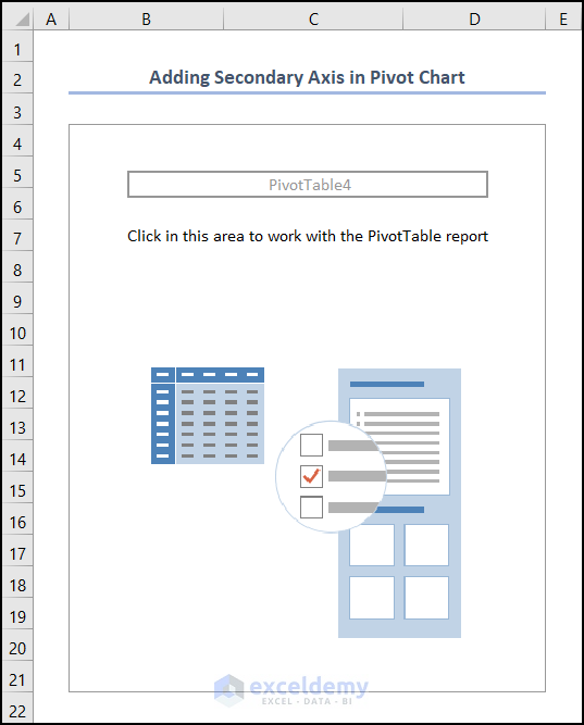
Excel has created a blank Pivot Table in a new worksheet.
- Select any cell on the Pivot Table. For example, we chose cell B4.
- The PivotTable Fields task pane opens on the right side of the worksheet.
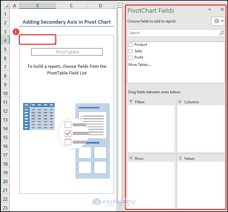
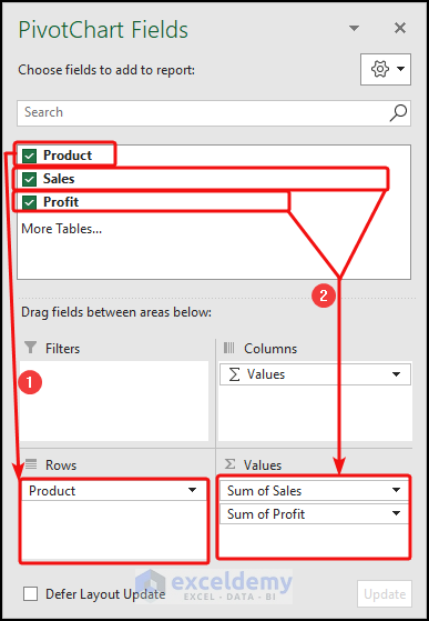
The PivotTable Fields task pane has two parts: the upper part, where the field names reside, and the lower part, where you will place the upper part’s field names as necessary. In our example, the upper part of the PivotTable Fields task pane holds the Product, Sales, and Profit. The lower part has filters, columns, rows, and values.
Step 3: Lay out the Pivot Table
- Drag the Product field into the Rows area.
- Drag the Sales and Customer fields into the Values area.
And the final output looks like the following one.
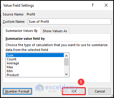
- Right-click on the Sum of Profit heading.
- From the context menu, select the Value Field Settings option.
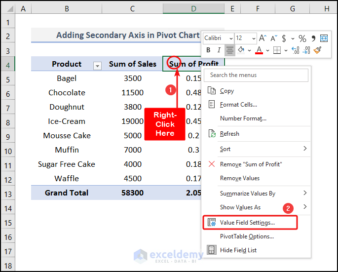
- The Value Field Settings dialog box pops up.
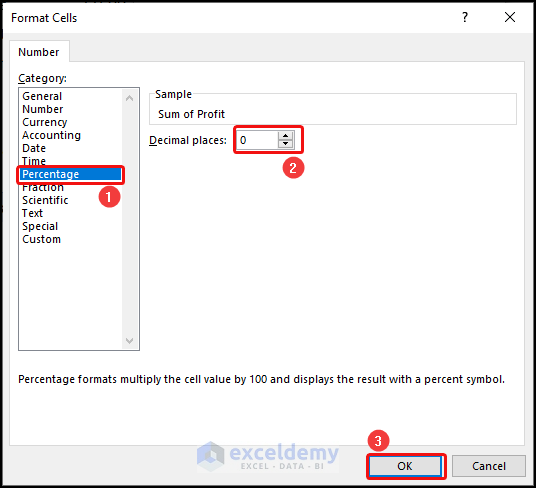
- Click on the Number Format.
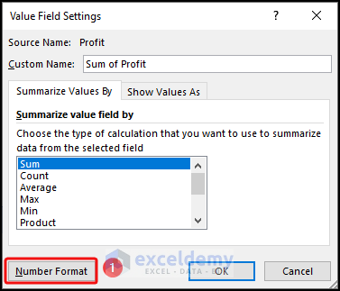
- The Format Cells Wizard opens.
- In the Category section, select Percentage format.
- Change the Decimal places to 0.
- Click OK.
- It returns us to the Value Field Settings wizard.
- Click OK.
- Go to the Design tab.
- Click on the Layout group drop-down.
- Select the Grand Totals drop-down option.
- Choose the Off for Rows and Columns.
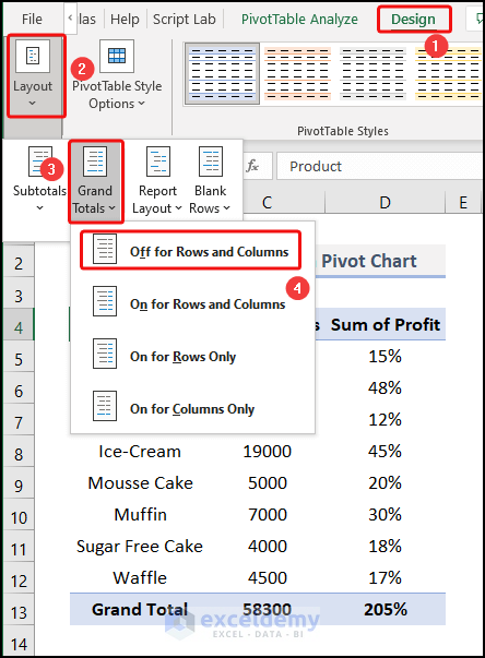
Our PivotTable looks like the one below.
Step 4: Insert a Pivot Chart
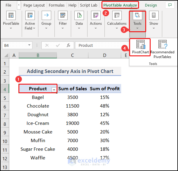
- Select cell B4 to open up the Tool.
- Go to the PivotTable Analyze tab.
- Click on the Tools drop-down group.
- Select PivotChart from the available options.
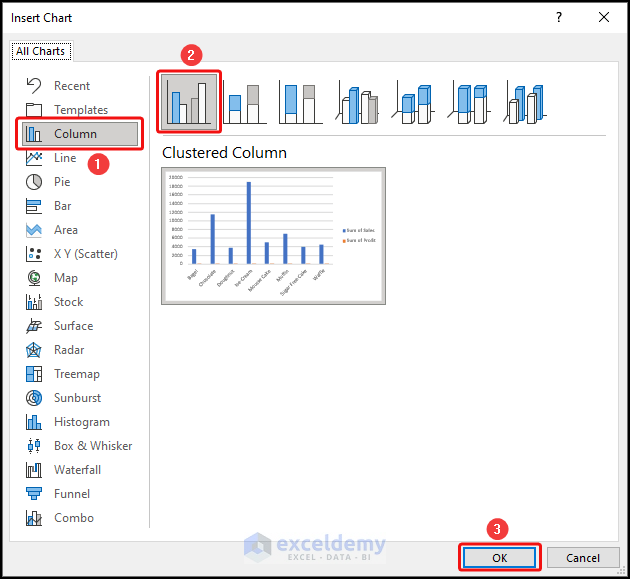
The Insert Chart prompt appears.
- Click on the Column chart.
- Choose the Clustered Column from the choices.
- Click OK.
We can see a 2-D Clustered Column chart in our worksheet.
Read More: Create a Clustered Column Pivot Chart in Excel
Step 5: Utilize the Format Data Series Pane
- Right-click on the column of Sum of Sales.
- From the context menu, select Format Data Series.
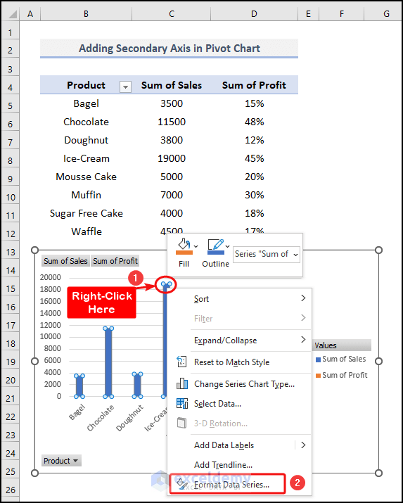
The Format Data Series task pane appears on the right side of the worksheet.
- Click on the Chart Elements drop-down beside the Series Options text.
- Select Series “Sum of Profit” from the options.
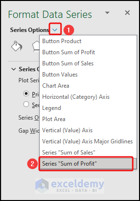
- Select the Secondary Axis from the Plot Series On section.
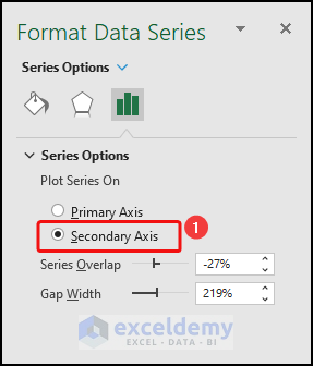
The chart looks like the screenshot below.
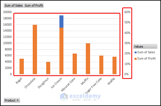
The right side of the chart now has a new secondary axis for the sum of profit.
Read More: How to Show Grand Total with Secondary Axis in Pivot Chart
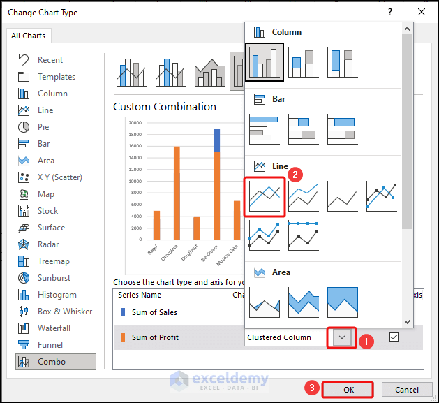
Step 6: Change Series Chart Type
- Right-click on the Sum of Profit series on the chart.
- From the context menu, select Change Series Chart Type.
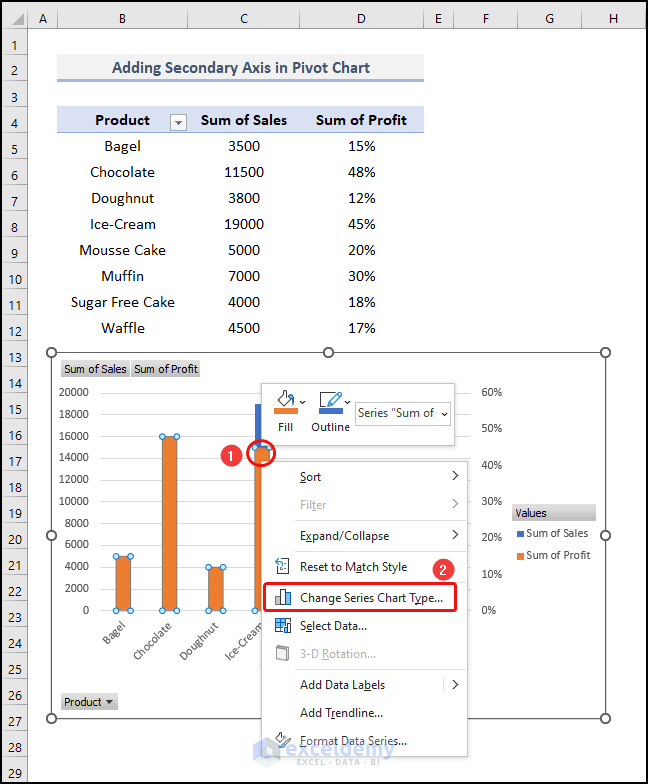
The Change Chart Type wizard opens.
- Click on the Chart Type drop-down of the Sum of Profit Series.
- Select the Line chart from the options.
- Click OK.
Our PivotChart gets changed into an explainable one.
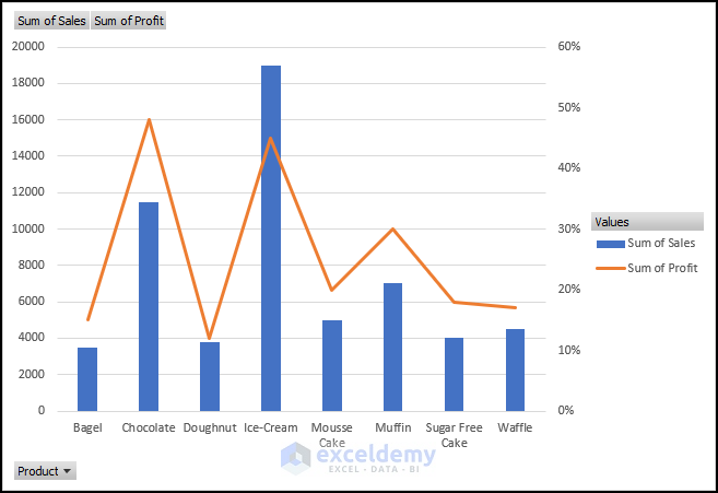
The Sum of Profit series is displayed by lines. Thus, we can easily visualize the contents of the chart.
A Possible Solution If the Secondary Axis Disappears from the Excel Pivot Chart
Steps:
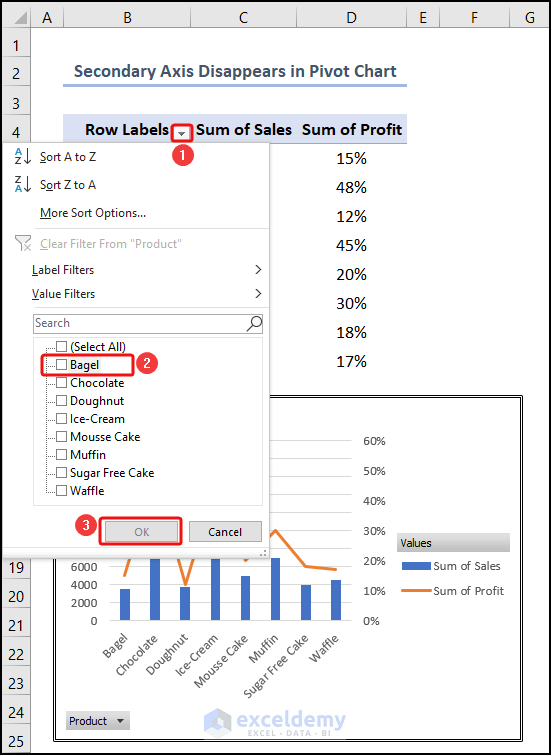
- Click on the down arrowhead icon beside the Row Labels heading.
- Unselect the option Select All and select Bagel only.
- Click OK.
The chart shows an illustration just for the product Bagel. Here, we cannot see the Secondary Axis, so we can say that it disappeared from the chart for this instance.
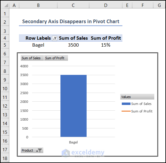
If we clear the filter, the axis will be visible.
Download the Practice Workbook
You may download the following Excel workbook to practice.
Related Articles
- How to Filter a Pivot Chart in Excel
- How to Add Grand Total to Stacked Column Pivot Chart
- How to Add Target Line to Pivot Chart in Excel
<< Go Back to Pivot Chart | Pivot Table in Excel | Learn Excel
Get FREE Advanced Excel Exercises with Solutions!
