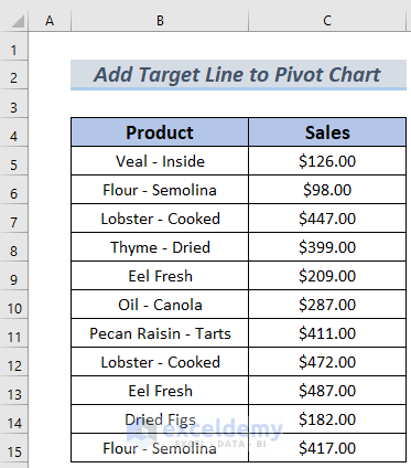
The dataset contains sales information about some grocery items. We will show you how to add this amount as a target line in a Pivot Chart.
Method 1 – Applying a Target Value
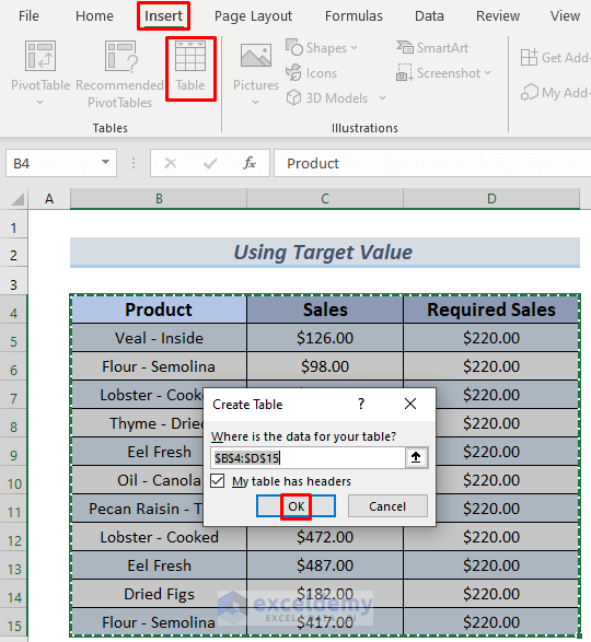
- Enter the required sales amount and convert your data into a table. Select your range and go to Insert >> Table.
- Select ‘My table has headers’.
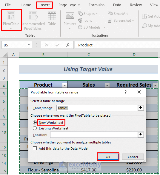
- Select the table and then go to Insert >> PivotTable.
- You will see a dialog box showing whether you want your PivotTable in the existing worksheet or a new worksheet. (The screenshot below shows New Worksheet)
- Click OK.
- You will see a Pivot Table in a new worksheet.
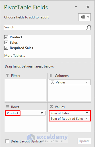
- In the sheet, you will also see the PivotTable Fields.
- Drag the Product Field to the ‘Rows’ area.
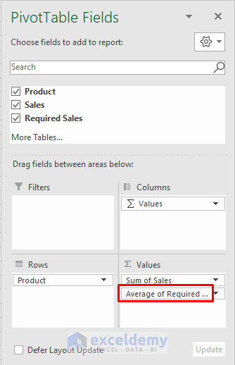
- Drag the Sales and Required Sales Fields to the Values Area.
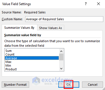
Instead of taking the Sum of Required Sales, we will use the Average of Required Sales because that will keep the target or required sales value constant while analyzing the Pivot Table.
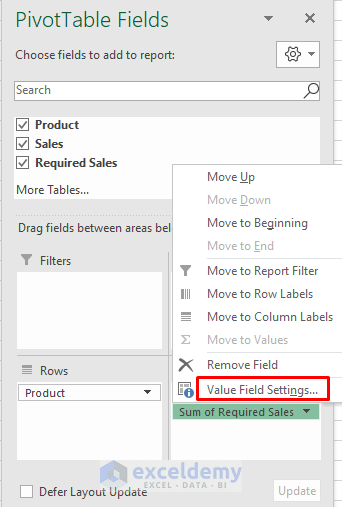
- Click on the Sum of Required Sales Area and select Value Field Settings…
- Select Average and click OK.
Your Pivot Table Fields are all set now.
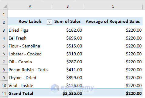
In the following image, you will see the Pivot Table analysis for the sales of your grocery items.
- Select any cell in your Pivot Table and then go to PivotTable Analyze >> Tools >> PivotChart.
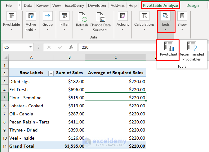
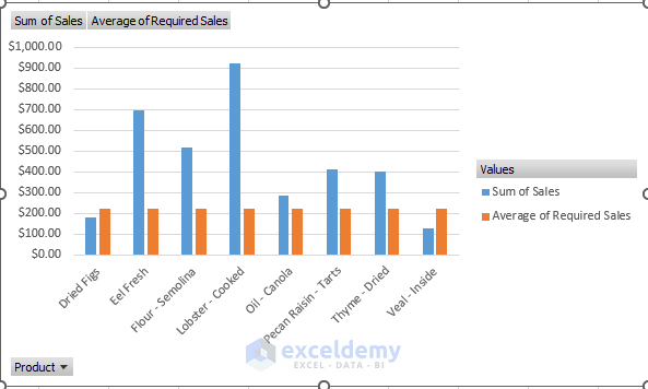
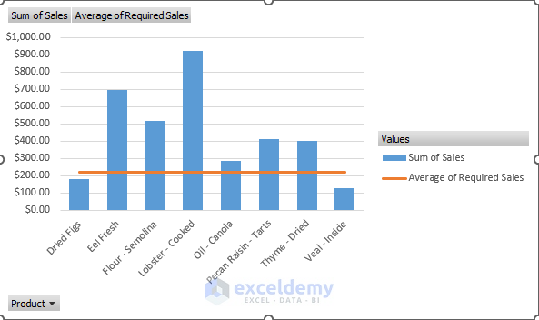
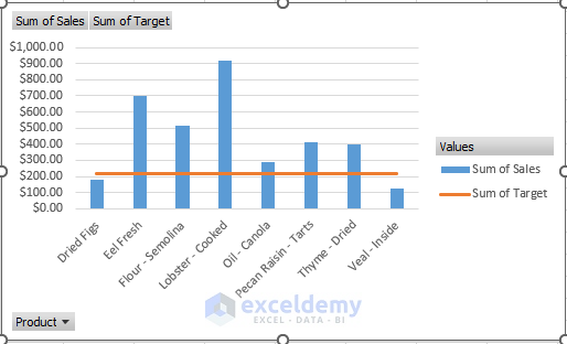
- You will see the data information in a Column Chart. Some columns in the chart are the same height. They indicate the Required Sales amount of your products, which is $220.
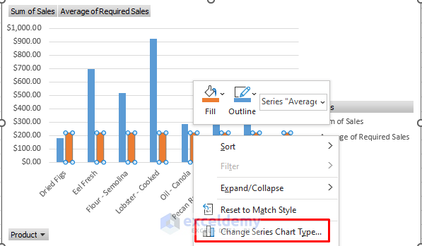
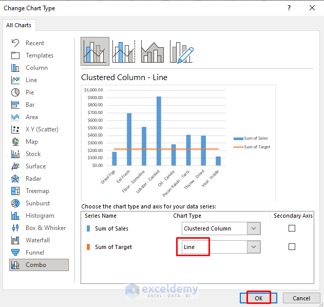
- Select any of the columns of the same height and right-click on it. Choose Change Series Chart Type…
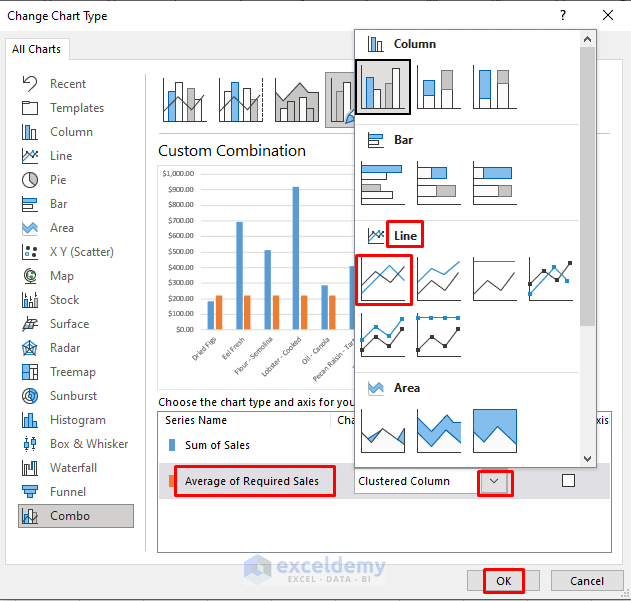
- Change the chart type for the Average of Required Sales from a Clustered Column to a Line Chart.
- Click OK.
- You will see the target line in your Pivot Chart.
You can add a target line to the Pivot Chart in Excel by applying a target value.
Method 2 – Using Excel Pivot Table Analyze Tab
Steps:
- Follow the steps in Section 1 to create the Pivot Table analysis sheet, and follow this link to add the Required Sales amount to your Pivot Chart.

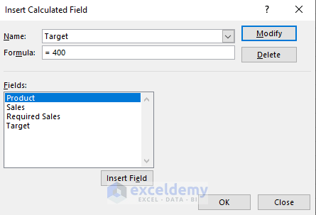
- Select the chart and go to PivotTable Analyze >> Fields, Items & Sets >> Calculated Field…
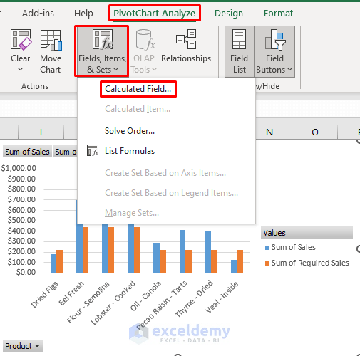
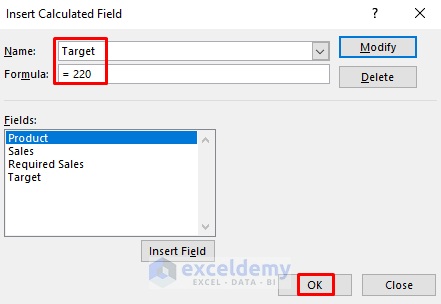
- Set a name and add your target value in the Formula section of the Insert Calculated Field In my case, it’s 220$.
- Click OK.
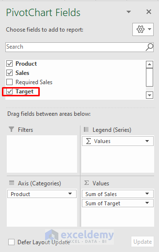
- If you go to the PivotTable Fields, you will see the Target field added. Uncheck Required Sales and check Target.
- You will see a Column Chart and convert the columns that indicate Target values to a Line Chart following the steps described in Section 1.
- You will see a target line in your Pivot Chart.
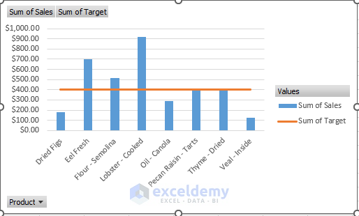
- If you want to change your target line, you can do so in the Calculated Field. In this case, I changed it to $400 and clicked OK.
- You will see the target line elevated to $400.
You can add a target line to the Pivot Chart in Excel by using the PivotTable Analyze Tab.
Read More: How to Filter a Pivot Chart in Excel
Practice Section
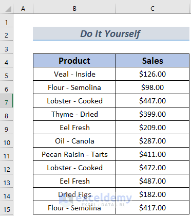
Here is the dataset so you can practice these methods on your own.
Download the Practice Workbook
Related Articles
- How to Insert a Stacked Column Pivot Chart in Excel
- Create a Clustered Column Pivot Chart in Excel
- How to Add Secondary Axis in Excel Pivot Chart
- How to Show Grand Total with Secondary Axis in Pivot Chart
<< Go Back to Pivot Chart | Pivot Table in Excel | Learn Excel
Get FREE Advanced Excel Exercises with Solutions!

OMG, I searched for this solution off and on for months, this was the first one that completely worked!!!!!! THANK YOU VERY MUCH!
Dear Micah,
Thanks for your kind words. ExcelDemy is dedicated to provide solutions to help you.
Regards
Shamima Sultana | Project Manager | ExcelDemy
You guys are awesome, please create more pivot table for data analysis and power pivot, thank you!!!
Hello Zayaan,
You are most welcome. Thanks for your appreciation. We have a category of pivot table and data analysis. We will create more pivot table for data analysis and power pivot. Keep learning Excel with us.
Please explore our this section.
Pivot Table in Excel
Data Analysis in Excel
Power Pivot
Regards
ExcelDemy