Method 1 – Adding Data Labels in Pivot Chart
Steps
- Go to Insert tab > Tables group.
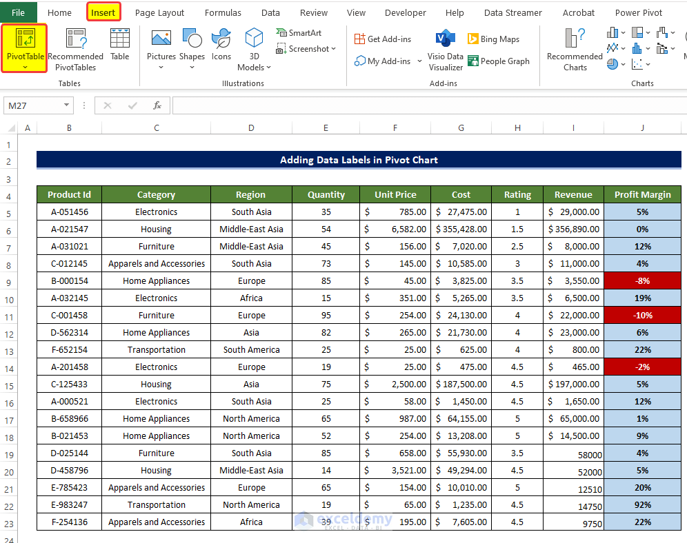
- Select the range of cells of the primary dataset., here the range of cells is B4:J23.
- Select the New Worksheet in the next option.
- Click OK after this.
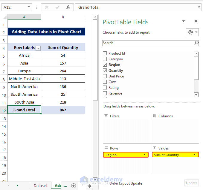
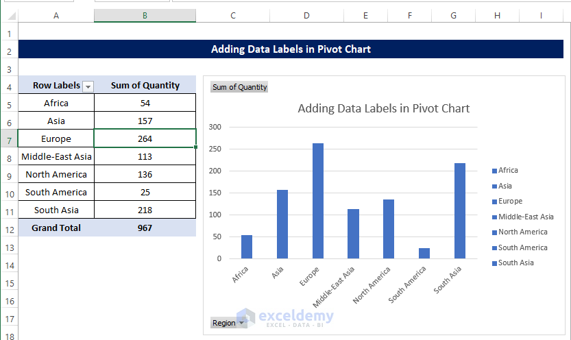
- Open a new worksheet. The Pivot table fields will be on the right side of that worksheet.
- The Pivot Table fields, drag the region in the Row area below.
- Drag the Quantity in the Values area.
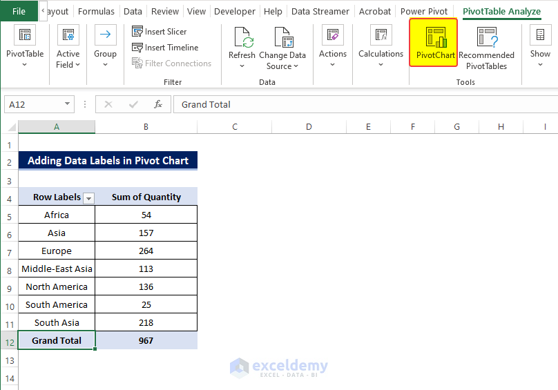
- From the PivotTable Analyze tab, click the PivotChart.
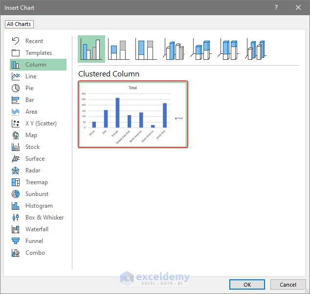
- In the Insert Chart dialog box, select the Clustered Column option.
- Click OK after this.
- There will be a column chart without any data label.
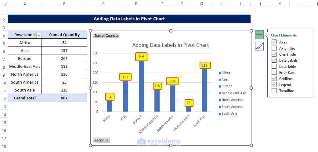
- Click the Plus sign right next to the chart.
- From the menu, notice the Data Labels check box.
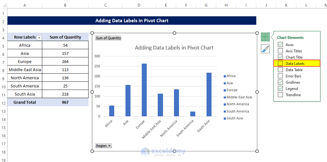
Then check the Data labels box, after then you will see the Data Labels showing over the columns.
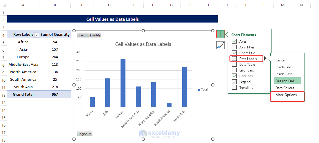
Method 2 – Set Cell Values as Data Labels
Steps
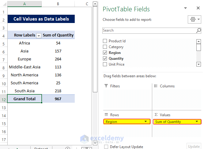
- Create the Pivot Table just like before and then drag the Region in the Axis area and Quantity in the Values area.
- Add a Pivot Chart from the PivotTable Analyze tab.
- A data label option, but we want to add it manually from a range of cells.
- Click on the Plus sign right next to the Chart, from the Data labels, click on the More Options.
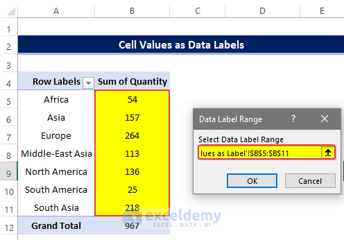
- In the Format Data Labels, click on the Value From Cells and click on the Select Range.
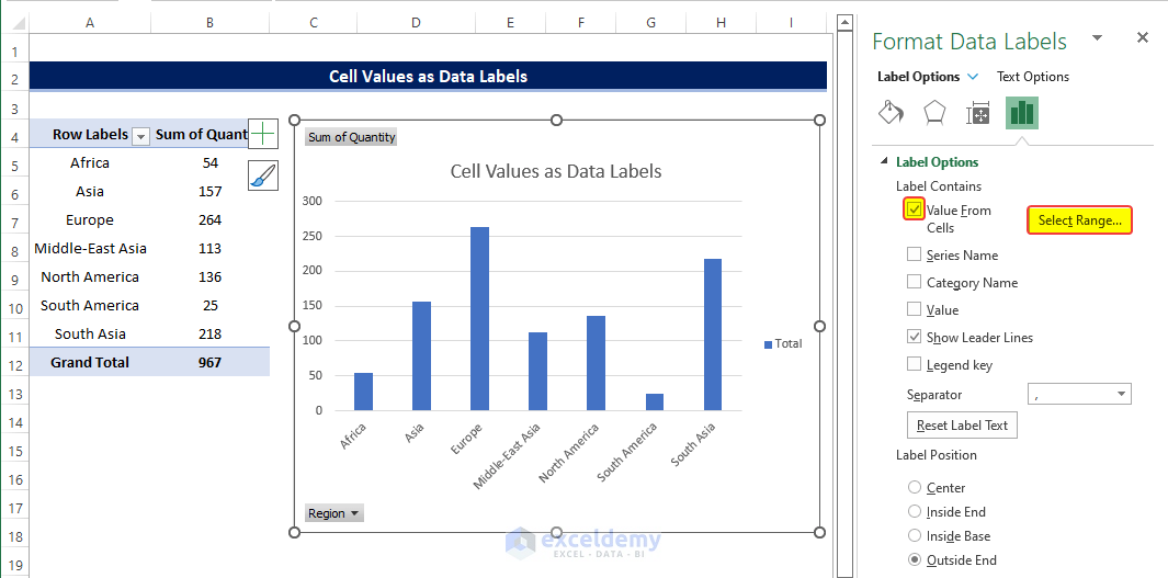
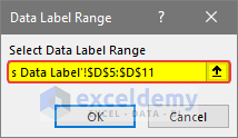
- In the next step, select the range of cells B5:B11.
- Click OK after this.
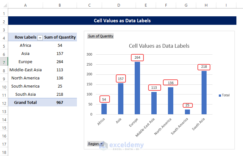
- There will be Data Labels from the range of cells B5:B11 on top of each column.
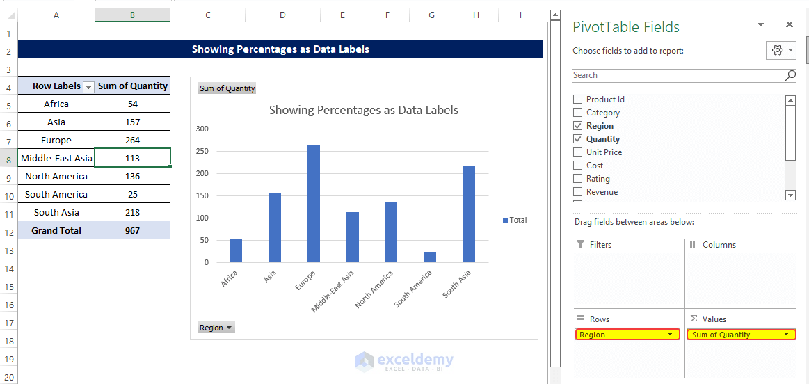
Method 3 – Showing Percentages as Data Labels
Steps
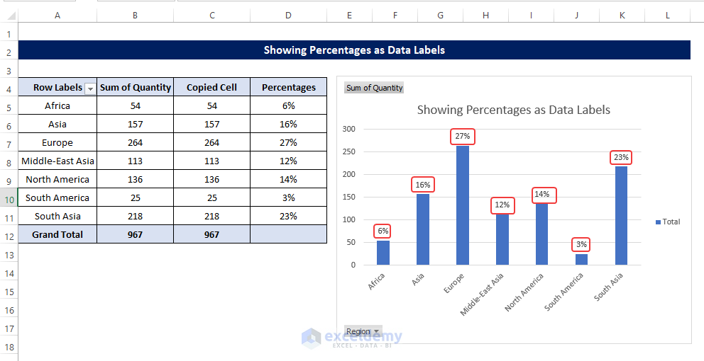
- Create a similar Pivot Table, just like the previous methods, by dragging the Region in the Rows area and the Quantity in the Values area.
- Create a Pivot Chart from this table similarly using the PivotTable Analyze before.
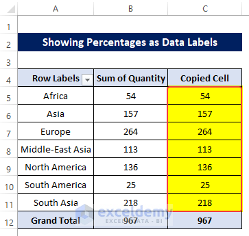
- Copy the range of cells B5:B11 to the range of cells C5:C11.
- Select cell D5 and enter the following formula:
=C5/$C$12
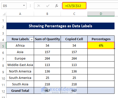
- Drag the Fill Handle to cell D11.
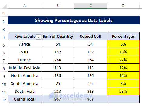
- Doing this will fill the range of cells C5:C11 with the percentages of each cell concerning the Total values.
- Add a Pivot Chart from the PivotTable Analyze tab.
- Press on the Plus right next to the Chart.
- Open Format Data Labels by pressing the More options in the Data Labels.
- On the side panel, click on the Value From Cells.
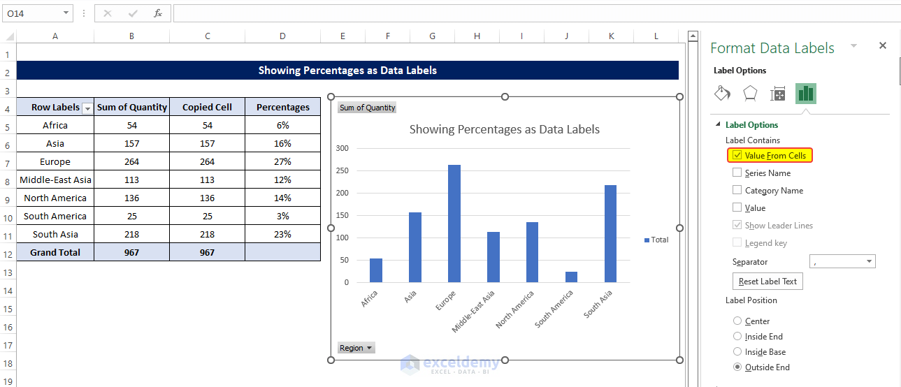
- In the dialog box, Select D5:D11, and click OK.
- Right after clicking OK, you will notice that percentage signs are showing on top of the columns.
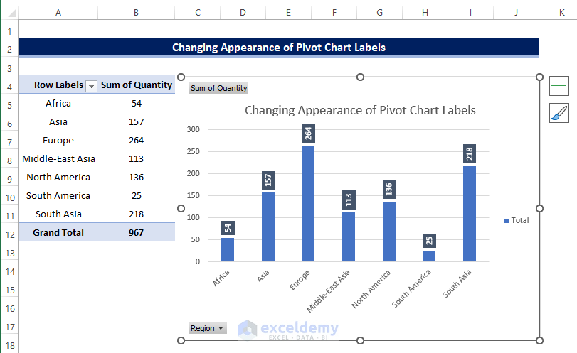
Method 4 – Changing the Appearance of Pivot Chart Labels
Steps
- Try to change the way the Data Labels look.
- Create the Pivot Table and the Chart the same way before.
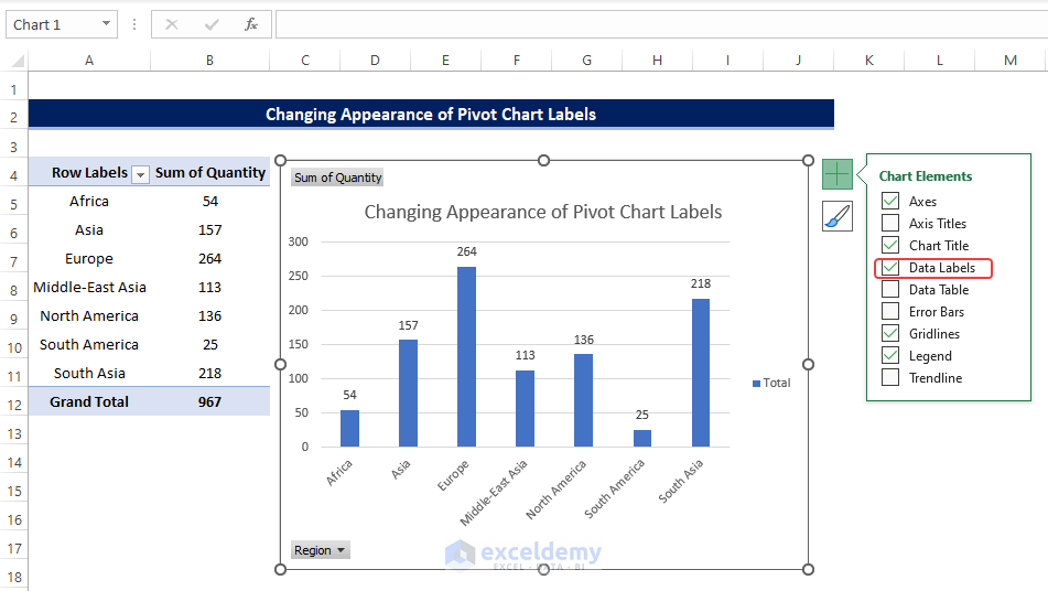
- Click on the Plus sign top right corner of the Chart.
- Click on the Data Labels.
- Notice that the Data Labels are now showing on top of each column.
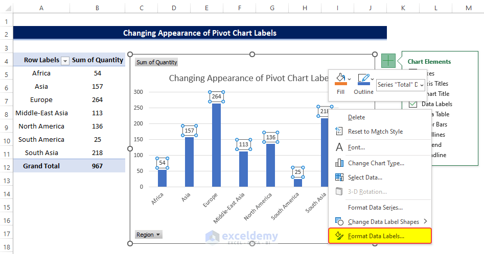
- Clicking on any Data labels one time will select all of the Data Labels simultaneously.
- Right-click on the Data Table, and click on the Format Data Labels from the context menu.
- In the Format Data Labels, go to the Size and Properties.
- Click on the Text Directions, and from the drop-down menu, click on the Rotate all text 270.
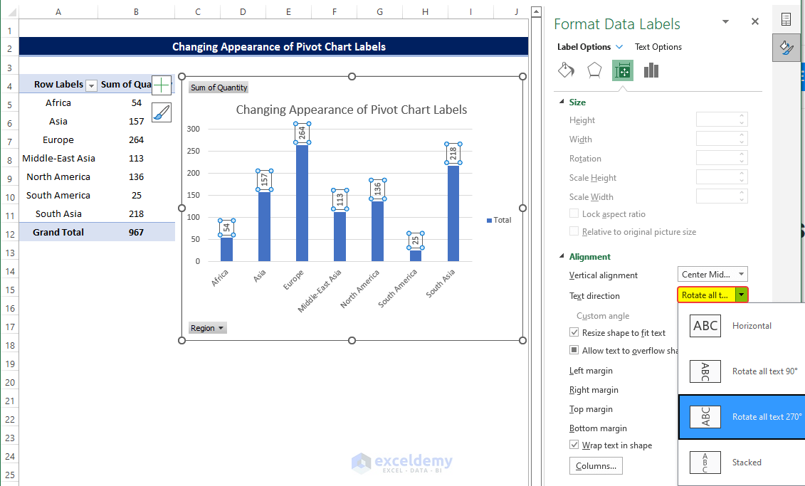
- Doing this will instantly rotate the text 270 degrees.
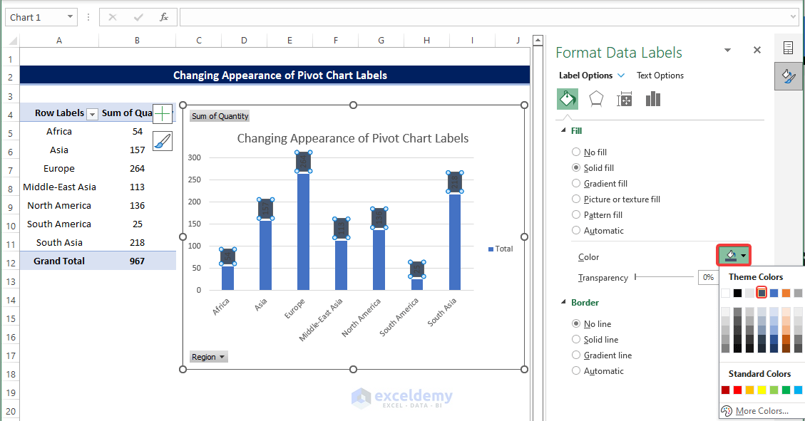
- Go to Fill and Line, and from there, select the color.
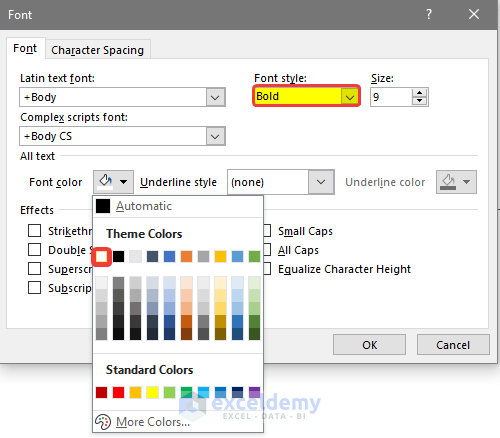
- While selecting the data label, right-click on it again and then choose Font.
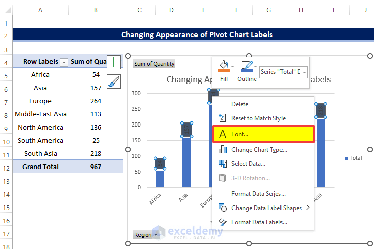
- Select the Font style to be Bold and the Font color to be White.
- Click OK after this.
- The Chart will finally look like the image below.
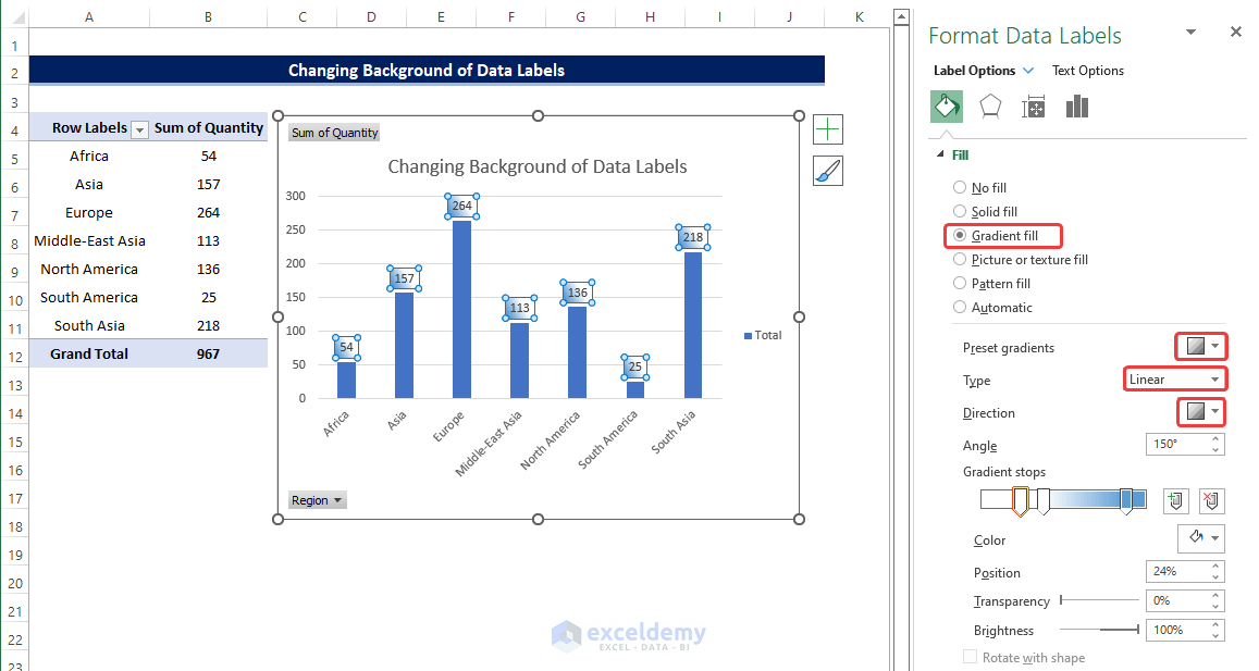
Method 5 – Changing Background of Data Labels
Steps
- Create the Pivot Table and the Chart just like the previous steps.
- Rght-click on any data labels and click on the Gradient fill.
- Choose the color gradient as you wish and adjust settings accordingly.
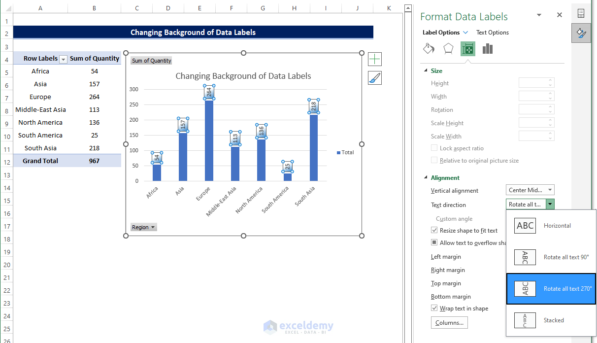
- Go to the Size and Properties and click on the Text Direction.
- Select Rotate all texts 270 degrees from the dropdown menu.
- Go to Fill and Line, and from the Border, click on Solid Line.
- In the Width, select 1.25 pt.
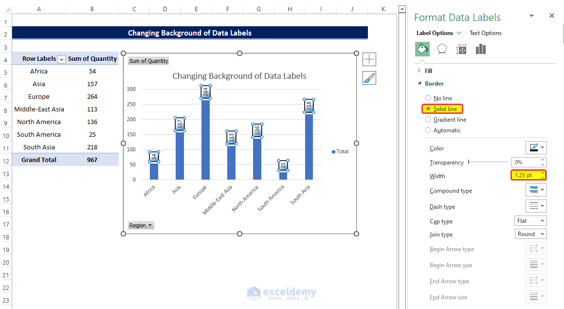
- The background of the data labels on the Pivot Chart is now altered.
- This is how we changed the background of the data labels in the Excel Pivot Chart.
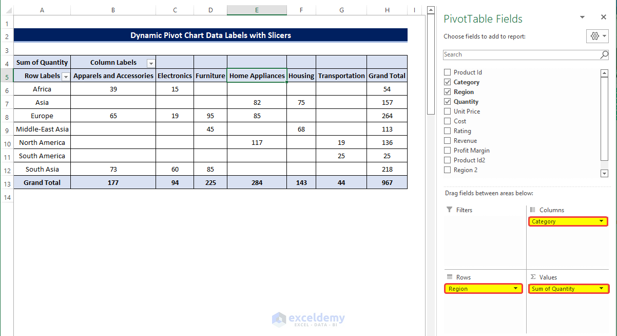
Method 6 – Dynamic Pivot Chart Data Labels with Slicers
Steps
- Create Pivot Table just like the previous examples, but with a slight change.
- Add the category in the column area in the chart.
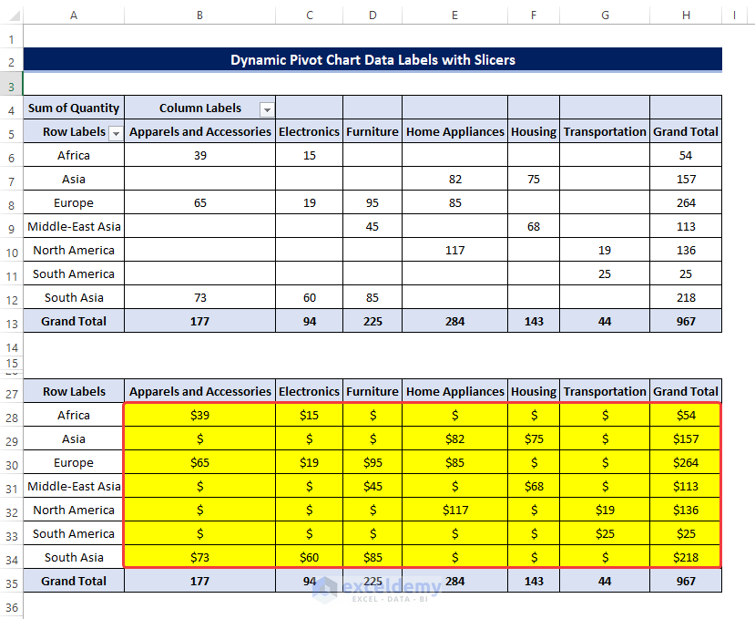
- Copy the newly created table (range of cells A5:H13) in the range of cells A16:H24.
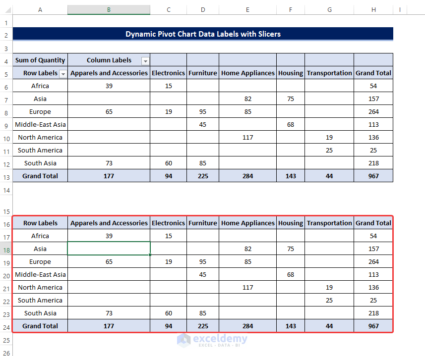
- Create the table with the same table header without the values in the range of cells A27:A35.
- Select cell B28 and enter the following formula:
=TEXT(B17,"$#,###")
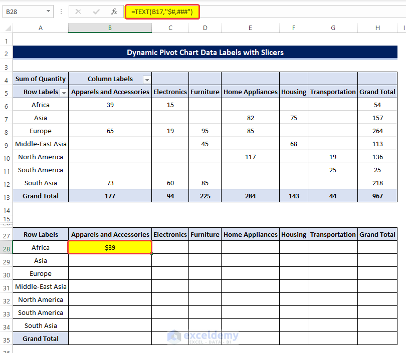
- Drag the Fill Handle horizontally to cell H28.
- Drag it vertically to cell H35.
- Select the cell B29, and enter the following formula:
=TEXT(IFERROR(B17/B$24,0),"0.0%")
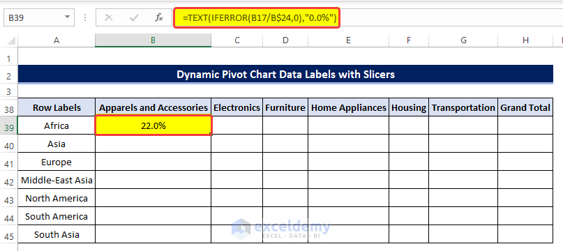
Breakdown of the Formula
- IFERROR(B17/B$24,0): This part of the formula will check whether the division of cell B17 by cell B24 is valid or shows any error. It will return 0 if the division result returns an error. Otherwise, it will be as it is.
- TEXT(IFERROR(B17/B$24,0),“0.0%”): This formula will take the output of the previous function as input. Return the percentage formatted text as one decimal place.
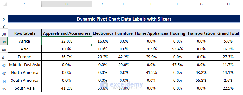
- Drag the Fill Handle first in the horizontal direction to cell H39.
- Drag the Fill Handle first in the vertical direction to cell H45.
- Create the table in the same format shown below. Select cell C49, and enter the following formula:
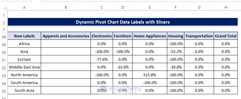
=TEXT(IFERROR((C17-E17)/E17,0),"0.0%")
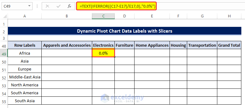
Breakdown of the Formula
- IFERROR((C17-E17)/E17,0): This part of the formula will check whether the division of (C17-E17) by the cell E17 is valid or shows any error. It will return 0 if the division result returns an error. Otherwise, it will show as it is.
- TEXT(IFERROR((C17-E17)/E17,0),“0.0%”): This formula will take the output of the previous function as input. Return the percentage formatted text as one decimal place.
- Drag the Fill Handle first in the horizontal direction to cell H49.
- Drag the Fill Handle first in the vertical direction to cell H55.
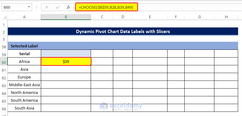
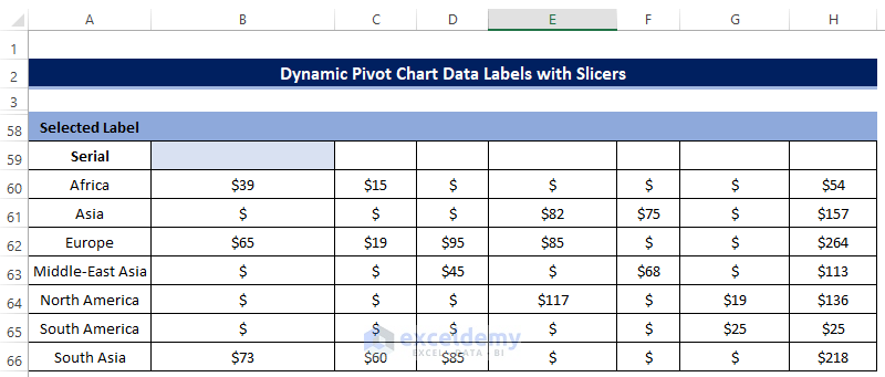
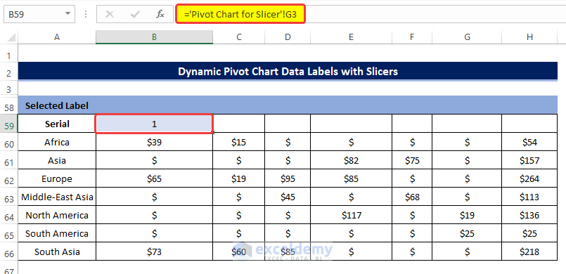
- Select the cell B60, and enter the following formula:
=CHOOSE($B$59,B28,B39,B49)
- Dag the Fill Handle first in the horizontal direction to cell H60.
- Drag the Fill Handle first in the vertical direction to cell H66.
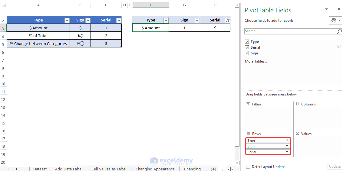
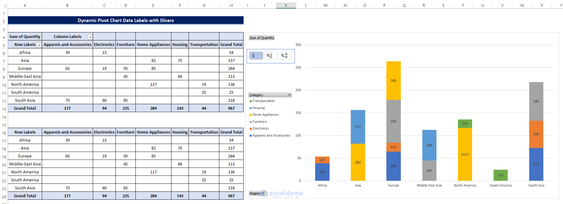
- Create the following table as shown here, this table will help us to switch the data labels easily.
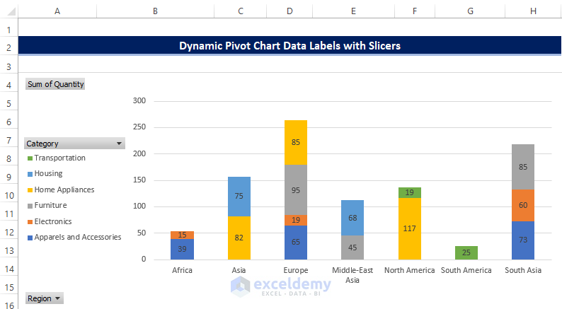
- From the data labels table, create a Pivot Chart.
- While creating the Chart, add Type, Sign, and Serial in the Row area.
- Add a slicer from the PivotTable Analyze.
- Go back to the previous Chart and select cell B59 and enter the “=”, to initiate the formula. Then go to the newly created sheet and select cell G3.
- This way this cell is now linked with the value of cell G3.
- Click the Insert tab, and then from the Charts, select 2-D Column.
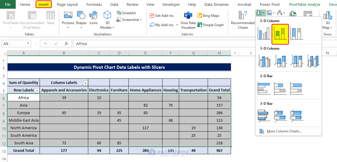
- There will be a new Chart with the 2-D columns.
- But we need to make the table Data Labels dynamic.
- Select any Data Labels and right-click on them.
- From the context menu, click on the Format Data Labels.
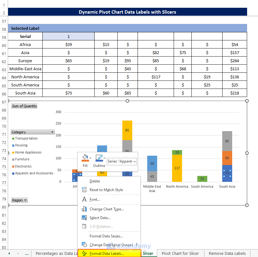
- From the side panel, click on the Value From Cells.
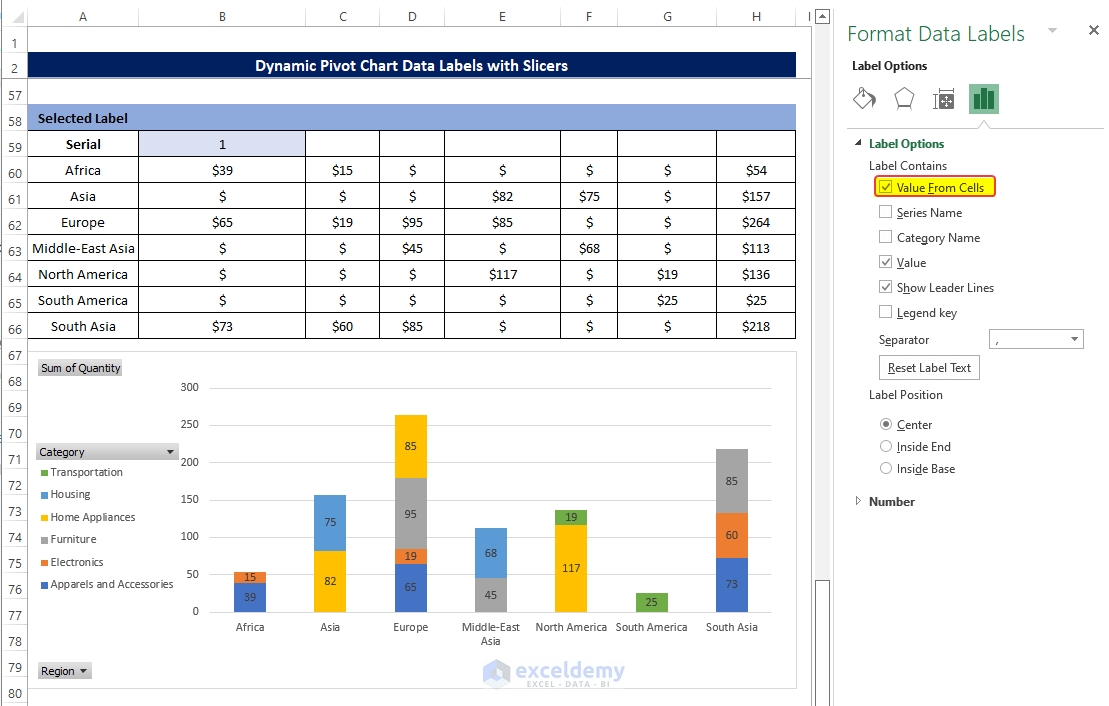
- In the range box, select the range of cells B60:B66.
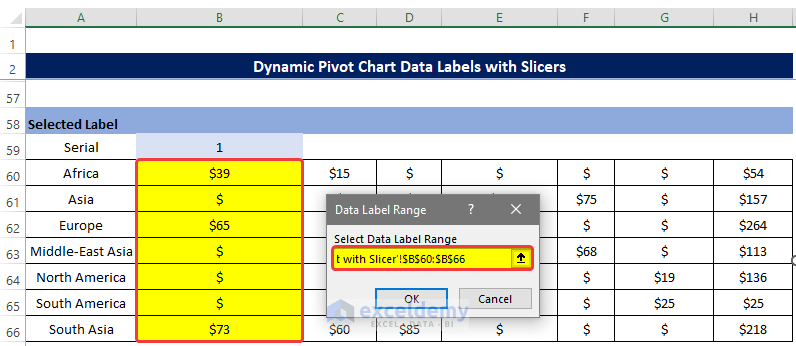
- Select the data label named 15 and right-click on it.
- From the context menu, click on the Format Data Labels.
- From the side panel, click on the Value From Cells.
- In the range box, select the range of cells C60:C66.
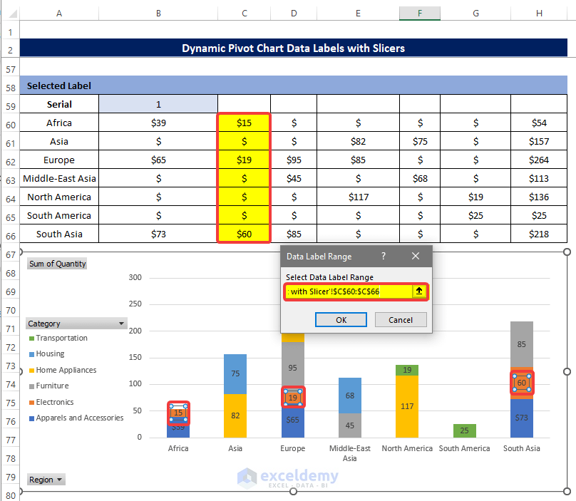
- Repeat the same process for the rest of the columns.
- Finally the Chart will look like the below image with the slicer.
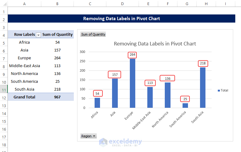
Method 7 – Removing Data Labels in Pivot Chart
Steps
- A Pivot Table alongside the Pivot Chart is created in the same way as in previous examples.
- Notice where all the data labels are showing.
- And we want to get rid of them.
- Select the data label and right-click on the mouse.
- Click on the Plus sign on the right most corner of the chart.
- From there you can see that the Data Labels box is checked.
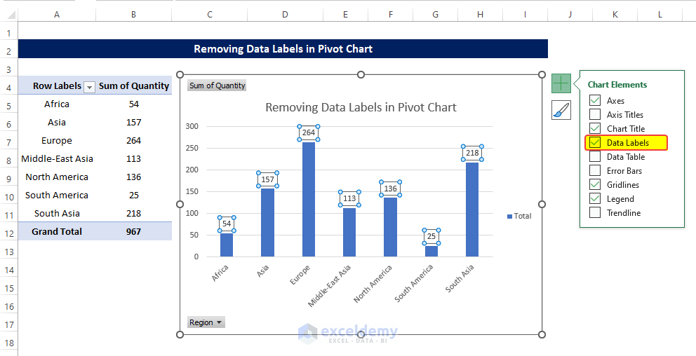
- Uncheck the data labels box.
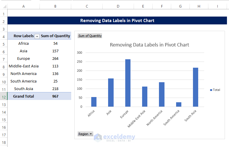
- You will notice that the data labels are no longer visible right now.
Download Practice Workbook
Download this practice workbook below.
Related Articles
- How to Use Pivot Chart in Excel
- Types of Pivot Charts in Excel
- Difference Between Pivot Table and Pivot Chart in Excel

