If you are looking for how to edit a pivot chart in Excel, then you are at the right place. In our practical life, we often need to create pivot charts based on pivot tables and then need to edit them. A Pivot Chart in Excel is the visual representation of data. It gives us the big picture of our raw data. It allows us to analyze data using various types of graphs and layouts. In this article, we’ll study how to edit a pivot chart in Excel.
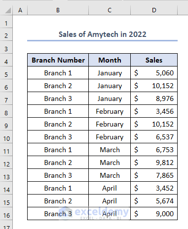
Before editing a pivot chart, firstly, we need to make a pivot table. Secondly, we need to make the pivot chart. We have created a dataset named Sales of Amytech in 2022 which has headings as Branch Number, Month, and Sales in columns B, C, and D respectively. The dataset is like this.
Now, we’ll try to discuss the steps to edit the pivot chart.
Step 1: Preparing Chart from Pivot Table in Excel
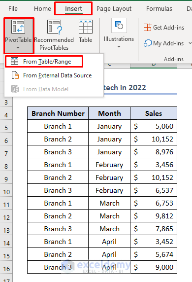
Firstly, we have to create a Pivot Table.
To do this, firstly, select Insert > choose PivotTable > select From Table/Range.
Secondly, select the dataset to fill up the bar of Table/Range of the following picture.
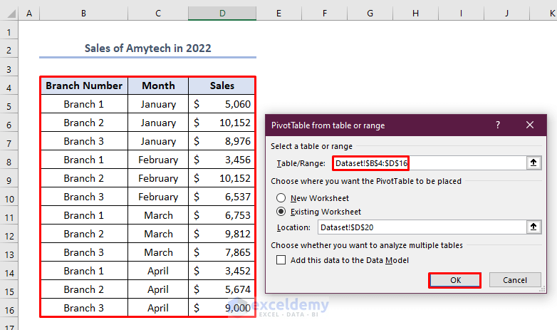
A PivotTable window will appear like the picture below.
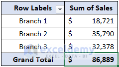
Thirdly, select Branch Number and Sales.
Fourthly, drag down the Branch Number to the Rows bar and Sales to the Value bar.

Eventually, we’ll find a pivot table like this where we have got the Sum of Sales in three different branches which is marked as Branch Name.
Fifthly, we have to add a Pivot Chart.
To do this, firstly click anywhere on the pivot table> go to Insert > select PivotChart.
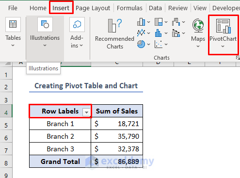
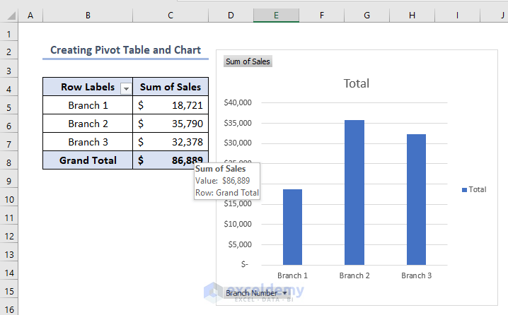
As a result, we’ll find a pivot chart like this.
Read More: How to Create Chart from Pivot Table in Excel
Step 2: Adding Headings to Edit Excel Pivot Chart
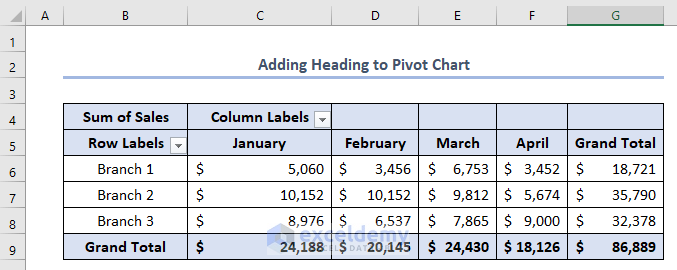
Suppose we want to add another heading in the pivot chart which is Month. To do this, firstly, we should select Month in the PivotTable Field window and then drag it into the Columns bar.

Consequently, we’ll get the pivot table like this where the Sum of Sales is shown in different individual months in individual branches.
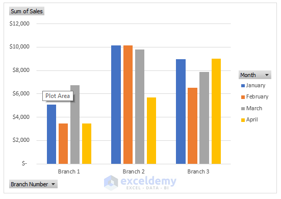
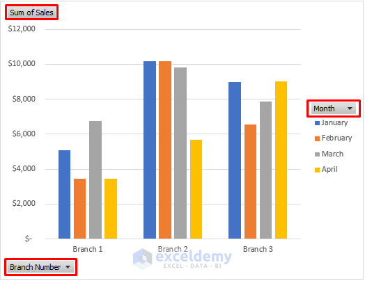
Simultaneously, the pivot chart will be like this where an extra variable, Month is added.
Read More: Data Labels in Excel Pivot Chart
Step 3: Showing Specific Results
Suppose, we don’t want to show all the information in the pivot chart. We want to show specific data in the chart. Let’s think that we need to show the Sales of different branches only in the month of January. We have three options in the pivot chart i.e. Sum of Sales, Branch Number, and Month. We can change or add any requirement in these three options marked below according to our requirements.
To show only Sales of different branches in January, we first need to click on the Month option.
Consequently, the following bar will appear. We need to unclick other months except for January.
Lastly, click OK.
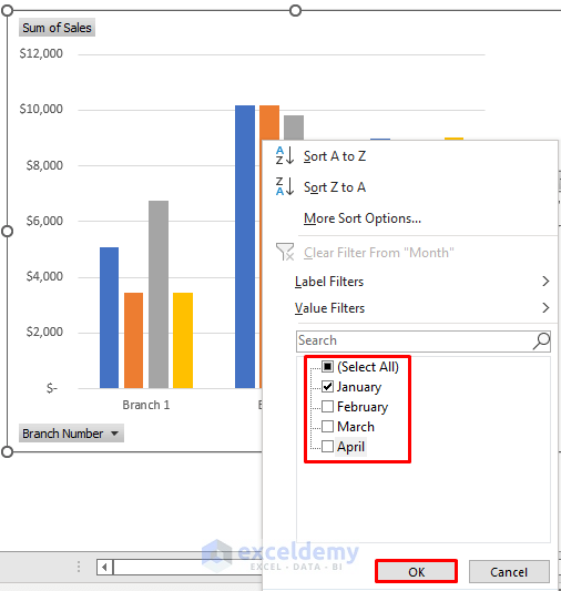
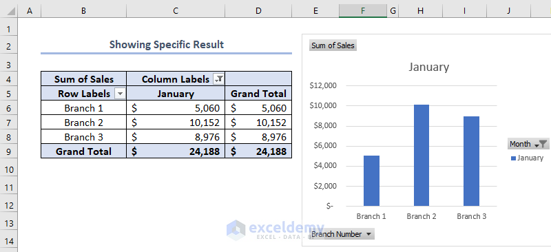
Eventually, we’ll find only the sales in January in the pivot chart.
Read More: Use Excel VBA to Create Chart from Pivot Table
Step 4: Adding a Slicer to Edit Pivot Chart in Excel
A Slicer in Excel is a kind of filter we use to filter the data available in the pivot table as per the connections made between the slicer and the pivot table. Suppose, here we want to add a slicer of Branch Name and Month.
Firstly, go to Insert > click on Filters > select Slicer.

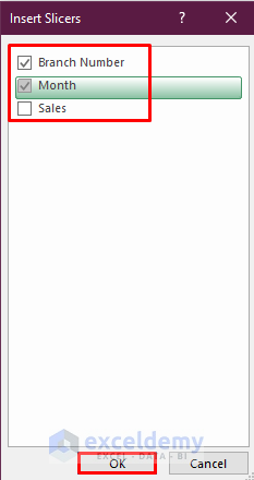
Eventually, the Insert Slicers window will appear.
Secondly, select Branch Name and Month. We can select any number of headings according to our resources available and requirements.
Thirdly, click OK.
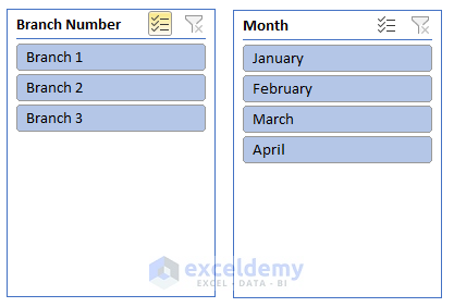
As a result, we’ll get slicers like this.
From these slicers, we can select any options, and subsequently, the figure of both the pivot table and pivot chart will be changed. Here, if we select Branch 1 and January in slicers that means we want to show the sales in January in Branch 1 only. And consequently, the output becomes like this.

Things to Remember
- The pivot table and pivot chart are inter dependable. If we change one, another will be changed automatically. So we can edit the chart or table by changing both table and chart.
- The shape of the pivot table and chart depends on the placement of headings in the PivotTable Fields. If we swap the rows and columns in the pivot table of this article the structure of the table and chart will change automatically.
Download Practice Workbook
Conclusion
We can create a pivot table, and pivot chart, and edit the table and chart if we study this article properly. This article shows the basic things associated with pivot tables and charts.
Related Articles
- How to Use Pivot Chart in Excel
- Types of Pivot Charts in Excel
- How to Refresh Pivot Chart in Excel
- Difference Between Pivot Table and Pivot Chart in Excel

