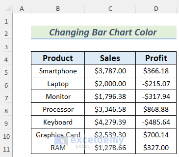
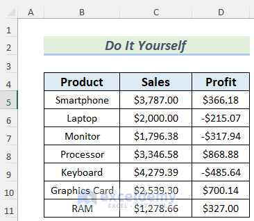
In the dataset, we have sales and profit information about some products. Here, the negative profit of a product refers to the loss in sales of that product. Let’s use the dataset to demonstrate how you can change bar chart colors.
Method 1 – Changing an Excel Bar Chart Color Automatically Based on the Category
Steps:
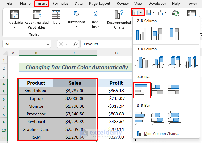
- Select the range that you want to put in the Bar Chart. We want to show the Sales of the Products in the Bar Chart, so we selected B4:C11.
- Go to Insert, pick Chart, and choose 2D Bar Chart.
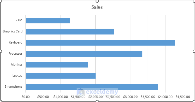
- You will see a Bar Chart with all the bars in the same color.
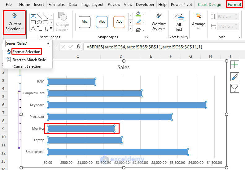
- Select any of the bars in the chart and go to the Format tab.
- Go to Current Selection and select Format Selection.
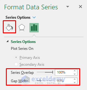
- The Format Data Series window will appear. Fix your Series Overlap and Gap Width how you want them and select the Fill Shape icon.
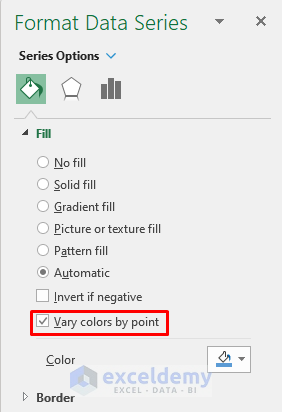
- Check the Vary colors by point.
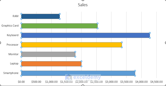
- You will get a Bar Chart filled with different colors for different data.
Read More: How to Color Bar Chart by Category in Excel
Method 2 – Changing the Bar Chart Color Based on Value Type
Steps:
- Select the ranges B4:B11 and D4:D11
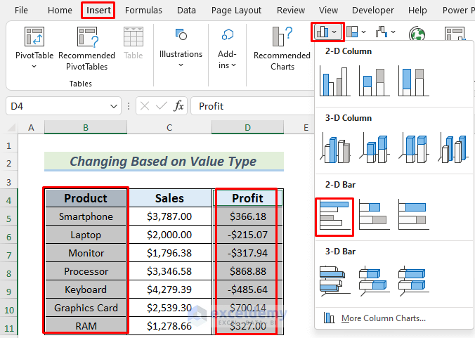
- Go to Insert, select Bar Chart, then pick 2D Bar Chart.
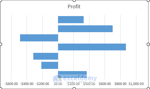
- You will see the bars in the Bar Chart of the Profit value in the same color. The negative profit value or the loss amounts are situated on the left side of the chart.
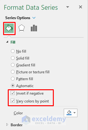
- Open the Format Data Series window following the steps described in Method 1.
- Select the Shape Fill icon and check Invert if negative and Vary colors by point.
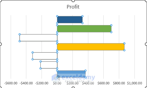
- You will see that the loss amounts are in an inverted color and the profit amount in various colors.
Read More: Excel Bar Graph Color with Conditional Formatting
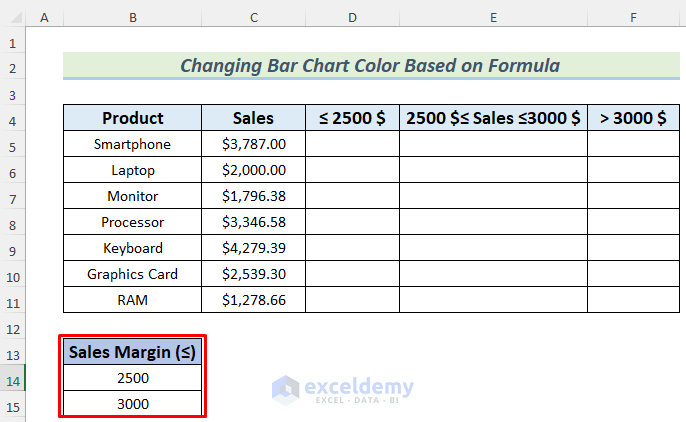
Method 3 – Bar Chart Color Changing Based on Formula Category
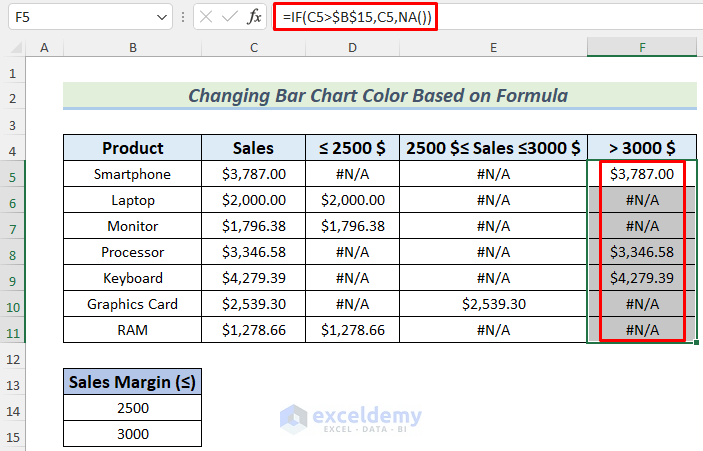
We’ll categorize the Sales values by some Sales Margin and make formulas with them.
Steps:
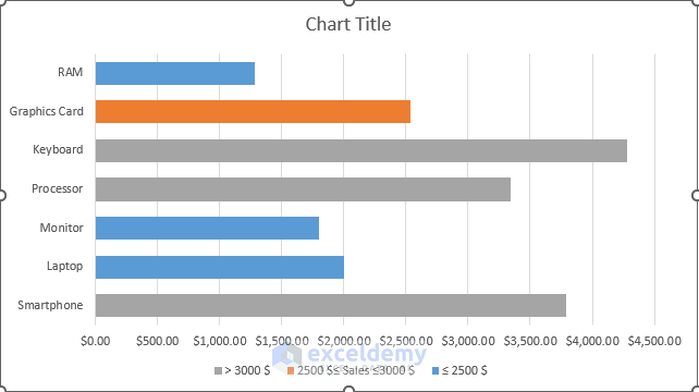
- Set up Sales Margins. In this case, we divided the sales amount into 3 classes: less than or equal to 2,500$, between 2,500$ and 3,000$, and greater than 3,000$.
- Insert the following formula in cell D5.
=IF(C5<=$B$14, C5, NA())
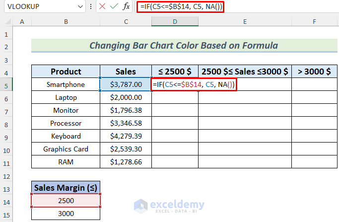
The formula uses the IF function and returns the value of the sales amount if it is less than or equal to 2500$, otherwise, it returns #N/A error (Value not Available Error). The advantage of this error for the chart is that we won’t get any bar for it. And the values we categorize by this formula will be in a certain bar color.
- Hit the Enter button and you will see the #N/A error as the formula didn’t meet the logical test value of the IF function.
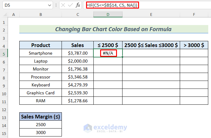
- Use the Fill Handle to AutoFill the lower cells.
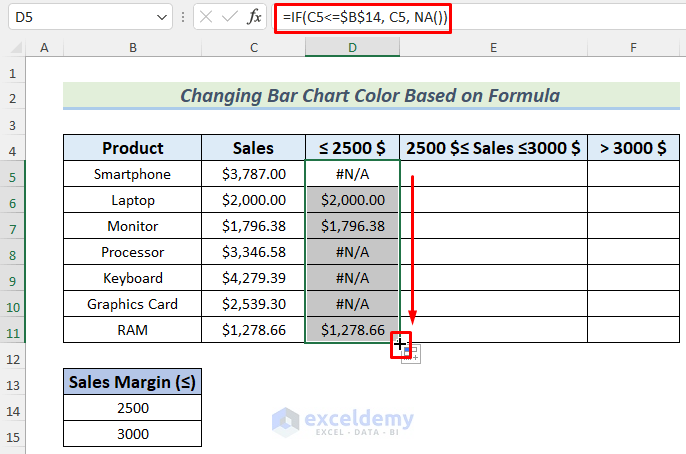
- Use the following formula in column E and fill the cells below with it.
=IF(AND(C5>=$B$14,C5<=$B$15),C5,NA())
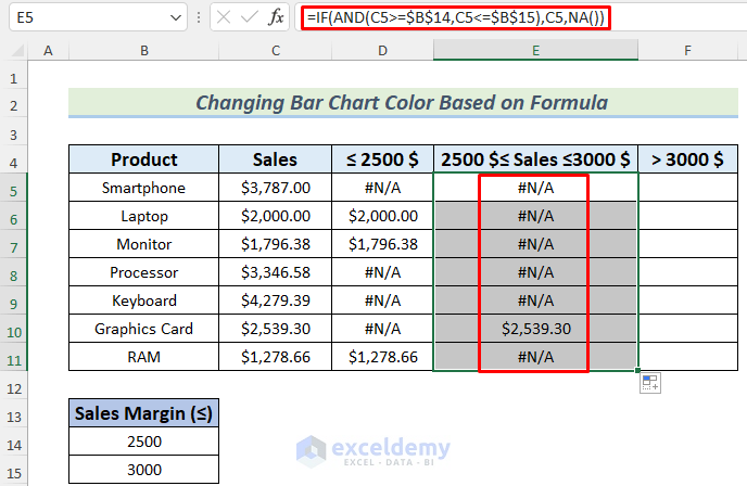
We used the AND function to set the range [2500$, 3000$].
- Use the formula below to define the range greater than 3,000$.
=IF(C5>$B$15,C5,NA())
Note: You can use any #N/A error handling Excel function like IFNA, ISNA (and even IFERROR) to get rid of these #N/A from the visualization.
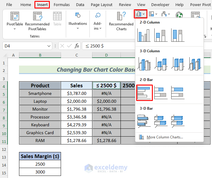
- Select the range B4:B11 and D4:F11 simultaneously.
- Go to Insert, choose Bar Chart, and pick 2D Bar Chart.
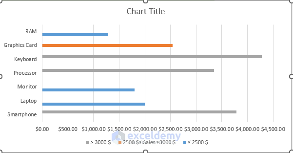
- You will see the Bar Chart based on the formula values. But the Bar Chart is not convenient here.
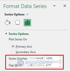
- To make the Bar Chart look more understandable, open the Format Data Series following the process of Method 1, go to Series Options, and set the Series Overlap and Gap Width.
- You will see the bars in the Bar Chart in three different colors (Blue, Orange, and Grey) for the three categories that we set in the formulas. You can change the color of any set of bars manually. If you change the sales value of any product in the dataset, the corresponding bar will change its color.
Read More: How to Sort Bar Chart in Descending Order in Excel
Practice Section
We’re providing the dataset of this article so that you can practice these methods on your own.
Download the Practice Workbook
Related Articles
- Reverse Legend Order of Stacked Bar Chart in Excel
- How to Add Grand Total to Bar Chart in Excel
- How to Create Bar Chart with Error Bars in Excel
- Excel Add Line to Bar Chart
- How to Add Horizontal Line to Bar Chart in Excel
- How to Add Vertical Line to Excel Bar Chart
- How to Create Bar Chart with Target Line in Excel
- Excel Bar Chart with Line Overlay
<< Go Back to Excel Bar Chart | Excel Charts | Learn Excel
Get FREE Advanced Excel Exercises with Solutions!
