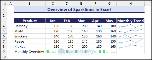
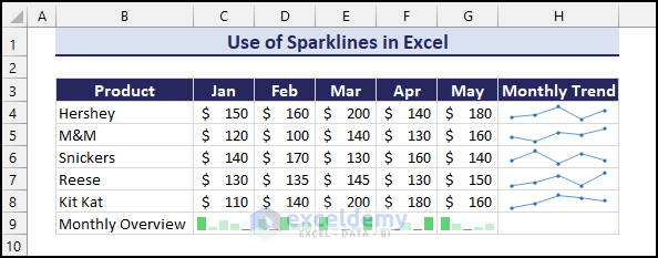
Here’s an overview of Excel Sparklines. We have sales data for several months in a worksheet. We have used the Excel Sparklines feature to visualize the changes over time rather than using Excel charts.
⏷What Are Sparklines?
⏷Why Use Sparklines?
⏷Types of Sparklines
⏷How to Add Sparklines in Excel?
⏷How to Customise Sparklines in Excel?
⏷Group and Ungroup Sparklines
⏷Show Sparklines for Hidden and Empty Cells
⏷Resize Sparklines
⏷Remove Sparklines
⏷Edit Existing Dataset of Sparklines
⏷Important Notes about Excel Sparklines
What Are Sparklines in Excel?
Sparklines are small, condensed charts that fit into a single cell. In Excel, sparklines provide a quick visual representation of original data such as trends, patterns, growths, and variations.
The best feature of Sparklines is that it explains data without the need for a full-size chart while remaining in the background of a cell.
Sparklines were introduced in Excel 2010.
Why Use Sparklines in Excel?
Generally, professionals use sparklines in Excel to get a quick overview of data over time in areas such as sales, stock prices, performance metrics, trend calculation, temperature fluctuations, and more. Typically sparklines are placed next to the rows or columns of data. As a result, users get a quick concise snapshot of the data trend in each row or column.
Although Sparklines do not offer detailed information like standard graphs and charts, their advantages lie in being compact, providing a quick assessment, and for smooth integration with the data tables.
Sparklines saves space on the workbook and enhances the readability of data. Changing the data in Excel will automatically update the Sparklines, making them dynamic and efficient.
How Many Types of Sparklines Are Available in Excel?
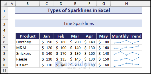
Type 1 – Line Sparklines
Line Sparklines represent data trends using a simple line graph within a single cell. It’s ideal for displaying data trends over time, such as stock prices, temperature fluctuations, performance evaluation, etc.
We have the monthly sales revenue trends of 5 products in line sparklines for 5 months.
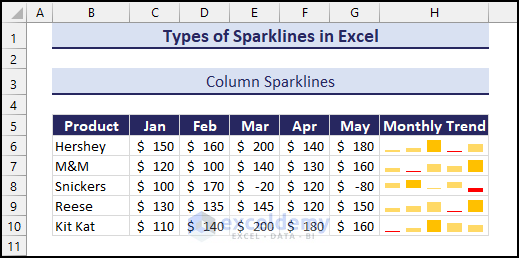
Type 2 – Column Sparklines
Column Sparklines use vertical bars to visually represent variations in data within a single cell. You can create column sparklines to compare individual data points across categories or time intervals, such as comparing discrete values such as sales figures, performance metrics, etc.
In the following image, we have compared the monthly sales revenue of each product using Column Sparklines.
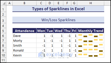
Type 3 – Win/Loss Sparklines
This specific type of sparkline represents positive (win) or negative (loss) outcomes using symbols. They work best for showcasing binary data or outcomes, such as monthly goal achievements, project milestones, or game scores, where the focus is on success or failure. You can use win/loss sparklines to provide a quick clear visual distinction about whether the goal is achieved.
Check out the image below showing the weekly attendance of 5 students. The red signs indicate absences or -1.
How to Add Sparklines in Excel
You can add sparklines in Excel using the Insert tab. To create sparklines you can navigate to the Sparkline group where you will find all the available sparklines. There are two ways you can add sparklines in Excel.
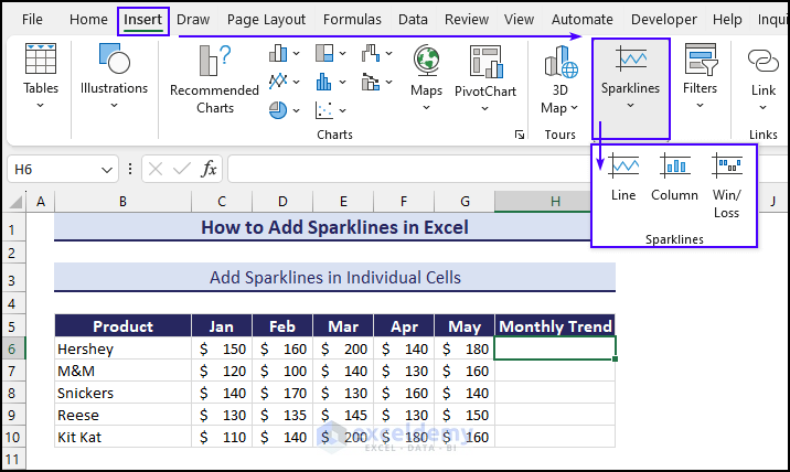
Case 1 – Add Sparklines in Individual Cells
- Select the cell where you want the sparklines, i.e. Cell H6.
- Go to the Insert tab and the Sparklines group.
- Choose a type (e.g., Line Sparklines).
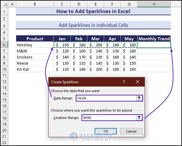
- In the Create Sparklines window, select the Data Range (e.g., C6:G6).
- Verify that the Location Range is set to the cell.
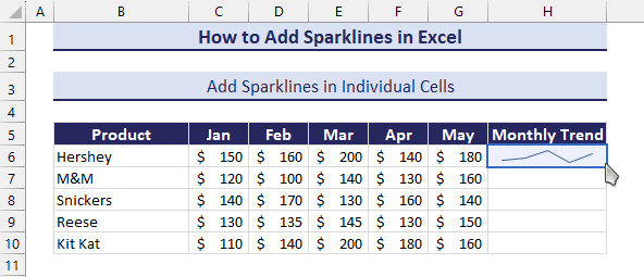
- Click OK to create line sparklines based on the specified data.
- You can also use the Fill Handle feature to autofill the remaining cells.
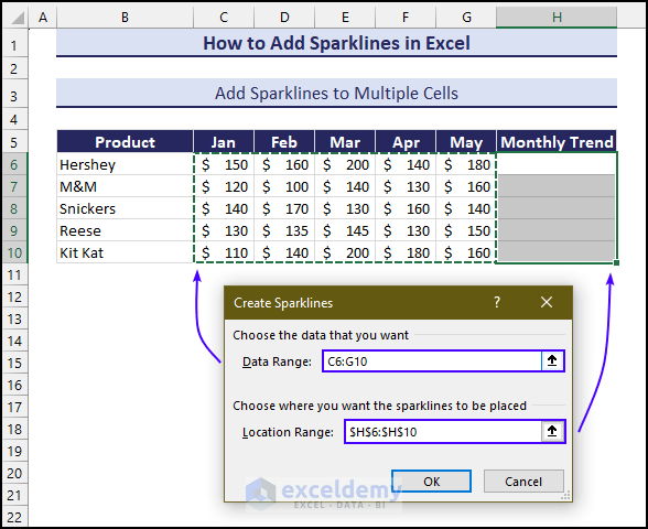
Case 2 – Add Sparklines to Multiple Cells
- Select the cell range where you want the sparklines, i.e. Cell H6:H10.
- Head to the Insert tab and the Sparklines group.
- Choose a type (e.g., Line Sparklines).
- In the Create Sparklines window, select the Data Range (e.g., C6:G10).
- Verify that the Location Range is set.
- Click OK to create line sparklines based on the specified data.
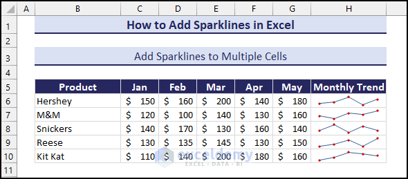
You can check out the Monthly Trend column (H6:H10) which has line sparklines for each row showing individual data trends.
How to Customize Sparklines in Excel
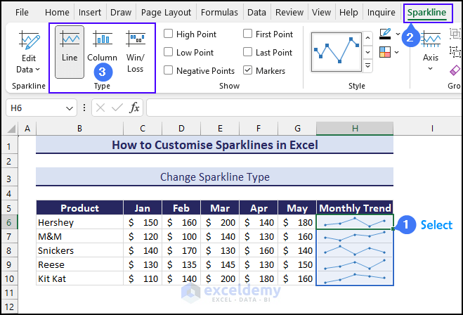
Case 1 – Change Sparkline Types
- Select the sparkline or group of sparklines
- Head to the Sparkline tab.
- Under the Type group, choose any.
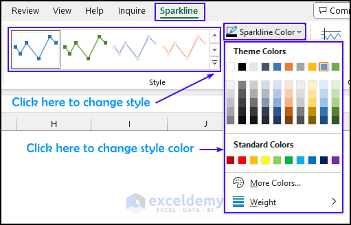
Case 2 – Change the Style and Color
- Choose any of the available colorful styles from the drop-down menu of the Styles section.
- You can use the Sparklines Colors drop-down menu to manually change the sparkline color.
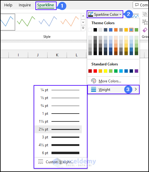
Case 3 – Change the Line Width
- Select the sparkline.
- Go to the Sparkline tab.
- In the Style group, click on the Sparkline Color drop-down menu.
- Select the Weight option and choose any weight to change the line width.
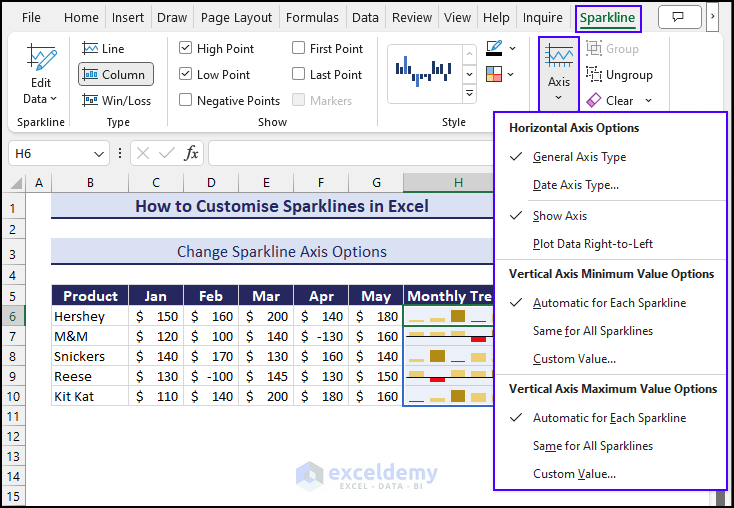
Case 4 – Change Axis Options
Generally, Excel sparklines do not use any axis or coordinates. They plot the lowest value of the dataset at the bottom, with other points positioned relative to it.
Horizontal Axis Options
- General Axis Type
It automatically detects the general type of horizontal axis in sparklines representing categories or time intervals based on the data. - Date Axis Type
If your data has date values, you can select this feature to choose the date data for the horizontal axis value. - Show Axis
It shows the horizontal axis within the sparkline. By default, it remains hidden. - Plot Data Right to Left
Useful for scenarios where you need to present data in reverse order (from right to left).
Vertical Axis Options
- Automatic for Each Sparkline
Sets the minimum or maximum value of the vertical axis independently for each Sparkline. - Same for All Sparklines
To ensure consistency and maintain a standard scale, it sets a uniform value for the vertical axis across all sparklines to simplify the comparison. - Custom Value
It allows users to define a specific value for the vertical axis by giving precise control over the data range.
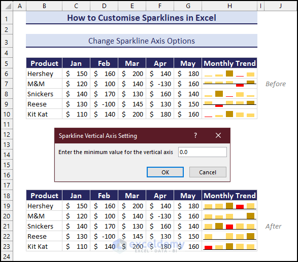
For instance, if the variation between the lowest point and other values seems larger than actual, you can use the options under the Vertical Axis.
This allows you to set maximum and minimum values using the Custom Value option, providing a more accurate representation of the data trend in the sparkline.
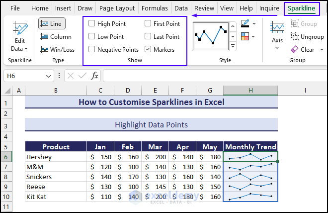
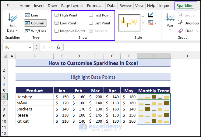
Case 5 – Highlight Data Using a Marker
Using the options under the Show group of the Sparkline tab you can easily highlight data based on Sparklines type. You’ll get the following options:
- High Point: Displays the highest point or maximum values within the sparklines.
- Low Point: Highlights the lowest point or minimum values within the sparklines.
- First Point: Highlights the first point in the figure.
- Last Point: Marks the last point at the end of the data series
- Negative Points: Shows the values that are below zero.
- Markers: Selecting this option will enhance the clarity of the sparklines by highlighting individual data points.
In the case of Line sparklines, you can add Markers to sparklines to point out data.
For column sparklines, you can use the High Point and Low Point to make the column sparkline more meaningful by providing important details.
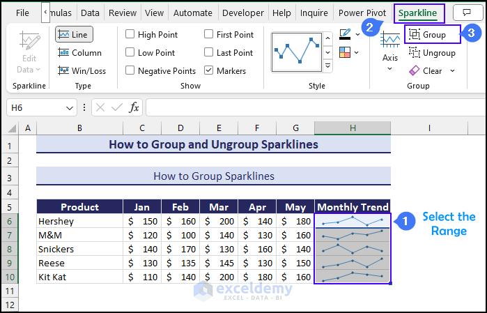
How to Group and Ungroup Sparklines in Excel
Grouping:
- Select the cell range you want to group (i.e. H6:H10).
- Navigate to the Sparkline tab and choose Group.
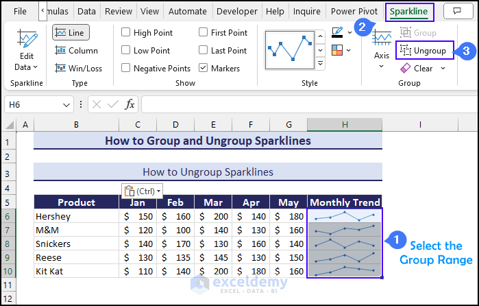
Ungrouping:
- Select the group range you want to ungroup (i.e. H6:H10).
- Head to the Sparkline tab and choose Ungroup.
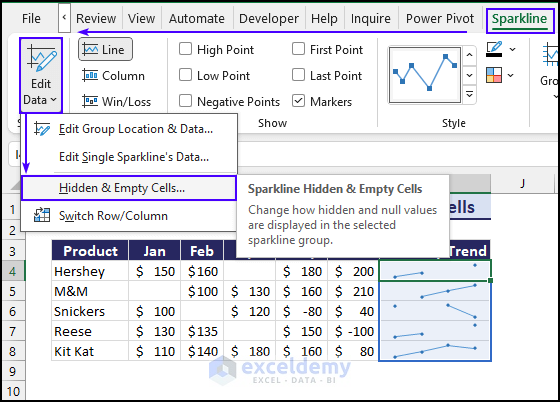
How to Show Sparklines for Hidden and Empty Cells
To show sparklines for hidden and empty cells in Excel, you can use the Hidden & Empty Cells option by navigating to the Edit Data drop-down menu from Sparkline tab. When a sparkline dataset has hidden rows or columns or empty cells, it does not show continuity for missing data. In Excel, sparklines are designed to accurately represent the available data without making any assumption about the values of missing data.
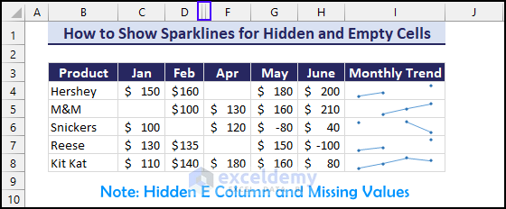
You can use the following steps to treat your broken sparklines.
- Select the sparkline or group.
- In the Sparkline tab, go to the Edit Data drop-down menu and select Hidden & Empty Cell.
From the Hidden and Empty Cell Settings window you will have the following options:
- Gap
This option will display the break in the sparkline if there is hidden data or missing value in the cells. - Zero
It treats hidden data or missing values as zero. Thus, it maintains the continuity of the sparkline by plotting zero as a substitute value. - Connect data points with Line
It ignores the hidden and empty cells by creating a bridge between the gaps. It connects sparklines across hidden data or empty cells.
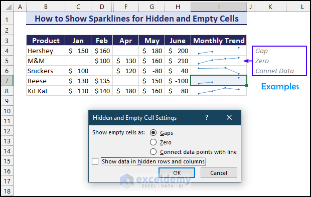
Show data in hidden rows and columns
By default, this option is disabled as sparklines only consider visible data. If you enable this option, it will include data from hidden rows and columns when rendering for visualization.
If your data has only hidden rows or columns, not missing values, selecting this option will allow sparklines to maintain continuity.
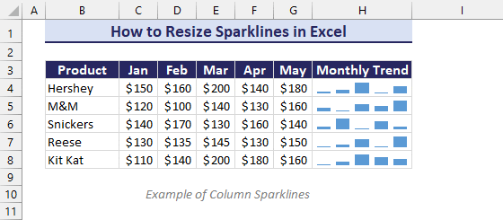
How to Resize Sparklines in Excel
- If you want to change the height of sparklines, adjust the rows themselves.
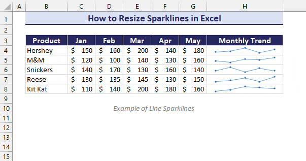
- If you want to change the width of sparklines, adjust the column width.
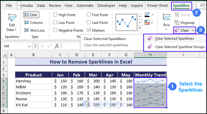
How to Remove Sparklines in Excel
- Select the sparklines.
- Go to the Sparkline tab and go to the Clear drop-down menu.
- You can clear the selected sparklines by selecting Clear Selected Sparklines or the entire group by selecting Clear Selected Sparkline Group.
- Alternatively, go to Home, then to Clear, and select Clear All.
Read More: [Solved]: Excel Sparklines Location Reference Is Not Valid
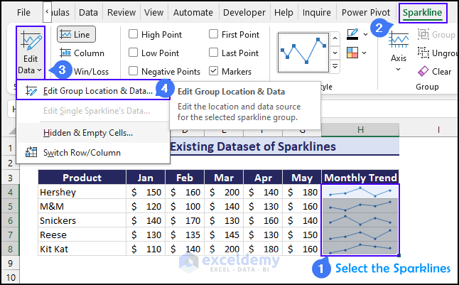
How to Edit Existing Datasets of Sparklines
- Select the sparkline or the group.
- In the Sparkline tab, go to the Edit Data drop-down menu and select Edit Group Location and Data…
This will take you to the Edit sparkline window where you can edit the data range and the location range.
Important Notes about Excel Sparklines
- Sparklines are dynamic. If the underlying dataset changes, it automatically updates. Integration with formulas allows for real-time insights.
- By adjusting the height and width of a cell you can resize the sparkline.
- Sparklines remain in the background of a cell, allowing you to enter text in the cell while maintaining the visual representation.
- You can use the AutoFill feature of Excel to create sparklines in adjacent cells.
- Win/Loss sparklines function as a type of column chart, representing binary data such as win/loss, head/tail, yes/no, True/False, etc.
Download the Practice Workbook
<< Go Back to Learn Excel
Get FREE Advanced Excel Exercises with Solutions!
