Excel’s Sparklines feature is a helpful tool for identifying data trends. Sparklines are tiny charts that can fit into a single cell and give quick solutions.
These tiny charts are so small that it is easy to add several sparklines to a workbook.
This article will explore different types of sparklines in Excel and their uses to assist you in selecting the most appropriate one for your visualization.
The Sparklines feature is available from Excel 2010. Various sparklines are available in Excel, each with its benefits and restrictions.
You can effectively convey insights and trends to your audience by choosing the right type of sparkline for your data.
What are Sparklines in Excel?
Sparklines are mini graphs or charts to visually present data in a single worksheet cell. Sparklines are sometimes referred to as “in-line charts”.
The primary purpose of these in-line charts is to place a visual close to the original data without taking up too much space.
Any tabular numerical data can be used with sparklines. Sparklines can highlight maximum and minimum values and trends in various values, such as seasonal increases or decreases or economic cycles.
The trend in each row or column is presented graphically when sparklines are inserted next to the rows or columns of data.
Excel 2010 introduced Sparklines, which is still available in Excel 2013, Excel 2016, Excel 2019, and Excel for Office 365.
Read More: How to Create Sparklines in Excel
Types of Sparklines in Excel
In Microsoft Excel, there are three types of Sparklines: Line Sparklines, Column Sparklines, and Win/Loss Sparklines.
1. Line Sparkline
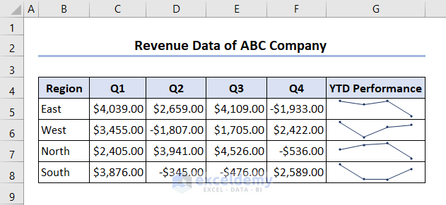
Line Sparklines are similar to Excel’s Line Chart. A line sparkline links data points together to create line segments. You can visualize sales figures, stock values, or website traffic with Line Sparklines. It works best for continuous data. Sparkline is rendered as a line sparkline by default.
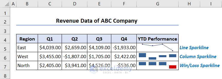
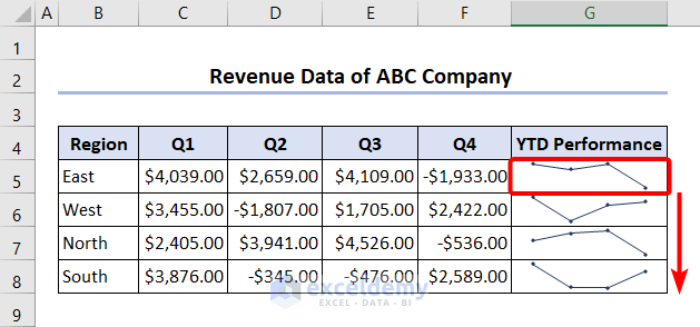
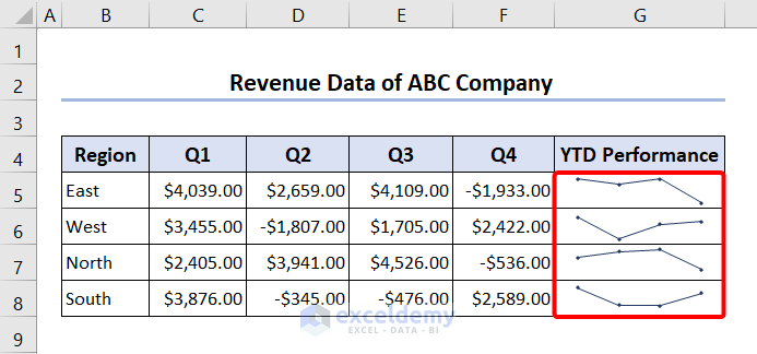
In the image below, the Line Sparklines show the revenue data of a company. Each Sparkline shows the trend of revenue for each region through 4 quarters of a year.
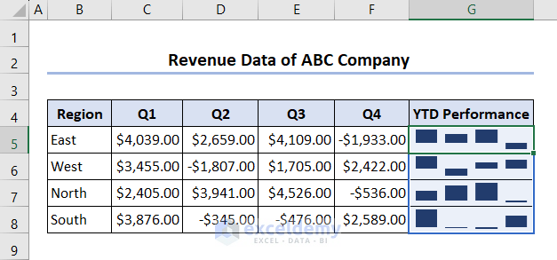
2. Column Sparkline
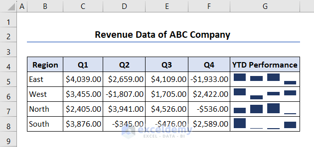
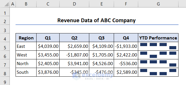
The Column Sparklines show each data point as vertical bars or columns.
Positive data points are drawn upward in a column sparkline, whereas negative data points are drawn downward. A Column Sparkline doesn’t display zero values. It shows a blank space instead of the zero value.
Column sparklines simplify comparison and are ideal for categorical data visualization, such as displaying the sales and profits from various store departments.
Column Sparklines displays a company’s revenue data in the image below. Each Sparkline indicates the revenue trend for each region over a year’s four quarters.
Read More: How to Create Column Sparklines in Excel
3. Win/Loss Sparkline
Win/Loss Sparklines are equal-sized columns drawn in an upward and downward direction to make up the display of data points. This type is very similar to a column sparkline, except that it does not display the magnitude of a data point. The win-loss sparkline does not consider the relative value of a data point; instead, it only considers whether a data point is positive or negative. To picture a win/loss scenario, use this technique. Upward-pointing columns indicate wins, while downward-pointing columns indicate losses. Win/Loss Sparkline, for instance, can be used to monitor a sporting season.
Here, in the image below, the Win/Loss Sparkline indicates the profit and loss at any quarter of each region.
Read More: How to Use Win Loss Sparklines in Excel
Step-by-Step Guidelines to Insert 3 Types of Sparklines in Excel
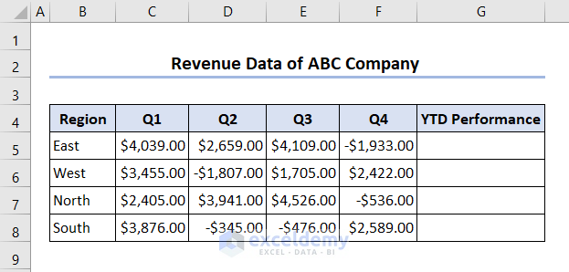
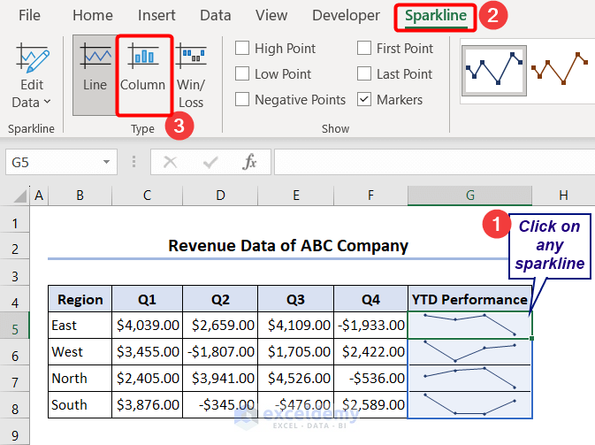
Now we will look into step-by-step guidelines on how to insert these 3 types of sparklines in Excel. For this, we have used Revenue Data from different quarters and different regions throughout the year of a company. We want to visualize the trend of each region throughout the quarters. Now, we will insert Sparklines beside every row of the data.
Step 1: Selecting Type of Sparklines
First, we will select the type of sparkline to insert in a cell. To do that:
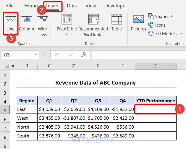
- Select a cell beside the data that you want to visualize. Here we select cell G5.
- Then, click on the Insert tab in the Ribbon.
- Now, in the Sparklines group of command, we can see the three types of sparklines and we can click on any one of these three. We click on Line.
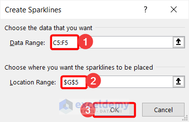
Step 2: Choosing Data Range
Now, we will select the range of data for which we want to insert the sparkline.
- After choosing a type of sparkline, the Create Sparklines dialog box will appear. Select the data range for which you want to insert the sparkline. Here we select C5:F5 range and G5 will appear as the location range as we have selected this cell beforehand.
- After pressing OK we will be able to see the Line Sparkline in cell G5. Similarly, we can insert Line Sparklines for other regions. We can also do this by dragging down the Fill Handle after selecting cell G5.
Step 3: Customizing Sparklines
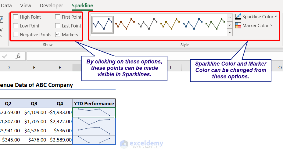
Now, we can customize the sparkline’s design, color, and layout from the options in the Sparkline tab.
- Select the sparklines by clicking on any sparkline and then go to the Sparkline tab.
- We can show the High Point, Low Point, Negative Points, First Point, and Last Point in the chart by clicking on these options in the Show group of commands. Moreover, we can make visible all points by clicking on the Markers box.
Here, we clicked on the Markers option to make all points visible.
- You can change the Sparkline Color and Marker Color from the Style.
We kept the default style here.
How to Change Sparkline Type in Excel
We have already shown how to insert sparklines in Excel. Now we will show how to change the sparkline type.
- To change the sparkline type, click on any of the inserted sparklines in the worksheet. Then, click on the Sparkline tab in the ribbon, and from the Type group select the type of sparkline you want.
- Here, we changed line-type sparklines into column types.
How to Change Axis and Display Range of Sparklines in Excel
The highest and lowest values of each sparkline’s respective data source are scaled by default to fit them: The cell with the highest value will be at the top, while the cell with the lowest value will be at the bottom. This, however, does not demonstrate the level at which the values are in relation to other sparklines. Excel has made it simpler to compare sparklines by giving the ability to change the sparkline display range.
Now we will show you how to change the axis and display the range of sparklines in Excel.
- To change the axis, again select the sparklines, click on the Sparkline tab, and from the Group commands click on Axis.

- Select the Same for All Sparklines option from the Vertical Axis Minimum Value Options and Vertical Axis Maximum Value Options.
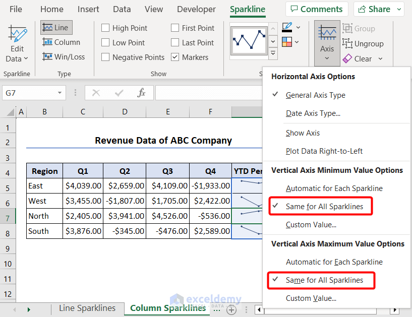
- So, after changing the axis and display range the trends can be seen for each region.
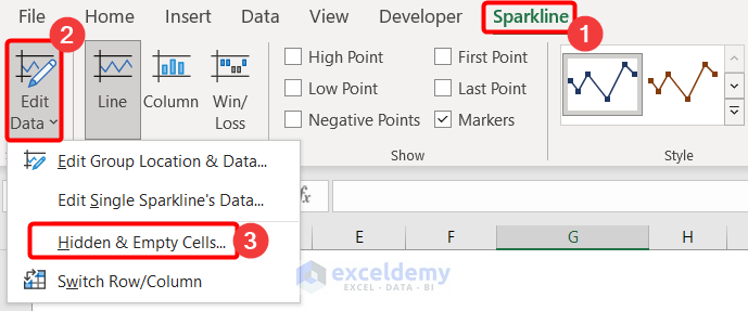
How to Handle Hidden and Empty Cells when Inserting Sparklines in Excel
While working with huge data, sometimes cells might be hidden or empty. In that case, we can choose what to do with these cells in Excel when inserting sparklines.
- In the Sparkline tab, there is an option Edit Data. Click on the option and select the Hidden & Empty Cells.. option from the drop-down.
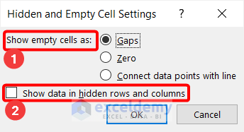
- A dialog box named Hidden and Empty Cells Settings will appear. Now we can choose the option of showing empty cells as Gaps, Zeros, or Connect data points with line. For hidden rows and columns, we have the option of either showing them or not.
Frequently Asked Questions
1. What are the differences between the three types of sparklines in Excel?
Line charts display continuous data, whereas column sparklines are appropriate for data comparison situations. Similarly, a win-loss sparkline works best for visualizing true-false (or win-loss) scenarios.
2. Why use Sparklines in Excel?
In comparison to charts, sparklines have some advantages. Let’s say, for illustration, that you’re dealing with 5,000 rows of data. To adequately represent all the rows in a conventional chart, 5,000 data series would be required, making it challenging to locate pertinent information. However, if a sparkline were placed across every row, it would be adjacent to its data source, making it simple to view patterns and correlations simultaneously for several data series.
Things to Remember
- Excel sparklines, like complete charts, are dynamic and update automatically as data changes. But they are images that appear in the background of a cell, as opposed to objects like traditional Excel charts.
- The cell size affects the sparkline size. The sparkline adapts when you alter the height or width of the cell.
- Sparklines can not display text or error values. It only displays numerical data. A sparkline chart also contains blank cells if the source data set does.
- Excel 2007 and earlier do not display sparklines, they are available from Excel 2010 and later versions.
- A workbook opened in compatibility mode does not enable the sparkline feature.
Download Practice Workbook
You can download our practice workbook from here!
Conclusion
This article provides a clear overview of the various Excel sparklines types. Additionally, it shows how to insert these sparklines, alter the style, switch the sparklines’ types, alter the axis and display range, and deal with hidden and empty cells.
In brief, Excel sparklines are a helpful tool for compactly and quickly visualizing data trends. You can effectively represent your data series visually by selecting the right sparkline for your data, revealing insights and trends that raw data alone might miss. Sparklines are available in Excel in various formats, including line, column, win/loss, and bullet. Each has unique advantages and disadvantages. Understanding the variations among these sparklines will help you select the most appropriate one for your data visualization requirements and produce engaging, instructive charts that convey the insights you need to share.
Related Articles
- How to Create Excel Sparkline for Multiple Data Ranges
- How to Add Markers to Sparklines in Excel
- How to Use Sparklines in Excel
<< Go Back to Excel Sparklines | Learn Excel
Get FREE Advanced Excel Exercises with Solutions!
