Excel is an effective tool for visualizing and analyzing data. Sparklines, a type of small chart in Excel, can be used to represent trends and changes in data in an easy format. When analyzing numerous pieces of data at once, they are quite helpful. In this article, we will discuss how to create a sparkline for multiple data ranges in Excel with some easy steps. We’ll also learn about creating sparklines for multiple cells, formatting them, and also grouping and ungrouping them. At last, you’ll get an output like the overview image below.

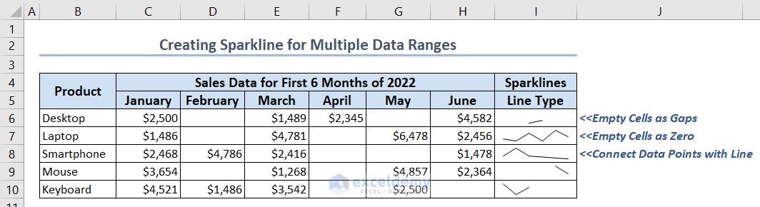
In the above image, you can see that we have some sales data for the first 6 months of 3 different products. Some data are missing and the corresponding cells are empty. We inserted 3 different types of Line Sparklines in column I. The first one is treating empty cells as gaps, the second one is treating empty cells as zero and the last one is connecting data points with lines.
What Are Sparklines in Excel?
A little graph that fits inside one cell is called a sparkline. It functions as a visual representation of how a number evolves over time.
Sparklines can be used to display data in a table, such as stock prices or temperature. The sparklines help you observe how each number changes over time when you place them next to the numbers.
There are 3 types of sparklines in Excel: Line, Column, and Win/Loss.
- The Line sparklines closely resemble short, straightforward lines. They can be created with or without markers, just like a conventional Excel Line Chart.
- The Column sparklines appear as vertical bars. Positive data points are located above the x-axis and negative data points are located below the x-axis, much like in a traditional Column Chart. Zero values are not shown; instead, a blank area is left where a zero data point should be.
- The Win/Loss sparklines are similar to a column sparkline, with the exception that it does not display the magnitude of a data point. Instead, all bars, regardless of the original value, have the same size. The x-axis is represented with positive numbers (wins) above it and negative values (losses) below it.
Read More: Types of Sparklines in Excel
How to Create Excel Sparkline for Multiple Data Ranges (with Easy Steps)
Here we’ll create both Line and Column sparklines for multiple data ranges with 4 easy steps.
1st Step: Making a Suitable Dataset
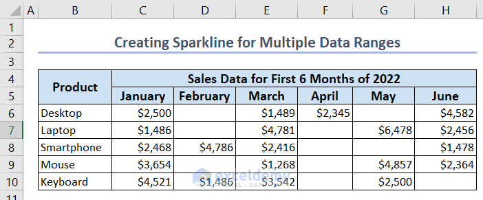
In this step, we’ll make a suitable dataset which will be used later to create sparkline charts.
- We entered some products’ names in column B and their sales data for the first 6 months starting from January across columns C to H.
- You may notice that we have kept some cells empty to make the ranges of data non-contiguous.
2nd Step: Inserting Sparklines
In this part, we’ll insert sparklines into our dataset.
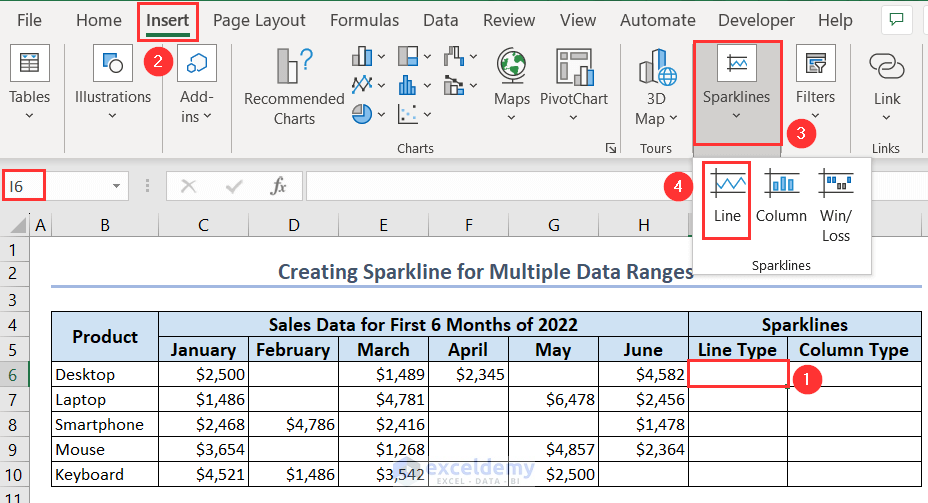
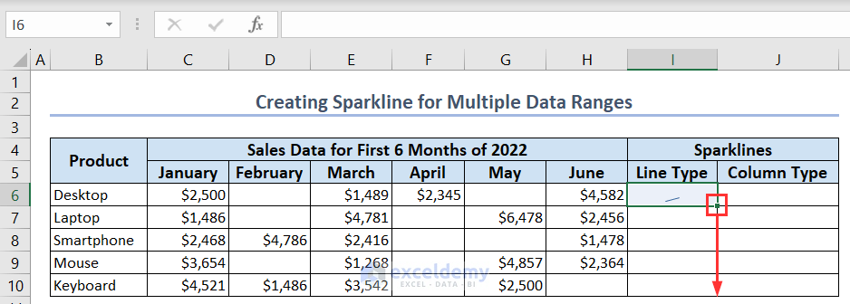
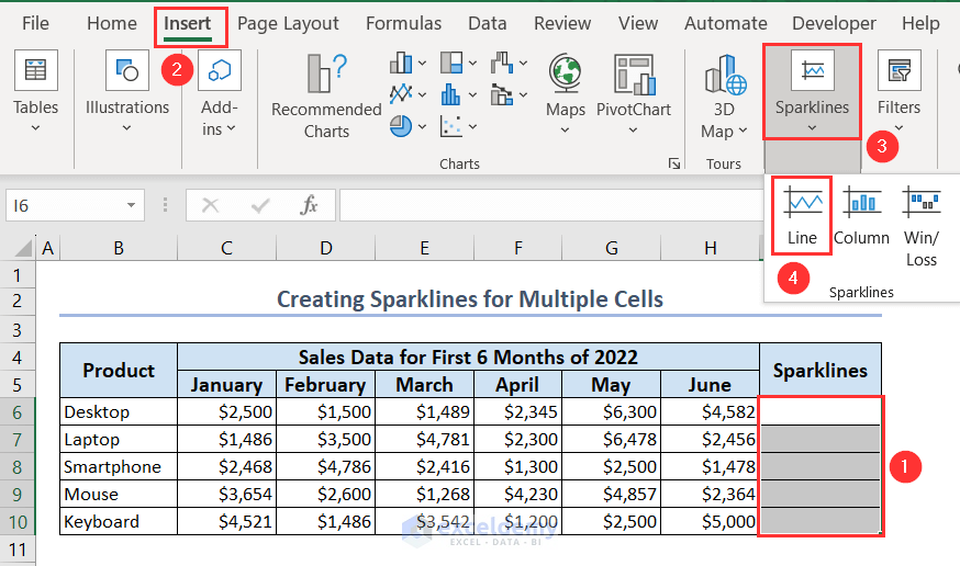
- Select a cell where you want to put the sparkline chart, in this case, it is cell I6.
- Go to the Insert tab and click on the Line option under the Sparklines menu.
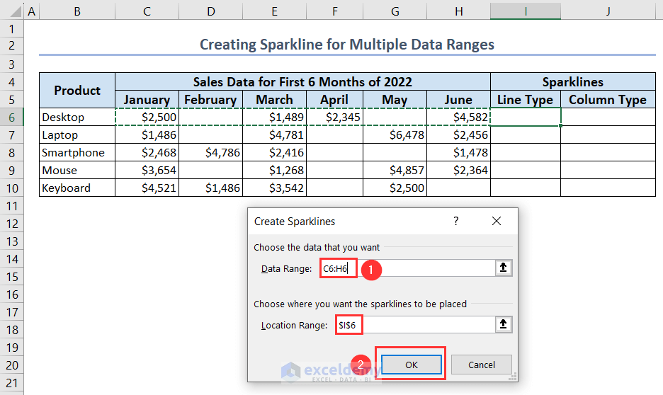
- A window titled “Create Sparklines” will appear.
- Put the Data Range as C6:H6 by selecting the range with the mouse.
- The Location Range is already there as $I$6 because we have selected this cell before.
- Click the OK button to insert the Line sparkline.
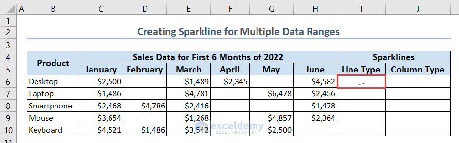
- You’ll see a Line sparkline in cell I6 for the whole range from January to June.
- Use the Fill Handle tool to extend the output for all the products.
- You’ll see the Line sparklines in every cell of column I for each product.
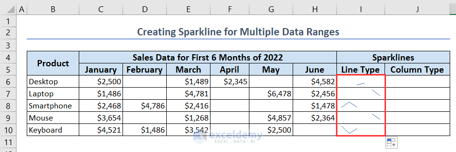
- Repeat the process to obtain the Column sparklines in column J for each product. This time you only have to select the Column option under the Sparklines menu on the Insert tab.
3rd Step: Use Hidden & Empty Cells Option for Multiple Non-Contiguous Cells
If you look closely, you’ll see that both the Line and Column sparklines we create, take values from the whole ranges of data whether a cell has value or not. So we have to define the empty cells so that our sparkline charts work for multiple data ranges that have values and are non-contiguous.
- Select any cell that has a sparkline chart in it. We select cell I6 and a new tab will open titled “Sparkline”.
- Go to this tab and select the Hidden & Empty Cells option under the Edit Data menu.
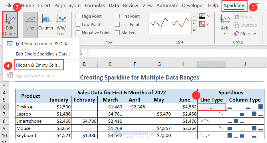
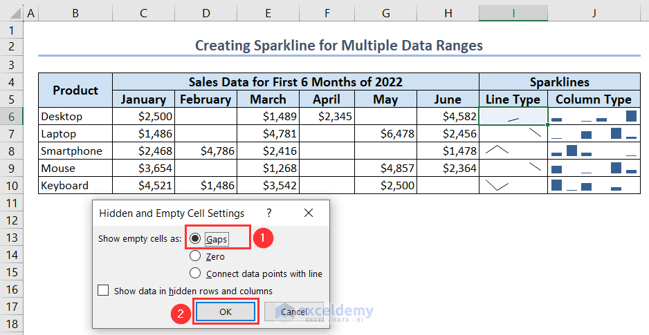
- Hidden and Empty Cells Settings window will appear. Here, you’ll see 3 options for showing empty cells in the chart.
- The first option is Gaps. If you select this option, the empty cells will be shown as gaps in the sparkline chart. By default, when you create a sparkline chart, the empty cells are treated as gaps.
- The second option is Zero. if you select this option, the empty cells will be treated as having 0 values.
- The third option will connect the data points with a single line.
- We have kept the default option as it was.
4th Step: Show Excel Sparkline for Multiple Non-Contiguous Data Ranges
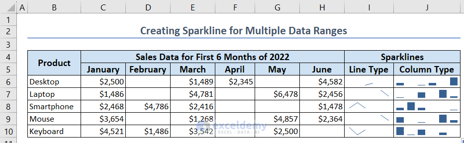
In this part, you’ll find 3 different Line sparklines when you choose 3 different options from the Hidden and Empty Cells Settings window.
- When you want to display a gap in the sparkline, you’ll get a sparkline like the cell I6.
- When you want to show a zero instead, you’ll get a sparkline like the cell I7.
- You will obtain a sparkline similar to cell I8 when you want to represent a continuous line by linking the data points.
- For Column sparklines, only the first 2 option is available, Gaps and Zero.
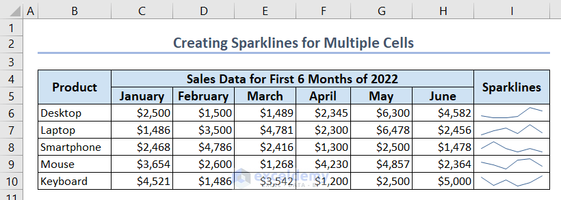
How to Create Sparklines for Multiple Cells in Excel
We can create sparklines for multiple cells together in Excel quite easily. Now we have the same dataset as before having values in all cells. So, the cells are now contiguous, there is no empty cell in the range.
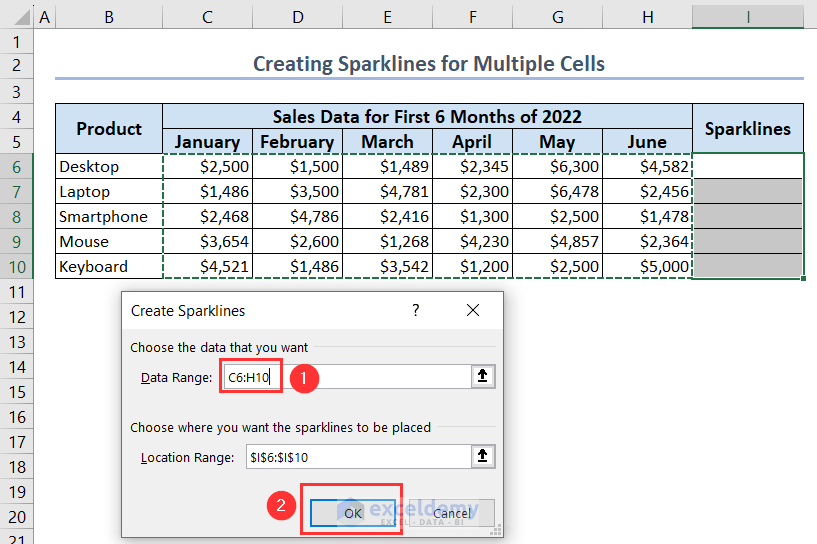
- Select all the cells together from I6:I10 where we’ll put the sparklines.
- Choose the Line option from the Sparklines menu on the Insert tab.
- The “Create Sparklines” window will show up.
- By selecting the entire range with the mouse, set the Data Range to C6:H10.
- The Location Range is already listed as $I$6:$I$10.
- To insert the Line sparkline, select the OK button.
- You’ll get sparklines in column I for multiple cells at a time.
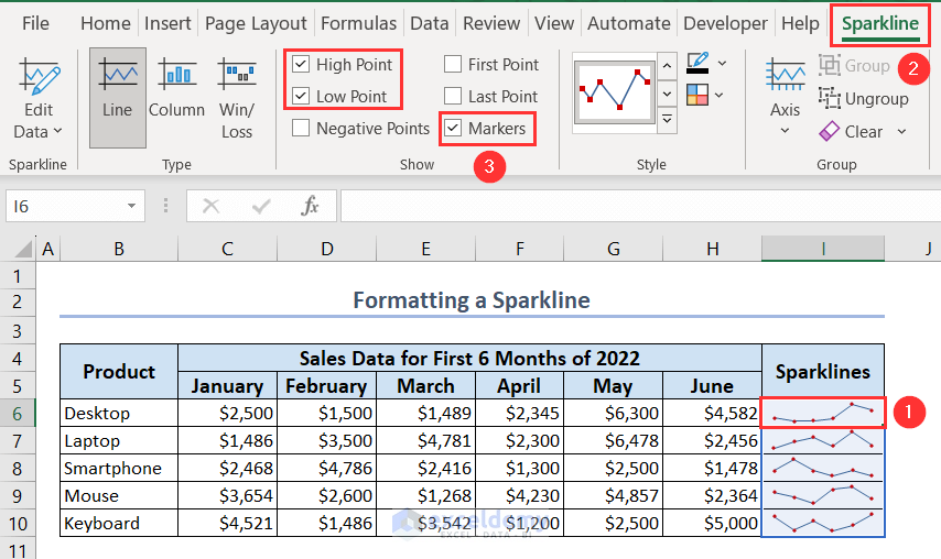
How to Format Sparklines in Excel
You can quickly format a sparkline by highlighting it with some color or adding some markers to the sparkline. We format a sparkline for clear visibility and understanding.
- When you want to add markers to your sparkline, you have to choose among 6 options on the Show ribbon under the Sparkline tab after selecting the cell having a sparkline. As soon as you choose any option, markers will add to your selected cells having sparklines.
- High Point draws attention to a sparkline’s highest value and Low Point to the lowest value.
- Negative Points highlight all negative points.
- First Point and Last Point change the color of the first and last data points respectively.
- At each data point, Markers are markers. Only Line Sparklines have access to this choice.
- For our dataset, we only choose the 3 options, High Point, Low Point, and Markers.
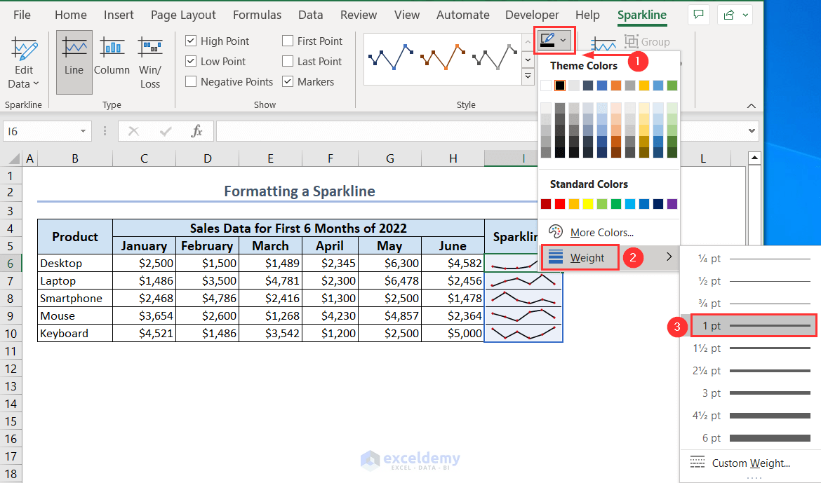
- You can also change the color and line weight of your sparklines from the Sparkline Color option under the Sparkline tab.
- We have selected the Black color and line Weight as 1 pt for our sparklines.
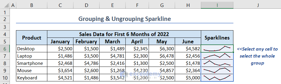
How to Group & Ungroup Sparkline in Excel
In Excel, grouping numerous sparklines gives you a significant benefit because you can modify the entire group at once.
- To group sparklines, select all the cells you want to group as we selected cells I6:I10.
- Go to the Sparkline tab and select Group.
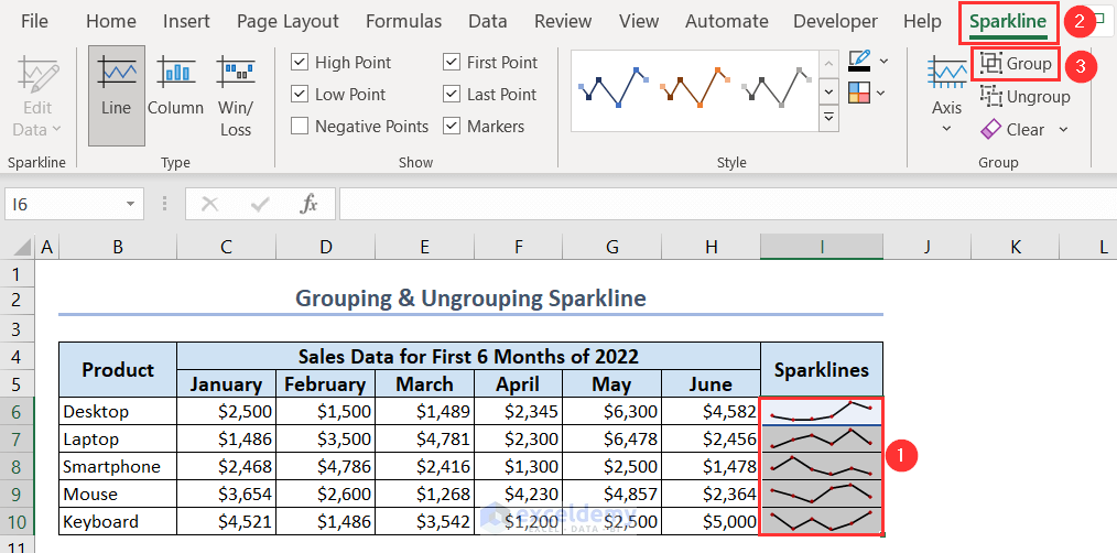
- Your selected sparklines are now in a group. You can check it by selecting any cell under the group. When you select any cell of the group, you select the whole group.
- To ungroup them, select the sparklines and choose the Ungroup option from the Sparkline tab.
Read More: How to Ungroup Sparklines in Excel
Download Practice Workbook
You can download the practice workbook from here and practice on your own.
Conclusion
In conclusion, sparklines are a useful tool for data analysis and visualization in Excel. They are simple to make and you can apply them to simultaneously represent several types of data. Therefore, we have covered how to create a sparkline for multiple data ranges in Excel in this article. Additionally, we have learned how to group and ungroup cells as well as to format and create sparklines for multiple cells in Excel. You can make relevant and useful sparklines that will aid in your data analysis and understanding by using the procedures described in this article.
Related Contents
- How to Create Sparklines in Excel
- How to Create Column Sparklines in Excel
- How to Add Markers to Sparklines in Excel
- How to Use Sparklines in Excel
- How to Use Win Loss Sparklines in Excel
<< Go Back to Excel Sparklines | Learn Excel
Get FREE Advanced Excel Exercises with Solutions!
