Looking for ways to adjust chart gridlines spacing in Excel? Then, this is the right place for you. We can add vertical or horizontal and major or minor gridlines in our Excel charts. These gridline spacing can also be adjusted following some easy steps. Here, you will find 3 different ways to adjust chart gridlines spacing in Excel.
How to Add Chart Gridlines in Excel
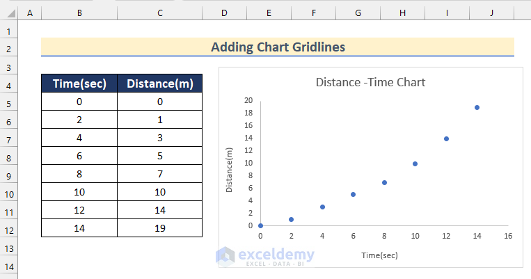
Sometimes, gridlines may not be added to your Excel chart. Follow the steps given below to add Major Horizontal and Vertical gridlines to your chart.
Steps:
- In the beginning, select the chart and click on the “+” sign to open Chart Elements.
- Then, click on Gridlines.
- After that, turn on the Primary Major Horizontal and Primary Major Vertical options.
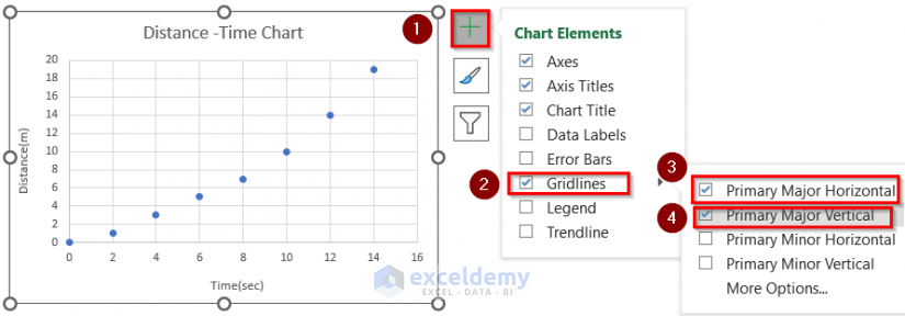
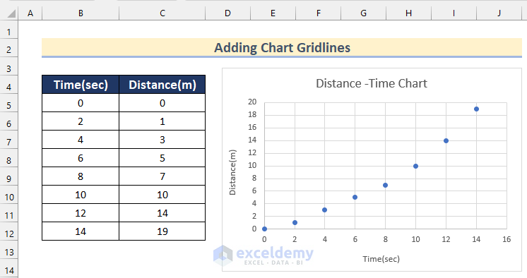
- Thus, you can add both horizontal and vertical gridlines to your chart.
How to Adjust Chart Gridlines Spacing in Excel: 3 Effective Ways
Now, we will show you how you can adjust these gridlines spacing in your Excel chart in 3 different effective ways.
1. Adjust Excel Chart Gridlines Spacing by Double-Clicking on Axis Values
In the first method, you will find a way to adjust Excel chart gridline spacing by Double-Clicking on axis values. Go through the steps given below to do it on your own.
Steps:
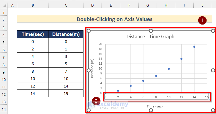
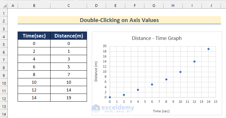
- First, select the chart.
- Then, double-click on the axis values where you want to change the gridline spacing. Here, we will double-click on the X-axis.
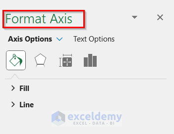
- Now, the Format Axis toolbar will open.
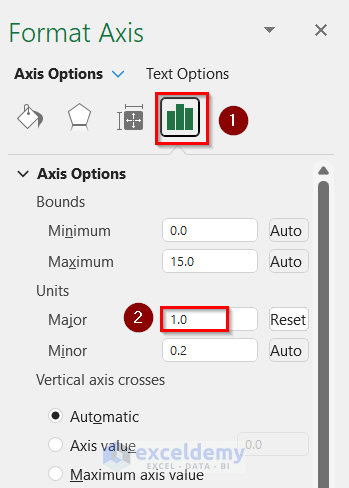
- After that, click on the button under Axis Options shown below.
- Next, insert your desired spacing as Major Units. Here, we will insert 1.
- Thus, you can adjust Excel chart gridlines spacing on the X-axis by Double-Clicking on axis values.
- Similarly, you can adjust chart gridlines spacing on the Y-axis.
Read More: How to Remove Gridlines in Excel Graph
2. Apply Format Selection Feature to Modify Chart Gridlines Spacing
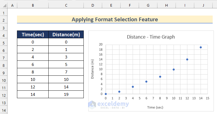
Now, we will show you how you can modify the chart gridlines spacing in Excel by applying the Format Selection Feature. Follow the steps given below to do it on your own dataset.
Steps:
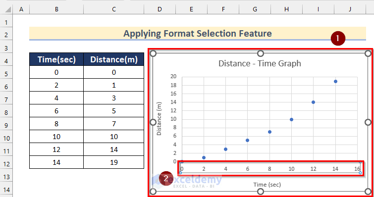
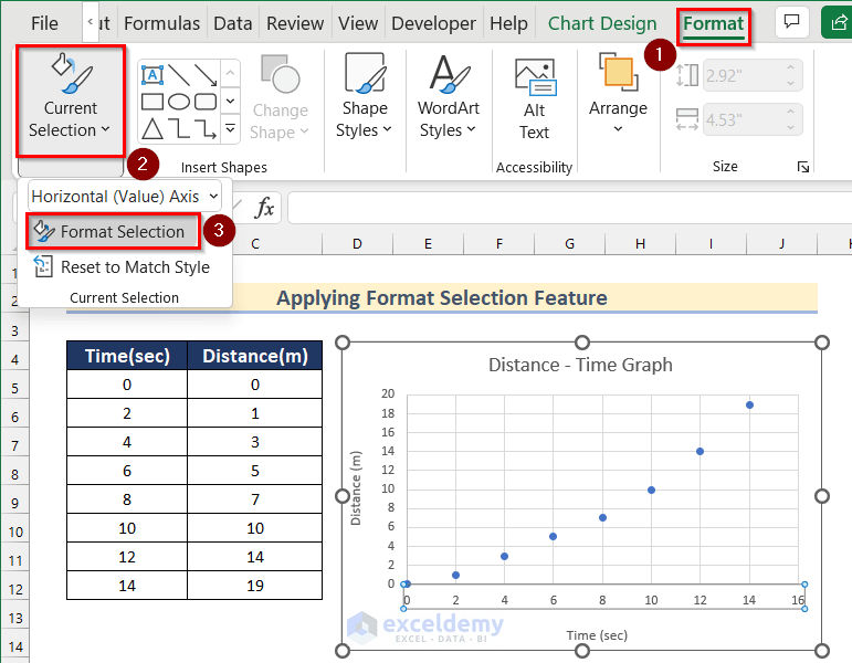
- In the beginning, select the chart.
- Then, click on the axis values where you want to change the spacing. Here, we will click on the X-axis.
- After that, go to the Format tab >> click on Current Selection >> select Format Selection.
- Now, the Format Axis toolbar will open.
- Next, insert your desired spacing as Major Units. Here, we will insert 1.
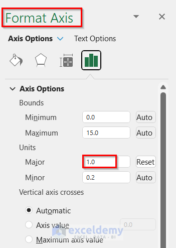
- Thus, you can adjust Excel chart gridlines spacing on the X-axis by Double-Clicking on axis values.
- Similarly, you can adjust chart gridlines spacing on the Y-axis.
3. Square Chart Gridlines Spacing Using VBA in Excel
You can also make square gridlines by adjusting spacing in your Excel chart using VBA. Below you will find 4 different ways to do that.
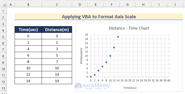
3.1 Formatting Axis Scale Applying VBA
In the first method, we will format the axis scale by applying VBA to make square chart gridlines in Excel.
Here are the steps.
Steps:
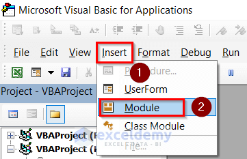
- Firstly, go to the Developer tab >> click on Visual Basic.

- Now, the Microsoft Visual Basic for Application box will open.
- After that, click on Insert >> select Module.
- Then, write the following code in your Module.
Sub Formatting_Axis_Scales()
  If Not ActiveChart Is Nothing Then
    FormattingAxisScales ActiveChart
  ElseIf TypeName(Selection) = "DrawingObjects" Then
    Dim Chart_Shape As Shape
    For Each Chart_Shape In Selection.ShapeRange
      If Chart_Shape.HasChart Then
        FormattingAxisScales Chart_Shape.Chart
      End If
    Next
  Else
    MsgBox "You have not selected any chart. Please select one.", vbExclamation, "Warning!"
  End If
End Sub
Function FormattingAxisScales(Distance_Time_Chart As Chart)
  With Distance_Time_Chart
    With .PlotArea
      Dim xplotHight As Double, xplotWidth As Double
      xplotHight = .InsideHeight
      xplotWidth = .InsideWidth
    End With
    With .Axes(xlValue)
      Dim Yaxis_max As Double, Yaxis_min As Double, Ymaj1 As Double
      Yaxis_max = .MaximumScale
      Yaxis_min = .MinimumScale
      Ymaj1 = .MajorUnit
      .MaximumScaleIsAuto = False
      .MinimumScaleIsAuto = False
      .MajorUnitIsAuto = False
    End With
    With .Axes(xlCategory)
      Dim axis_max As Double, Xaxis_min As Double, Xaxis_maj As Double
      Xaxis_max = .MaximumScale
      Xaxis_min = .MinimumScale
      Xaxis_maj = .MajorUnit
      .MaximumScaleIsAuto = False
      .MinimumScaleIsAuto = False
      .MajorUnitIsAuto = False
    End With
    Dim Yaxis_tic As Double, Xaxis_tic As Double
    Yaxis_tic = xplotHight * Ymaj1 / (Yaxis_max - Yaxis_min)
    Xaxis_tic = xplotWidth * Xaxis_maj / (Xaxis_max - Xaxis_min)
    If Xaxis_tic > Yaxis_tic Then
      .Axes(xlCategory).MaximumScale = xplotWidth * Xaxis_maj / Yaxis_tic + Xaxis_min
    Else
      .Axes(xlValue).MaximumScale = xplotHight * Ymaj1 / Xaxis_tic + Yaxis_min
    End If
  End With
End Function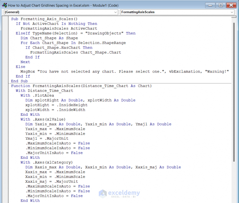
Code Breakdown
- Firstly, we created a Sub Procedure as Formatting_Axis_Scales.
- Then, set a MsgBox to check if a chart has been selected.
- After that, we created a function named FormattingAxisScales.
- Finally, we formatted axis scales in the function.
- Next, click on the Save button and go back to your worksheet.
- After that, select your chart.
- Then, go to the Developer tab >> click on Macros.
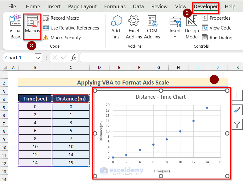
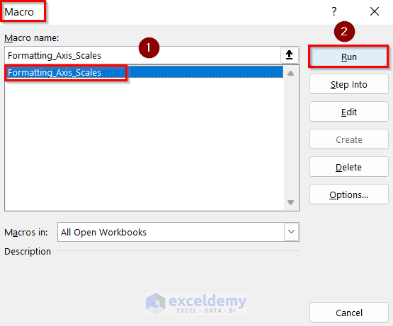
- Now, the Macros box will appear.
- Afterward, select Formatting_Axis_Scales.
- Further, click on Run.
- Thus, you can make square gridlines by formatting the axis scale in your Excel chart.
3.2 Setting Equal Major Unit Spacing
Next, we will show you how to set equal major unit spacing by applying VBA to make square chart gridlines in Excel.
Steps:
- In the beginning, go to the Developer tab >> click on Visual Basic.
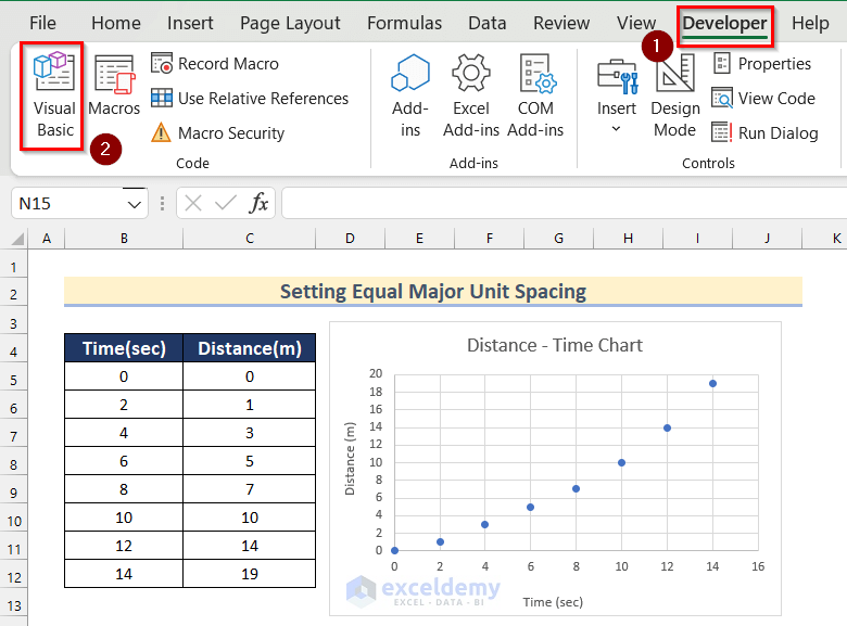
- Further, insert a module going through the same steps shown in Method 3.1.
- Next, write the following code in your Module.
Sub Setting_Equal_Major_Unit_Spacing()
  If Not ActiveChart Is Nothing Then
    SettingEqualMajorUnitSpacing ActiveChart, True
   ElseIf TypeName(Selection) = "DrawingObjects" Then
    Dim Chart_Shape As Shape
    For Each Chart_Shape In Selection.ShapeRange
      If Chart_Shape.HasChart Then
        SettingEqualMajorUnitSpacing Chart_Shape.Chart
      End If
    Next
  Else
    MsgBox "You have not selected any chart. Please select one.", vbExclamation, "Warning!"
  End If
End Sub
Function SettingEqualMajorUnitSpacing(Distance_Time_Chart As Chart, Optional aEqualMajorUnit As Boolean = False)
  With Distance_Time_Chart
    With .PlotArea
      Dim plotHeight As Double, plotWidth As Double
      plotHeight = .InsideHeight
      plotWidth = .InsideWidth
    End With
    With .Axes(xlValue)
      Dim Yaxis_max As Double, Yaxis_min As Double, Yaxis_maj As Double
      Yaxis_max = .MaximumScale
      Yaxis_min = .MinimumScale
      Yaxis_maj = .MajorUnit
      .MaximumScaleIsAuto = False
      .MinimumScaleIsAuto = False
      .MajorUnitIsAuto = False
    End With
    With .Axes(xlCategory)
      Dim Xaxis_max As Double, Xaxis_min As Double, Xaxis_maj As Double
      Xaxis_max = .MaximumScale
      Xaxis_min = .MinimumScale
      Xaxis_maj = .MajorUnit
      .MaximumScaleIsAuto = False
      .MinimumScaleIsAuto = False
      .MajorUnitIsAuto = False
    End With
    If aEqualMajorUnit Then
      Xaxis_maj = WorksheetFunction.Min(Xaxis_maj, Yaxis_maj)
      Yaxis_maj = Xaxis_maj
      .Axes(xlCategory).MajorUnit = Xaxis_maj
      .Axes(xlValue).MajorUnit = Yaxis_maj
    End If
    Dim Yaxis_tic As Double, Xaxis_tic As Double
    Yaxis_tic = plotHeight * Yaxis_maj / (Yaxis_max - Yaxis_min)
    Xaxis_tic = plotWidth * Xaxis_maj / (Xaxis_max - Xaxis_min)
    If Xaxis_tic > Yaxis_tic Then
      .Axes(xlCategory).MaximumScale = plotWidth * Xaxis_maj / Yaxis_tic + Xaxis_min
    Else
      .Axes(xlValue).MaximumScale = plotHeight * Yaxis_maj / Xaxis_tic + Yaxis_min
    End If
  End With
End Function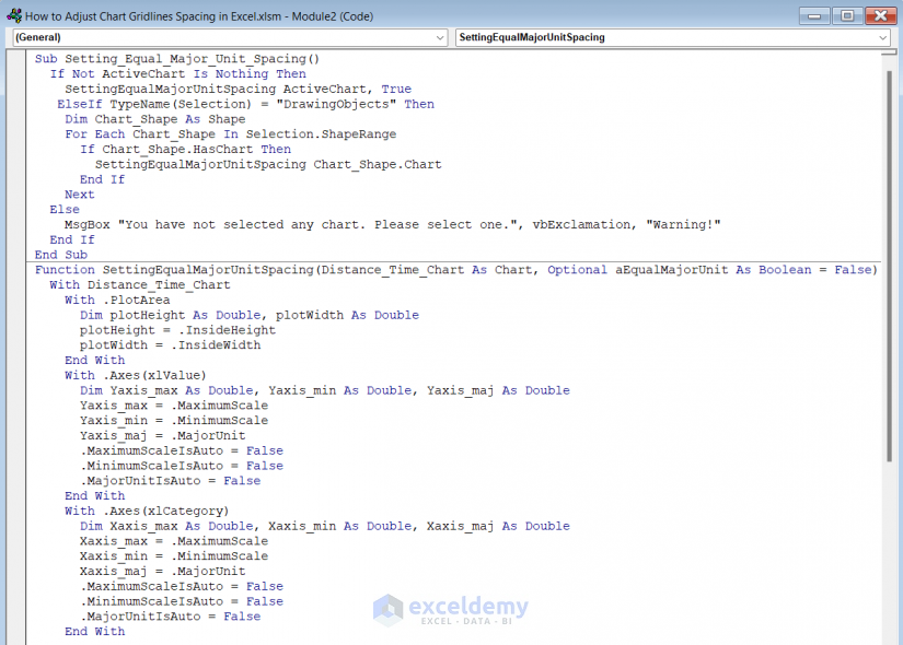
Code Breakdown
- Here, we created a Sub Procedure as Setting_Equal_Major_Unit_Spacing.
- Then, set a MsgBox to check if a chart has been selected.
- After that, we created a function named SettingEqualMajorUnitSpacing.
- In the end, we set equal major unit spacing in the function.
- After that, save the code following the steps shown in Method 3.1.
- Then, select your chart.
- Next, go to the Developer tab >> click on Macros.
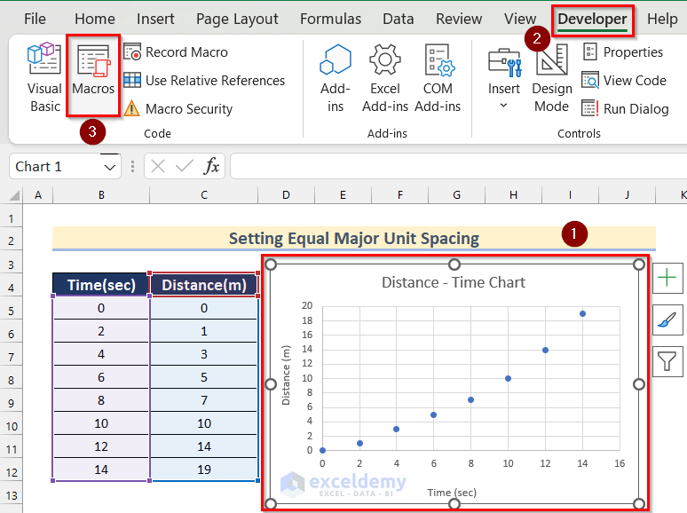
- Now, the Macros box will appear.
- Afterward, select Setting_Equal_Major_Unit_Spacing.
- Then, click on Run.
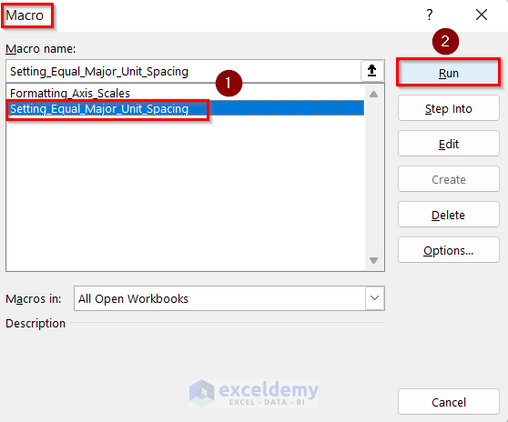
- Thus, you can make square gridlines by setting equal major unit spacing in your Excel chart.

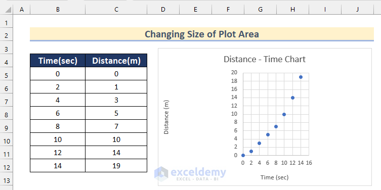
3.3 Changing Size of Plot Area
In the third method, we will show you how to adjust chart gridlines spacing in Excel by changing the size of the plot area in Excel.
Here are the steps.
Steps:
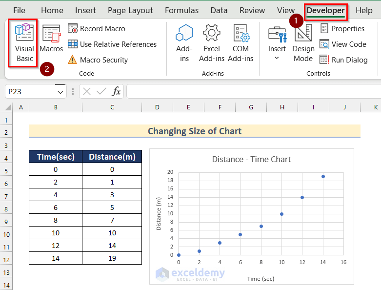
- Firstly, go to the Developer tab >> click on Visual Basic.
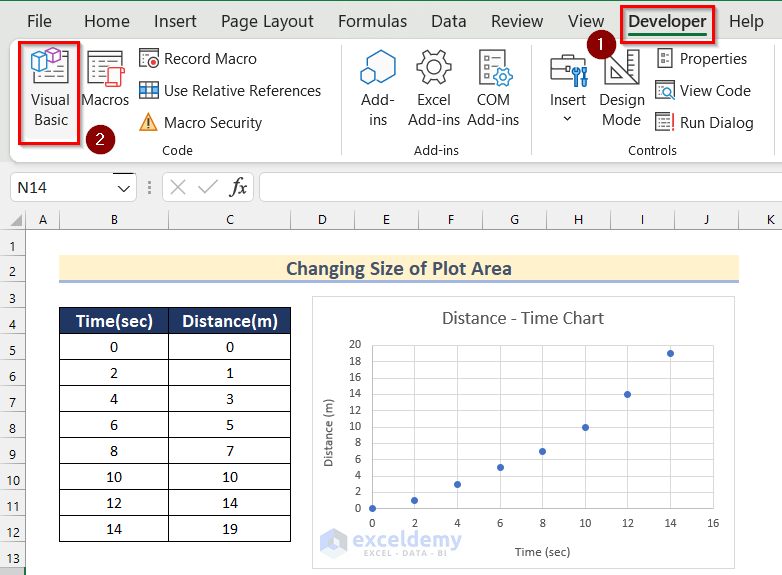
- Then, insert a module going through the same steps shown in Method 3.1.
- Next, write the following code in your Module.
Sub Changing_Size_of_Plot_Area()
  If Not ActiveChart Is Nothing Then
    ChangingSizeofPlotArea ActiveChart, True
  ElseIf TypeName(Selection) = "DrawingObjects" Then
    Dim Chart_Shape As Shape
    For Each Chart_Shape In Selection.ShapeRange
      If Chart_Shape.HasChart Then
        ChangingSizeofPlotArea Chart_Shape.Chart
      End If
    Next
  Else
    MsgBox "You have not selected any chart. Please select one.", vbExclamation, "Warning!"
  End If
End Sub
Function ChangingSizeofPlotArea(Distance_Time_Chart As Chart, Optional aEqualMajorUnit As Boolean = False)
  With Distance_Time_Chart
    With .PlotArea
      Dim plotHeight As Double, plotWidth As Double
      plotHeight = .InsideHeight
      plotWidth = .InsideWidth
    End With
    With .Axes(xlValue)
      Dim Yaxis_max As Double, Yaxis_min As Double, Yaxis_maj As Double
      Yaxis_max = .MaximumScale
      Yaxis_min = .MinimumScale
      Yaxis_maj = .MajorUnit
      .MaximumScaleIsAuto = False
      .MinimumScaleIsAuto = False
      .MajorUnitIsAuto = False
    End With
    With .Axes(xlCategory)
      Dim Xaxis_max As Double, Xaxis_min As Double, Xaxis_maj As Double
      Xaxis_max = .MaximumScale
      Xaxis_min = .MinimumScale
      Xaxis_maj = .MajorUnit
      .MaximumScaleIsAuto = False
      .MinimumScaleIsAuto = False
      .MajorUnitIsAuto = False
    End With
    If aEqualMajorUnit Then
      Xaxis_maj = WorksheetFunction.Min(Xaxis_maj, Yaxis_maj)
      Yaxis_maj = Xaxis_maj
      .Axes(xlCategory).MajorUnit = Xaxis_maj
      .Axes(xlValue).MajorUnit = Yaxis_maj
    End If
    Dim Yaxis_tic As Double, Xaxis_tic As Double
    Yaxis_tic = plotHeight * Yaxis_maj / (Yaxis_max - Yaxis_min)
    Xaxis_tic = plotWidth * Xaxis_maj / (Xaxis_max - Xaxis_min)
    If Xaxis_tic < Yaxis_tic Then
      .PlotArea.InsideHeight = .PlotArea.InsideHeight * Xaxis_tic / Yaxis_tic
      .PlotArea.Top = .PlotArea.Top + _
        (.ChartArea.Height - .PlotArea.Height - .PlotArea.Top) / 2
    Else
      .PlotArea.InsideWidth = .PlotArea.InsideWidth * Yaxis_tic / Xaxis_tic
      .PlotArea.Left = .PlotArea.Left + _
        (.ChartArea.Width - .PlotArea.Width - .PlotArea.Left) / 2
    End If
  End With
End Function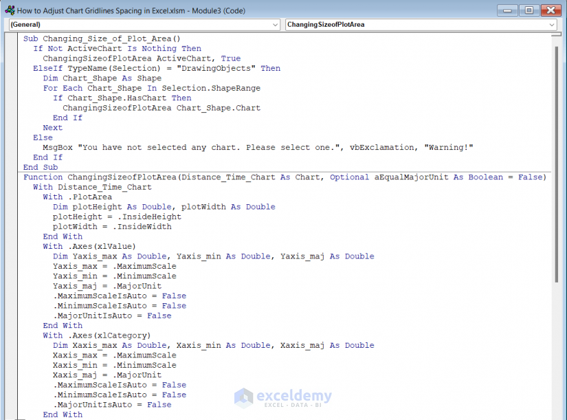
Code Breakdown
- Firstly, we created a Sub Procedure as Changing_Size_of_Plot_Area.
- Then, set a MsgBox to check if a chart has been selected.
- After that, we created a function named ChangingSizeofPlotArea.
- Finally, we changed the size of the plot area of the chart in the function.
- After that, save the code following the steps shown in Method 3.1.
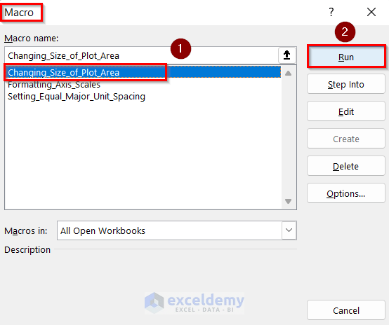
- Then, select your chart.
- Now, go to the Developer tab >> click on Macros.
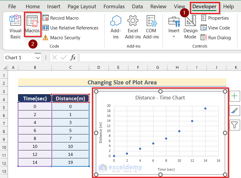
- Next, the Macros box will appear.
- Afterward, select Changing_Size_of_Plot_Area.
- Click on Run.
- Thus, you can make square gridlines by changing the size of plot area in your Excel chart.
3.4 Making Square GridLines by Changing Size of Chart
In the last method, you will find a way of making square gridlines by changing the size of the chart which will adjust the chart gridlines spacing in Excel.
Steps:
- In the beginning, go to the Developer tab >> click on Visual Basic.
- Then, insert a module like the steps shown in Method 3.1.
- Further, write the following code in your Module.
Sub Changing_Size_of_Chart()
  If Not ActiveChart Is Nothing Then
    ChangingSizeofChart ActiveChart, True, True
  ElseIf TypeName(Selection) = "DrawingObjects" Then
    Dim Chart_Shape As Shape
    For Each Chart_Shape In Selection.ShapeRange
      If Chart_Shape.HasChart Then
        ChangingSizeofChart Chart_Shape.Chart, True, True
      End If
    Next
  Else
    MsgBox "You have not selected any chart. Please select one.", vbExclamation, "Warning!"
  End If
End Sub
Function ChangingSizeofChart(Distance_Time_Chart As Chart, Shrinking_Chart As Boolean, _
    Optional aEqualMajorUnit As Boolean = False)
  With Distance_Time_Chart
    With .PlotArea
      Dim plotHeight As Double, plotWidth As Double
      plotHeight = .InsideHeight
      plotWidth = .InsideWidth
    End With
    With .Axes(xlValue)
      Dim Yaxis_max As Double, Yaxis_min As Double, Yaxis_maj As Double
      Yaxis_max = .MaximumScale
      Yaxis_min = .MinimumScale
      Yaxis_maj = .MajorUnit
      .MaximumScaleIsAuto = False
      .MinimumScaleIsAuto = False
      .MajorUnitIsAuto = False
    End With
    With .Axes(xlCategory)
      Dim Xaxis_max As Double, Xaxis_min As Double, Xaxis_maj As Double
      Xaxis_max = .MaximumScale
      Xaxis_min = .MinimumScale
      Xaxis_maj = .MajorUnit
      .MaximumScaleIsAuto = False
      .MinimumScaleIsAuto = False
      .MajorUnitIsAuto = False
    End With
    If aEqualMajorUnit Then
      Xaxis_maj = WorksheetFunction.Min(Xaxis_maj, Yaxis_maj)
      Yaxis_maj = Xaxis_maj
      .Axes(xlCategory).MajorUnit = Xaxis_maj
      .Axes(xlValue).MajorUnit = Yaxis_maj
    End If
    Dim Yaxis_tic As Double, Xaxis_tic As Double
    Yaxis_tic = plotHeight * Yaxis_maj / (Yaxis_max - Yaxis_min)
    Xaxis_tic = plotWidth * Xaxis_maj / (Xaxis_max - Xaxis_min)
    If Shrinking_Chart Then
      If Xaxis_tic < Yaxis_tic Then
        .Parent.Height = .Parent.Height - .PlotArea.InsideHeight * (1 - Xaxis_tic / Yaxis_tic)
      Else
        .Parent.Width = .Parent.Width - .PlotArea.InsideWidth * (1 - Yaxis_tic / Xaxis_tic)
      End If
    Else
      If Xaxis_tic < Yaxis_tic Then
        .PlotArea.InsideHeight = .PlotArea.InsideHeight * Xaxis_tic / Yaxis_tic
        .PlotArea.Top = .PlotArea.Top + _
          (.ChartArea.Height - .PlotArea.Height - .PlotArea.Top) / 2
      Else
        .PlotArea.InsideWidth = .PlotArea.InsideWidth * Yaxis_tic / Xaxis_tic
        .PlotArea.Left = .PlotArea.Left + _
          (.ChartArea.Width - .PlotArea.Width - .PlotArea.Left) / 2
      End If
    End If
  End With
End Function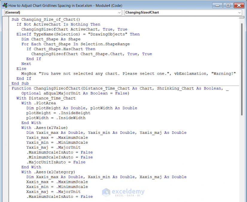
Code Breakdown
- Firstly, we created a Sub Procedure as Changing_Size_of_Chart.
- Secondly, set a MsgBox to check if a chart has been selected.
- After that, we created a function named ChangingSizeofChart.
- Finally, we changed the size of the chart in the function.
- Next, save the code following the steps shown in Method 3.1.
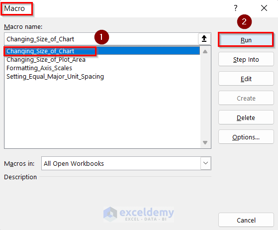
- Then, select your chart.
- Now, go to the Developer tab >> click on Macros.
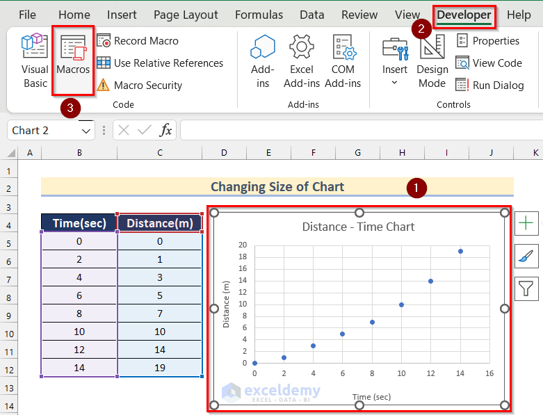
- Here, the Macros box will appear.
- Afterward, select Changing_Size_of_Plot_Chart.
- Then, click on Run.
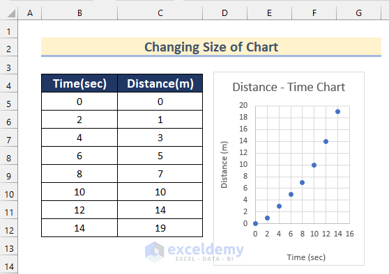
- That’s it! Thus, you can make square gridlines by changing the size of the chart in Excel.
Things to Remember
- You can use these codes only if the values of the x-axis and y-axis are close. In our dataset the values of the x-axis and y-axis were close. So, 4 of the codes worked perfectly.
- Otherwise, you have to adjust the chart gridline spacing using the other 2 methods.
Download Practice Workbook
You can download the workbook to practice yourself.
Conclusion
So, in this article, we have shown you ways to adjust chart gridlines spacing in Excel. I hope you found this article interesting and helpful. If something seems difficult to understand, please leave a comment. Please let us know if there are any more alternatives that we may have missed.
Related Articles
- How to Add Primary Major Vertical Gridlines in Excel
- How to Add Primary Minor Vertical Gridlines in Excel
- How to Add Minor Gridlines in Excel
- How to Add Gridlines to a Graph in Excel
- How to Adjust Gridlines in Excel Chart
<< Go Back To Gridlines in Excel Chart | Excel Chart Elements | Excel Charts | Learn Excel
Get FREE Advanced Excel Exercises with Solutions!
