Need to learn how to add minor gridlines in Excel? Minor gridlines are horizontal and vertical lines that run through your chart layout to represent axis divisions. They are very useful for quickly calculating the height or breadth of visual components used in our chart. If you are looking for such unique kinds of tricks, you’ve come to the right place. Here, we will take you through 3 easy and quick methods to add minor gridlines in Excel effectively with proper illustrations.
What Are Minor Gridlines in Excel Chart?
Excel offers the option of adding minor gridlines to a graph created on the basis of some gathered data. They can be either horizontal or vertical. Minor gridlines of a graph help to visualize the plotted data easily and make the chart reader-friendly. Usually, the graph shows Primary Horizontal Gridlines by default. But you can change this and add gridlines according to your needs and choice. Excel also allows you to remove the gridlines from your graph in case you don’t need them.
Creation of an Excel Chart
Firstly, we will create an Excel chart to add minor gridlines to the chart. Using Insert ribbon, we will import a chart from our dataset to add minor gridlines. This is an easy task. This is a time-saving task also. Let’s follow the instructions below to create the chart first.
📌 Steps
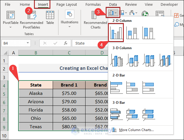
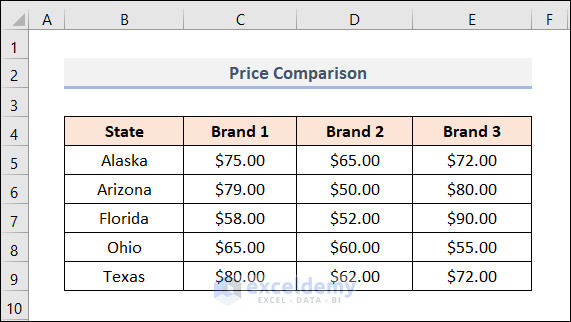
- First of all, select the range of data to insert a chart. In this case, we selected cells in the B4:E15 range for the convenience of our work.
- Secondly, go to the Insert tab.
- Then, click on the Insert Column or Bar Chart drop-down on the Charts group.
- After that, select the 2-D Clustered Column chart.
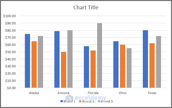
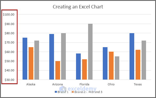
- As a result, you will create a 2-D Column Chart which is given in the below screenshot.
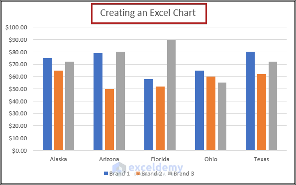
- At this moment, change the Chart Title and give a suitable title to it.
- At present, the minimum value on the y-axis is zero. As a result, the columns are unnecessarily long. So, we’ll increase the minimum bound now.
- Now, double-click on the Vertical (Value) Axis.
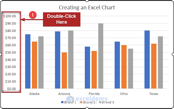
- It will open the Format Axis task pane.
- Then, click on the Axis Options icon.
- After that, expand the Axis Options.
- Later, write down 30 in the Minimum box under the Bounds section.
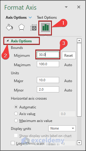
- As a result, we are able to increase the minimum bound value of the y-axis.
How to Add Minor Gridlines in Excel Chart: 3 Ways
Suppose you have the following dataset. It includes the Price Comparison of three different Brands in five different States.
In the previous section, we’ve already created a chart for our dataset like the one below.
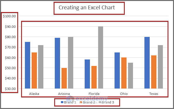
Now, we’ll add minor gridlines to our chart in Excel.
1. Using Chart Elements Button
In this method, we will use the Chart Elements button to add minor gridlines to an Excel chart. From our dataset, we can easily do that. Let’s follow the instructions below to adjust the gridlines in an Excel chart.
📌 Steps
- At first, click once anywhere on the chart.
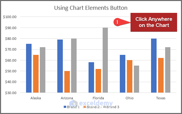
- As a result, a Chart Elements button will appear in front of you on the right top.
- Then, click on the Chart Elements button.
- Now, from the Chart Elements options click on the right arrowhead beside Gridlines.
- After that, uncheck the box of Primary Major Horizontal.
- Later, check the boxes of Primary Minor Horizontal and Primary Minor Vertical.
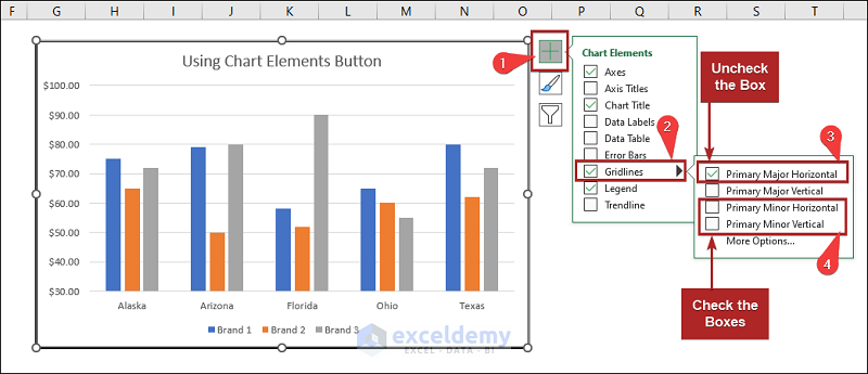
- Hence, you can add the horizontal and vertical minor gridlines of the Excel chart like the image below.

Read More: How to Add Vertical Gridlines to Excel Chart
2. Utilizing Chart Design Tab
For our previous set of data, we will now demonstrate another method for adding minor gridlines to a chart. Here, we will show the use of the Chart Design tab that appears as soon as a graph/chart is created on the basis of some gathered data. Let’s go through the procedure below.
📌 Steps
- At the very beginning, click on the chart.
- Then, the Chart Design tab will appear.
- Now, go to the Chart Design tab.
- After that, click on the Add Chart Element drop-down on the Chart Layouts group.
- Later, select the Gridlines option.
- Next, click on the Primary Major Horizontal once to set it off.
- And, select the Primary Minor Horizontal and the Primary Minor Vertical to set them on.
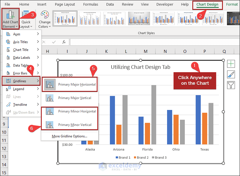
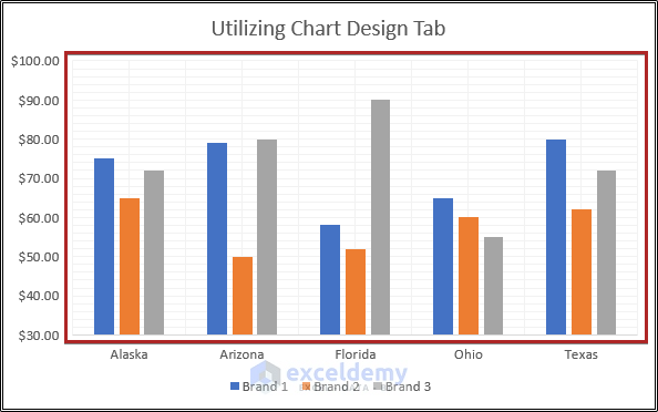
- Hence, the gridlines will appear according to your choice.
Read More: How to Add Gridlines to a Graph in Excel
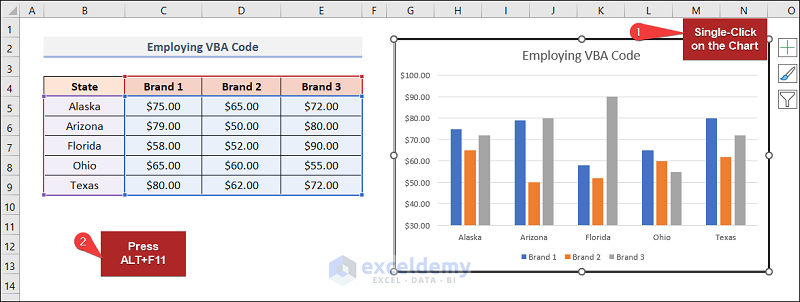
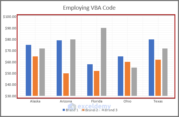
3. Employing VBA Code
Employing the VBA code is always an amazing alternative. Follow the steps below to be able to solve the problem in this way.
📌 Steps
- Initially, click anywhere on the chart once.
- Then, press the ALT+F11 key.
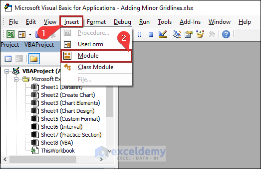
- Suddenly, the Microsoft Visual Basic for Applications window will open.
- Then, go to the Insert tab.
- After that, select Module from the options.
- It opens the code module where you need to paste the code below.
Sub add_minor_gridlines()
Dim cht As Chart
Set cht = ActiveChart
With cht.Axes(xlCategory, xlPrimary)
.HasMajorGridlines = False
.HasMinorGridlines = True
End With
With cht.Axes(xlValue, xlPrimary)
.HasMajorGridlines = False
.HasMinorGridlines = True
End With
End Sub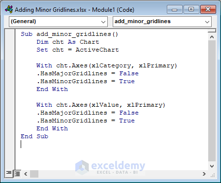
- Then click on the Run button or press the F5 key on your keyboard.
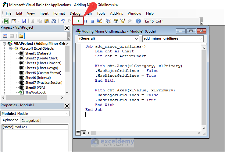
- After that, return to the worksheet VBA.
- Instantly, the worksheet looks like the one below.
Modifications in Minor Gridlines of Excel Chart
After adding minor gridlines, you can modify them in a few different ways. Let’s talk about a few of them.
1. Custom Format of Minor Gridlines
You can custom format the minor gridlines you have added to the Excel chart. Let’s explore this approach step by step.
📌 Steps
- In the beginning, double-click on the gridlines portion.
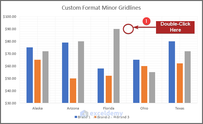
- Suddenly, the Format Minor Gridlines task pane will open.
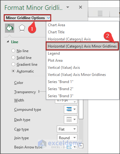
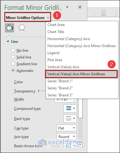
- Then, click on the Minor Gridline Options drop-down.
- After that, select the Horizontal (Category) Axis Minor Gridlines option.
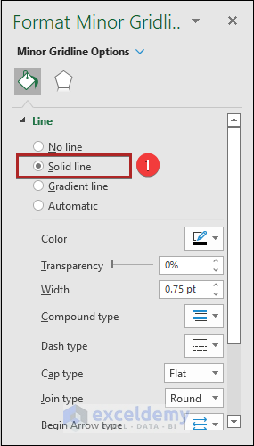
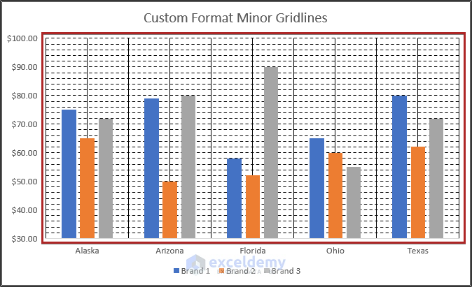
- At this point, choose the Solid line in the Line section.
- As a result, the Horizontal Minor Gridlines look as in the image below.
- Again, click on the Minor Gridline Options drop-down.
- At this time, select the Vertical (Value) Axis Minor Gridlines.
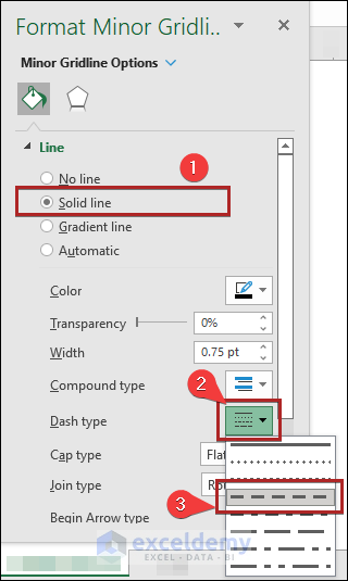
- Again, choose the Solid line in the Line section,
- Then, click on the Dash type drop-down.
- Later, choose Dash from the available options as shown in the image below.
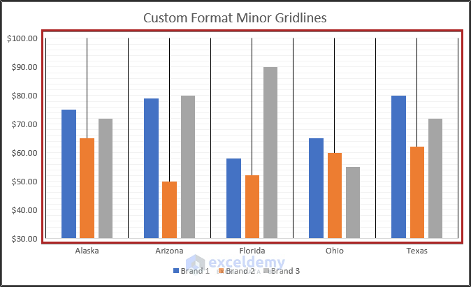
- As a result, the minor gridlines look as in the image below.
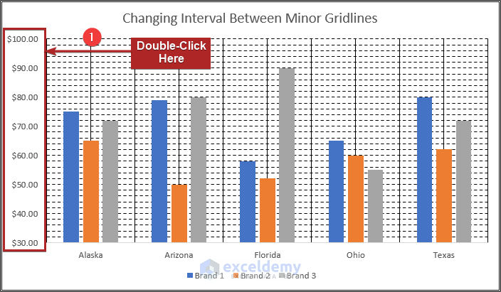
2. Changing Interval Between Minor Gridlines
Also, you can change the distance between the gridlines of the chart you have created in Excel. To do so, follow the steps below.
📌 Steps
- First, double-click on the Vertical (Value) Axis.
- Instantly, it will open up the Format Axis task pane.
- Then, click on the Axis Options icon.
- After that, expand the Axis Options.
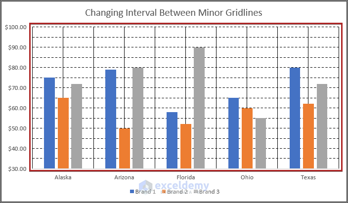
- Later, write down 5 in the Minor box under the Units section.
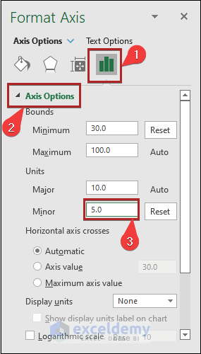
- Thus, you can change the gridline interval.
Removing Minor Gridlines from Excel Chart
As you can add minor gridlines to your chart, Excel also allows you to remove the minor gridlines you have added. Removing minor gridlines is also as simple as adding them. To remove minor gridlines from your chart, proceed as below:
📌 Steps
- Initially, click once anywhere on the chart.
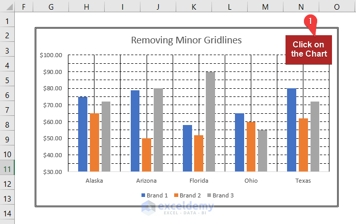
- As a result, a Chart Elements button will appear in front of you on the right top like before.
- Then, click on the Chart Elements button.
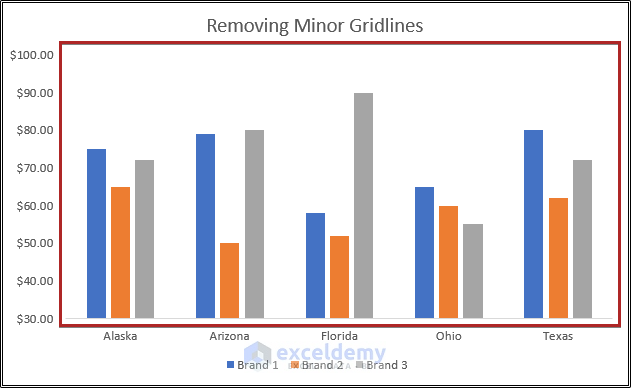
- After that, uncheck the box of Gridlines.
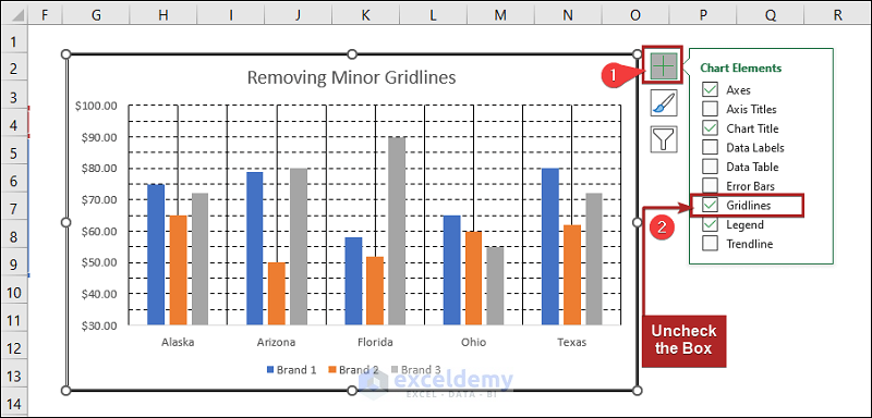
- Thus, you can disappear your previously added minor gridlines.
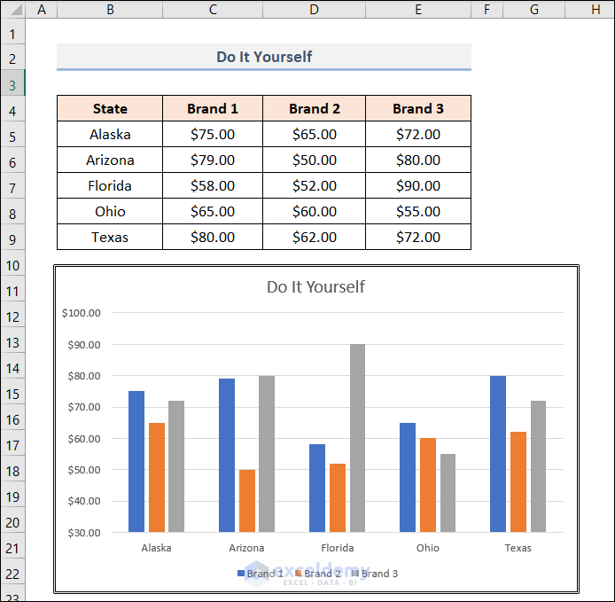
Practice Section
For doing practice by yourself we have provided a practice section like below in the last sheet Practice Section inside the workbook. Please do it by yourself.
Download Practice Workbook
You may download the following Excel workbook for better understanding and practice yourself.
Conclusion
This article provides easy and brief solutions to adding minor gridlines to charts in Excel. Don’t forget to download the Practice file. Thank you for reading this article, we hope this was helpful. Please let us know in the comment section if you have any queries or suggestions.
Related Articles
- How to Add Primary Major Horizontal Gridlines in Excel
- How to Add Primary Major Vertical Gridlines in Excel
- How to Add Primary Minor Vertical Gridlines in Excel
- How to Adjust Chart Gridlines Spacing in Excel
- How to Make Square Grid Lines in Excel Graph
- How to Adjust Gridlines in Excel Chart
- How to Remove Gridlines in Excel Graph
<< Go Back To Gridlines in Excel Chart | Excel Chart Elements | Excel Charts | Learn Excel
Get FREE Advanced Excel Exercises with Solutions!
