Method 1 – Use Chart Elements Option to Adjust Gridlines in Excel Chart
1.1 Add Horizontal and Vertical Gridlines
Steps:
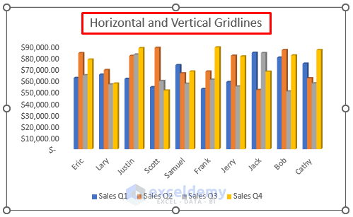
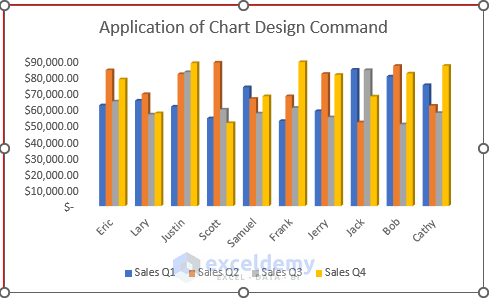
- Our created chart is below.
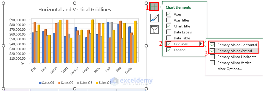
- After creating an Excel chart, press any portion of your chart.
- A Chart Elements option will appear in front of you on the right-top.
- From the Chart Elements option, check the Gridlines.
- Check the Primary Major Horizontal and Primary Major Vertical.
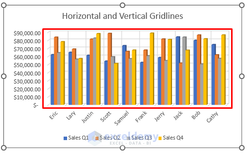
- You will be able to adjust the Horizontal and Vertical gridlines of the Excel chart like the below screenshot.
1.2 Custom Format Gridlines
Steps:
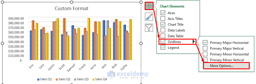
- Press any portion of your chart.
- From the Chart Elements option, check the Gridlines.
- Select More Options….
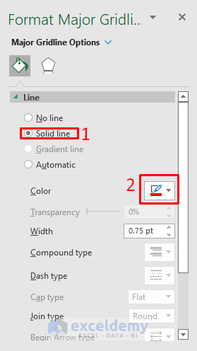
- A Format Major Gridlines dialog box will appear in front of you.
- From the Format Major Gridlines dialog box, select Fill & Line.
- Select the Solid line from the Line option.
- Select the Red color from the Color option.
- You will be able to adjust the gridlines of the chart using the Custom Format command.

Method 2 – Apply Chart Design Command to Adjust Gridlines in Excel Chart
Steps:
- Select the chart.
- From the Chart Design ribbon, go to,
Chart Design → Add Chart Element → Gridlines → Primary Major Horizontal
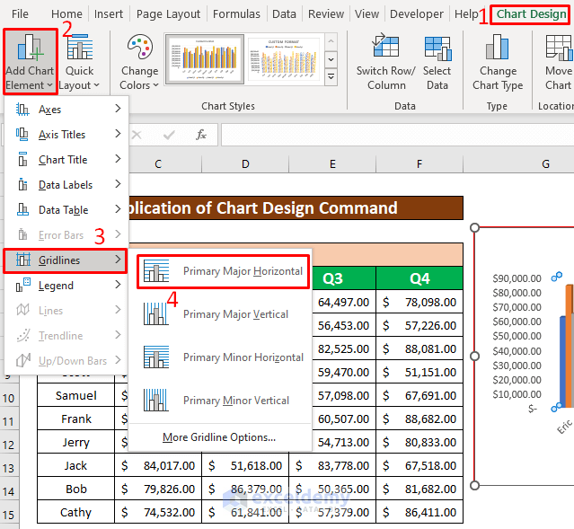
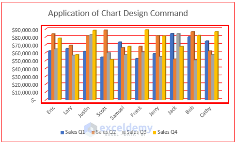
- Adjust the Primary Major Horizontal gridlines, which have been given in the screenshot below.
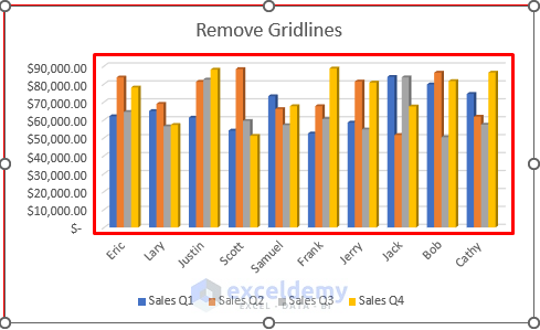
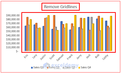
Method 3 – Remove Gridlines from Excel Chart
Steps:
- Select the chart.
- A Chart Elements option will appear in front of you in the right-top corner.
- From the Chart Elements option, uncheck the Gridlines option.
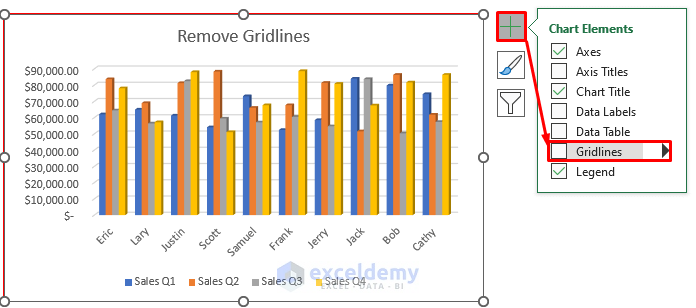
- You can remove the gridlines from the Excel chart.
Things to Remember
➜ While a value can not found in the referenced cell, the #N/A! the error happens in Excel.
➜ #DIV/0! the error happens when a value is divided by zero(0) or the cell reference is blank.
Download Practice Workbook
Download this practice workbook to exercise while you are reading this article.
Related Articles
- How to Add Primary Major Vertical Gridlines in Excel
- How to Add Gridlines to a Graph in Excel
- How to Add Vertical Gridlines to Excel Chart
- How to Adjust Chart Gridlines Spacing in Excel
- How to Make Square Grid Lines in Excel Graph
<< Go Back To Gridlines in Excel Chart | Excel Chart Elements | Excel Charts | Learn Excel
Get FREE Advanced Excel Exercises with Solutions!
