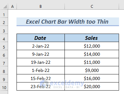
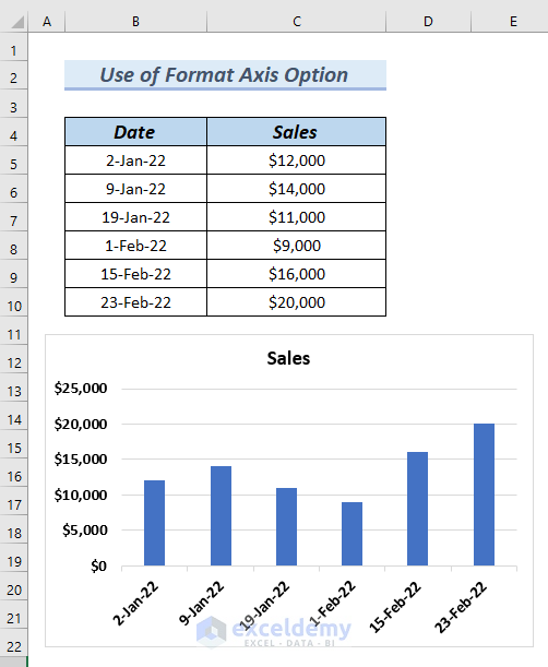
The following table has the Date and Sales columns. We will use these columns to insert a Column Chart. Since the Date column has dates in it, which are spread out over a long period, the bar width of the chart will be too thin.
Here’s why.
Steps:
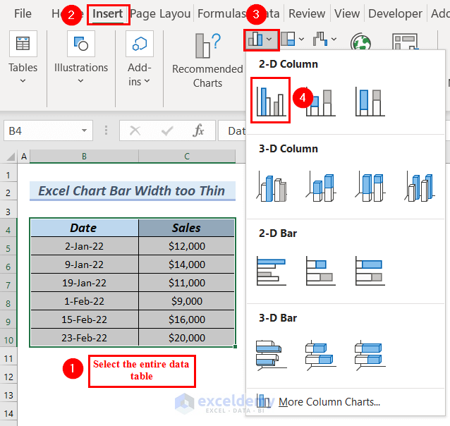
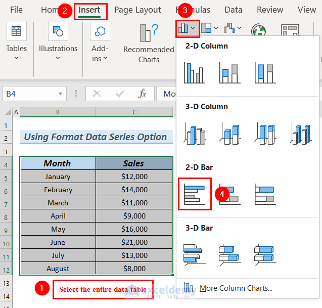
- Select the entire data table.
- Go to the Insert tab.
- From the Insert Column or Bar Chart group, select 2D Clustered Column chart.
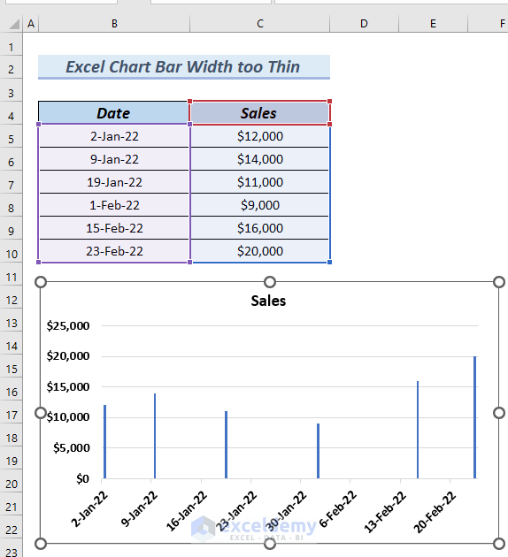
- You can see a column chart bar that is thin.
Let’s solve this issue.
Method 1 – Use the Format Axis Option
Solution:
- Right-click on the X–axis of the chart, since that’s the one with the dates.
- Select the Format Axis option from the Context Menu.
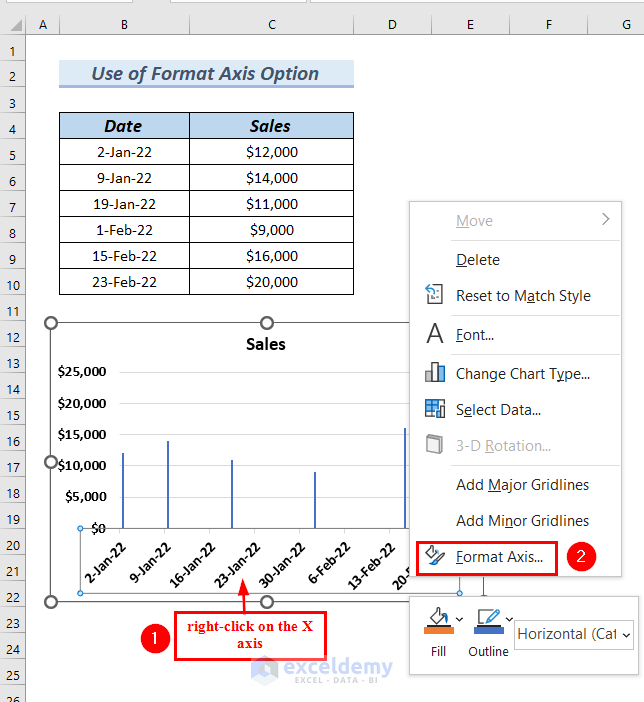
- A Format Axis dialog box will appear on the side of the Excel sheet.
- From Axis Options, select Text axis.
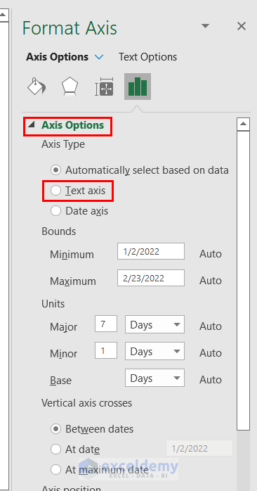
- The chart bar width has become thicker.
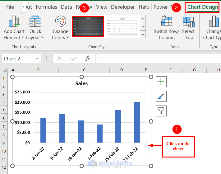
We will format the chart to make it more presentable.
- Click on the chart.
- Go to the Chart Design tab.
- From the Chart Styles group, select a Chart Style.
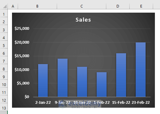
- You can see the chart with a thick chart bar width.
Read More: How to Make a Simple Bar Graph in Excel
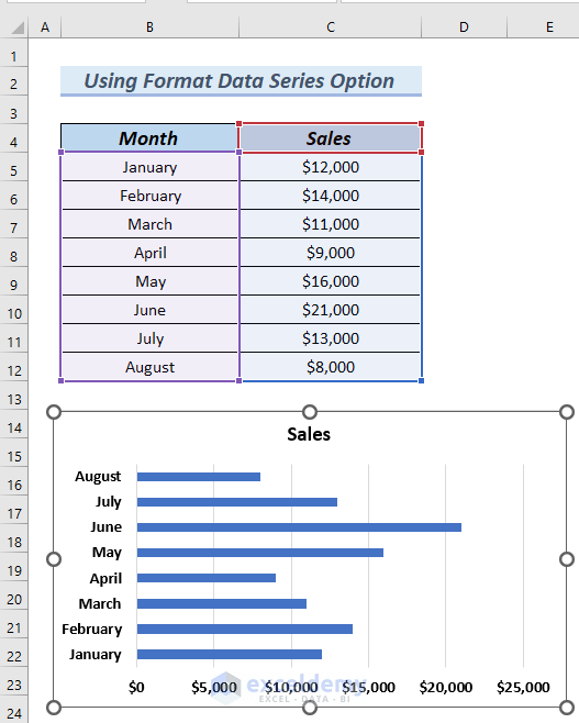
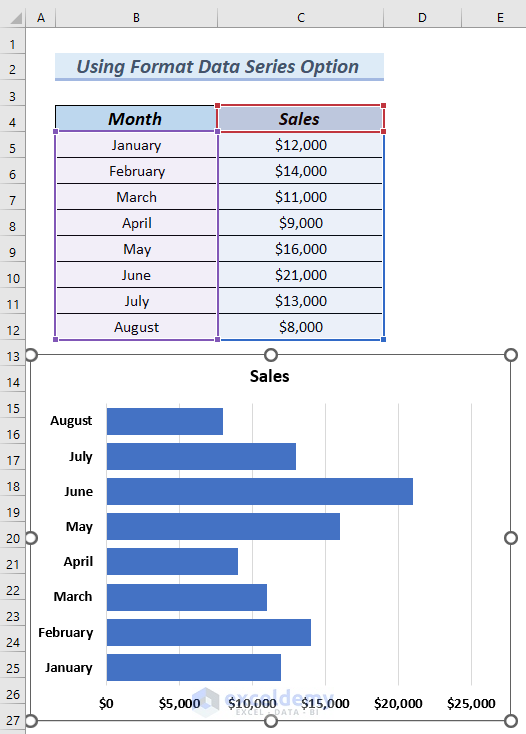
Method 2 – Using the Format Data Series Option
The following table has Month and Sales columns. We will use this table to insert a Bar chart. As the table contains a lot of rows, the chart bar width will be too thin. We have used a 2D Clustered Bar chart.
Here, you can see the chart bar width is too thin.
- Right-click on any of the bars.
- Select the Format Data Series option from the Context Menu.
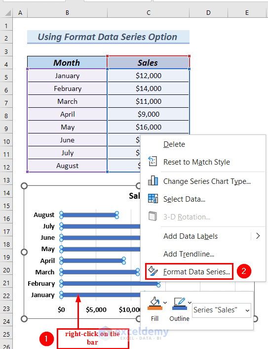
- A Format Data Series dialog box will appear on the side of the Excel sheet.
- In Series Options, set the Gap Width to 30%.
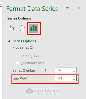
- This makes the bars thicker.
- You can try a lower gap width if you want even thicker bars.
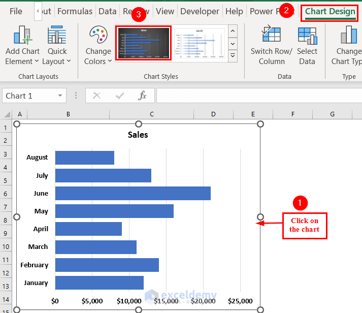
We will format the chart to make it more presentable.
- Click on the chart.
- Go to the Chart Design tab.
- From the Chart Styles group, select a Chart Style.
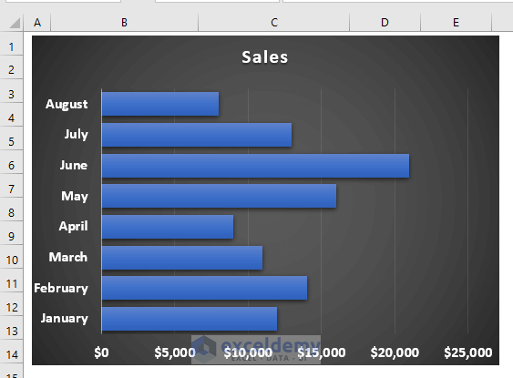
- Here’s one of the styles you can choose.
Read More: How to Create a Bar Chart in Excel with Multiple Bars
Download the Practice Workbook
Related Articles
- How to Make a Bar Graph in Excel without Numbers
- How to Make a Diverging Stacked Bar Chart in Excel
- How to Make a 100 Percent Stacked Bar Chart in Excel
- How to Create Clustered Stacked Bar Chart in Excel
- How to Make a Grouped Bar Chart in Excel
- How to Make a Double Bar Graph in Excel
<< Go Back to Excel Bar Chart | Excel Charts | Learn Excel
Get FREE Advanced Excel Exercises with Solutions!

Hi Afia,
I really liked your article and was hoping it would solve my problem. I have tried both your options and unfortunately, I still have thin bar (columns). I have Excel 365 and have a combo chart with lines and clustered columns. When I select the “Text data” option in the X-axis format, all the column bars shift and condense to the left side of the graph. Would you happen to have any other insights? I’d be happy to share my file so that you can see my issue.
Thanks,
Nick
Dear NICK,
Thank you for your comment. Please follow the second method, Using Format Data Series Option. For a Combo Chart, this method will work.
I hope your problem will be solved now. If, however, you are still facing an issue, you can send us your Excel file to [email protected].
Best,
Afia Aziz Kona
Excel & VBA Content Developer
Exceldemy