
Introduction to Radar Chart
A radar chart is a graphical representation that simultaneously displays information about different categories or variables. It resembles a spider web with lines extending outward from the center. Each line represents a distinct category (e.g., price or quality), and its length indicates the magnitude of that category.
Radar charts are commonly used for comparing and analyzing multiple variables or categories. They excel at showcasing patterns, strengths, and weaknesses across different data points.
There are 3 types of radar charts in Excel. They are:
- Basic Radar Chart
- Radar with Markers
- Filled Radar Chart
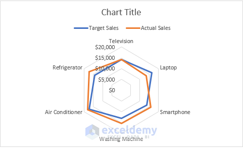
1. Basic Radar Chart
Creating a basic radar chart is straightforward:
- Select the dataset within the range B4:D10.
- Go to the Insert tab and click the down arrow icon (as shown in the image) to access all available chart type.
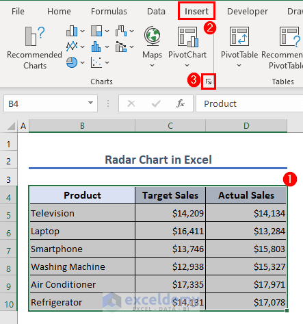
- In the Insert Chart dialog, navigate to the All Charts tab.
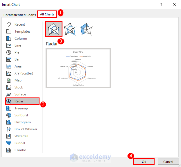
- Choose the Radar option and select the first chart type. Click OK.
Excel will generate a basic radar chart based on your selected data.
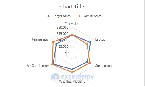
2. Radar with Markers
- Opt for the second chart type from the Radar chart options to create a Radar with Markers chart.
- In this chart, peripheral data points are clearly marked.
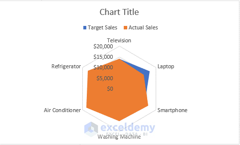
3. Filled Radar Chart
- The third option represents a Filled Radar chart.
- When you choose this option, Excel fills the areas between data points and the center with color, creating a solid chart.
Formatting a Radar Chart
When Excel generates radar charts, they appear in a basic format. However, you’ll likely want to format the charts to suit your needs. Keep in mind that there’s no strict rule for chart formatting—you can customize it as desired. Let’s walk through some essential tasks related to radar chart formatting:
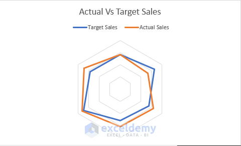
- Changing the Title:
- Click on the title bar to activate editing mode and give the chart a name. For instance, I’ll call it Target vs. Actual Sales.
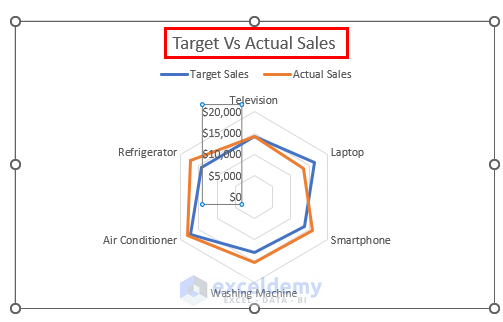
- Removing the Axis:
- Select the axis and press the Delete key. This action removes the axis from the chart.
- The below image shows that the axis is deleted.
- Deleting Category Labels:
- Select the category labels and press Delete to remove them.
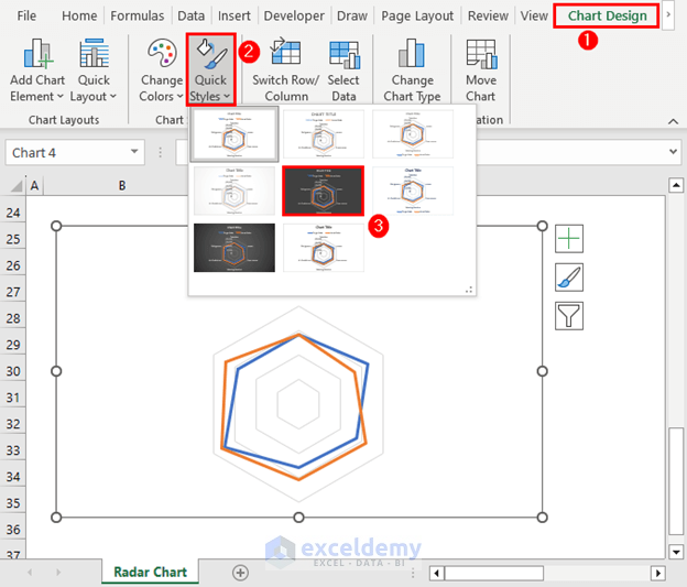
- Changing the Chart Style:
- Select the chart and go to the Chart Design tab (available once you select the chart).
- Choose a style from the Quick Styles options.
- Adding Data Labels:
- Go to the Chart Design tab.
- Select Add Chart Element, choose Data Labels and click on Data Callout.
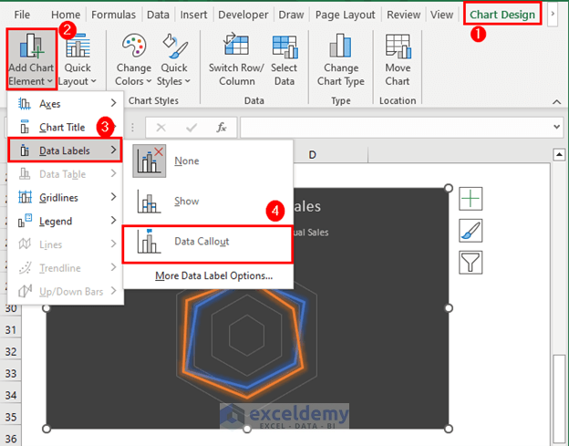
- Resize the chart area and organize the labels for a tidy appearance.
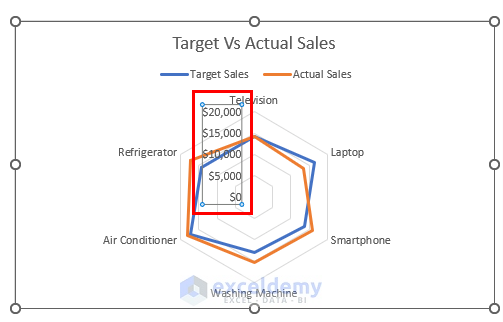
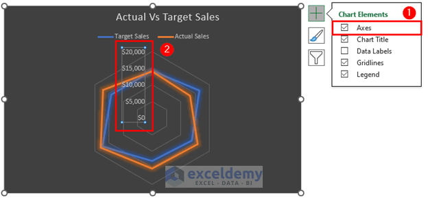
Setting Max Value for a Radar Chart
Customize the axis values according to your preferences. By default, the value range in this chart is 0 to 20,000. To change the range:
- Add the Axis:
- Select the chart and choose Axes from the Chart Elements box.
- Adjust the Axis Options:
- Press Ctrl + 1 to open the Format Axis pane on the right side of the Excel sheet.
- Set your desired minimum and maximum values in the Axis Options field. For example, I’ve set the minimum value to 5,000.00 and the maximum value to 20,000.00.
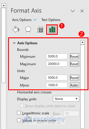
- Excel will update the chart accordingly.
Read More: How to Create Excel Radar Chart Max Value
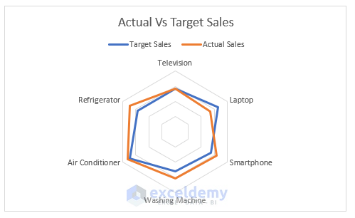
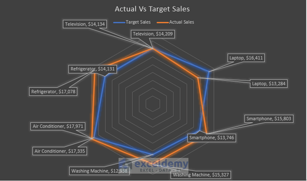
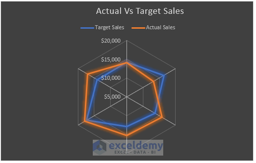
Understanding a Radar Chart
Let’s analyze the performance of various products using this dataset. The radar chart helps us compare target sales against actual sales:

- If the actual sales point is close to the target sales point, the product is performing well.
- If the actual sales point is significantly lower than the target sales point, the product falls short of its sales target.
For instance:
- Laptops had a sales target of $16,411 but actual sales of $13,284. The spoke representing laptops would be noticeably lower than the target sales point.
- Smartphones had a sales target of $13,746 and actual sales of $15,803. The spoke representing smartphones would be higher than the target sales point.
Advantages of a Radar Chart
Radar charts in Excel offer several benefits that make them useful for data analysis:
- Easy Comparison:
- Radar charts allow quick comparisons between different things or categories. You can easily see how they stack up against each other and identify their strengths and weaknesses.
- Showing Multiple Factors:
- Radar charts can display multiple factors or attributes simultaneously. Instead of using separate charts, you can consolidate all relevant information into a single radar chart, making it easier to understand.
- Clear Visuals:
- The unique shape of radar charts makes data visualization straightforward. The lines or filled areas clearly represent the values, helping you grasp the information without confusion.
- Highlighting Differences:
- Radar charts effectively highlight differences between target values and actual values. You can quickly identify where performance exceeds or falls short of the targets.
- Customization Options:
- Excel allows customization of radar charts to fit your preferences. You can change colors, labels, and other elements to enhance visual appeal and ease of interpretation.
In summary, radar charts in Excel provide a simple and effective way to analyze data, compare categories, and communicate insights clearly.
Limitations of Radar Chart
While Excel radar charts have advantages, they also come with limitations:
- Limited Data Points:
- Radar charts work best with a moderate number of categories. Too many categories can make the chart appear cluttered and difficult to interpret.
- Limited Customization Options:
- Excel offers fewer choices for customizing radar charts. Adjusting the appearance or format of the chart to specific needs may be challenging.
- Interpretation Challenges:
- Radar charts, including those in Excel, can be confusing for users unfamiliar with them. The unique design and data representation may require additional explanation.
Things to Remember
- Number of Variables:
- Avoid using more than two variables in a radar chart to prevent confusion and facilitate understanding.
- Background Colors:
- Use light colors in the background to make the chart visually appealing.
- Line Styles:
- Different line styles attract attention and enhance chart attractiveness.
- Data Arrangement:
- Organize data clearly to improve readability.
- Spider Web Size:
- Enlarge the spider web for easier information visualization.
Frequently Asked Questions
- How many variables can I include in an Excel radar chart?
- It is generally recommended to include up to two or three variables in an Excel radar chart to avoid overwhelming the chart and making interpretation difficult.
- How can I interpret an Excel radar chart?
- To interpret an Excel radar chart, compare the lengths of the spokes and the position of data points along each spoke. Longer spokes indicate higher values.
- Can I use radar charts for trend analysis over time?
- Radar charts are not the most suitable choice for displaying trends over time. Line charts or other chart types are generally better for visualizing time-based data.
Download Practice Workbook
You can download the practice workbook from here:
Excel Radar Chart: Knowledge Hub
<< Go Back To Excel Charts | Learn Excel
Get FREE Advanced Excel Exercises with Solutions!
