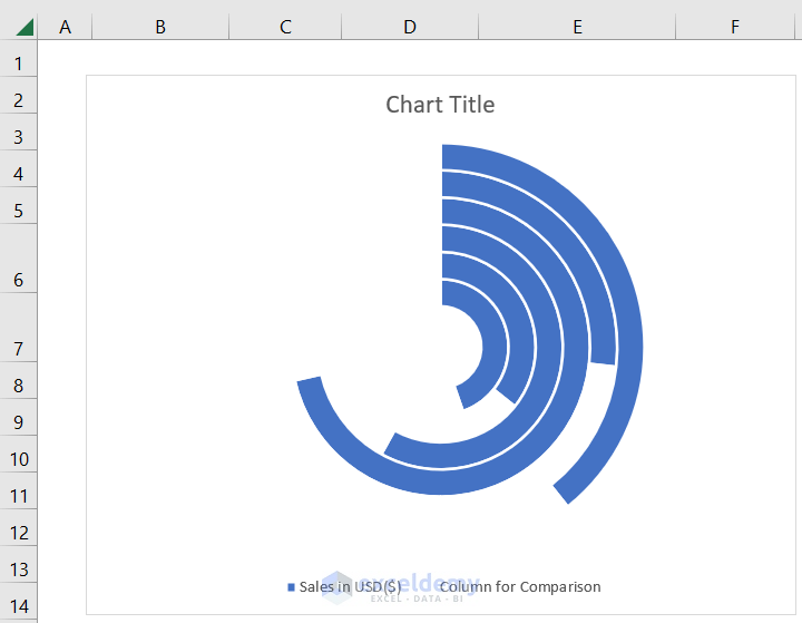
Suppose you are a product manager and want to compare the sale returns of your product in various outlets. Excel provides you with an option to do it in a smart way. A Radial Bar Chart in Excel helps you to visualize your data even better. In this article, I’m going to share the details about the Radial Bar Chart step by step so that you may use them whenever necessary. Let’s get a glimpse of what it looks like from this image:
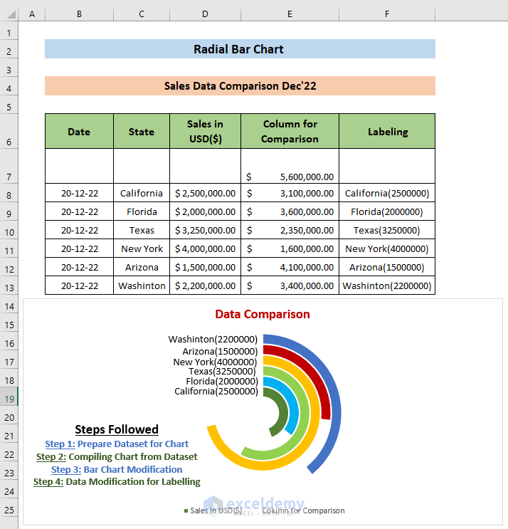
Radial Bar Chart in Excel: with Easy Steps
Step 1: Preparing Dataset for Chart
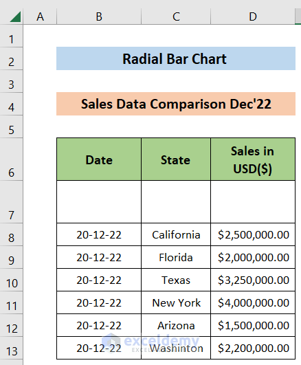
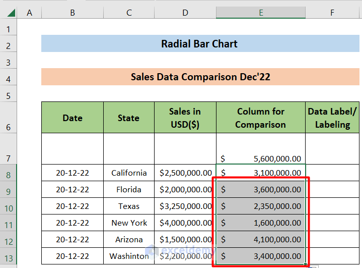
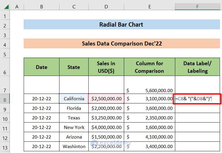
In this example, we have the sales data of our product “iPhone 14 Plus” in the month of December 2022 in the outlets across six states named “California”, “Florida”, “Texas”, “New York”, “Arizona” and “Washington”. We’ll use the Radial Bar Chart to compare the sales data.
Steps:
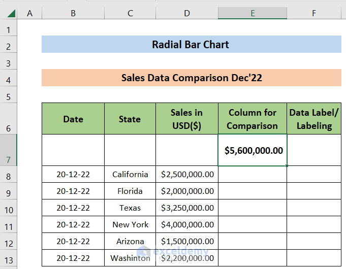
- Our dataset looks like this:
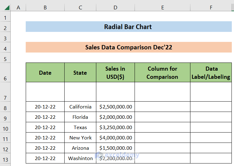
- Make two Columns named “Column for Comparison” for comparison purposes and “Labeling” for labeling purposes:
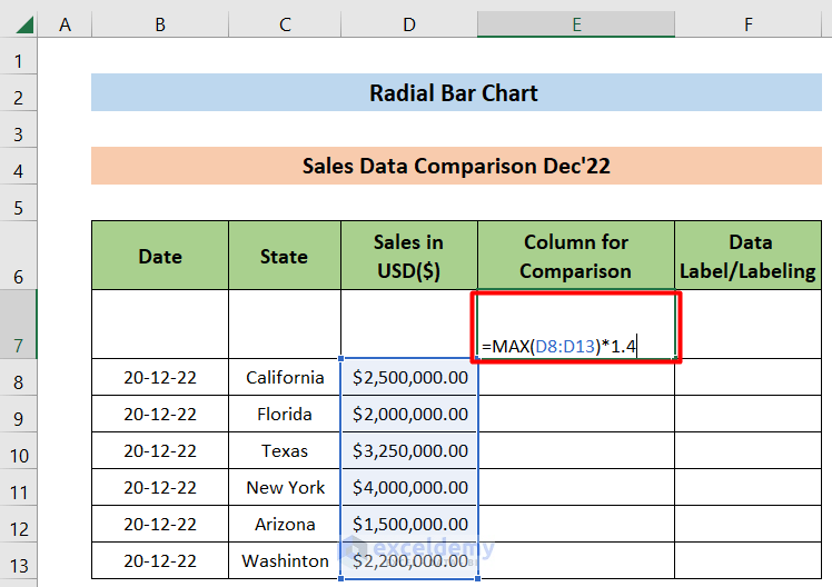
- Type the following formula in cell D7 and Hit ENTER. This shows the output in cell D7.
=MAX(C8:C13)*1.4This output is 1.4 times the maximum sell value. We’ll compare our sales according to this value. To know more about the MAX function.
The output of the formula is:
- Now, type the following formula in cell E8 and hit ENTER to get the difference between E7 and D8 :
=$E$7-D8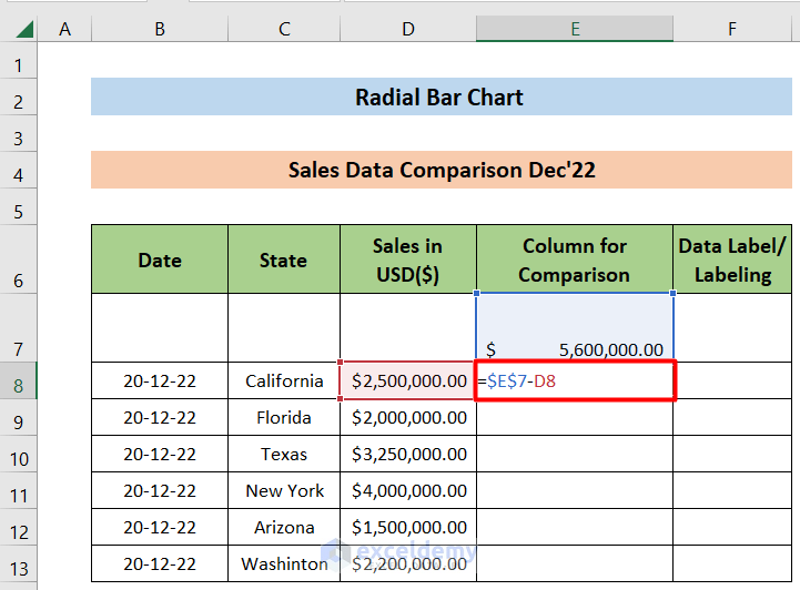
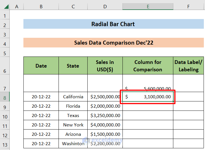
- The output looks like this:
- Hold and Drag down the AutoFill icon from the bottom right edge of cell E8 all the way to cell E13. This will automatically imply the formula we’ve used in cell E8 and make necessary adjustments to all the cells from E9 to E13.
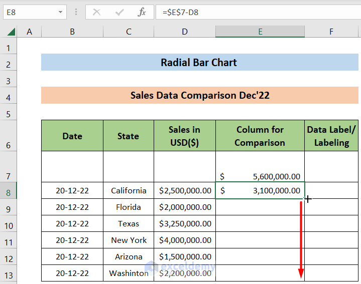
We can see the output in the “Column for Comparison” column. We’ll get all the output in this way.
Read More: How to Flip Bar Chart in Excel
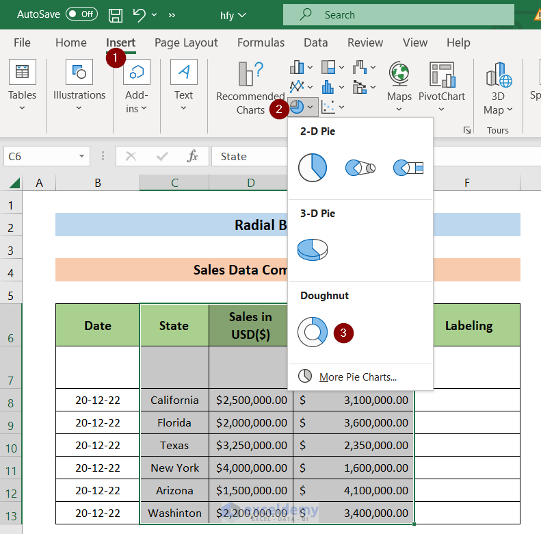
Step 2: Compiling Chart from Dataset
In this step, we’ll generate a Doughnut Chart for our dataset. This is the core part of our task.
- Select the range of cell C6:E13. After that, navigate to the “Insert” option and select the Doughnut Chart. I’ve attached a figure for your convenience.
- Now we’ll customize the chart according to our use. Select the “Chart Area” to actively select the chart.
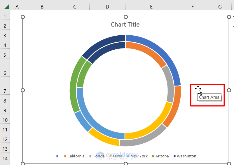
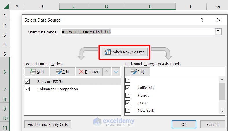
- Now, Right Click on the Chart Area and select the Select Data option.
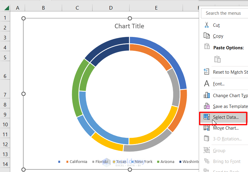
- A new window will open. Click the Switch Row/Column option. This will swap the row and column. Then click OK.
Read More: How to Create a 3D Bar Chart in Excel
Step 3: Bar Chart Modification
At this stage, we’ll get a chart, but in a very basic mode. We need to modify it further to get the digestive format. I’ve shown the process here:
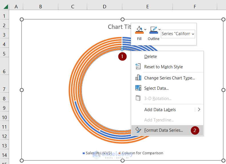
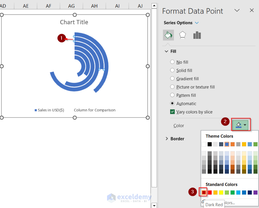
- Place the mouse pointer on the Doughnut as I’ve shown in the image below and Right Click on it. Now, select Format Data Series... A new window will open.
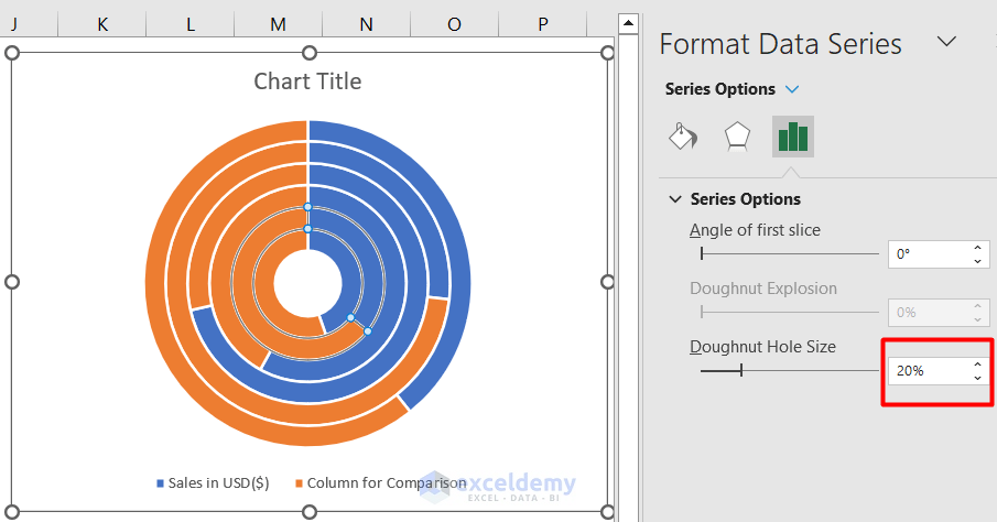
- We’ll get the Doughnut Hole Size option on the Right Pane. Set the Doughnut Hole Size to 20%.
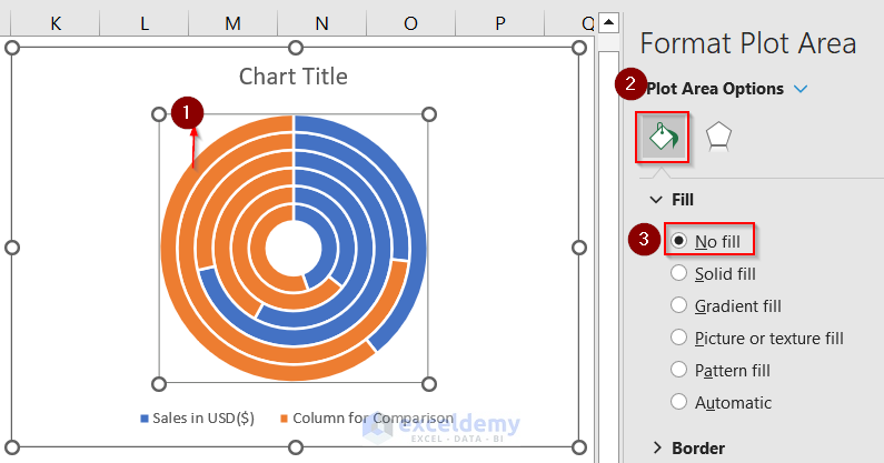
- Now. select the Orange portion (marked “1” in the image) of the outermost circle. We can see from the image that this Orange part represents the Column for the Comparison portion of the dataset. Follow my marking “2” and “3” to set the “No fill” option for this.
- I’ll repeat the just-mentioned process for the other circles too. This outcome is like this:
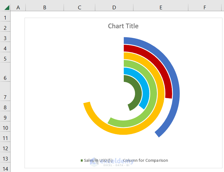
- Now, set different colors for the remaining portions of the circles according to your need (to better differentiate them). I’ve shown the process below for a single one.
- I’ve repeated the above step for all the other slices. The output is :
Read More: How to Change Bar Chart Color Based on Category in Excel
Step 4: Data Modification for Labeling
We need to properly label the Doughnut Chart to get the right visualization. For this purpose, we will create labeling by combining the State name and Sales in USD($) of the corresponding rows and store them in corresponding cells.
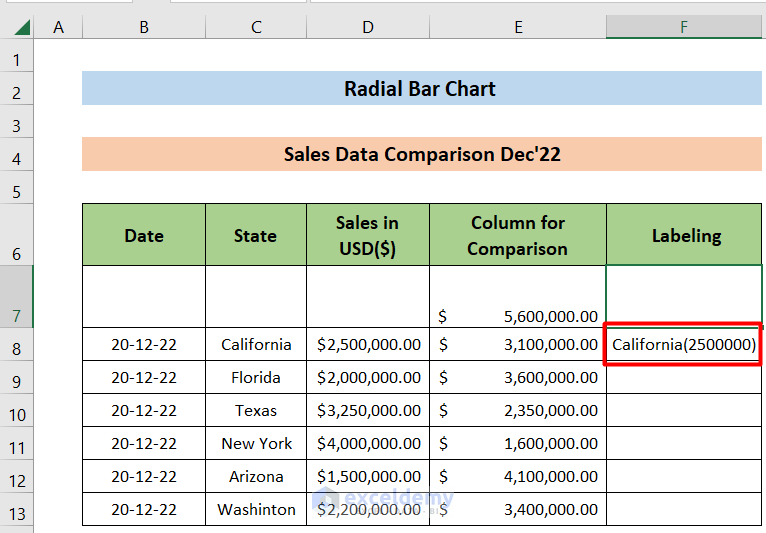
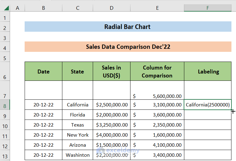
- We’ll set “Labeling” against all the slices. For this reason, type the following formula in the F8 cell and press ENTER.
- The output is :
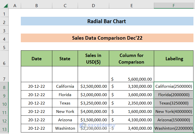
- Hold and Drag down the AutoFill icon from the bottom right edge of cell F8 all the way to cell F13. This will automatically imply the formula we’ve used in cell F8 and make necessary adjustments to all the cells from F9 to F13.
- AutoFill output looks like this:
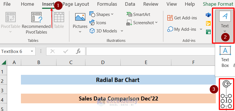
- Now, get a “Text Box” from the insert menu. This looks like this:
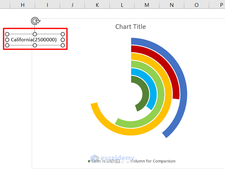
- Now, we’ll link cell F8 to this “Text Box” by selecting the “Text Box” and writing the following formula to the Formula Bar.
=$F$8- The output shows that:
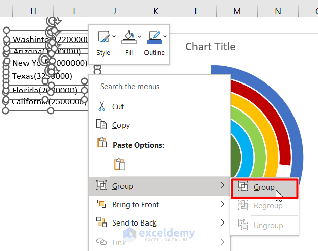
- We’ll repeat the process for cells C9:C13 and place the Text Box against the slices. Keep in mind to set the Text Boxes in the order that they appear in the Doughnut Chart. Also, Group all six Text Boxes by selecting the Text Boxes while pressing the Ctrl key. We’ve shown the process below:
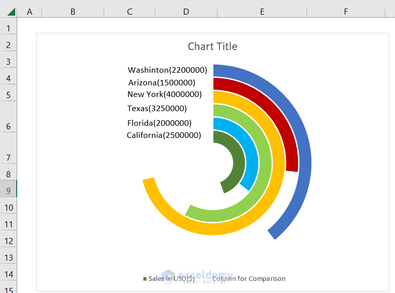
- The output looks like this:
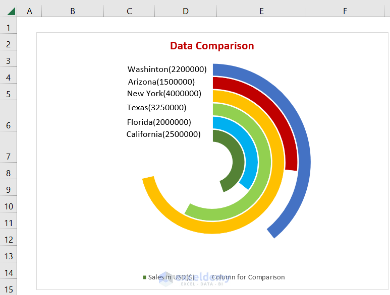
- Similarly, the Text Boxs and the Doughnut Chart are grouped too. And The Title of the chart is also adjusted. The final output looks like the following
Read More: How to Make Floating Bar Chart in Excel
Download Practice Workbook
You can download the workbook containing the dataset from here that we’ve used throughout this article.
Conclusion
If you’re in this segment, I thank you for your interest in this content. I’ve demonstrated a detailed process of how to create a Radial Bar Chart in Excel. I hope you get the necessary solution. Having said that, if you face any problems regarding this article or have any queries, please feel free to leave a comment in the comment box below, and we will try to solve that for you. Have a good day!
Related Articles
- How to Show Variance in Excel Bar Chart
- How to Create a Bar Chart with Standard Deviation in Excel
- How to Create Overlapping Bar Chart in Excel
- How to Create Construction Bar Chart in Excel
- How to Create Butterfly Chart in Excel
<< Go Back to Create a Bar Chart in Excel | Excel Bar Chart | Excel Charts | Learn Excel
Get FREE Advanced Excel Exercises with Solutions!
