Download the Practice Workbook
How to Enable the Power Map Add-in in Excel
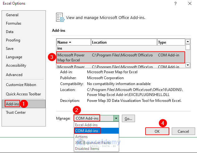
- Go to File and select Options.
- An Excel Options window appears. Go to Add-ins and for Manage, choose COM Add-ins.
- Select Microsoft Power Map for Excel and click OK.
How to Create a Power Map
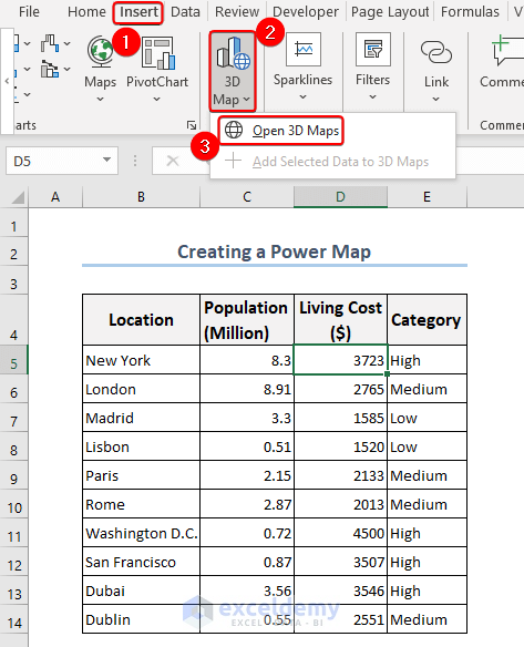
- Go to the Insert tab and choose 3D Map.
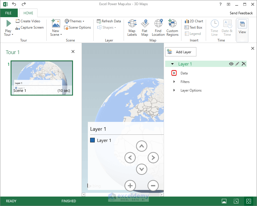
- Click Open 3D Maps.
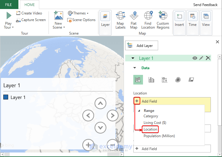
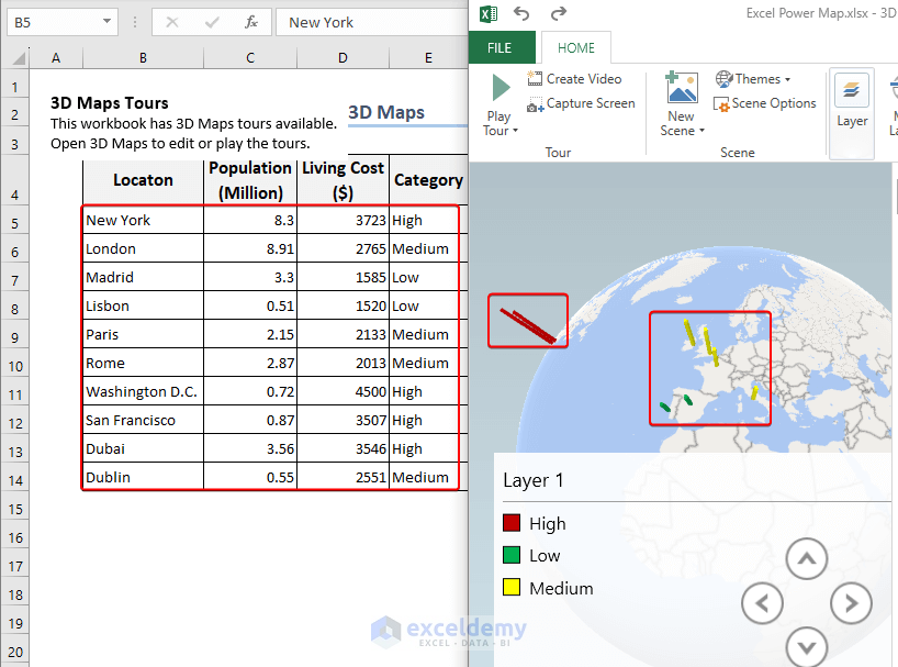
- Expand Data.
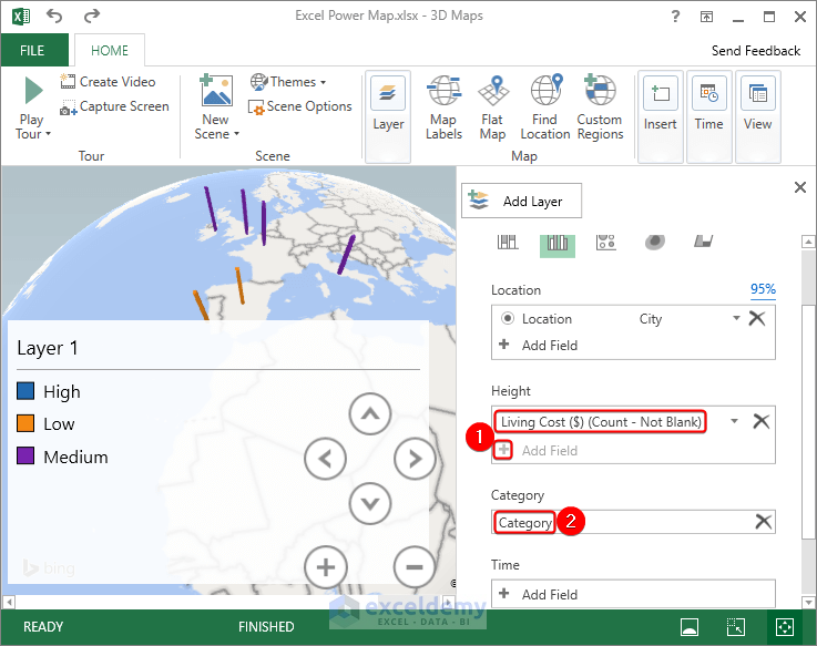
- Go to Add Field.
- Choose the Location column by clicking on the plus symbol in the Location box.
- In the Height box, click the plus sign(+).
- Choose the Living Cost ($).
- Under Category, select your category column.
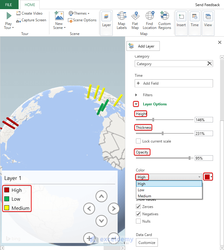
- Modify the Height, Thickness, Opacity, and Color in the Layer Options. In the drop-down menu for Color, select different Category Options from the column and assign a color to each of the Category Options.
How to Add a New Custom Power Map
- Go to the Insert tab, choose 3D Map, and click Open 3D Maps.
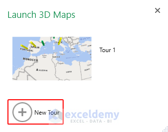
- The Launch 3D Maps window appears. Select New Tour.
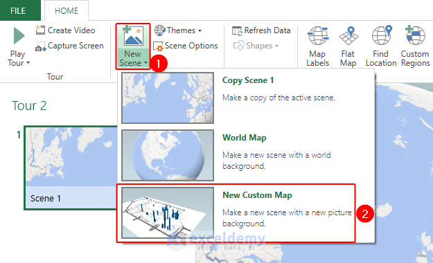
- The 3D Maps window appears. Select New Scene and choose New Custom Map.
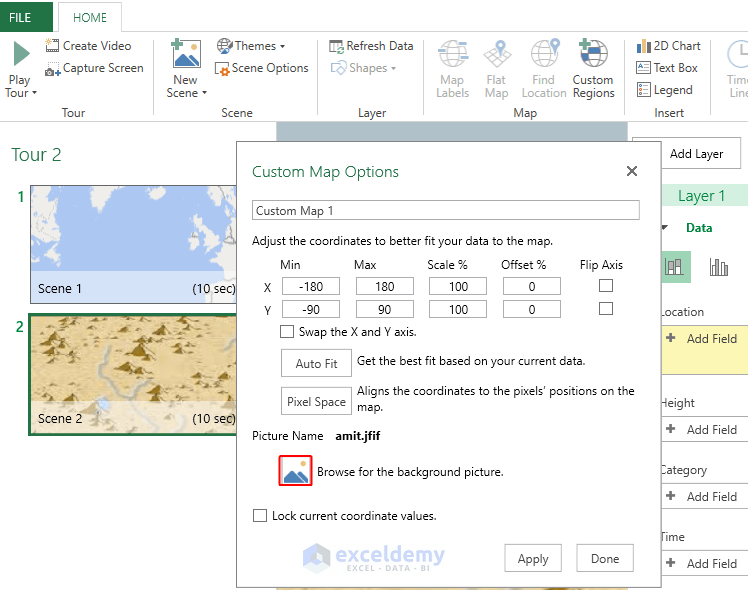
- A Custom Map Options window appears. Select your preferred map.
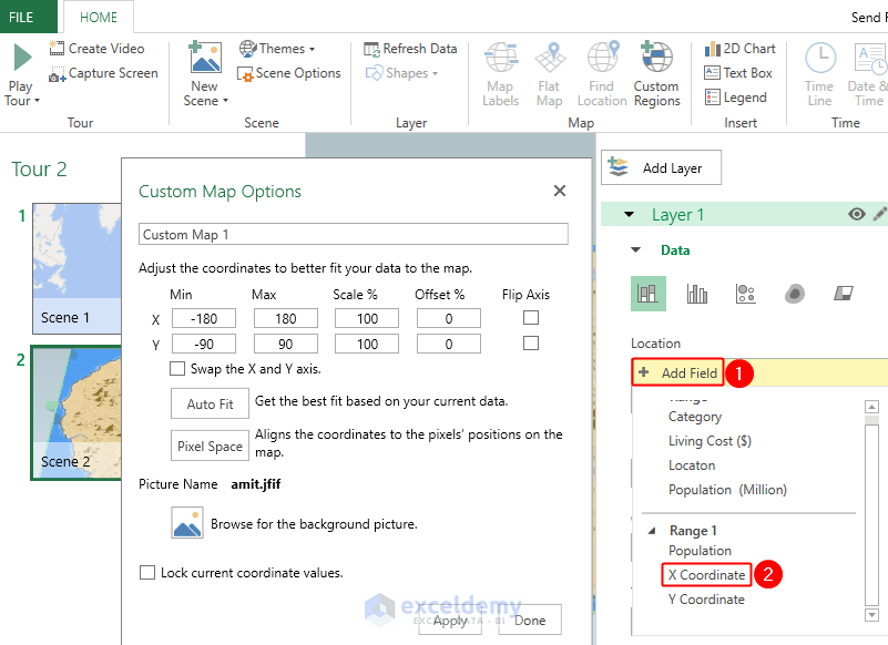
- Add the preferred fields under the Data menu. Under the Location option, select Add Field. Excel will automatically show your available data range from your Excel file. We have selected X Coordinate from Range 1.
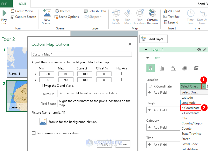
- Select the data type you have just entered as a field for your custom map. Click on the drop-down menu beside Select One and choose X Coordinate as the data type.
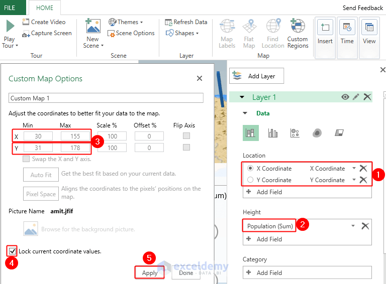
- Add the rest of the fields for your custom map. Here we have selected the Y Coordinate from Range 1 and chose the Y Coordinate as the data type. We have also selected Population from Range 1.
- Select the Min and Max of X Coordinate and Y Coordinate in the Custom Map Options window. If you don’t want to set Min and Max, you can select the AutoFit option. Remember to select this stage carefully to fit your data into your custom map. You can also drag the coordinates to fit data into your map.
- To secure your data fitted in the map, you can mark the box for Lock current coordinate values.
- Click on Apply.
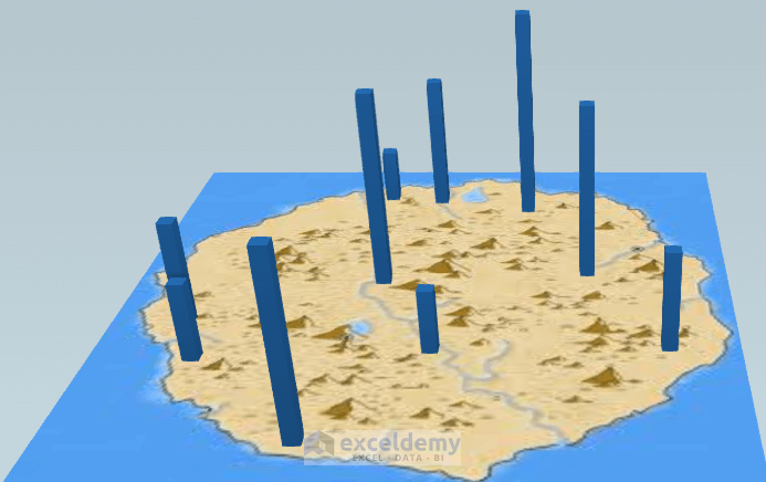
- Here’s the final output of the Population distribution in the custom map.
How to Change Data Sources for 3D Maps
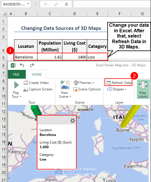
- Here is the data for the Living Cost ($) distribution and its Power Map side by side.
- Click Refresh Data in the 3D Maps after updating your data in Excel.
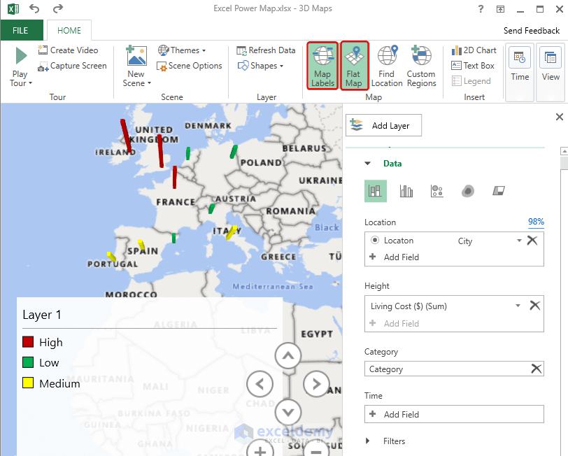
- You can alter the appearance of your map by clicking on the Map Labels and Flat Map.
How to Share 3D Power Maps
Method 1 – Using the Capture Screen Command
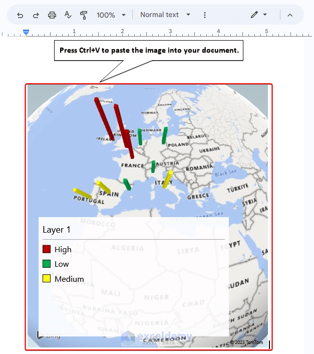
- In the 3D Maps window, choose “Capture Screen” from the ribbon.

- The 3D Maps image will be saved to your clipboard. Press Ctrl + V in the destination location such as a Google Doc.
Method 2 – Create a Sharable Video File Using the Create Video Options
- Turn on the Tour Editor from the View options.
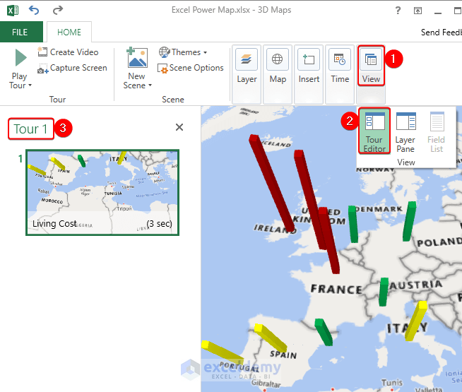
- The gear icon named “Change scene options” is selected in Scene 1.
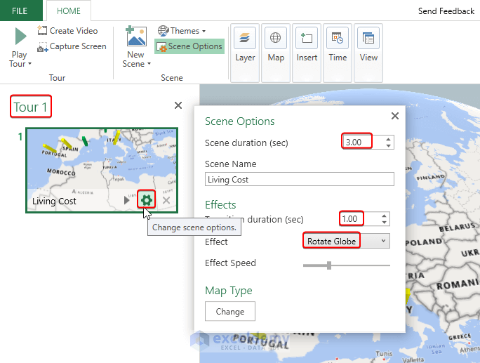
- The Scene Options dialog box appears.
- For Scene duration(sec), put – 3.00.
- For Transition duration(sec), put – 1.00.
- For Effect, put Rotate Globe.
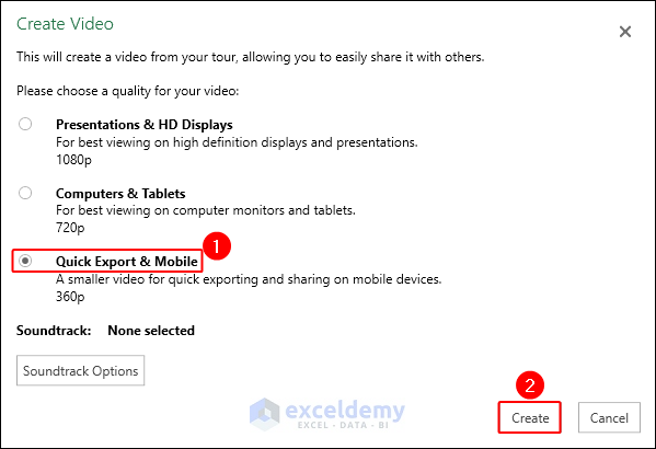
- Choose Create Video. The Create Video dialog box will now appear.
- Choose Quick Export & Mobile.
- Select Create.
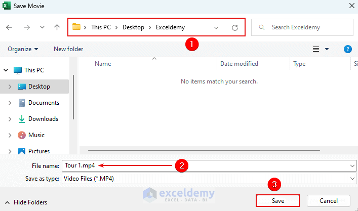
- The Save dialog box will appear.
- Select your directory. Type a file name or use the default.
- Press Save.
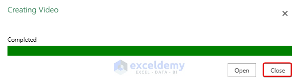
- When you get the Completed status on the progress bar, click Close.
- The result of our video file is shown here. You can share this video file in your document.
Frequently Asked Questions (FAQs)
Is Power Map available in all Excel versions?
Power Map is only available in Excel 2016 and later versions, as well as Excel 2013 Professional Plus. Check to see if Power Map is supported in your version of Excel. We have used Microsoft Excel with a Microsoft 365 subscription which is the latest version of Excel.
Can Power Maps be exported to other formats?
Yes, you can share Power Maps across platforms and embed them in other programs by exporting them as videos or images.
How can Power Map help with my data analysis?
By presenting your data in an interesting and simple map format, Power Map makes it possible to spot patterns and trends in it, especially in location-based data. It allows you to gather important insights and effectively convey them.
Excel Power Map: Knowledge Hub
- How to Enable 3D Maps in Excel
- How to Create Custom Regions in Excel 3D Maps
- How to Change Data Source of Excel 3D Maps
- How to Share a 3D Map in Excel
- [Solved:] Excel Power Map Add-in Not Showing
<< Go Back to Learn Excel
Get FREE Advanced Excel Exercises with Solutions!
