If you want to enable 3D maps in Excel, this article is for you. Here, we will demonstrate to you easy and simple steps to do the task. By following this article, you can make any type of 3D map according to your needs.
Steps to Enable 3D Maps in Excel
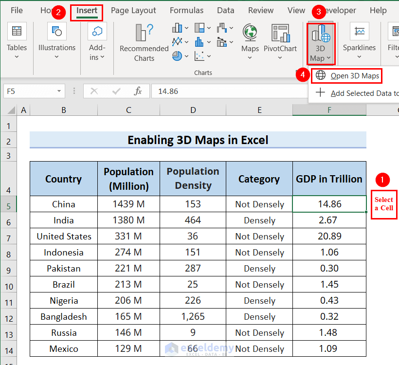
The following table contains Country, Population (Million), Population Density, Category, and GDP in Trillion columns. We will enable 3D maps in Excel for this table. To do so we will go through the following 9 steps. Here, we used Excel 365, you can use any available Excel version.

Step-1: Inserting a 3D Map
- First, we will select any cell of the table, here we selected cell F5.
- After that, we will go to the Insert tab >> select 3D Map >> click on Open 3D Map.
A Launch 3D Maps dialog box will appear.
- Afterward, we will click on New Tour.

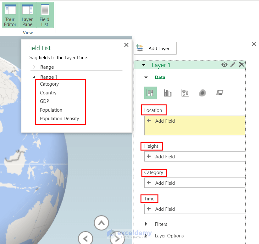
We will see a Field List on the right side with all the column headers of the table. Also, we will see the Location, Height, Category, and Time fields. In these fields, we will put our column headers.
Along with that, we will see several types of graphs in the Data tab.
We can use any of these graphs according to our needs. Here, we can see that the default graph is set as a column graph.
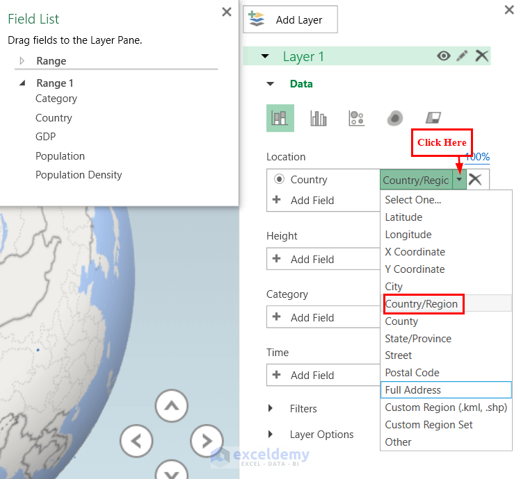
Step-2: Adding Country in Location Field
- First, we will click on the plus sign of the Location box >> and we will select Country.

On the right side of the Location field, we can see the geographic type is set as Country/Region.

You can change the geographic type by clicking on the downward arrow in the geographic type box.
- Here, we keep the Country/Region as a geographic type.
Read More: How to Create Custom Regions in Excel 3D Maps
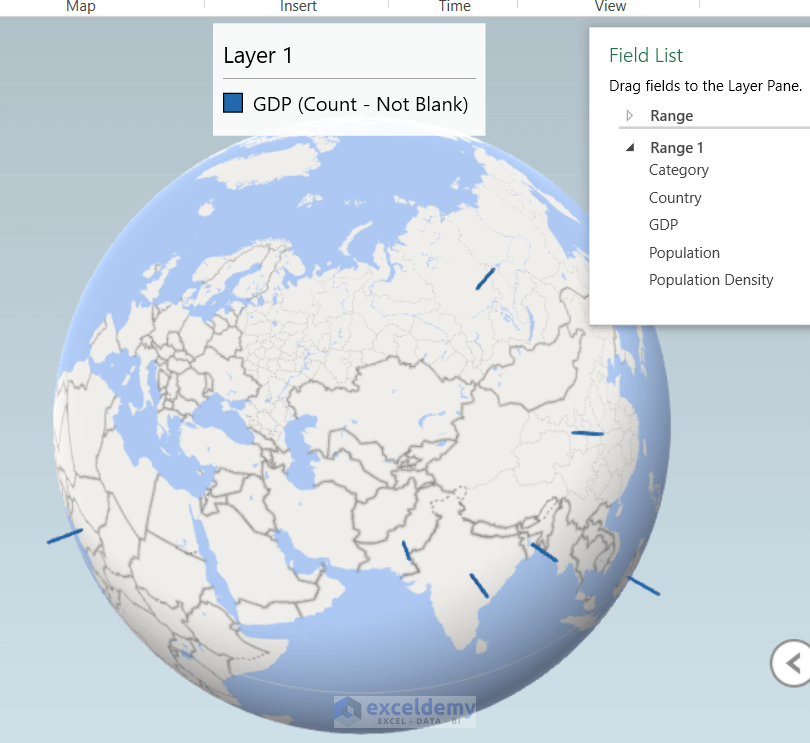
Step-3: Adding GDP as Field in Height to Enable 3D Maps in Excel

Now, we can see the map. The map has Legends on the top and Field List on the right.
Now for a better view, we will re-arrange this map.
Step-4: Changing Layer Options

- After that, we will increase the Height and Thickness by dragging the Height and Thickness bar towards the right.
You can increase the Height and Thickness according to your needs.
- Then, we will click on the change color box arrow, and select a color for our graph.
Here, we choose the red color.
- Afterward, we will close the Field List.

Now, we can see the 3D map has a better view.

- After that, we will hover our mouse on the columns of the map to know the numerical value of the column.
- Then, if we need to, we can delete the legend by simply clicking on the legend and pressing the DELETE button.

Here, on the bottom right of the map, we will see 4 arrow keys, which will help us to tilt the map up, down, right, and left according to our needs.
Along with that, we will see plus and minus sign keys, which will help us to zoom in and zoom out the map.
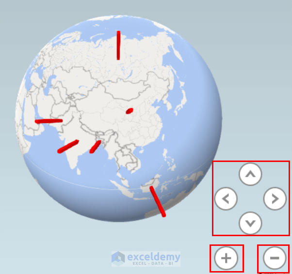
Later, if we need Legends and Field List, we can add them by clicking on Legend and Field List from the ribbon.

Read More: How to Change Data Source of Excel 3D Maps
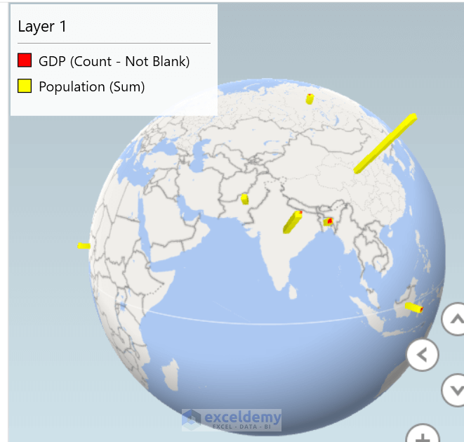
Step-5: Adding Population Column in Height Field to Enable 3D Maps in Excel
Now, along with the GDP, we will add the Population column in the Height field and we will see the joined 3D map.

- After that, we clicked on the downward arrow of the Color box >> We selected Population (Sum).
- Next, we choose a yellow color for the Population column.
Here, we keep the Height and Thickness as it was.

Finally, we can see the 3D map with a Column graph for both GDP and Population.
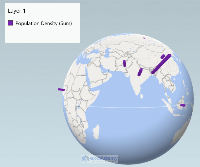
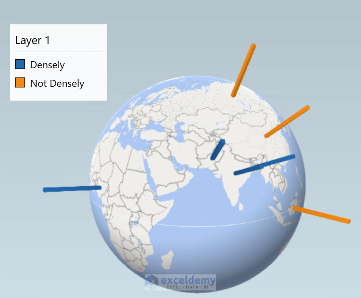
Step-6: Adding Population Density Column in Height Field to Enable 3D Maps in Excel
- First, we will cross the GDP and Population in the Height field.

- After that, we follow Step-3 to see the 3D maps with the Population Density column.
Finally, we can see the 3D maps with the Population Density column.
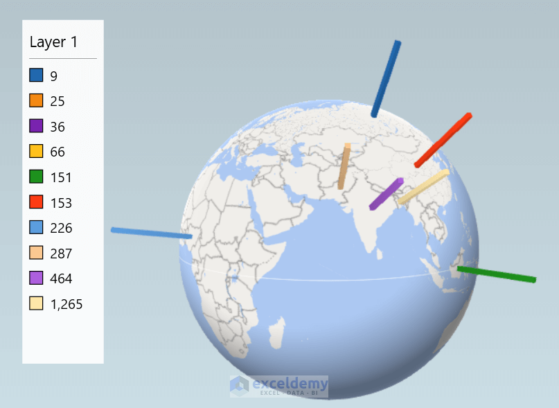
Step-7: Adding Population Density in Category Field to Enable 3D Maps

- Then, we will adjust the Height, Thickness, and Color by following the procedure of Step-4.
Finally, we can see the 3D map with the Population Density column.
Step-8: Inserting Bubble Chart in 3D Map
Now, we want to add a Bubble chart to the 3D map.
- First, we will follow the procedure of Step-5.
- After that, we will click on Bubble Chart.

Finally, we will see a 3D map with a Bubble chart of the Population Density column.
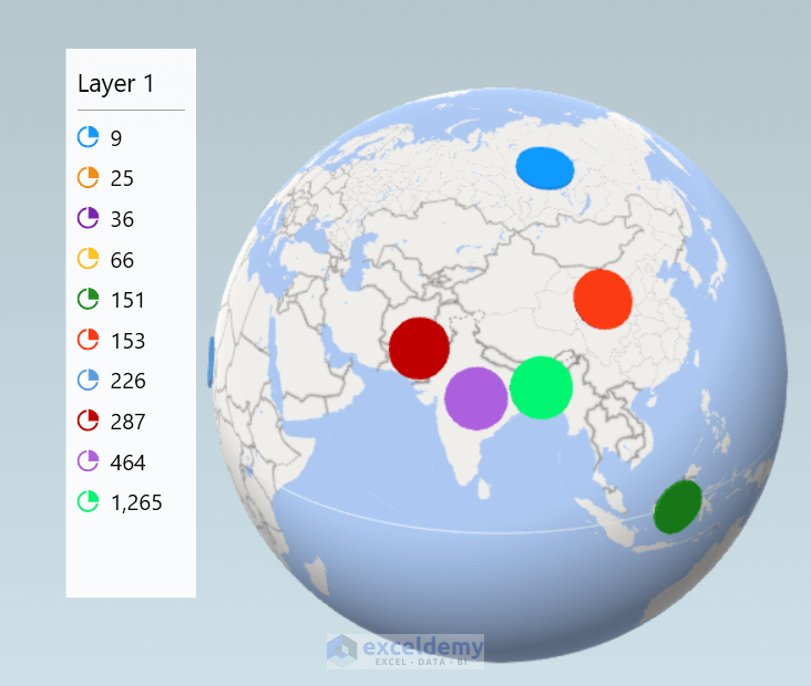
Step-9: Addition of Category Column in Category Field
Now, we want to see the Category column in the 3D map.
- First, we will follow the procedure described in Step-7.
Finally, we will see the Category column in the 3D map.
Download Practice Workbook
Conclusion
Here, we tried to show you 9 steps to enable 3D maps in Excel. Thank you for reading this article, we hope this was helpful. If you have any queries or suggestions, please let us know in the comment section.
Related Articles
<< Go Back to Excel Power Map | Learn Excel
Get FREE Advanced Excel Exercises with Solutions!
