The age pyramid, an especially useful tool for population statistics, helps to analyze the population with respect to age. In Microsoft Excel, we can create an age pyramid to show the distribution of the population. It will help us to visualize the age-wise population disbursement. There are many chart bars in Excel, and from there we can use one to create the pyramid. In this article, we’ll show you how to make an age pyramid in Excel. So, let’s get started.
What Is Age Pyramid?
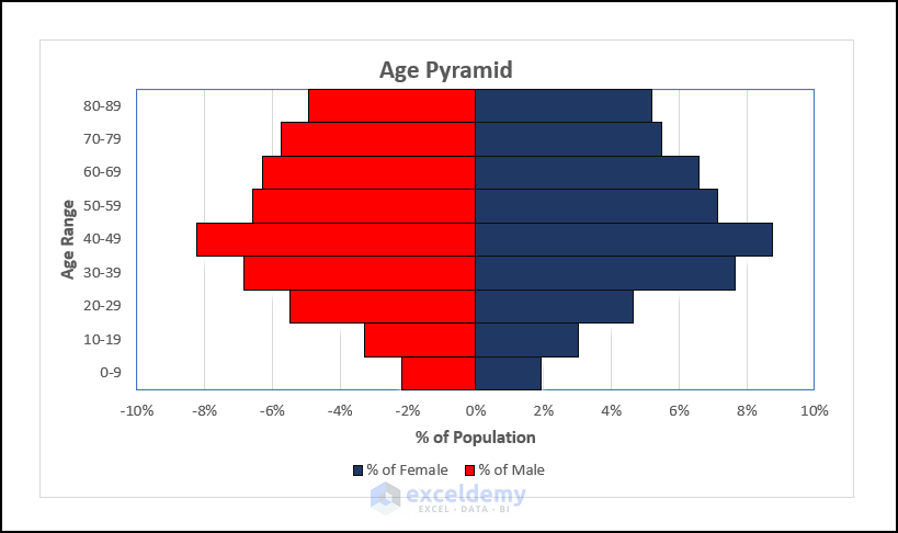
The age pyramid, also known as the population pyramid, is a distribution of the population of a particular region with respect to age. It is called the pyramid because the number of young people is slightly higher than the elderly and children in any area. When we create a chart with this kind of data, it takes the shape of a pyramid. The age pyramid helps us to know about a proper population distribution and analyze the statistical form of the population. We have attached a picture of the age pyramid for better visualization.
How to Make Age Pyramid in Excel: 2 Methods
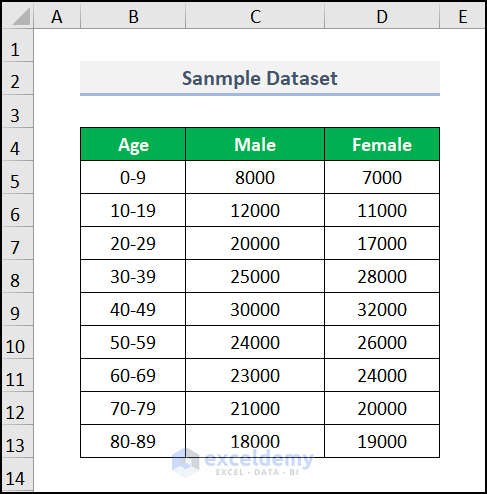
Excel shines with enormous Bar chart options, from which you can create an age pyramid. It is the most common and widely used method to make the age pyramid. Later, we’ll also discuss the use of the Conditional Formatting feature to create the pyramid along with the Bar chart method. We use a dataset of the population of “Males” and “Females” according to “Age”.
Not to mention, we have used the Microsoft 365 version. You may use any other version according to your preference.
1. Using Bar Chart to Make Age Pyramid
We can use the Bar chart to make an age pyramid in Excel. You have to calculate the percentage of the population, both males and females. The chart can be inserted via the Insert tab. It is the most widely used method to make the age pyramid. Follow the steps to make it.
📌 Steps:
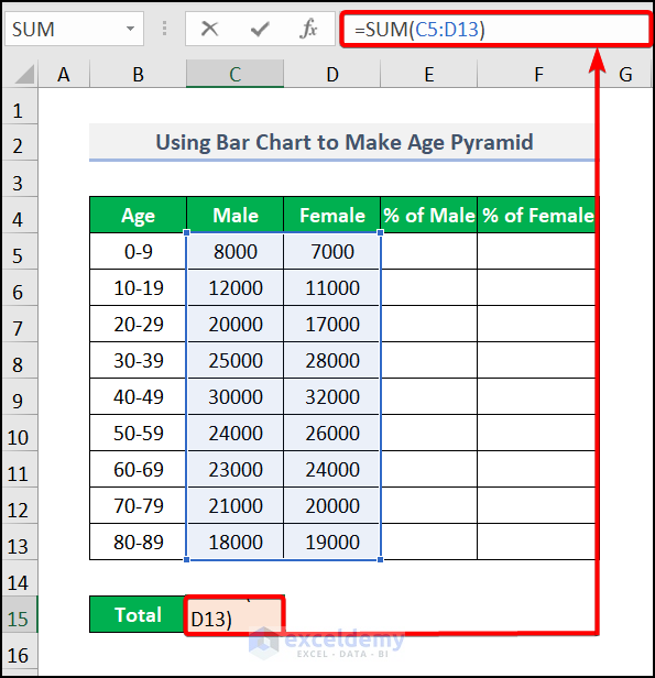
- In the beginning, you need to calculate the total population. To do this, we use the SUM function. Move to cell C15 and insert the formula.
Here, C5:D13 represents the cell range containing the number of “Males” and “Females”. The SUM function returns the total populations from the selected data range.
- Subsequently, you will get the result after pressing ENTER.

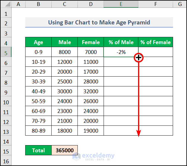
- Sequentially, move to cell E5 and enter the formula
The negative sign before the formula represents the negative gradient for making the pyramid. The formula will divide the value of C5 by the value of C15.
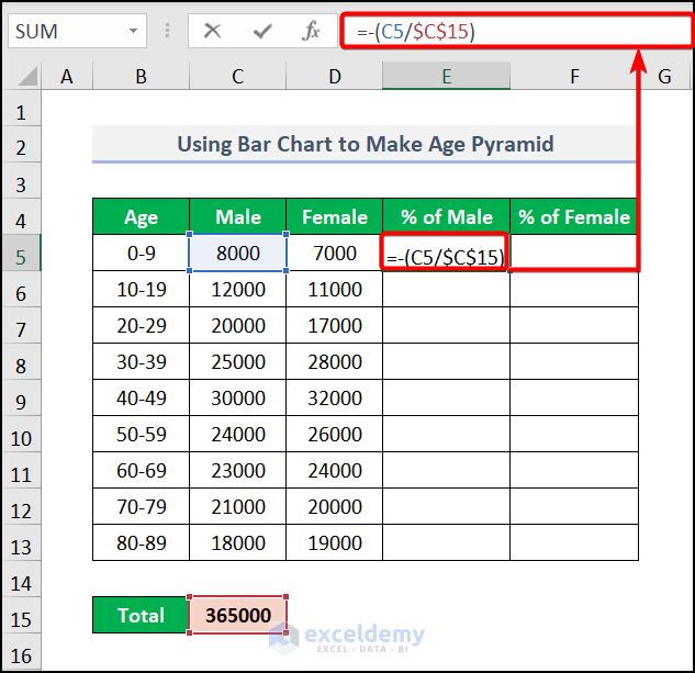
Note: Don’t forget to lock the C15 cell with the F4 key.
- Thus, press ENTER and drag down the Fill Handle tool for other cells.
- After that, go to cell F5 and input the formula
This will divide the value of D5 by the value of C15 of the “Total Population”.
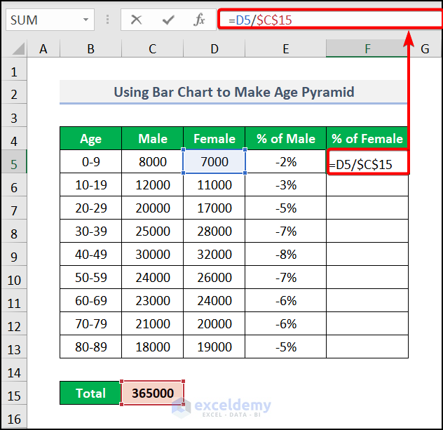
- Finally, all the percentages will be produced just like the image below.

- Now, select columns B, E, and F and go to the Insert tab >> from the Charts feature pick Insert Column or Bar Chart >> select Clustered Bar under the 2-D Bar section.
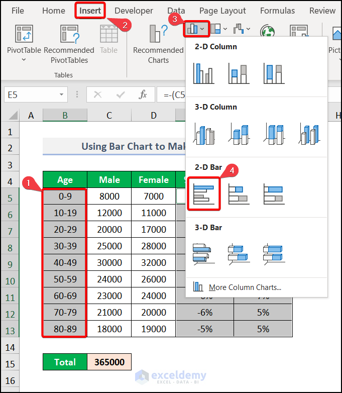
Note: Don’t forget to press the CTRL key while selecting the columns.
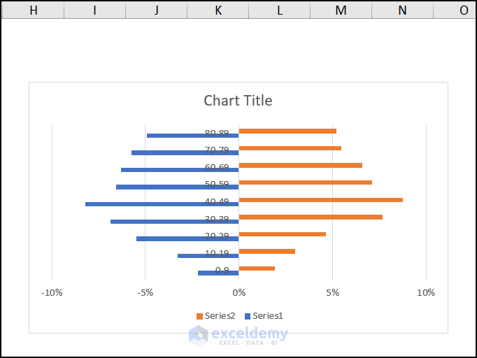
- Finally, a Bar chart has been inserted.
Now, we need to format the chart to give it the best outlook.
- Consequently, right-click on the chart and select Format Data Series.

- Subsequently, Format Data Series will open and under Series Options make 100% of Series Overlap and make 0% of the Gap Width.
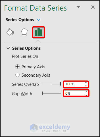
- Now, click on the bars and select Solid Fill under the Fill option.
- Then, select a suitable color from the Color option.

- Eventually, go to Border under Format Data Series and choose a color.

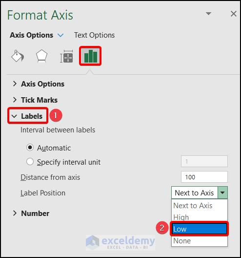
- Now, go to the Format Axis option under the Series Options.
- Under Axis Options, go to the Label and pick Low from the Label Position drop-down.
- Now, you need to create suitable Axis Titles from the Chart Elements according to your preferences.

Finally, after changing the legend’s title, your age pyramid will look like the image below.

2. Applying Conditional Formatting
You can also make an age pyramid by applying the Conditional Formatting feature. Though it is an unfamiliar method, it is quite handy in contrast with Bar charts. It is also an easy and time-saving method. We discuss the process in easy steps. Go through it to get the basic idea.
📌 Steps:
- Firstly, select the E column and go to the Home tab >> Conditional Formatting >> Data bars >> More Rules.
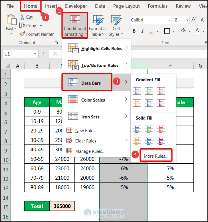
- Consequently, the New Formatting Rule window will appear.
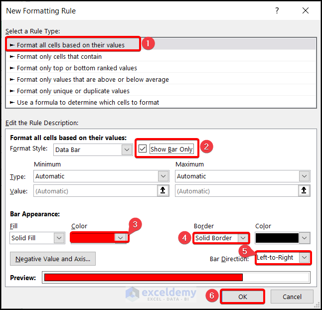
- Then, select Format all cells based on their values >> check the tick mark in the Show Bar only >> pick a color from Bar Appearance >> choose Solid Border under Border >> select Left-to-Right from Bar Direction drop-down >> click on OK.
Eventually, the result will be formed just like the image below.

- After that, select the F column and go to the Home tab >> Conditional Formatting >> Data Bars >> More Rules.

- Afterward, apply the same procedure of the New Formatting Rule window stated above. You need to just change the color for the difference.

Eventually, you will get the result just like the image below.

Practice Section
We have provided a practice section on each sheet on the right side for your practice. Please do it by yourself.

Download Practice Workbook
Download the following practice workbook. It will help you realize the topic more clearly.
Conclusion
That’s all about today’s session. These are some easy methods of how to make an age pyramid in Excel. Please let us know in the comments section if you have any questions or suggestions. For a better understanding, please download the practice sheet. Thanks for your patience in reading this article.
Related Articles
- How to Calculate Population Mean in Excel
- How to Calculate Population Growth Rate in Excel
- How to Analyze Demographic Data in Excel
- How to Create Age and Gender Chart in Excel
- Population Projection Formula in Excel
- How to Create Age Distribution Graph in Excel
- How to Make a Population Pyramid in Excel
<< Go Back to Excel Demographic Data | Excel for Statistics | Learn Excel
Get FREE Advanced Excel Exercises with Solutions!

great contribution in education
Hello Sani Suleiman,
Thank you so much for your kind words! I’m really glad to hear that the tutorial was helpful for your learning. Your appreciation means a lot!
Regards,
ExcelDemy