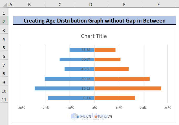
Method 1 – Creating a Graph Without Gaps Between Bars
In this scenario, we want to display the Y-axis values to the left of the graph. To achieve this, follow these steps:
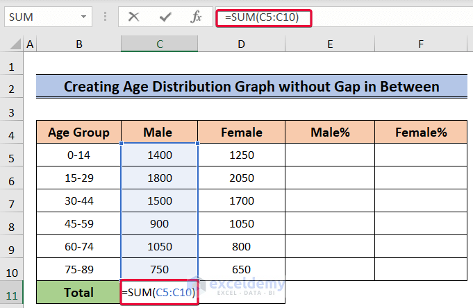
- Sum the Total Population:
- Start by selecting cell C11.
- Enter the following formula:
=SUM(C5:C10)-
- Press Enter.
-
- This will give you the total number of males across different age groups.
- Repeat for Females:
- Repeat the same process for the Female group (cells D5:D10).
- Calculate the sum using the formula:
=SUM(D5:D10)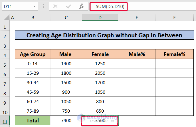
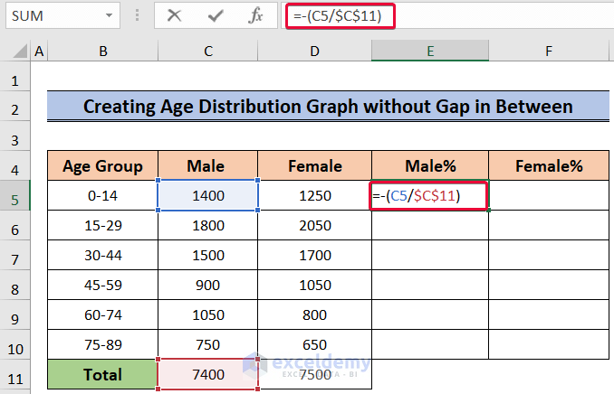
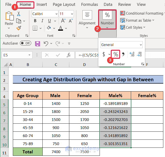
- Calculate Percentages:
- Now, let’s calculate the percentage of each group relative to the total.
- For males, select cell E5 and enter:
=-(C5/$C$11)The negative sign ensures that the data will be plotted to the left of the chart.
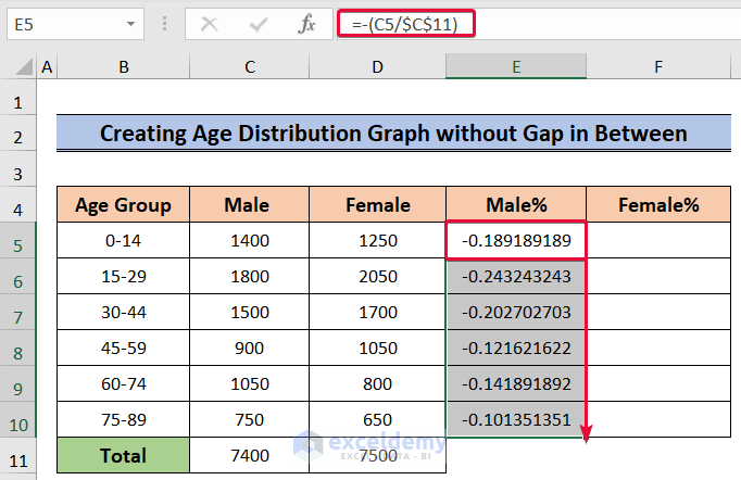
- Autofill and Format:
- Autofill the formulas down to cover all age groups.
-
- Format the percentages as follows:
- Select the cells containing male percentages.
- Go to the Home tab and choose the % sign under the Number format options.
- Format the percentages as follows:
-
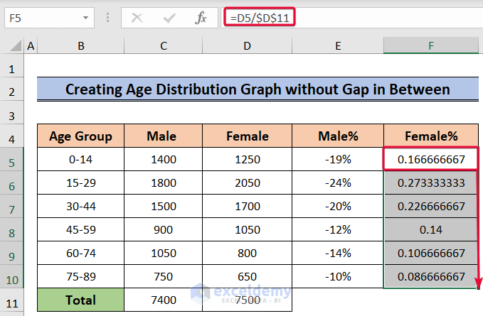
- For females, select cell F5 and enter:
=-(D5/$D$11)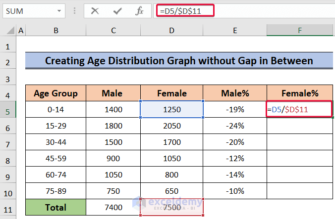
- Autofill and Format:
- Autofill the formulas down to cover all age groups.
-
- Format the percentages as follows:
- Select the cells containing female percentages.
- Go to the Home tab and choose the % sign under the Number format options.
- Format the percentages as follows:
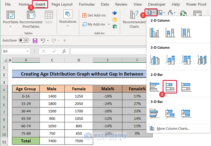
- Create the Stacked Bar Chart:
- Select the Age Group, Male%, and Female% columns.
- Go to the Insert tab.
- Choose the Insert Column or Bar Chart option.
- From the drop-down menu, select Stacked Bar Chart..
-
- The chart for the data will be shown.
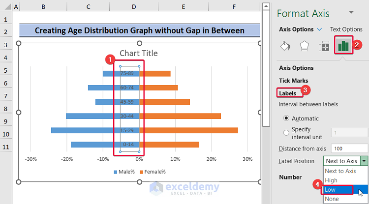
- Adjust Data Labels:
- Click on the labels within the chart.
- Go to the Series Options tab.
- Under Labels, choose Low from the Label Position drop-down.
- This will position the data labels to the left.
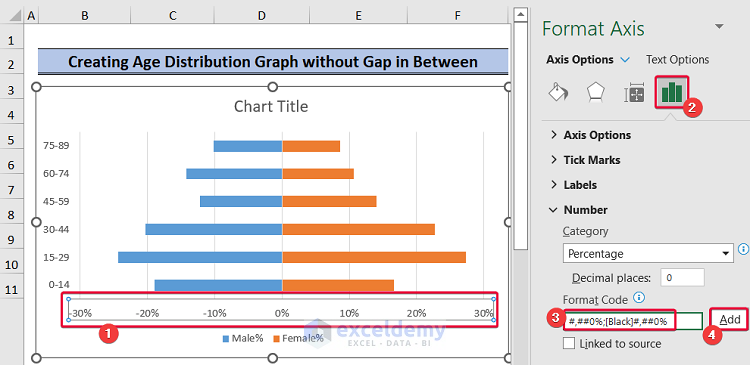
- X-Axis Label Formatting:
- Select the X-axis label.
- Go to Axis Options.
- Click the Number option to format the axis labels.
- In the box under the Format Code option, enter the following:
#,##0%;[Black]#,##0%-
- Click Add.
- This will remove negative values from the X-axis.
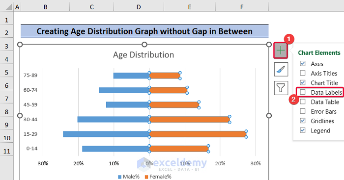
- Add Data Labels for Females:
- Click on the bars representing the Female group.
- Select the plus sign (+) to the right of the graph.
- Check the Data Labels box.
- This will add labels to the data bars.
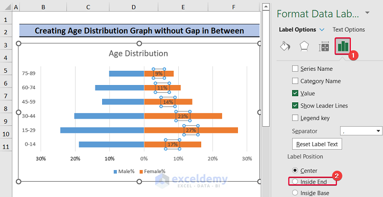
- Reposition Data Labels:
- To adjust the position of the data labels:
- Select the data labels.
- Go to the Label Options tab.
- Mark the oval beside Inside End under the Label Position option.
- This will reposition the labels to the far right of the graph.
- To adjust the position of the data labels:
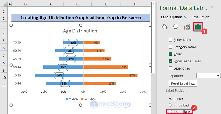
- Repeat for Male Percentages:
- Follow the same process for the Male% column.
- The only difference is that you’ll check the Inside Base oval instead of Inside End.
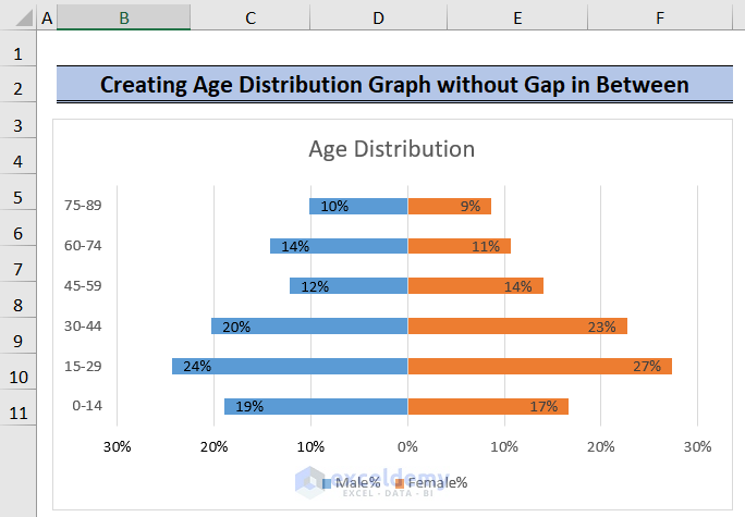
- Present Your Age Distribution Graph:
- With the adjusted data labels and formatting, your Age Distribution graph is ready for presentation!
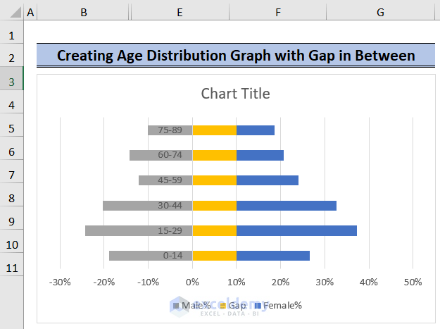
Method 2 – Creating a Graph with a Gap Between Bars
In this method, we’ll position our Y-axis value in the center of the graph. We’ll follow similar steps as in the previous method, including summing the number of people in each age group and calculating proportions. However, we’ll introduce a new column called “Gap” to create space between the two groups on the plot.
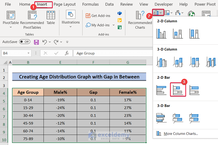
- Insert the Graph:
- Select the entire data (including the Male and Female groups).
- Go to the Insert tab.
- Click on the Insert Column or Bar Chart option.
- Choose the Stacked Bar Chart from the available options.
-
- This will give us a graph with the Gap data between the main data.
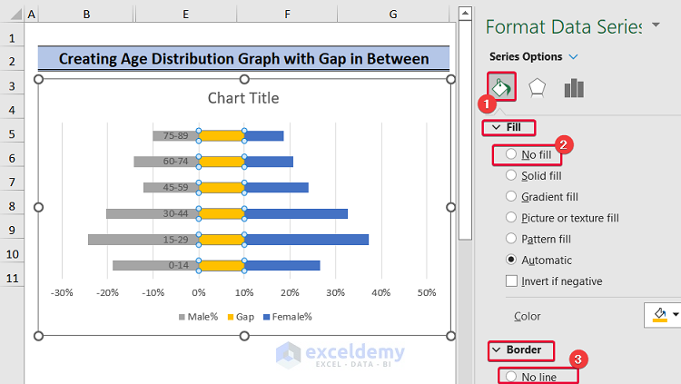
- Format the Gap Data:
- Select the Gap data series.
- Go to Series Options.
- From the drop-down menu, select No Fill to make the Gap bars invisible.
- Under Border, choose No Line.
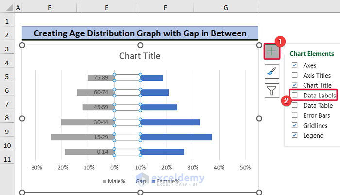
- Add Data Labels for Gap:
- Click the plus sign (+) on the right side of the Gap data.
- Check the “Data Labels” option.
- This will display the value 0.1 for each cell in the Gap column.
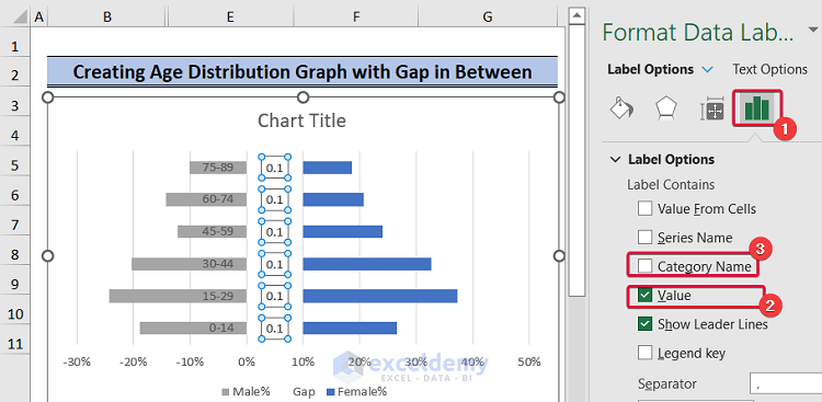
- Adjust Data Label Position:
- To change the data label value:
- Go to the Label Options tab.
- Uncheck the Value checkbox.
- Check the Category Name box.
- This will position the Y-axis value in the middle.
- To change the data label value:
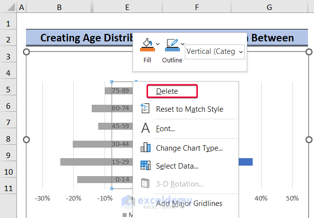
- Remove Data Labels for Male%:
- Delete the data labels on the Male% bars.
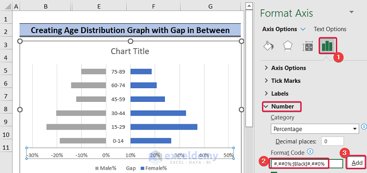
- Format X-Axis Labels:
- Select the X-axis values.
- Go to Axis Options.
- Choose the Number option.
- Under the Format Code box, enter:
#,##0%;[Black]#,##0%-
-
- Click Add.
- This ensures the X-axis won’t have negative values.
-
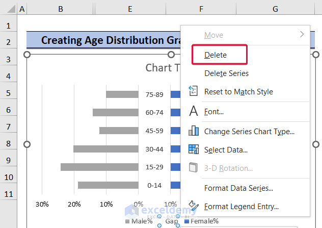
- Remove Gap Axis Label:
- Delete the Gap axis label.
- Add Data Labels for Both Groups:
- Follow the same steps as in the previous method to add labels to the data.
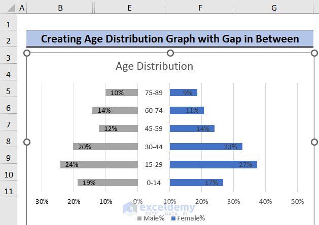
- Your Age Distribution Graph:
- With Y-axis values in the middle, your Age Distribution graph is complete!
Download Practice Workbook
You can download the practice workbook from here:
Related Articles
- How to Calculate Population Growth Rate in Excel
- How to Analyze Demographic Data in Excel
- How to Create Age and Gender Chart in Excel
- Population Projection Formula in Excel
- How to Make a Population Pyramid in Excel
- How to Make Age Pyramid in Excel
<< Go Back to Excel Demographic Data | Excel for Statistics | Learn Excel
Get FREE Advanced Excel Exercises with Solutions!
