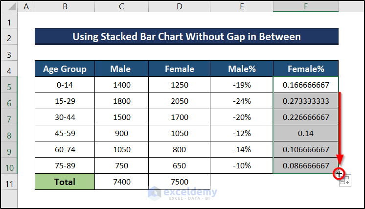
This is the sample dataset. The Y-axis value is placed on the left.
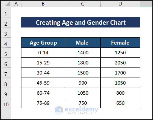
Example 1 – Using a Stacked Bar Chart Without Gaps in Between
Steps:
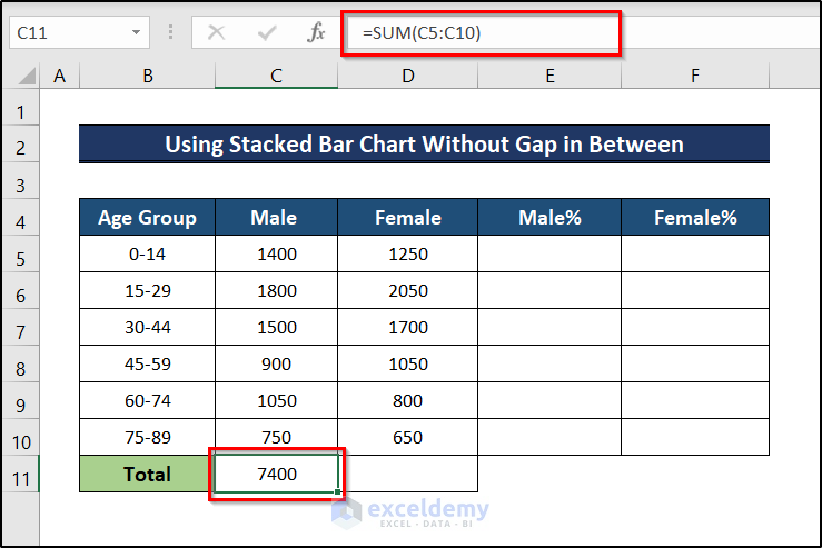
- Select C11 and enter the following formula,
=SUM(C5:C10)
- Press Enter.
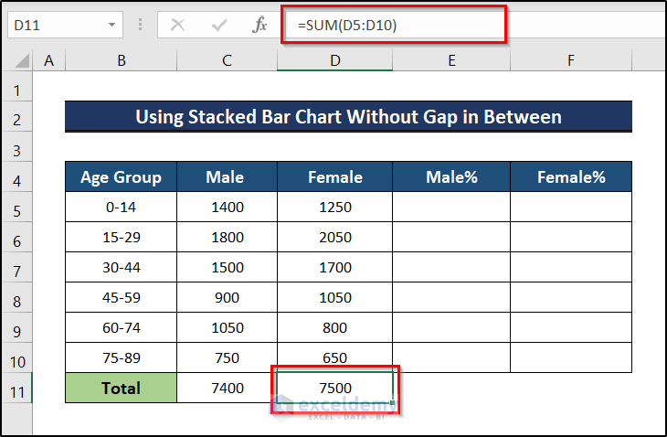
- For the Female group, select D11 and enter the following formula.
=SUM(D5:D10)
- Press Enter.
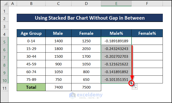
- Select E5 and enter the following formula,
=-(C5/$C$11)
- Press Enter.
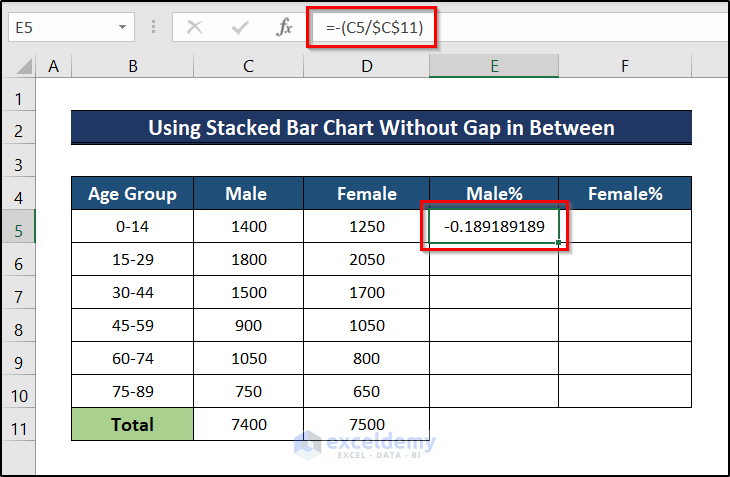
The formula has a minus sign to place the data to the left of the chart.
- The percentage of males belonging to that age group will be displayed.
- Drag down the Fill Handle to AutoFill the rest of the cells.
- Go to the Home tab.
- In Number, select the %.
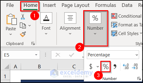
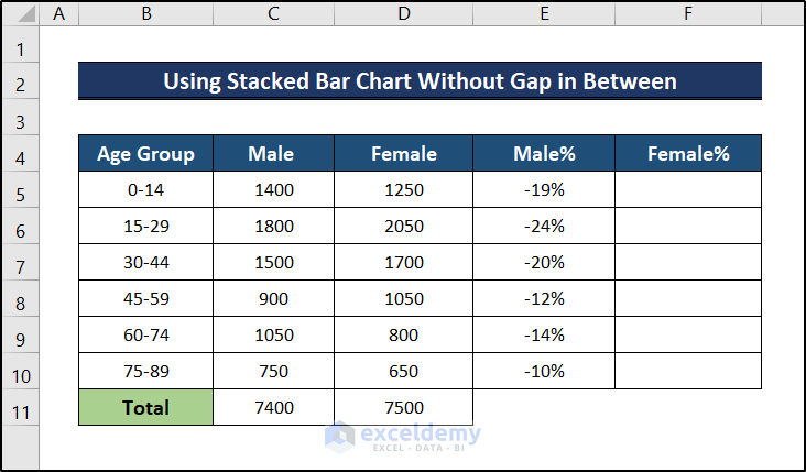
Data will be presented in percentage.
- Click F5 and enter the formula below.
=D5/$D$11
- Press Enter.
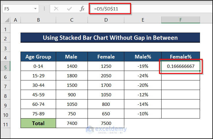
The proportion of females in that age group will be displayed.
- Drag down the Fill Handle to AutoFill the rest of the cells.
- Convert the proportion of females into a percentage following the same steps indicated for males.
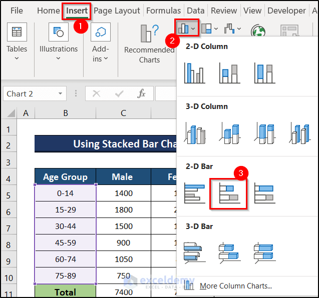
- Select the Age Group, Male%, and Female% columns.
- Go to the Insert tab.
- Choose Insert Column or Bar Chart.
- Select Stacked Bar Chart.
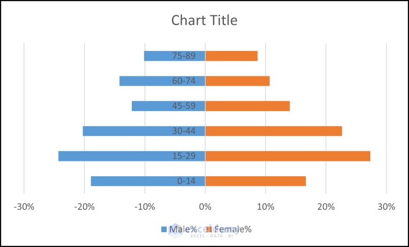
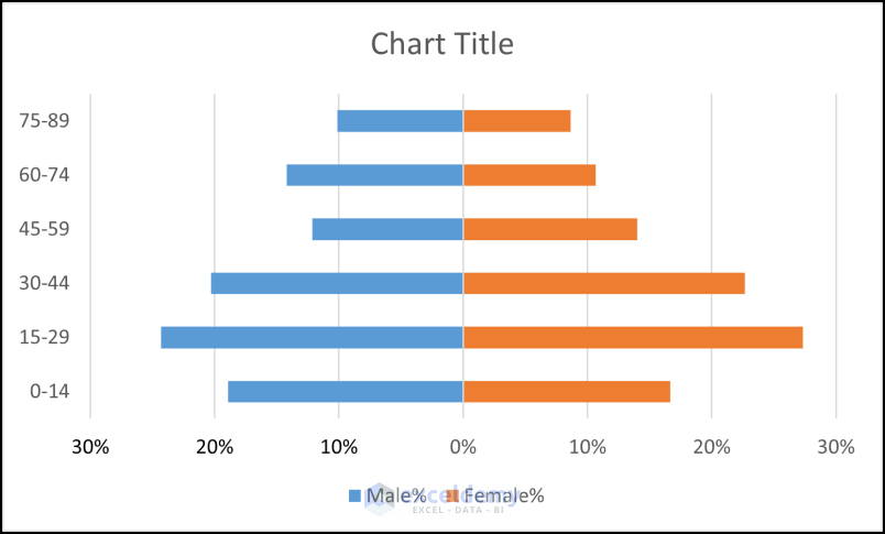
This is the output.
- Select the labels on the graph.
- Choose Series Options.
- Select Labels.
- In Label Position, select Low.
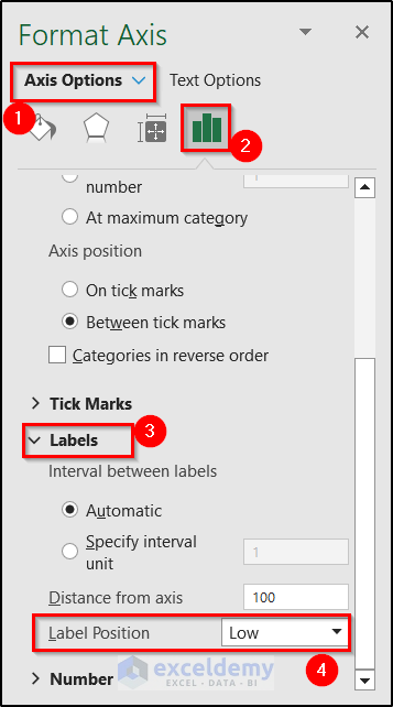
Data labels will be placed on the left.

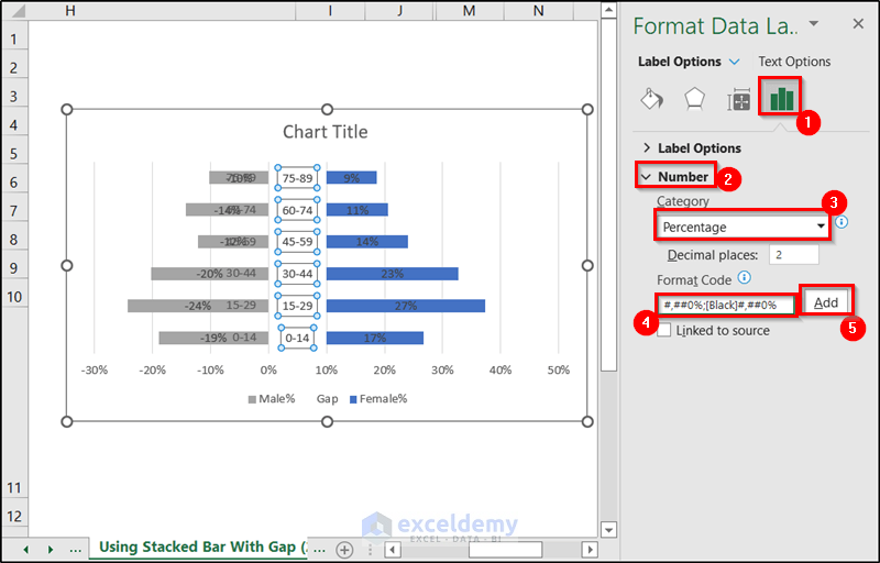
- Double-click the X-axis label.
- Go to Axis Options.
- Click Number.
- Enter the following code.
#,##0%;[Black]#,##0%
- Click Add.
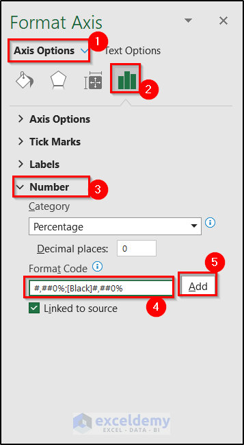
All negative values in the X-axis will be removed.
- Click the bars in the Female group.
- Select the plus sign.
- Check Data Labels.
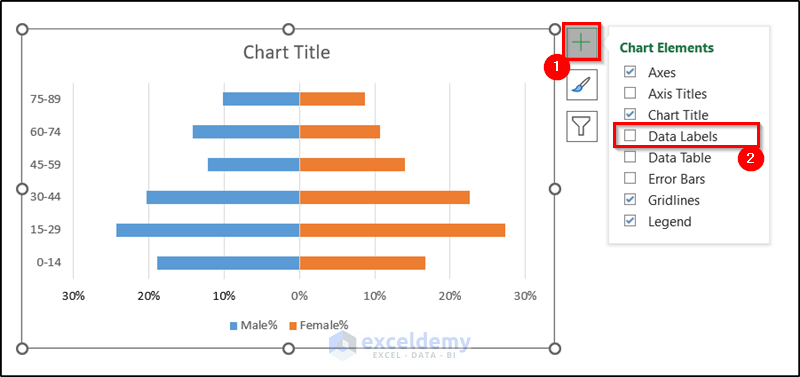
Labels will be displayed.
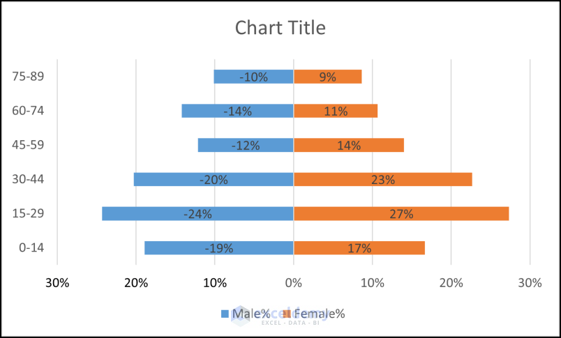
- Select Data labels.
- Go to the Label Options tab.
- in Label Position, check Inside End.
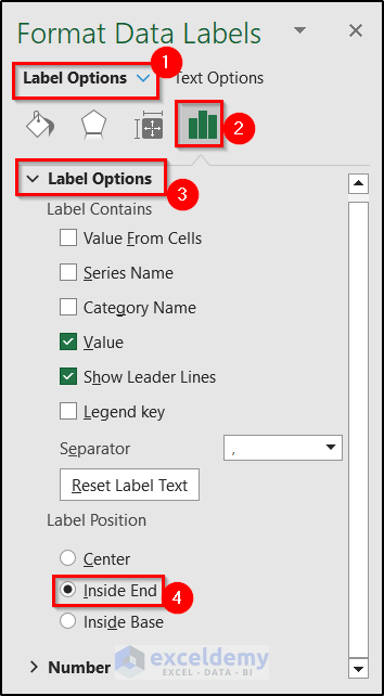
Labels will be repositioned on the right of the graph.
- Repeat the process for the Male% column.
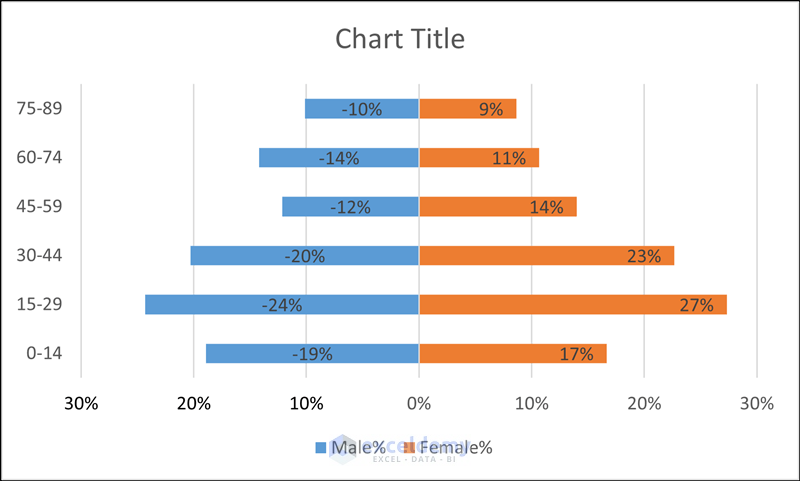
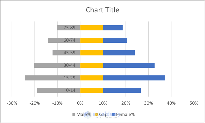
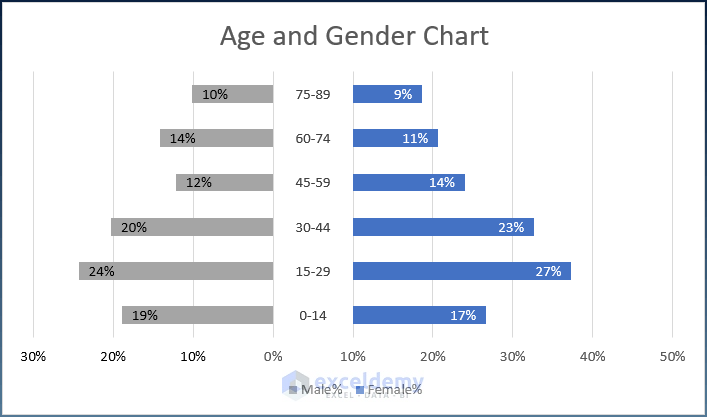
This is the final age and gender distribution chart.
Example 2 – Using a Stacked Bar Chart with Gaps in Between to Create an Age and Gender Chart in Excel
The Y-axis value will be set in the center. A new column (Gap) is inserted to create a gap between the two groups.
Steps:
- Select the entire data.
- Go to the Insert tab.
- Click Insert Column or Bar Chart.
- Select Stacked Bar.
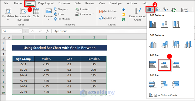
A graph with a gap between the main data will be displayed.
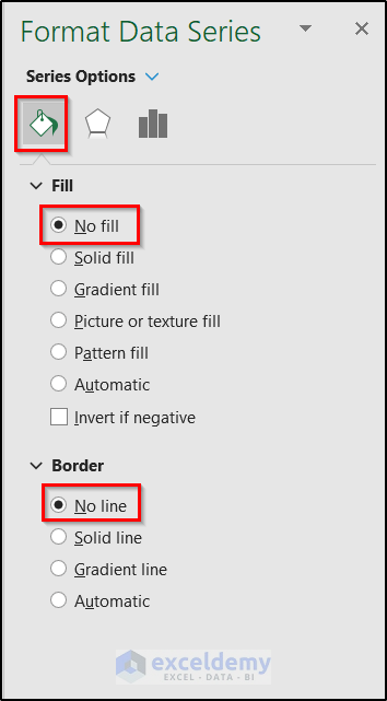
- Select the Gap data.
- Go to Series Options.
- In Fill, select No Fill.
- In Border, select No Line.
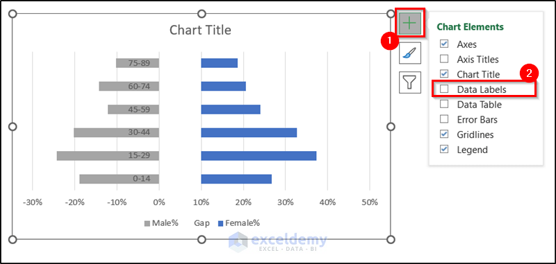
- Select the data in the gap and click the plus sign on the right.
- Check Data Labels.
0.1 will be displayed in each level (the value of each cell in the Gap column).
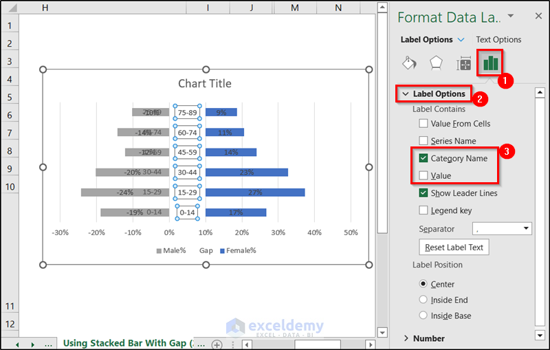
- To change it, go to the Label Options tab.
- Uncheck Value.
- Check Category Name.
The Y-axis value will be in the center.
- Select the Male% data labels and delete them.
- Select the X-axis values.
- Go to Axis Options.
- Choose Number.
- Enter the following code.
#,##0%;[Black]#,##0%
- Click Add.
The X-axis will showcase no negative value.
- Follow the steps in Example 1 to add labels.
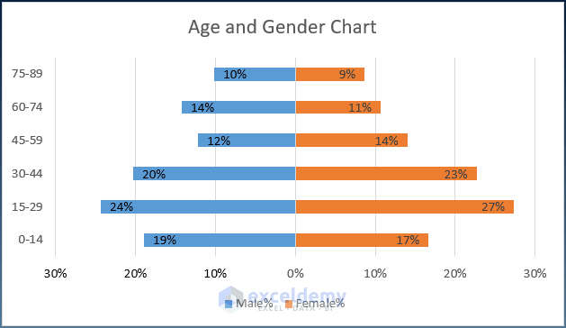
The age and gender chart with Y-axis values in the middle will be displayed.
Example 3 – Using Conditional Formatting to Create an Age and Gender Chart in Excel
Steps:
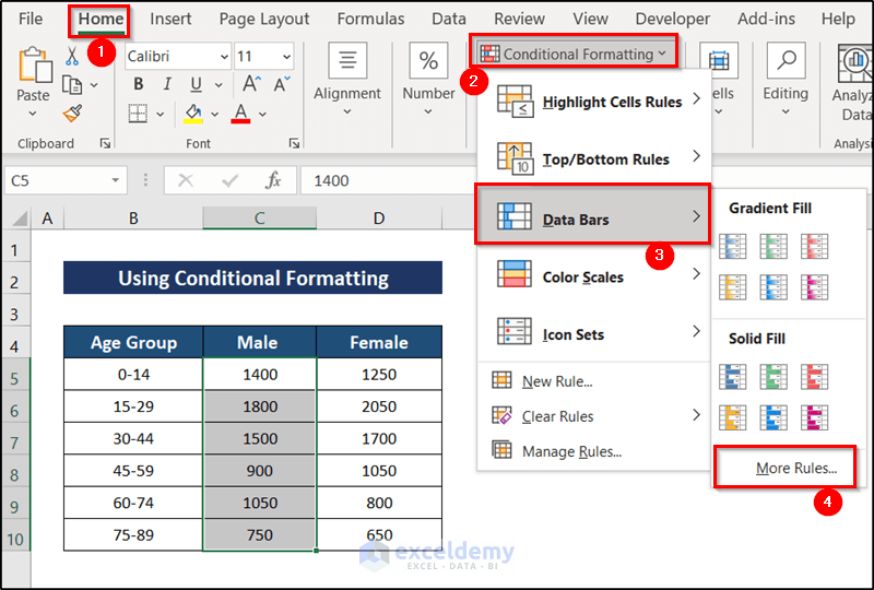
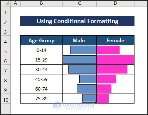
- Select the male column (C5:C10).
- Go to the Home tab.
- In Styles, select Conditional Formatting.
- Choose Data Bars.
- Select More Rules.
- In the New Formatting Rule window, select Format all cells based on their values.
- In Edit, check Show Bar Only.
- Select the Bar Direction as Right-to-Left. Choose a color and a solid border.
- In Bar Appearance, choose a color.
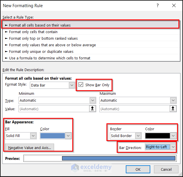
- Click OK.
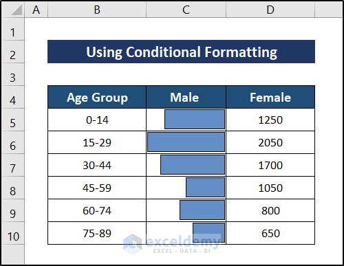
- Follow the same procedure for the Female column.
The age and gender chart will be displayed.
Download Practice Workbook
Download the workbook here.
Related Articles
- How to Make a Population Pyramid in Excel
- How to Make a Population Pyramid in Excel
- How to Calculate Population Growth Rate in Excel
- How to Analyze Demographic Data in Excel
- How to Make Age Pyramid in Excel
- Population Projection Formula in Excel
<< Go Back to Excel Demographic Data | Excel for Statistics | Learn Excel
Get FREE Advanced Excel Exercises with Solutions!

its fantastics, you made significant contribution in increase utilization of excel microsoft, ignorance is a barrier in underwolds!!
Hello Sani Suleiman,
Thank you so much for your thoughtful comment! I’m really glad to know the tutorial helped increase your confidence in using Microsoft Excel. Your appreciation means a lot, and I completely agree—learning removes many barriers. Thanks again for your encouraging words!
Regards,
ExcelDemy