Indeed, Excel has a powerful graphing feature that can add visual depth and clarity to even the most boring of datasets. For instance, you may want to make a Sunburst Chart with conditional formatting. Fortunately, in this article, we’ll describe how to insert a Sunburst Chart with conditional formatting in Excel. Moreover, we’ll also learn to show percentages in a Sunburst Chart.
What Is a Sunburst Chart?
First of all, let’s start with a quick explanation of a Sunburst Chart, so you don’t have to spend all day on this.
In a nutshell, a Sunburst Chart shows hierarchical data by using a set of concentric rings. Typically, the circles in a Sunburst Chart reflect the various levels of the data points that have been split into their individual components.
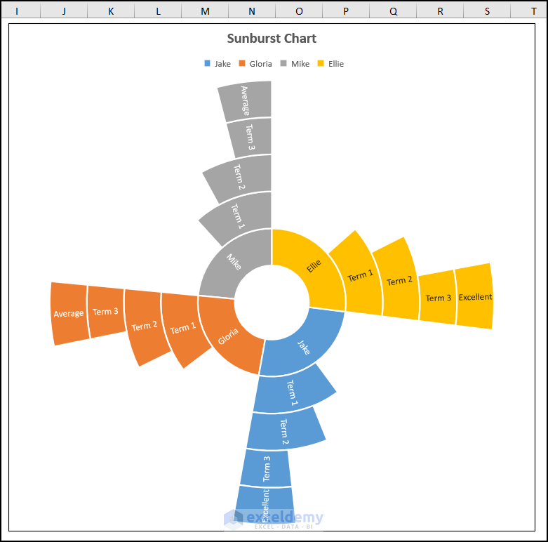
The above screenshot is an overview of this article, which represents the detailed steps to insert a Sunburst Chart with conditional formatting in Excel. In addition to this, in the following sections, we’ll learn more about the dataset and the chart.
Sunburst Chart with Conditional Formatting in Excel: 2 Steps to Insert
Now, let’s assume the Term Result of Students dataset shown in the B4:F20 cells which depicts the Names, the Terms, and the Score respectively. Here, we want to represent this hierarchical data using a Sunburst Chart with conditional formatting in Excel. So, without further delay, let’s see the process in detail.

Here, we have used the Microsoft Excel 365 version; you may use any other version according to your convenience.
📌 Step 01: Prepare the Dataset
- First, go to the F5 cell >> use the the SUM function to calculate the total “Score”.
=SUM(F6:F8)
Here, the F6:F8 range of cells refers to the “Term 1”, “Term 2”, and “Term 3” “Scores” respectively.
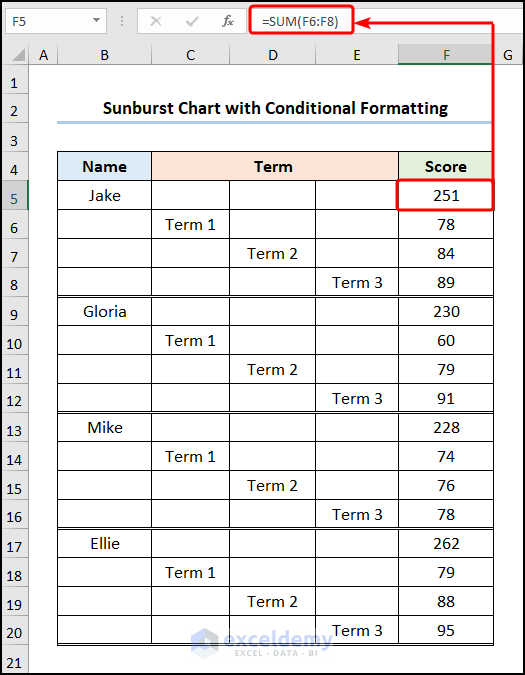
- Likewise, apply a similar formula to the F9, F13, and F17 cells.

- Next, insert a “Remark” column >> apply the conditional the IF function to formulate the expression given below.
=IF(G5>250,"Excellent",IF(G5=250,"Good",IF(G5<250,"Average")))
In this case, the G5 cell represents the total “Score” of “Jake”.
Formula Breakdown:
- IF(G5<250,”Average”) → checks whether a condition is met and returns one value if TRUE and another value if FALSE. Here, G5<250 is the logical_test argument that compares the value of the G5 cell with 250. If this value is less than 250 then the function returns “Average” (value_if_true argument) otherwise it returns FALSE (value_if_false argument).
- Output → FALSE
- IF(G5=250,”Good”,IF(G5<250,”Average”))) → becomes
- IF(G5=250,”Good”,FALSE) → in this case, G5=250 is the logical_test argument that compares the value of the G5 cell with 250. If this value is equal to 250 then the function returns “Good” (value_if_true argument) otherwise it returns failed (value_if_false argument).
- Output → FALSE
- IF(G5>250,”Excellent”,IF(G5=250,”Good”,IF(G5<250,”Average”))) → becomes
- IF(G5>250,”Excellent”,FALSE) → specifically, G5>250 is the logical_test argument that compares the value of the G5 cell with 250. If this value is greater than 250 then the function returns “Excellent” (value_if_true argument) otherwise it returns failed (value_if_false argument).
- Output → “Excellent”
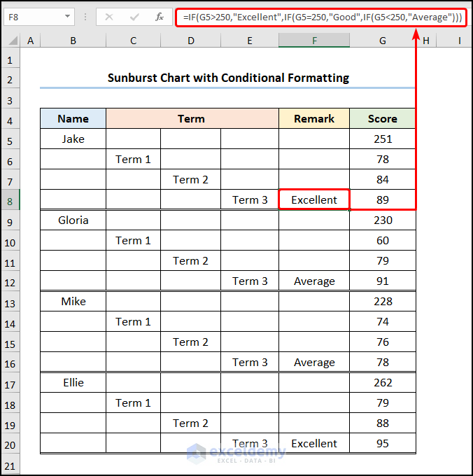
- In a similar style, use this formula in the F12, F16, and F20 cells.

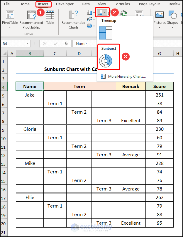
📌 Step 02: Insert the Sunburst Chart
- Second, navigate to the Insert tab >> click the Insert Hierarchy Chart drop-down >> choose the Sunburst Chart.
Not long after, format the chart using the Chart Elements option.
- In addition to the default selection, enable the Chart Title to name the chart. Here, it is the “Sunburst Chart”.
- Now, enable the Data Labels option to display each label.
- Lastly, check the Legend option to show the four data points.
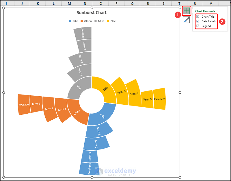
Finally, this should generate the figure shown in the image below.

Read More: How to Insert Sunburst Chart in Excel
How to Show Percentages in Sunburst Chart in Excel
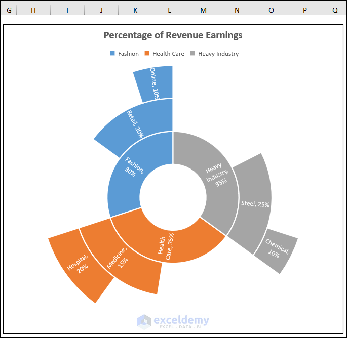
For one thing, you can also display percentages in Excel’s Sunburst Chart. In this situation, let’s consider the Breakdown of Revenue Earnings dataset in the B4:E13 cells, which shows the Category, Sub Category, and Revenue in percentages. Hence, follow the steps below to display the percentages in the Sunburst Chart.

📌 Steps:
- First and foremost, move to the E5 cell >> insert the formula into the Formula Bar.
=SUM(E6:E7)
For example, the E6:E7 arrays represent the “Revenue” earned by the “Retail” and “Online” categories.
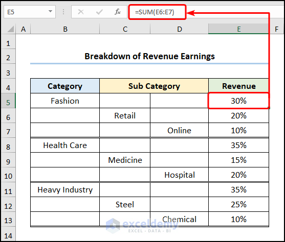
- Then, utilize a similar equation in the E8 and E11 cells.

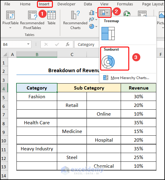
- Afterward, proceed to the Insert tab >> choose Insert Hierarchy Chart >> click on Sunburst Chart.
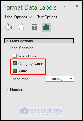
- Following this, select the Data Labels >> hit the CTRL + 1 keys to open the Format Data Labels pane.
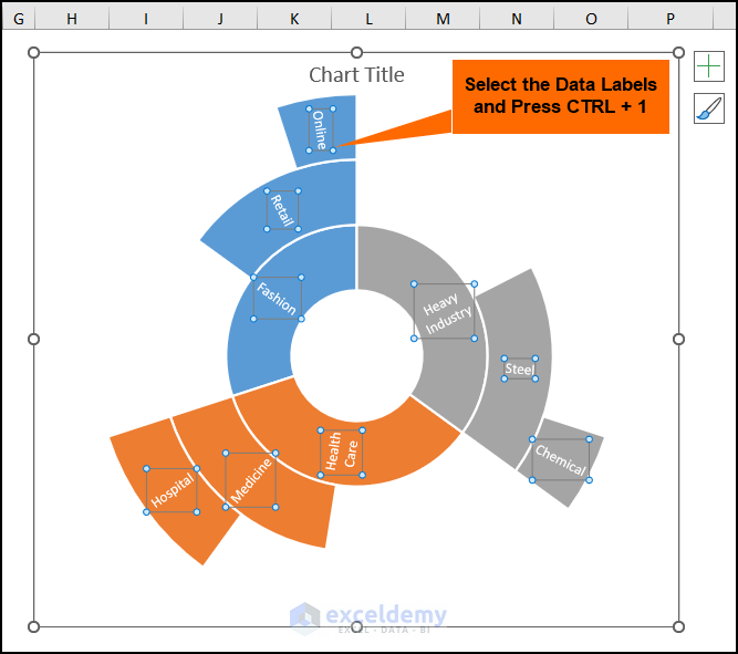
- In turn, insert a check for both Category Name and Value options.
- Later, format the chart according to the Steps described above.

Eventually, the final output should appear in the picture shown below.
Read More: Create Sunburst Chart with Percentage in Excel
Practice Section
We have provided a practice section on the right side of each sheet so you can practice yourself. Please make sure to do it by yourself.

Download Practice Workbook
Conclusion
To sum up, we hope this article helps you understand how to insert a Sunburst Chart with conditional formatting in Excel. Now, if you have any queries, please leave a comment below.
Related Articles
<< Go Back to Sunburst Chart in Excel | Excel Charts | Learn Excel
Get FREE Advanced Excel Exercises with Solutions!
