In this article, we will describe a step-by-step procedure to create a Sunburst Chart with percentage in Excel.
What Is a Sunburst Chart?
A Sunburst Chart in Excel is the most common way of presenting data charts with multiple layers of detail. It can show every portion of the data by using rings, where different portions of the rings represent different data values in the chart. The chart is also an efficient way of visualizing how the outer rings are divided into many parts. Typically, the circles in a sunburst chart reflect the various levels of the data points that have been split into their individual components.

Creating a Sunburst Chart with Percentage in Excel: Step-by-Step Procedure
Step 1 – Select the Dataset
For the purpose of demonstration, we’ll use the following sample dataset, containing some Departments and their respective Sub Divisions within an organization:
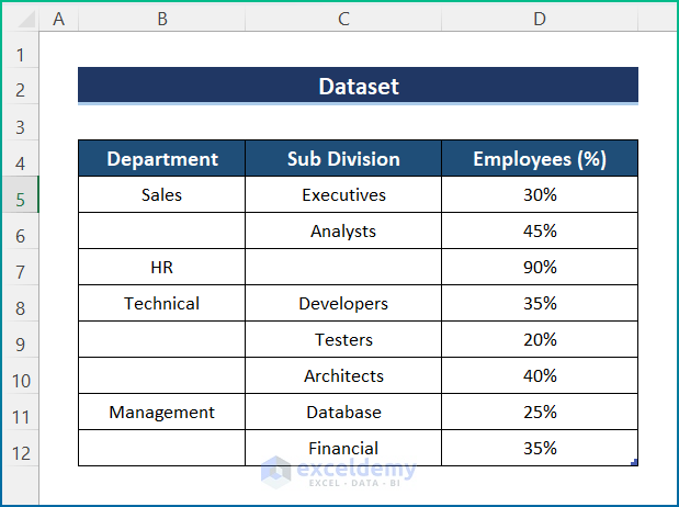
We have shown the number of Employees as a percentage in order to create the Sunburst Chart with percentage.
Read More: How to Sort Excel Sunburst Chart Order
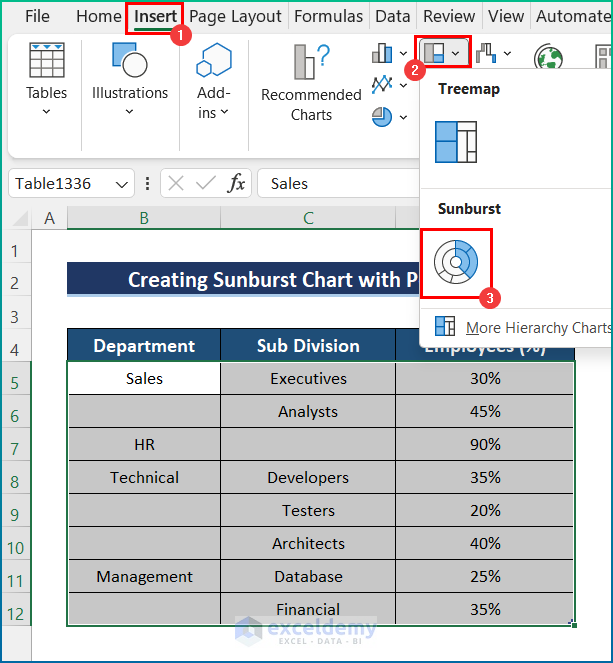
Step 2 – Insert the Sunburst Chart
- Select the dataset.
- Go to the Insert tab and select Insert Hierarchy Chart.
- Click on Sunburst Chart.
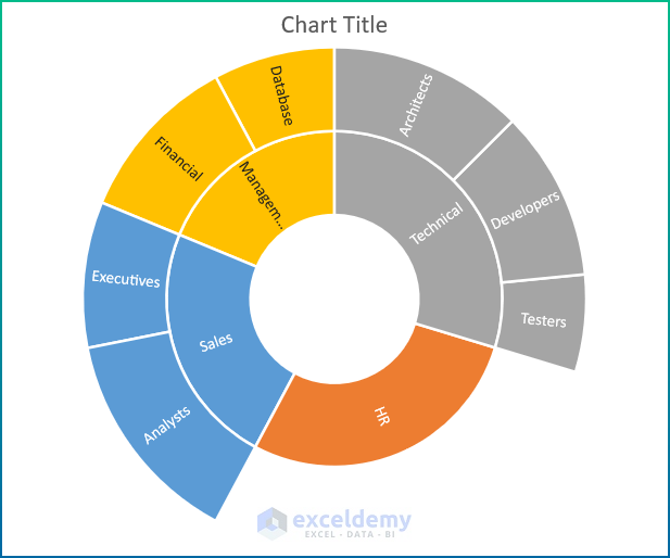
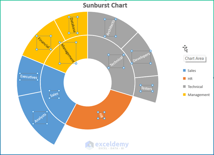
Our Sunburst Chart is generated.
Read More: How to Insert Sunburst Chart in Excel
Step 3 – Modification and Final Output
- Add a Chart Title, Data Labels, and Legend from Chart Elements.
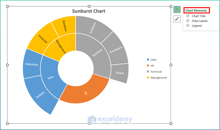
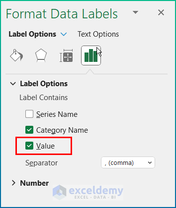
- Select Data Labels and press Ctrl + 1 to open the Format Data Labels pane.
- Tick both the Category Name and Value options.
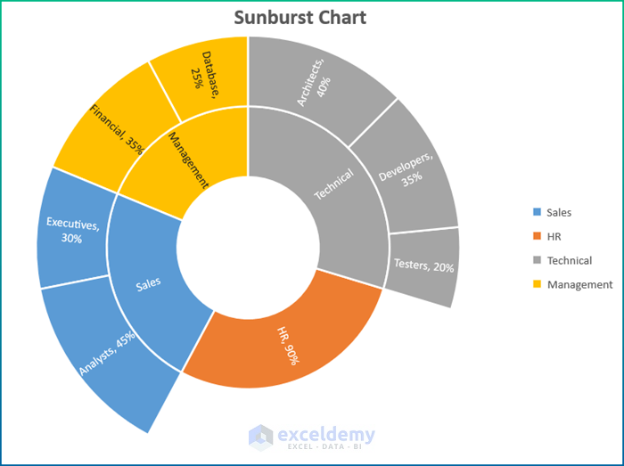
The Sunburst Chart now looks like the image below.
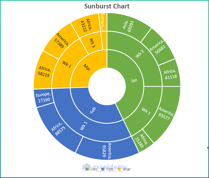
How to Create a Sunburst Chart with Values in Excel
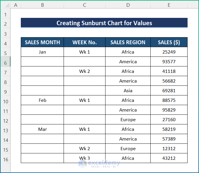
We can just as easily create a Sunburst Chart with values other than percentages. For example, the following dataset contains more divisions, so the chart will contain multiple levels.
Using the same process as in the first example above, create a Sunburst Chart from the Insert Hierarchy Chart option on the Insert tab. After some formatting, it will look like this:
Things to Remember
- To access the Sunburst Chart option, select the dataset, go to the Insert tab and select the Recommended Charts.
- Then, choose any type of data with sub-divisions in order to draw the chart.
- Data labeling and chart titles are essential in this chart, or it can be misleading.
- Format the chart as you like using the Chart Design option.
- Legends in the chart must be placed in a way that makes sense of the data.
Download Practice Workbook
Related Articles
- How to Rotate Sunburst Chart in Excel
- How to Insert Sunburst Chart with Conditional Formatting in Excel
<< Go Back to Sunburst Chart in Excel | Excel Charts | Learn Excel
Get FREE Advanced Excel Exercises with Solutions!
