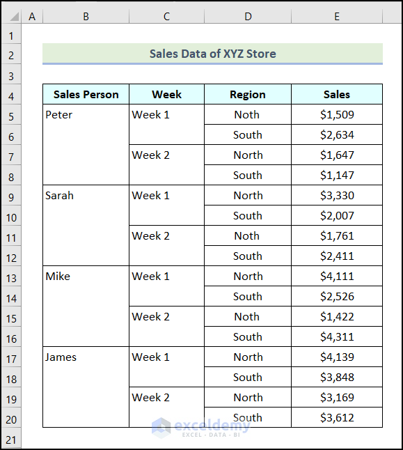
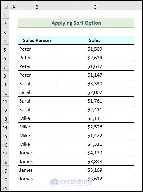
The Sales Data of XYZ Store is the sample dataset.
Create a Sunburst Chart and rotate it.
Method 1 – Using the Camera Tool
- This is the output.
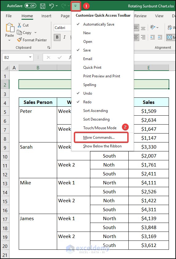
The Camera tool is not added by default in the Quick Access Toolbar of Excel. To add it manually:
- Click Customize Quick Access Toolbar.
- Select More Commands… .
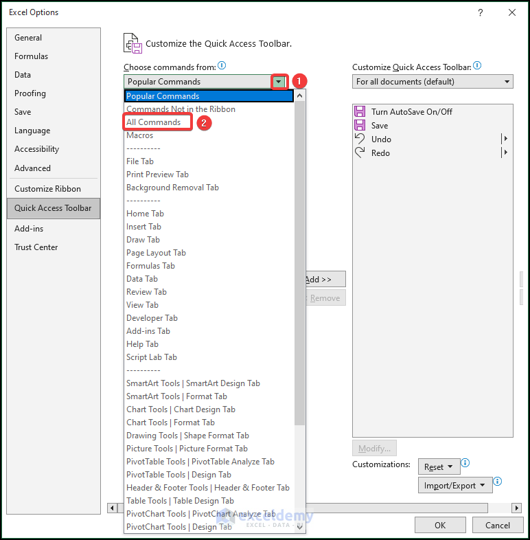
The Excel Options dialog box will open.
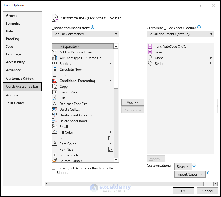
- Click the drop-down icon as shown below.
- Choose All Commands.
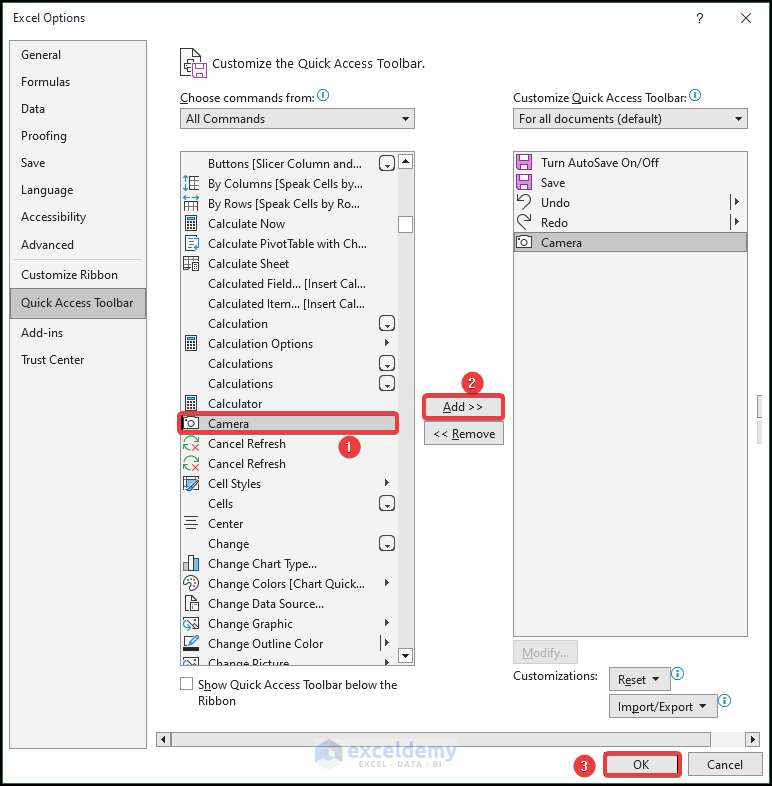
- Select Camera.
- Choose All Commands.
- Click Add.
- Click OK.
The Camera tool will be added to the Quick Access Toolbar.
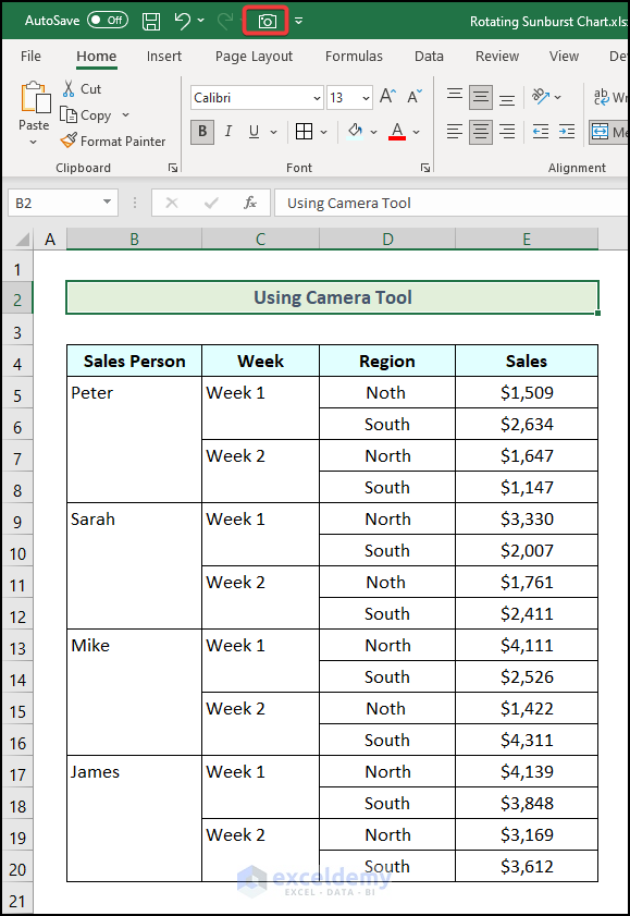
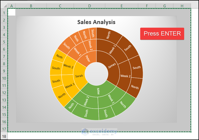
- Select the cells behind the chart area.
- Click Camera in Quick Access Toolbar.
- Press ENTER.
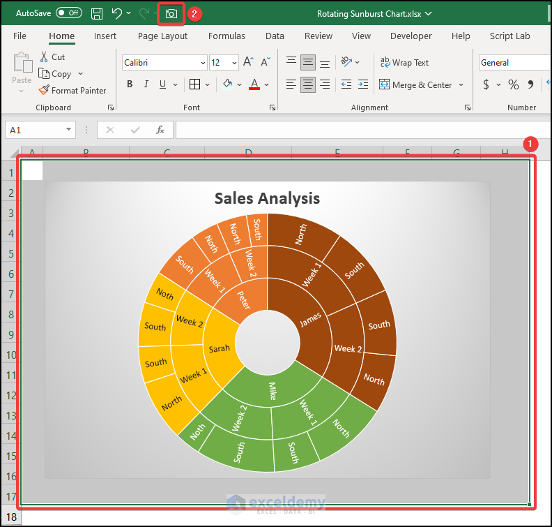
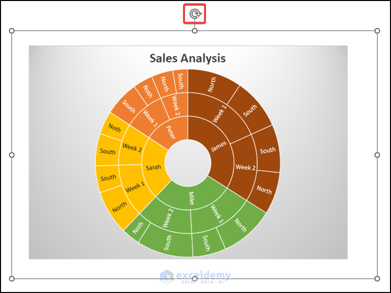
- Click and hold the rotation option and rotate the Sunburst Chart.
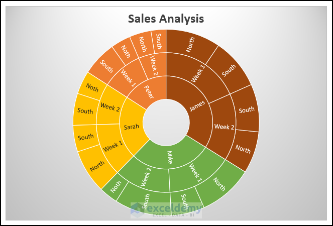
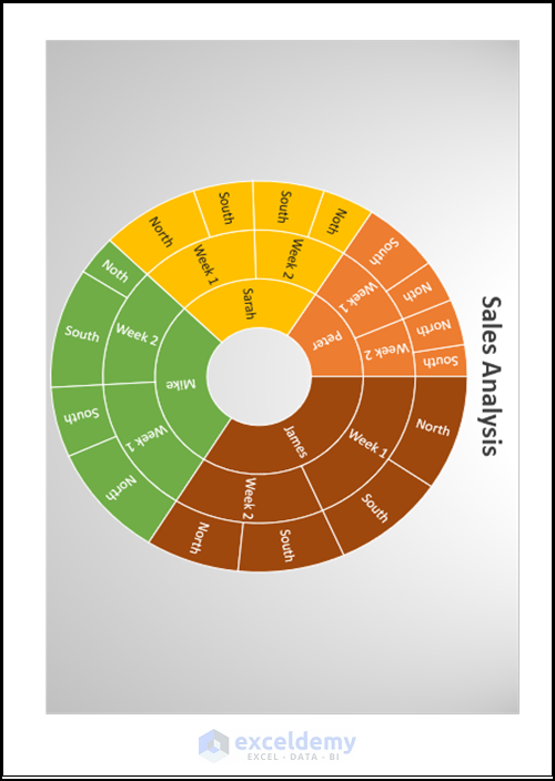
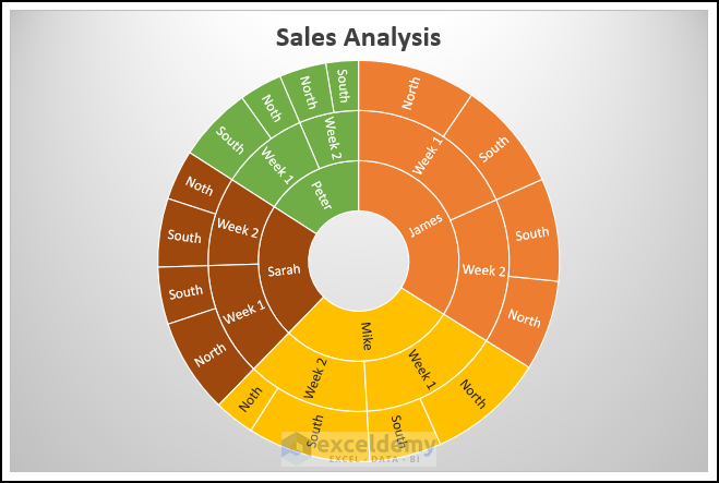
The Sunburst Chart will rotate:
Method 2 – Applying the Sort Option in Excel
Steps:
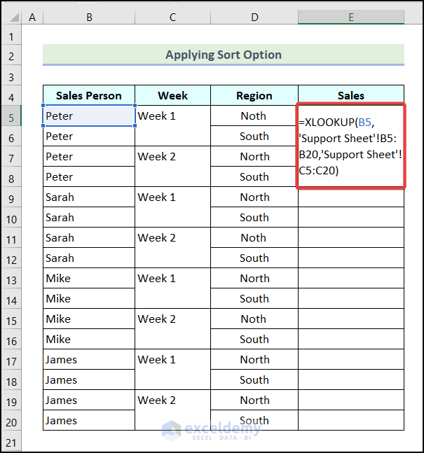
- Create a Support Sheet as shown below.
- Enter the following formula in E5.
=XLOOKUP(B5,'Support Sheet'!B17:B32,'Support Sheet'!C17:C32)B5 indicates the first cell in the Sales Person column, B5:B20 refers to the cells in the Sales Person column of the Support Sheet, and C5:C20 represents the cells in the Sales column in the Support Sheet. The the XLOOKUP function will return the Sales data in E5:E20.
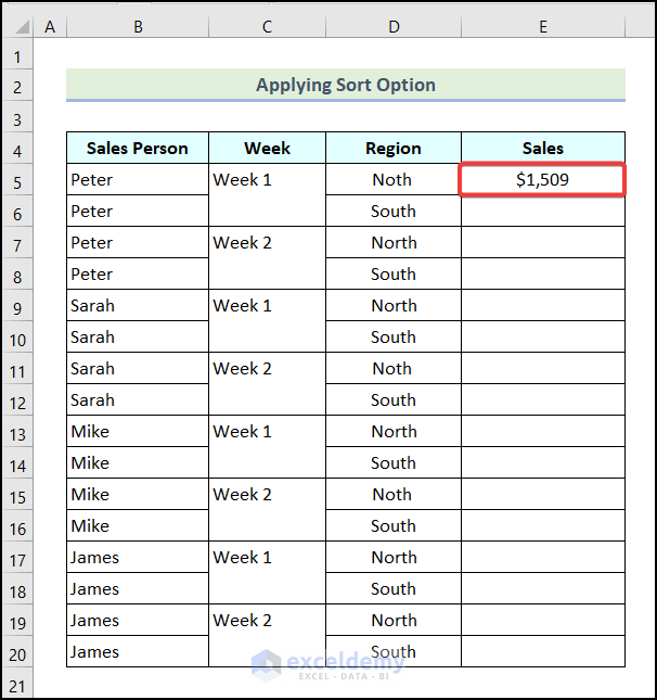
- Press ENTER.
Sales data of Peter for Week 1 in the North Region will be displayed in E5.
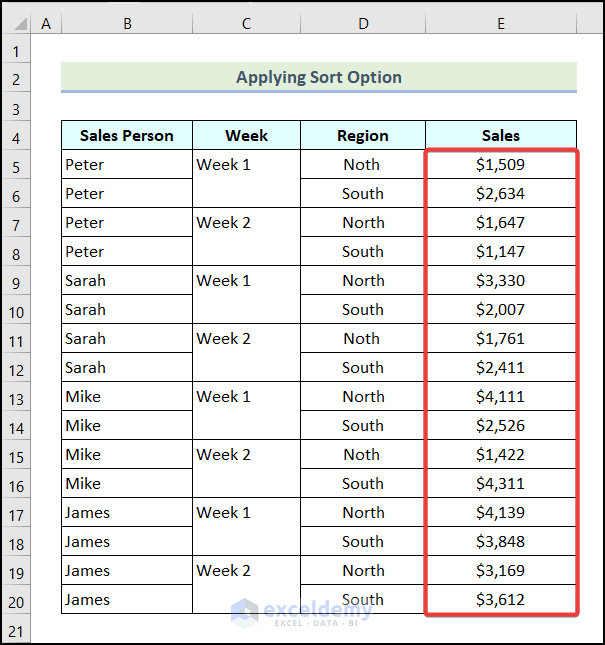
- Drag down the Fill Handle to see the result in the rest of the cells.
- Repeat the steps described in Method 1 to create the Sunburst Chart.

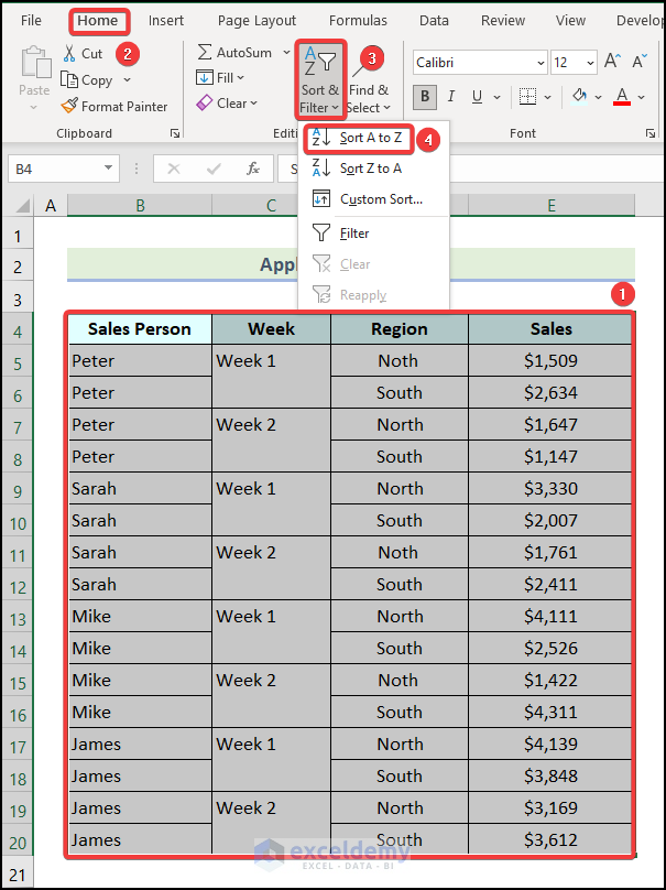
- Select the entire dataset.
- Go to the Home tab.
- Choose Sort & Filter in Editing.
- Select Sort A to Z.
Note: You can choose other Sort & Filter option.
The dataset will be sorted and the Sunburst Chart will rotate:
Read More: How to Sort Excel Sunburst Chart Order
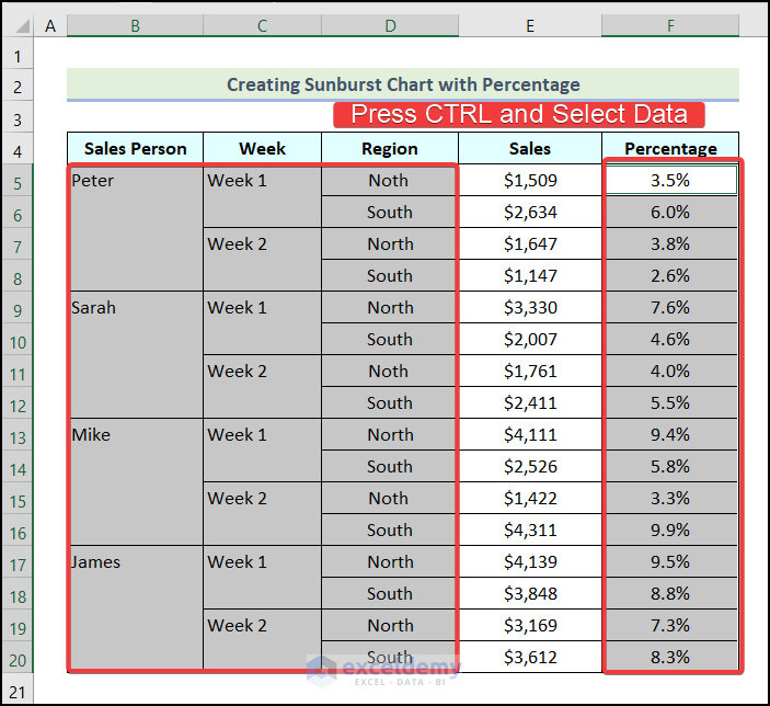
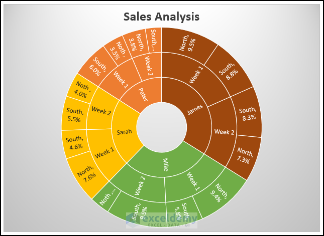
How to Create a Sunburst Chart with a Percentage in Excel
Steps:
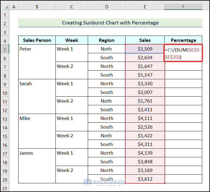
- Use the following formula in F5 to calculate the Percentage.
=E5/(SUM($E$5:$E$20))E5 indicates the first cell in the Sales column, and $E$5:$E$20 represents the cells in the Sales column.
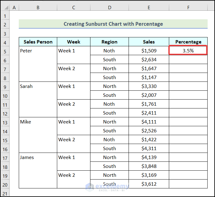
- Press ENTER.
This is the output.
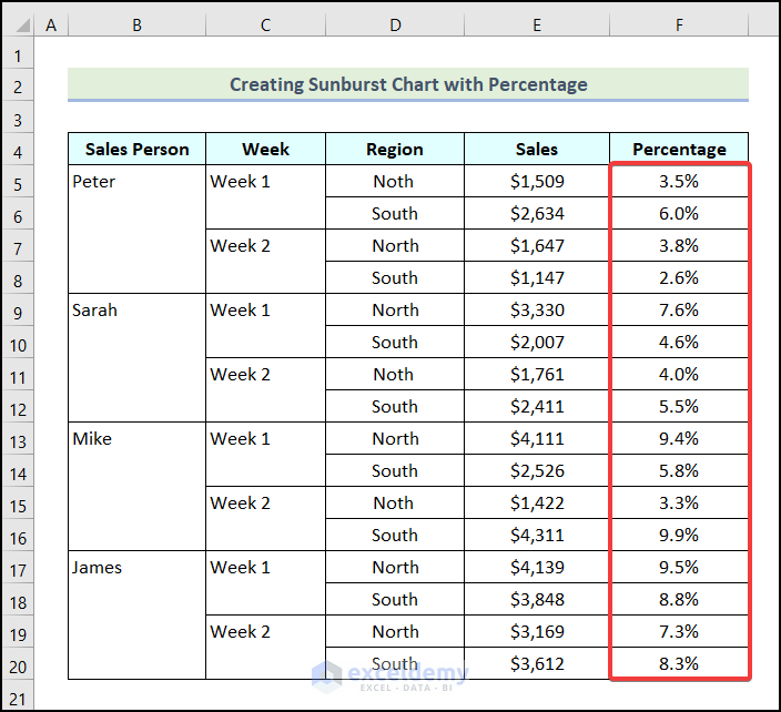
- Drag down the Fill Handle to see the result in the rest of the cells.
- Press and hold CTRL and select the data as shown below.
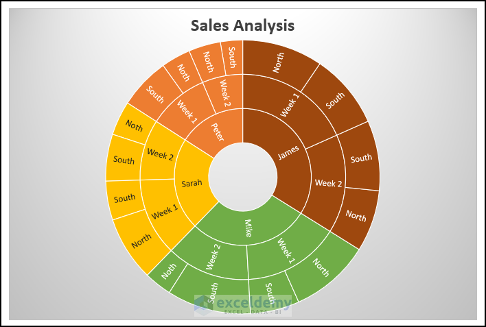
- Follow the steps described above to create the Sunburst Chart.
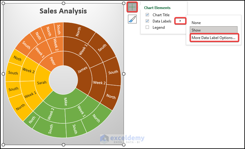
- Click Chart Elements.
- Click the Arrow option beside Data Labels.
- Choose More Data Label Options…
- Check Value in the Format Data Labels dialog box.
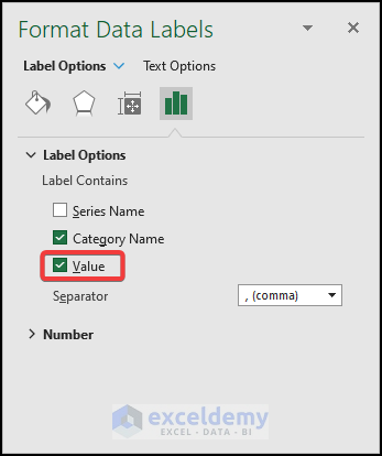
The Sunburst Chart will include the percentage values:
Download Practice Workbook
Related Articles
- How to Insert Sunburst Chart with Conditional Formatting in Excel
- How to Insert Sunburst Chart in Excel
<< Go Back to Sunburst Chart in Excel | Excel Charts | Learn Excel
Get FREE Advanced Excel Exercises with Solutions!
